“It’s more of having a different experience. They wanted a place for ‘staycation’, but not a hotel; that’s why the projects that we’ve been doing with them are very thematic in nature,” interior designer Denise Ayado explains her clients’ wish for the unit. Denise also shared that they have worked together before and that gave her and her team a general idea of how the couple wanted the space to look like: an industrial style theme with pops of colors, quirky items, and lots of character.
“On the days when the couple’s family isn’t using the unit, the place is being listed for rent on Airbnb. They didn’t want to be usual, especially now when people want not just a place to stay at but also a place to experience,” Denise furthers.
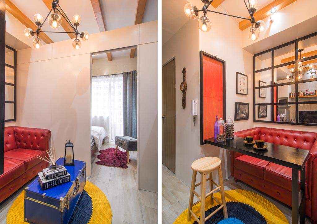
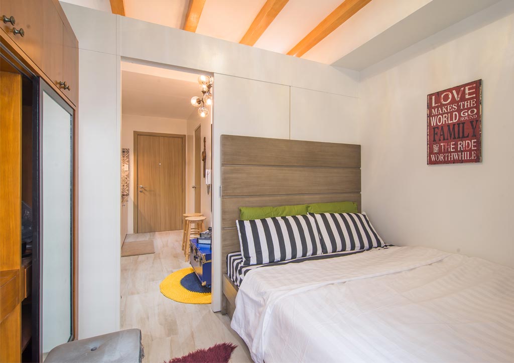
With a modest area to work with, it’s easy to think that dressing up a space like this would make it even smaller. However, the combination of colors, fixtures, and fittings in the unit made it appear airier and more spacious. The neutral and raw finish of the industrial style is contrasted with the warm wood in the ceiling and the wardrobe, as well as the striking chesterfield sofa in the living area. The inclusion of black in to the mix proved to be a great way to balance all the colors in the unit.
“It is an industrial themed space—it’s neutral and harsh—but we don’t want it to be that way. There must always be an element of surprise, so when you add something like an accent color, there is always freshness every time you go to a space, no matter how many times you’ve seen it,” explains Denise. “Although, we didn’t really follow a specific color palette; it’s more like an intuitive pairing of colors,” she adds.
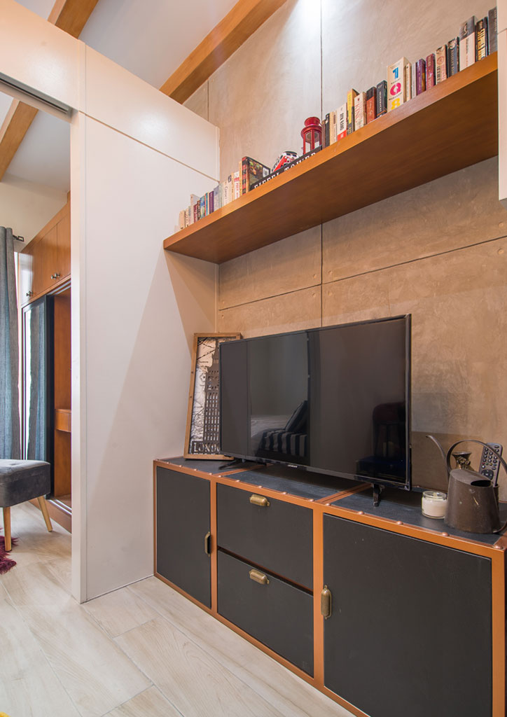
Denise mentions that the major renovation in the unit was made on the flooring and the ceiling. While the floor was changed, false beams were added to the ceiling that run from the living area to the bedroom. The design team also opted for an open floor layout for the living spaces to maximize precious space, but the contrasting cabinetry in the kitchen and the open shelving in the entertainment area subtly create a visual separation between the two areas.
The depth of the living area (which can also be transformed into a dining area by unfolding the wall art into a dining table that can accommodate up to four people) also adds to the distinction between spaces. Meanwhile, the wall finishing was achieved by adding concrete plaster. The red sofa, the blue vintage luggage trunk, and the yellow-and-blue round area rug add pops of colors, which evoke a sense of youthful charm.
Denise and her team likes to explore new ways of applying trends into their designs and builds, and seeing that the couple is open to and appreciates non-traditional approaches to both color and function just made this project easier to execute. However, she admits that the biggest challenge for them was fitting the requirements of a living space without sacrificing function, style, and comfort.
“We’re proud of how counterintuitive our approaches were in this specific project, especially when it comes to the do’s and dont’s of designing compact spaces, and yet they worked perfectly well. We used full-sized furniture, an oversized luggage trunk, ceiling beams, and a balance of different colors that meshed well in the space,” the interior designer concludes.
Look Inside More Mini Condos
A 27.5sqm Scandinavian Chic Rental Condo With A Tropical Hint
This 36-sqm Renovated Unit is a Spacious Condo with a Lot of Storage!


