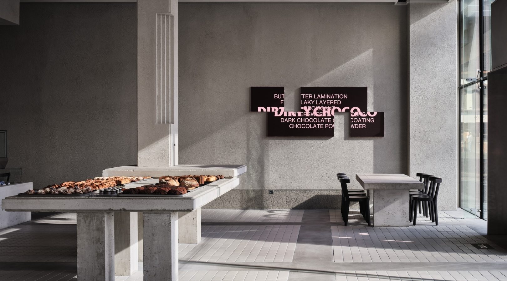
Our Bakery’s Monochromatic Interior is Inspired by Its Signature Bread
Two factors have to be considered when designing a bakery: space and baked goods. But modern bakeries today are steering away from the traditional aesthetics yet ensuring the shop still caters to these factors. The designs of most bake shops now are inspired by their products and processes.
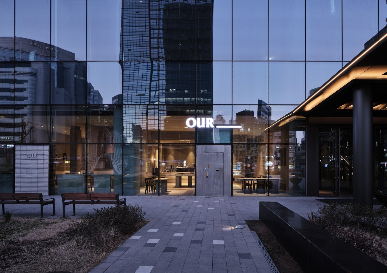
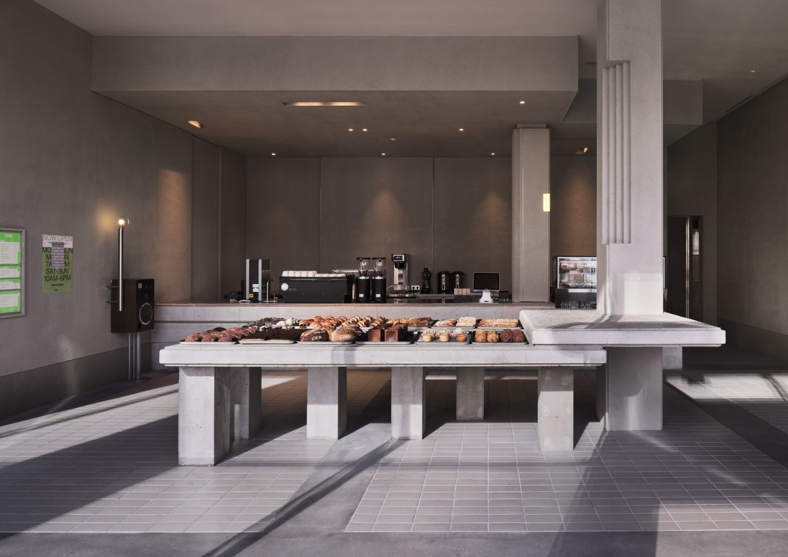
“Our Bakery” in South Korea, for instance, features a minimalist, monochromatic interior design that highlights textured concrete on its walls and columns. The cafe which makes and sells bread is designed by Studio Fragment.
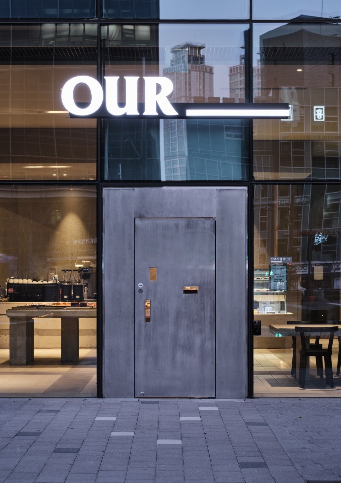
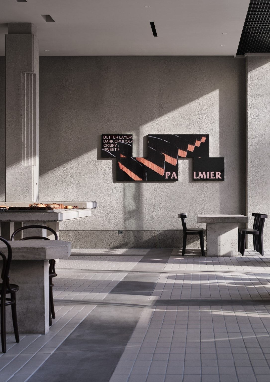
The overall aesthetic of the place is inspired by the shop’s popular menu items, such as ‘dirty chocolate’ mixed with pastry, chocolate, and bread with a texture like “palmier carré.” Roughly crumbled and sticky bread stimulates the visual and tactile senses.
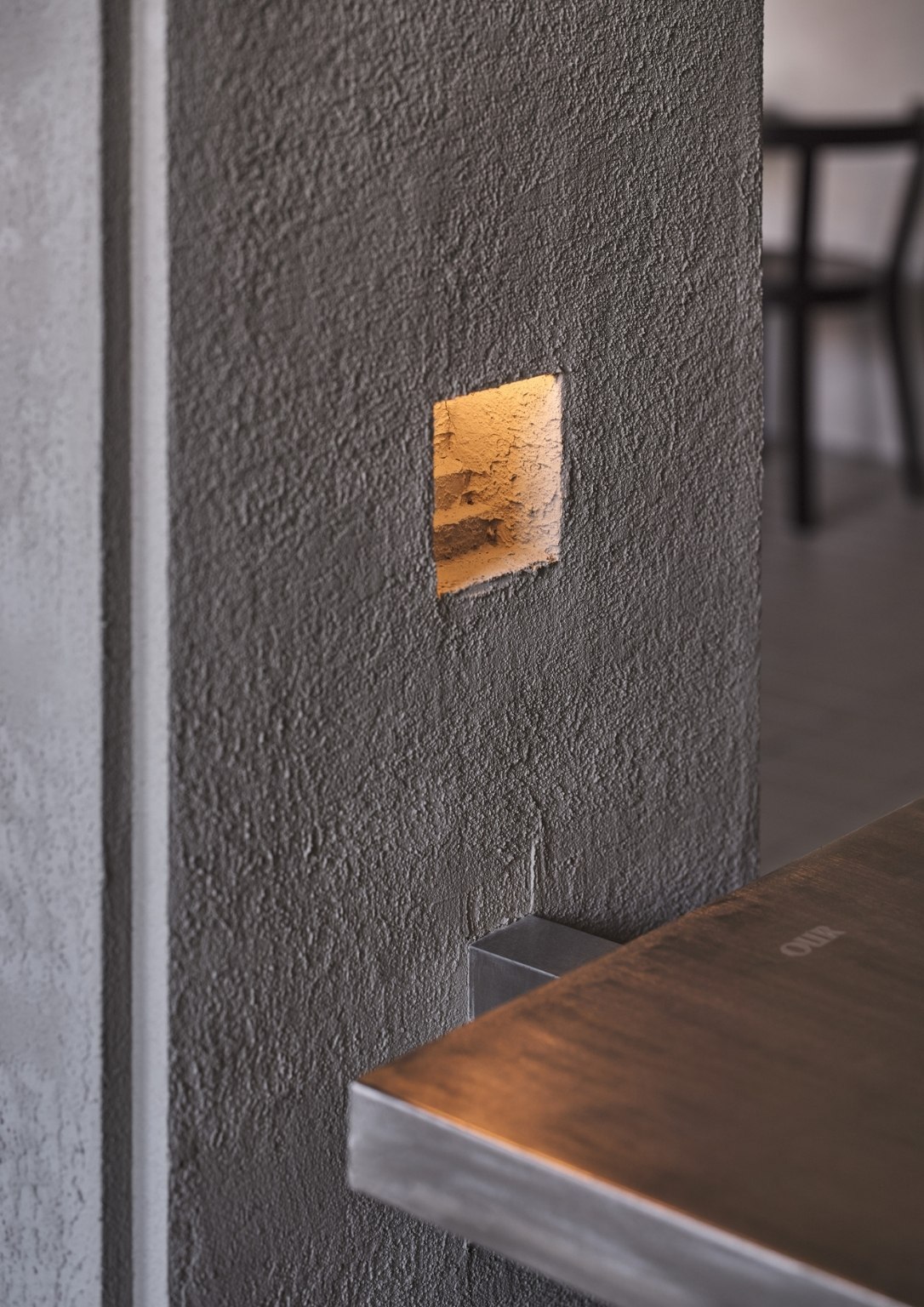

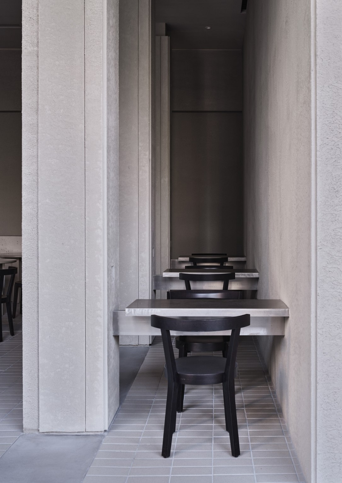
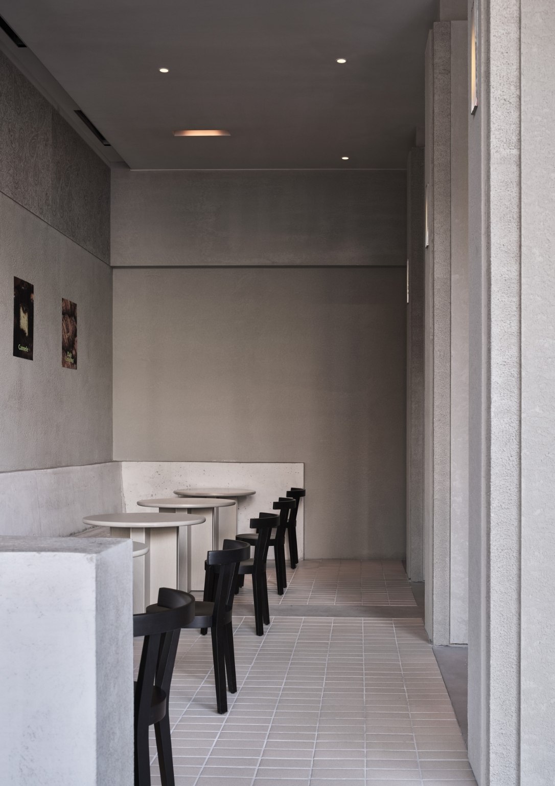
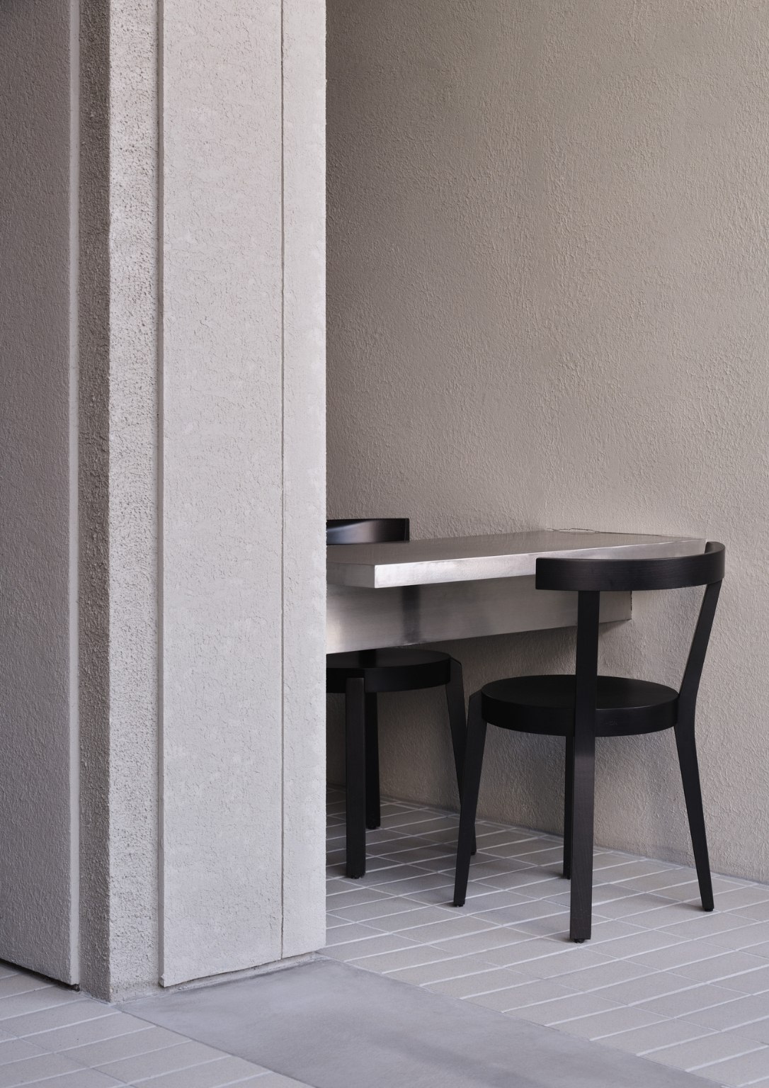
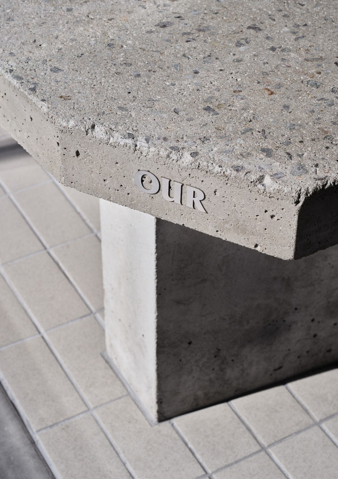
The architect relates the design process to bread making. “Bread is made from flour. The flour is kneaded, milled, cut, and layered to create a variety of shapes and textures. On the other hand, there are various materials that make-up space and architecture. Wood and stone, glass and metal, and among various materials, cement and concrete start as a powder like bread,” explains the architect. They have seen concrete being made into various shapes and textures according to its frame and structure in the same context as bread.
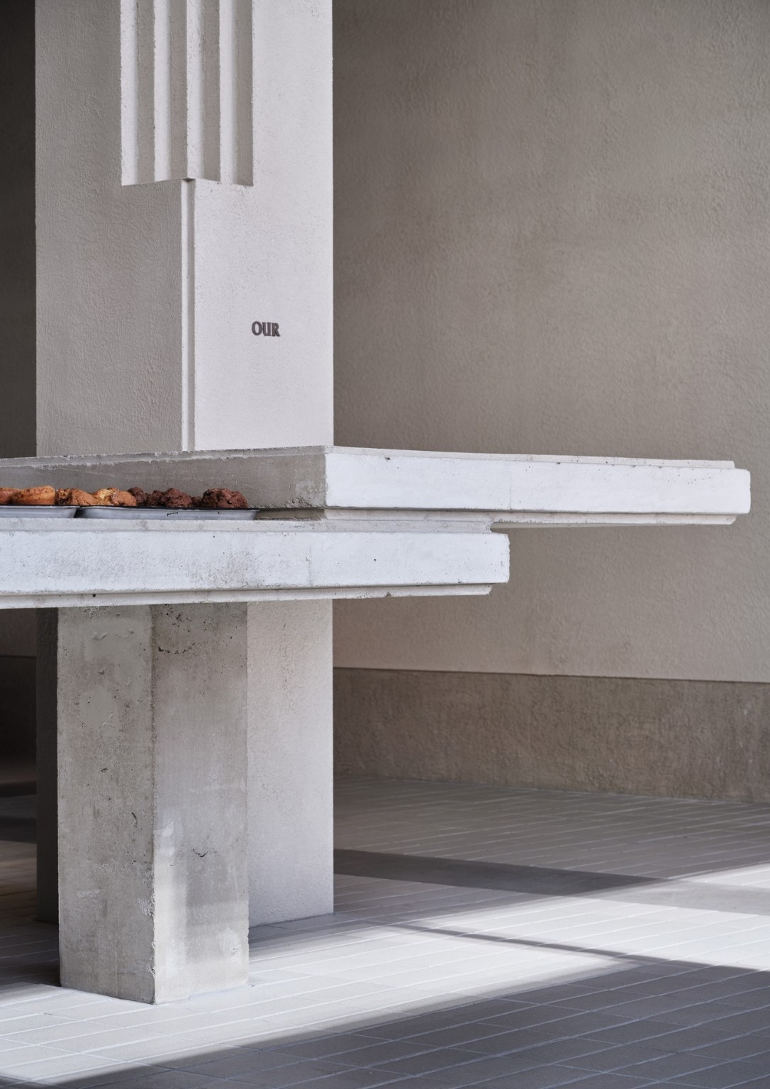
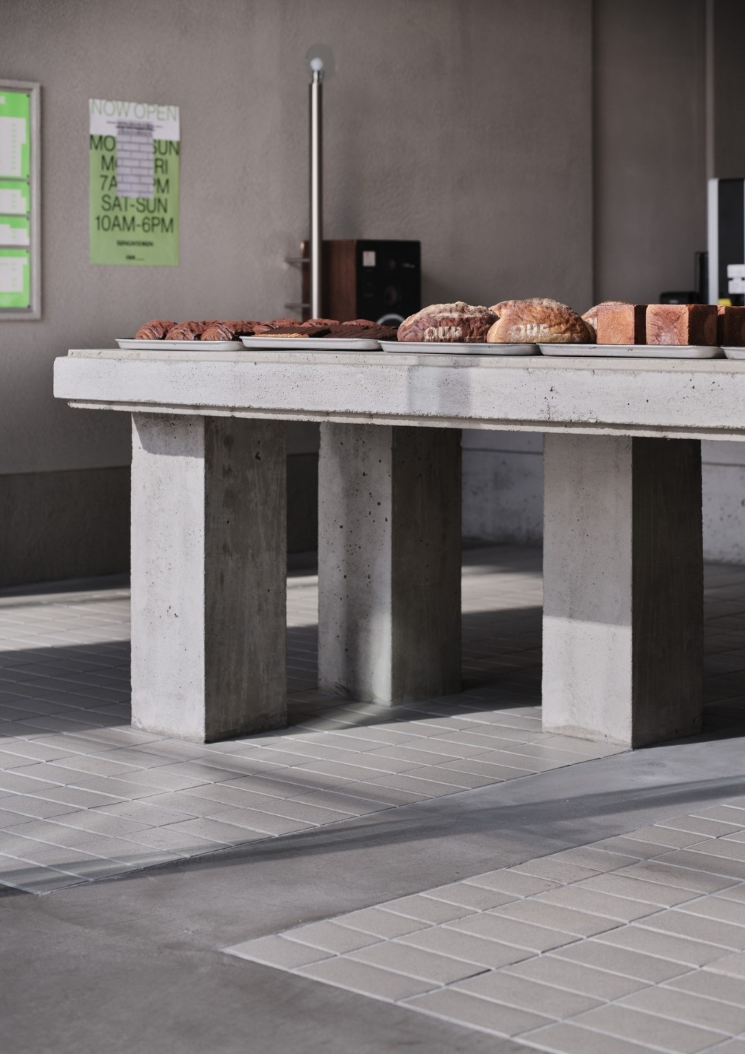
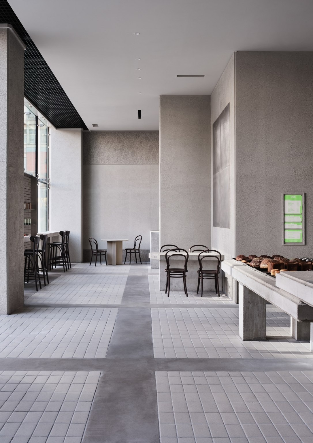
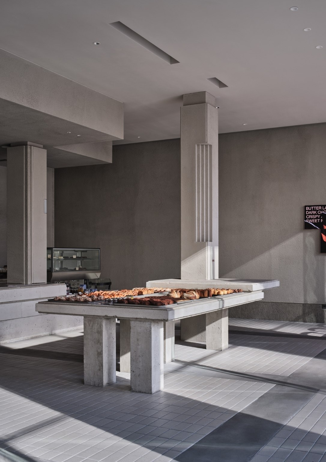
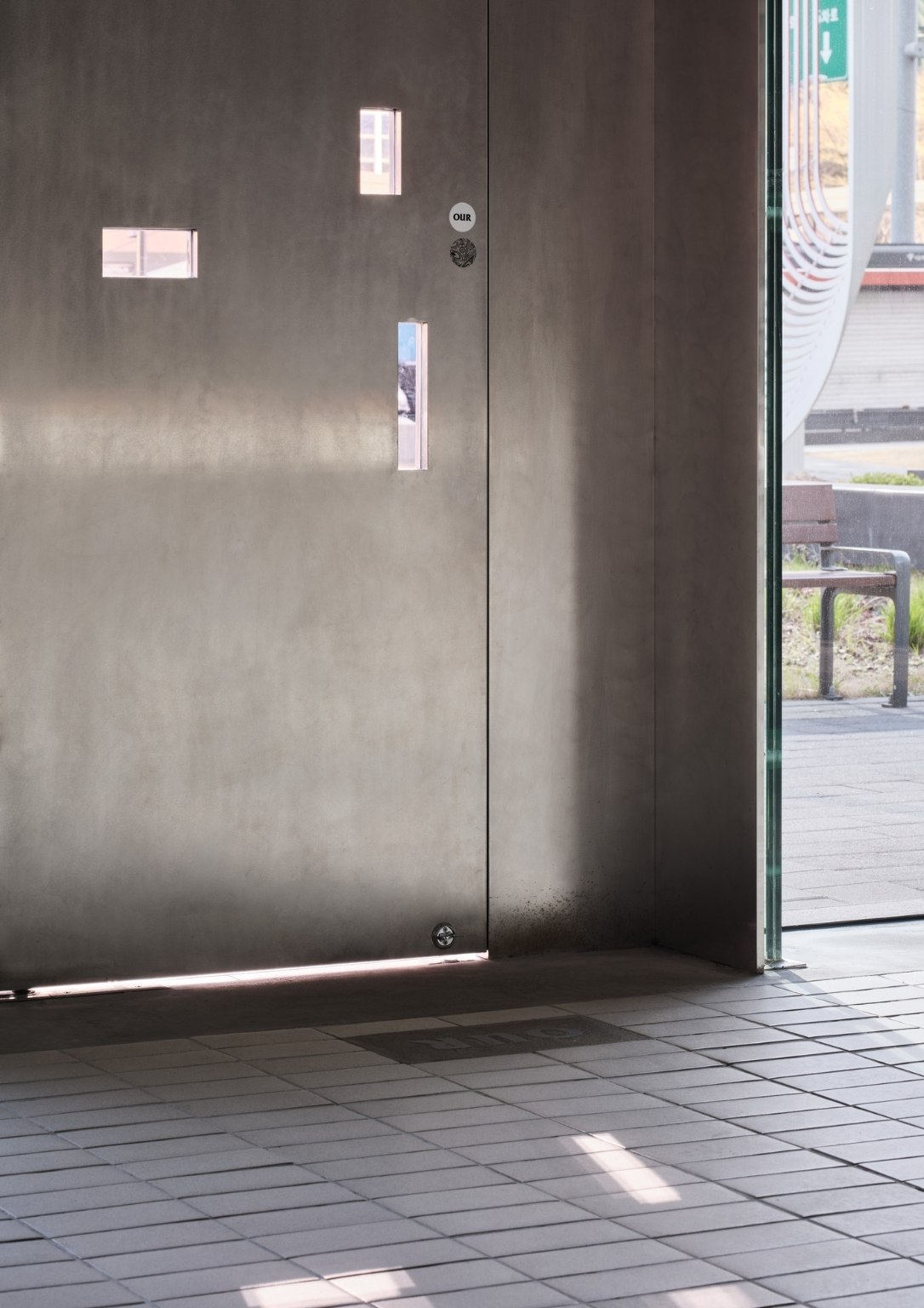
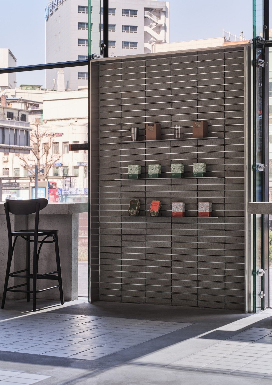
The team has decided to compose the space entirely with concrete, mortar, and metal. They have tried to express different textures with limited materials. They incorporated black-and-white photos to capture a more honest and diverse feeling through monotonous and indifferent materials. “The simple and rough texture adds to the texture of the bread, giving it a more raw feeling, and was intended to focus on the act of eating bread,” the architect adds.
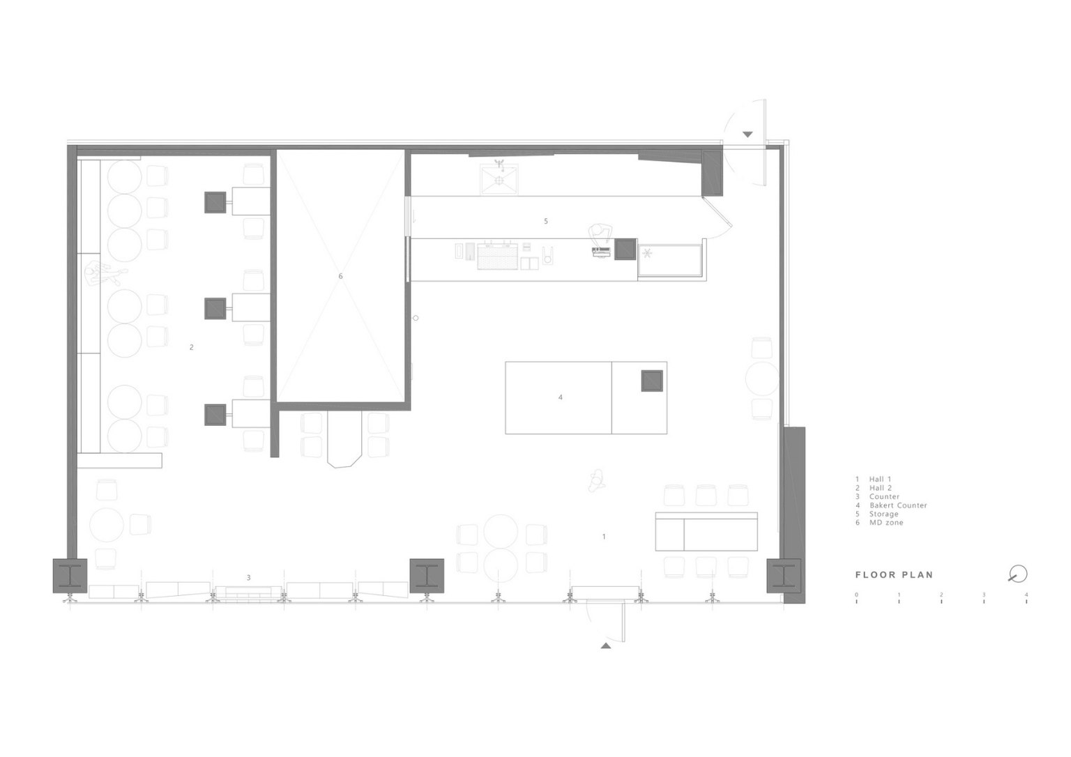
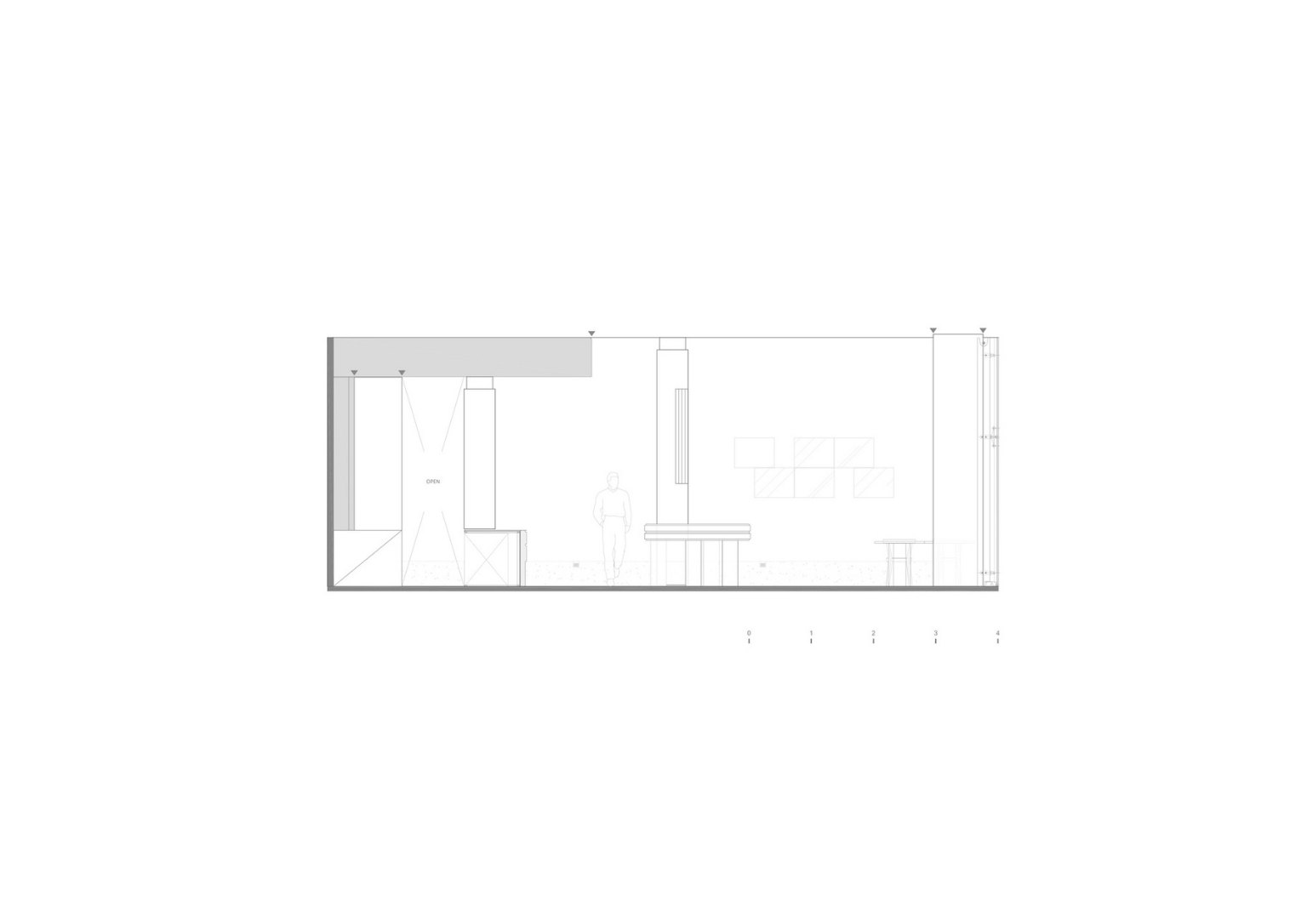
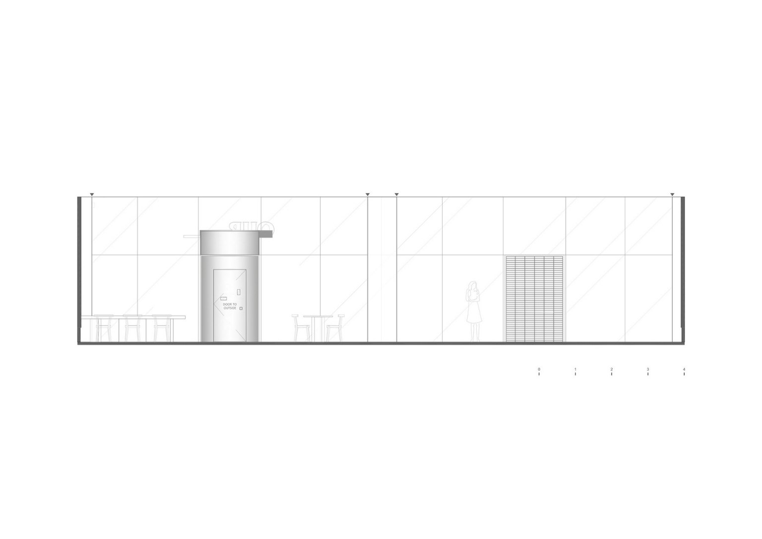
Upon entering the space, the first thing the architect saw was a large showcase in which large chunks of concrete intersected with a column to form a single chunk. They wanted the chunks to be placed naturally and used as tables and chairs. The small elements and devices, like the lights and metal materials embedded in the pillar were also designed by the team. It was meant to give a more delicate feeling by contrasting with the rough mass.
Photos by Kim Donggyu


