The Smart Use of Concrete and Metal Integrates A Wine Company’s HQ into The Surrounding Buildings
Recommended Video
Having headquarters is vital for manufacturing businesses to streamline the production process and house their products. A well-planned space designed according to the needs of the company is crucial so it can easily adapt as the business grows. The location, however, can pose challenges in creating the right facility for the business. michielizanatta.net architetti has recently completed the headquarters for the Cantina Montelliana in Italy. The place is characterized by an elegant, composite design that extends to include other pre-existing buildings.
Tommaso Michieli and Christian Zanatta of michielizanatta.net architetti share that the project is in a manufacturing and commercial area dominated by low-quality buildings that are arranged along the road from Montebelluna to Conegliano, in the province of Treviso in northeastern Italy. The headquarters of the wine cooperative is located near the southern slopes of Montello and a few kilometers from the Piave River. It covers an area of about 10,000 square meters. The facility allows the company to have a structure of a size congruent with its current workforce.
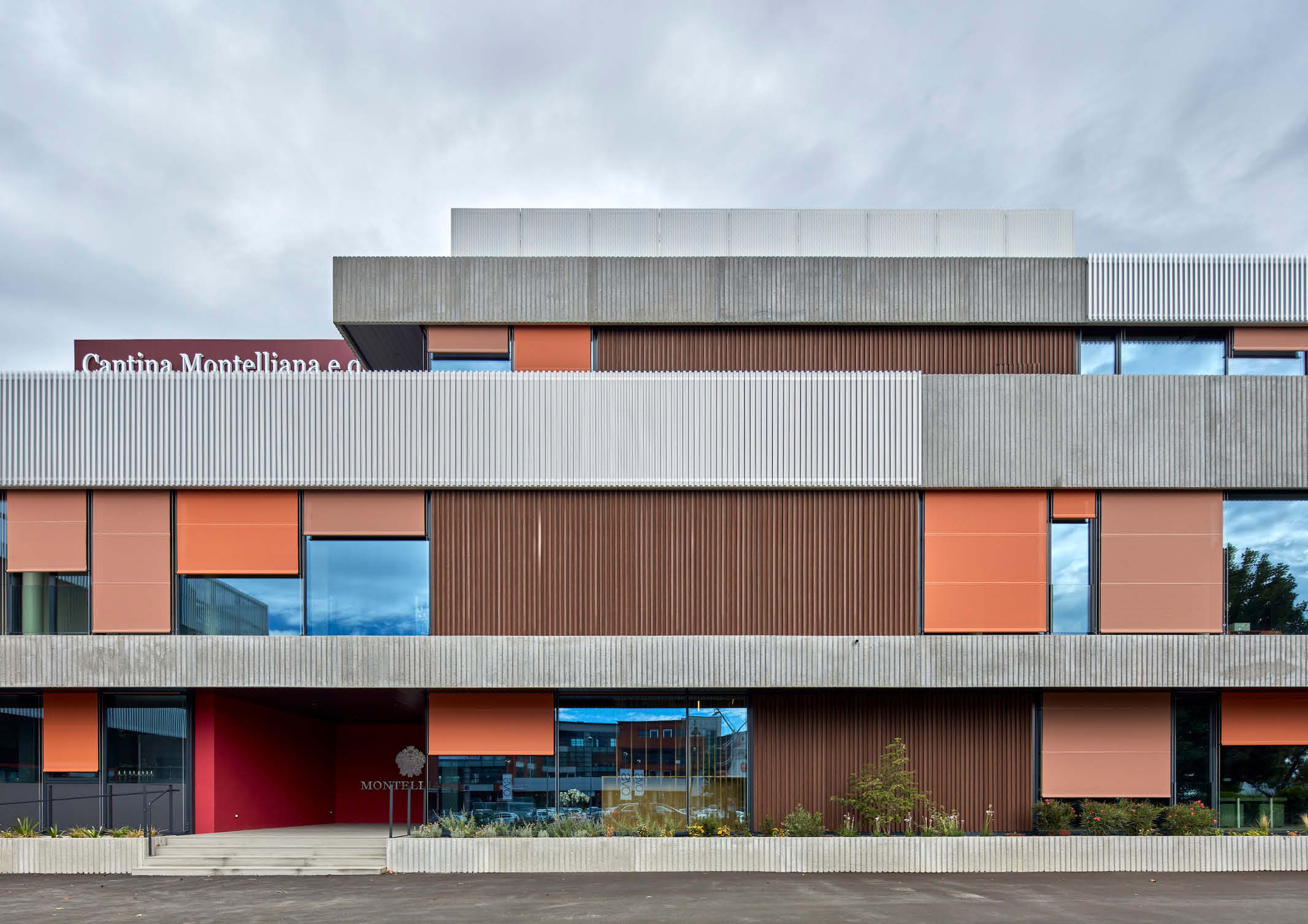
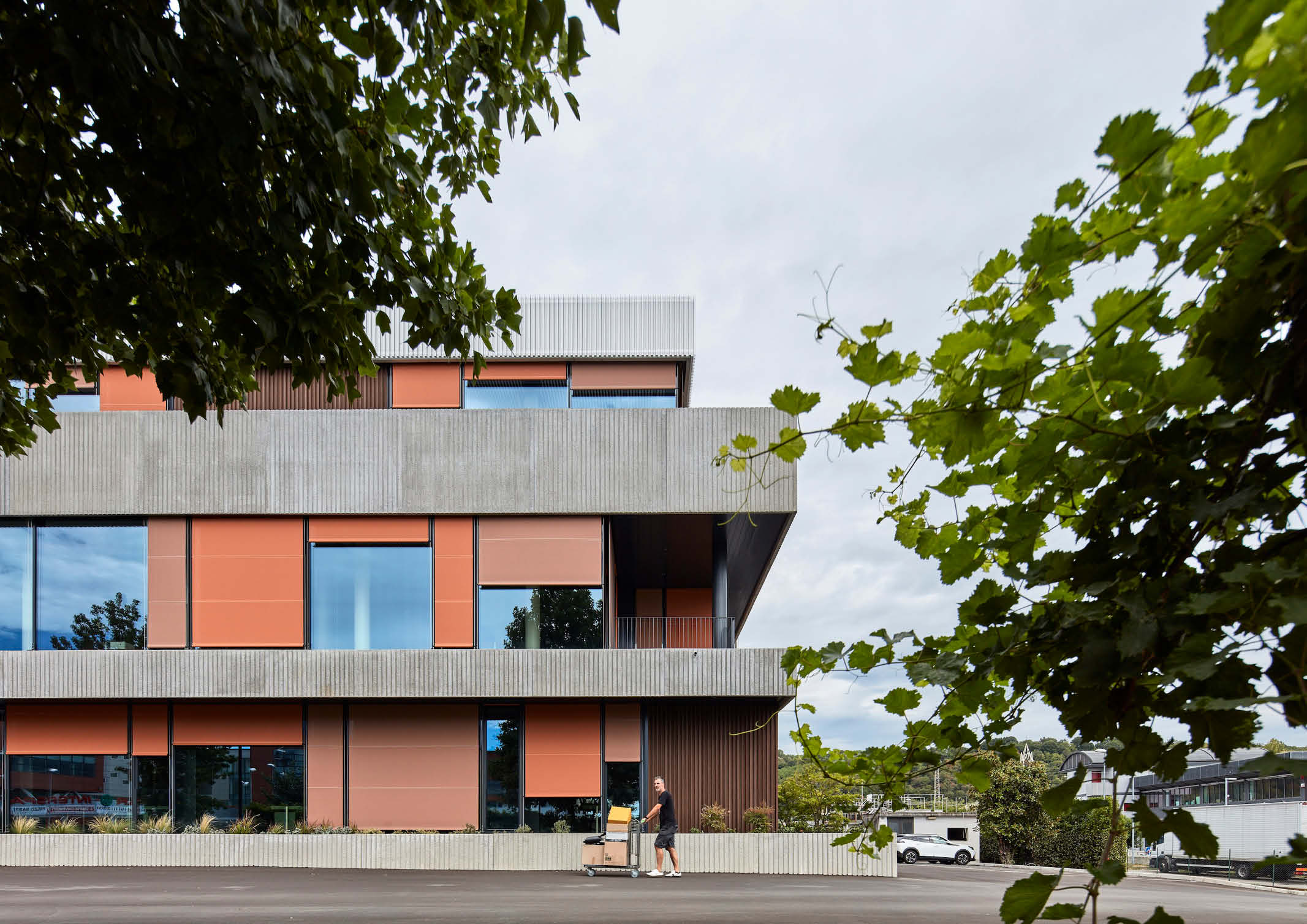
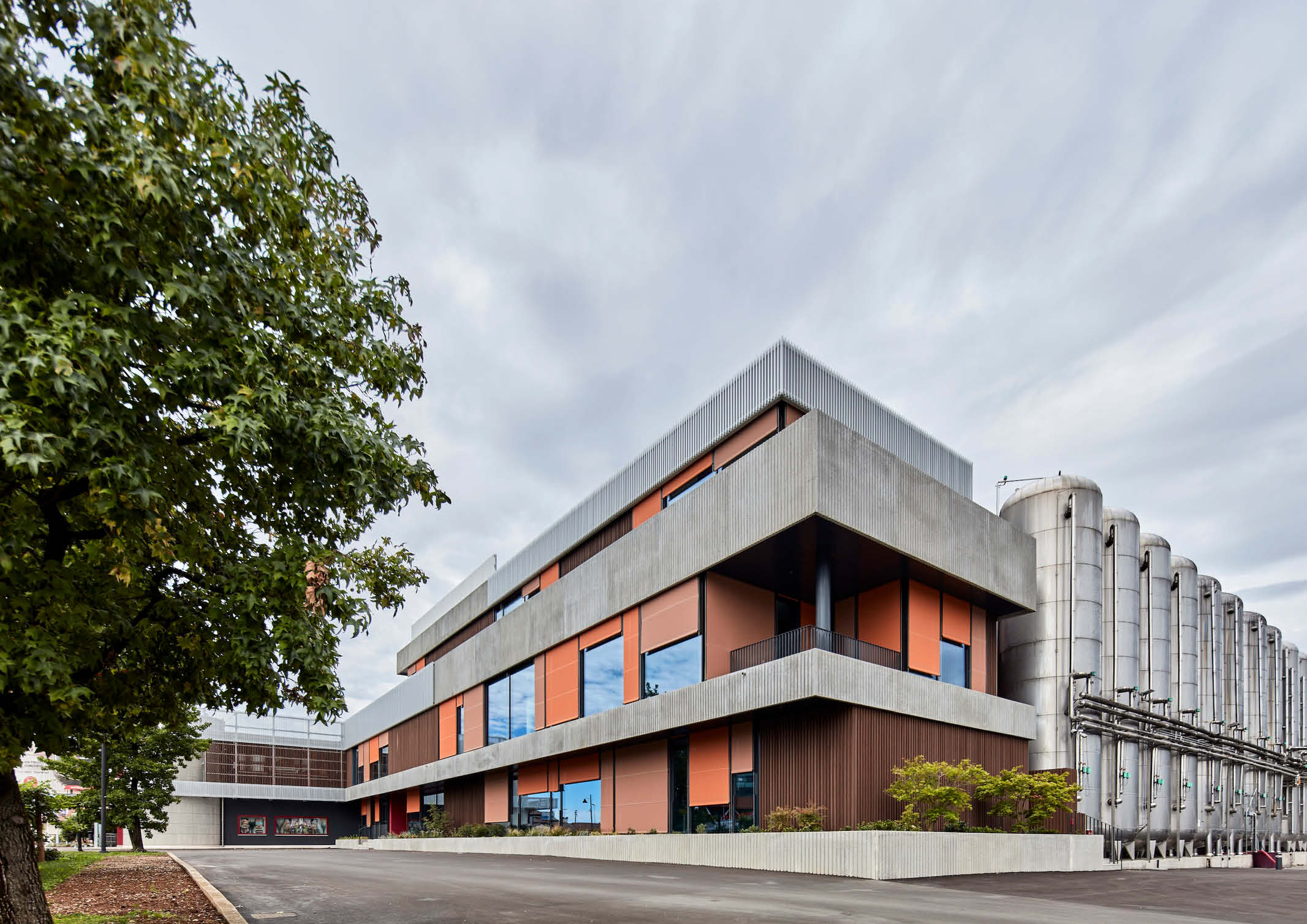
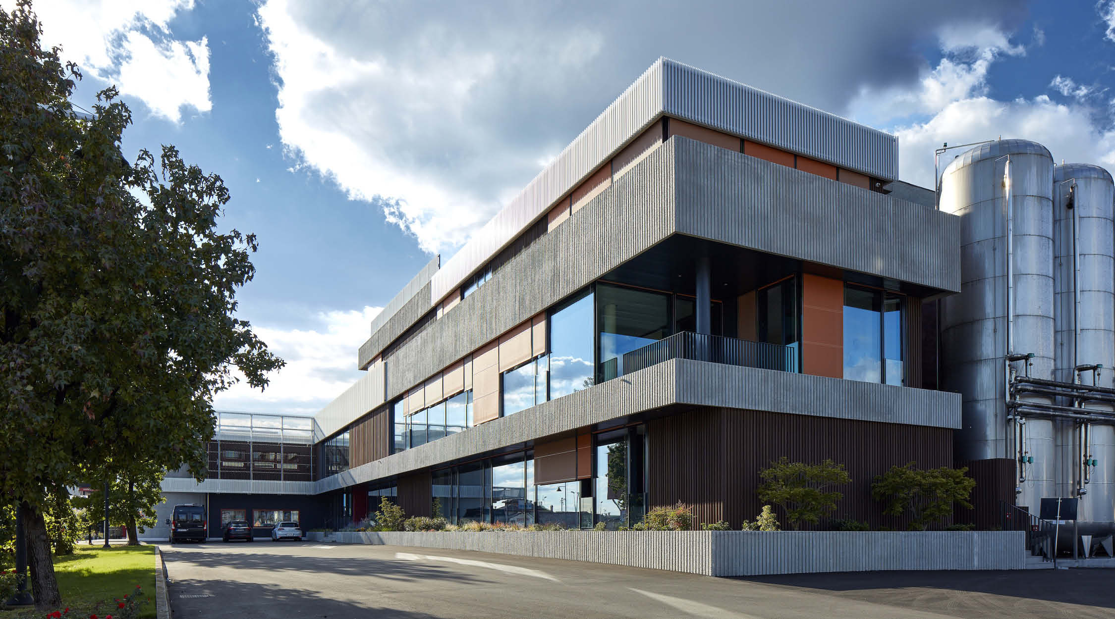
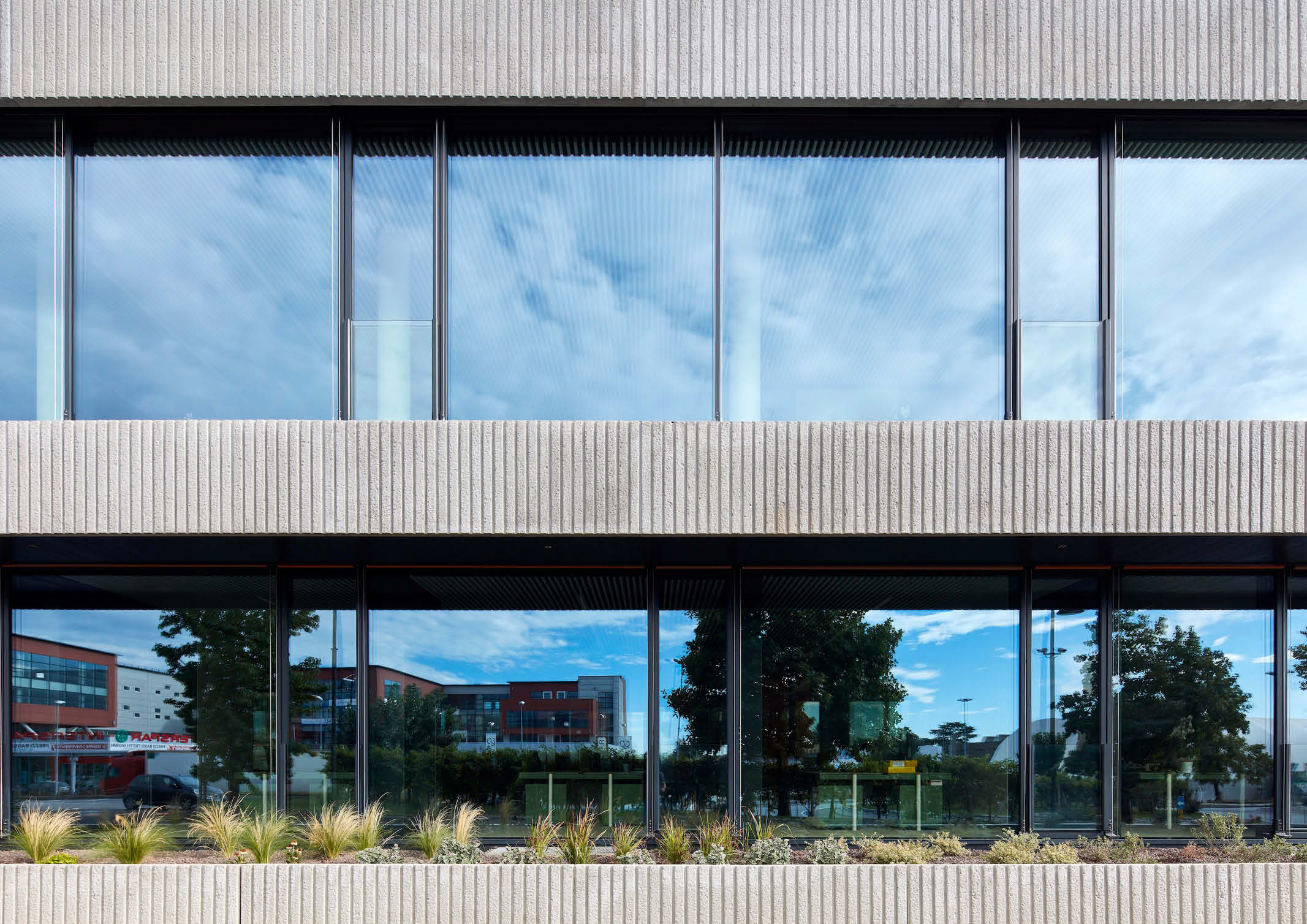
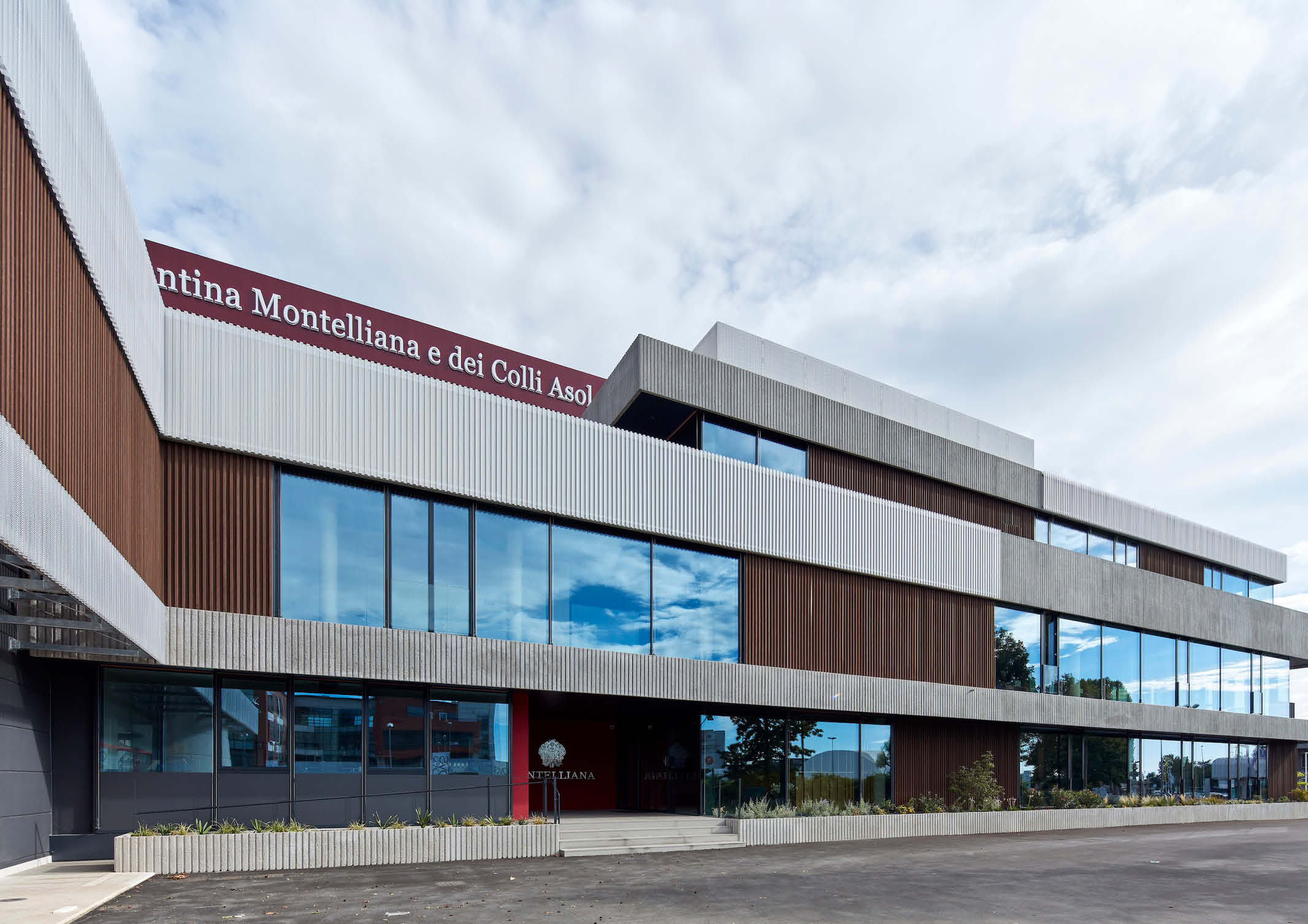
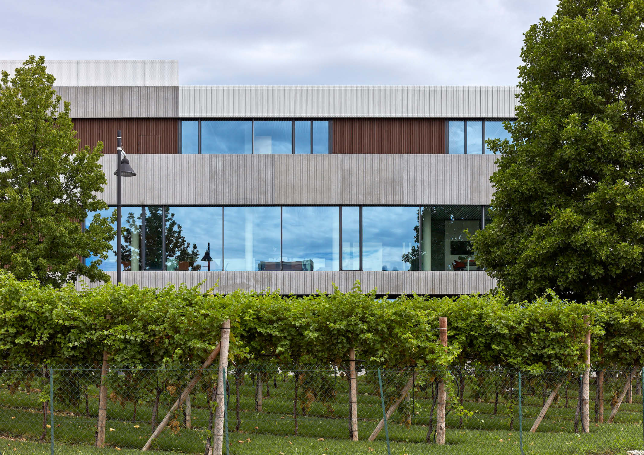
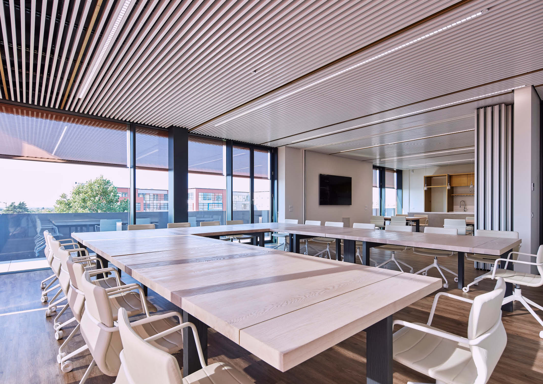
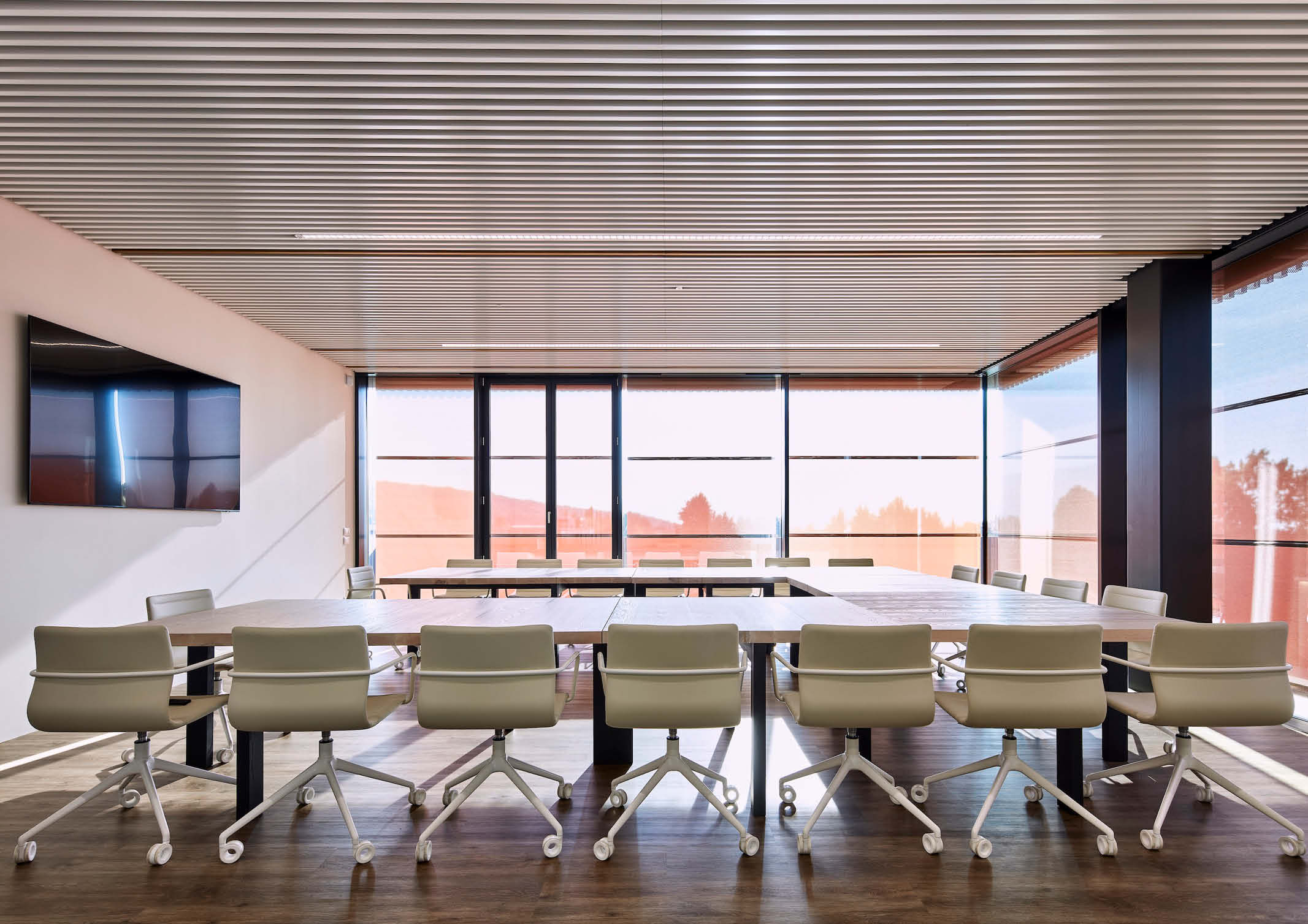
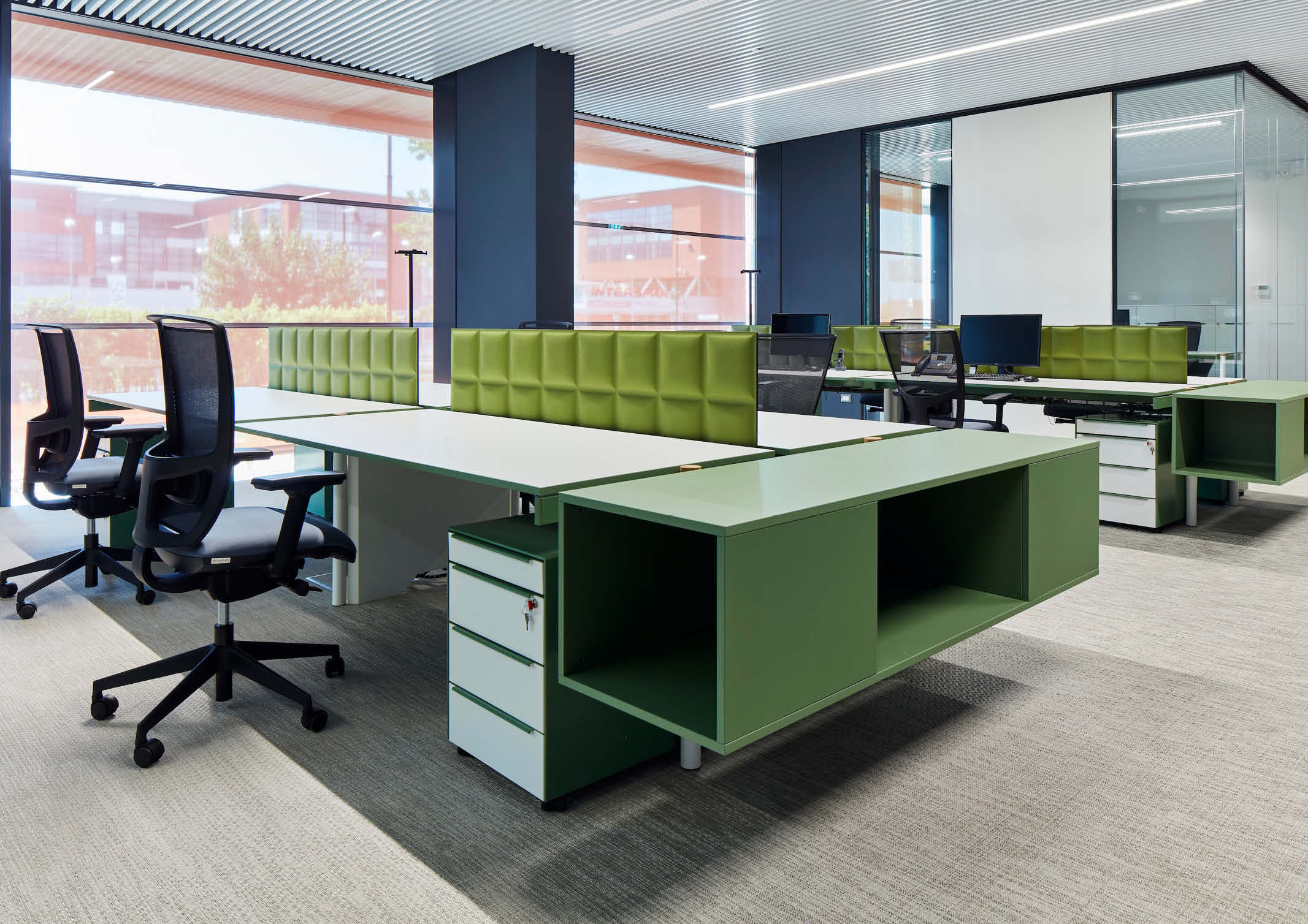
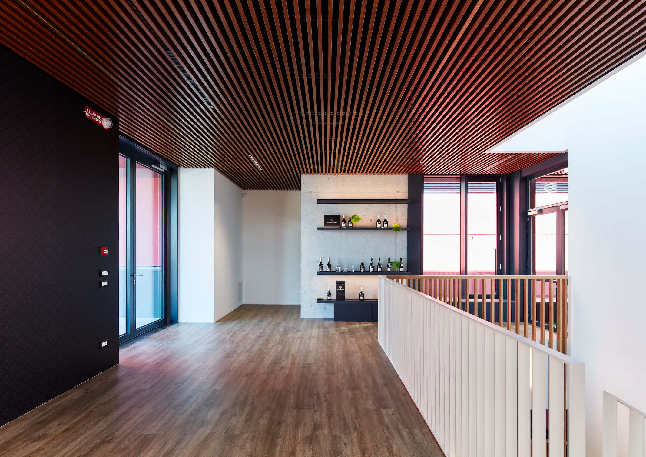
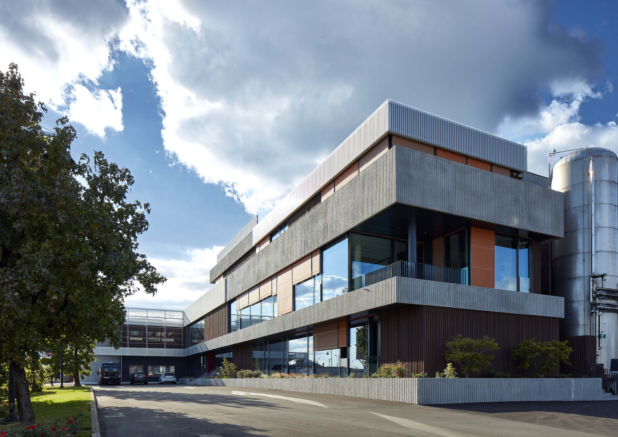
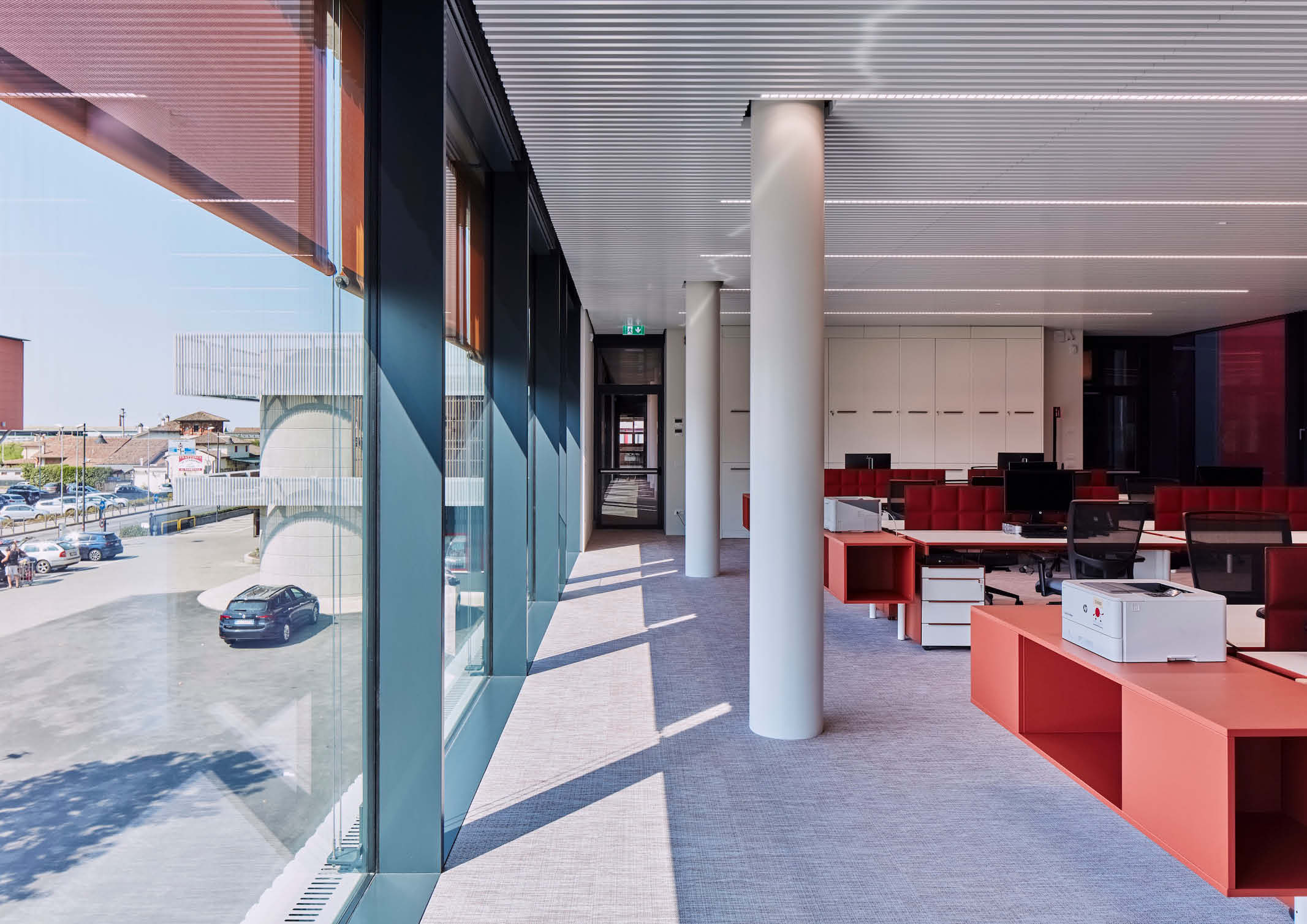
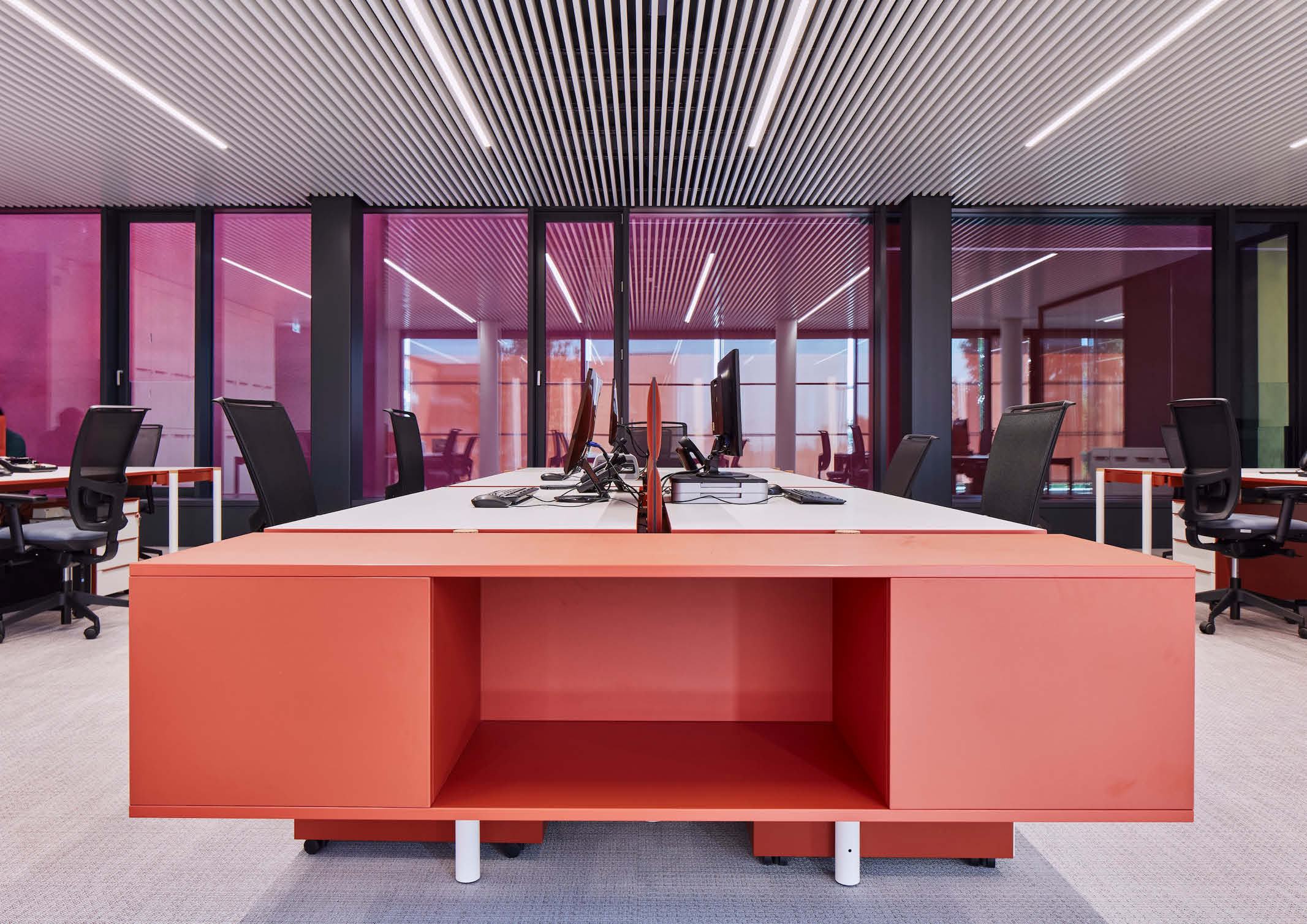
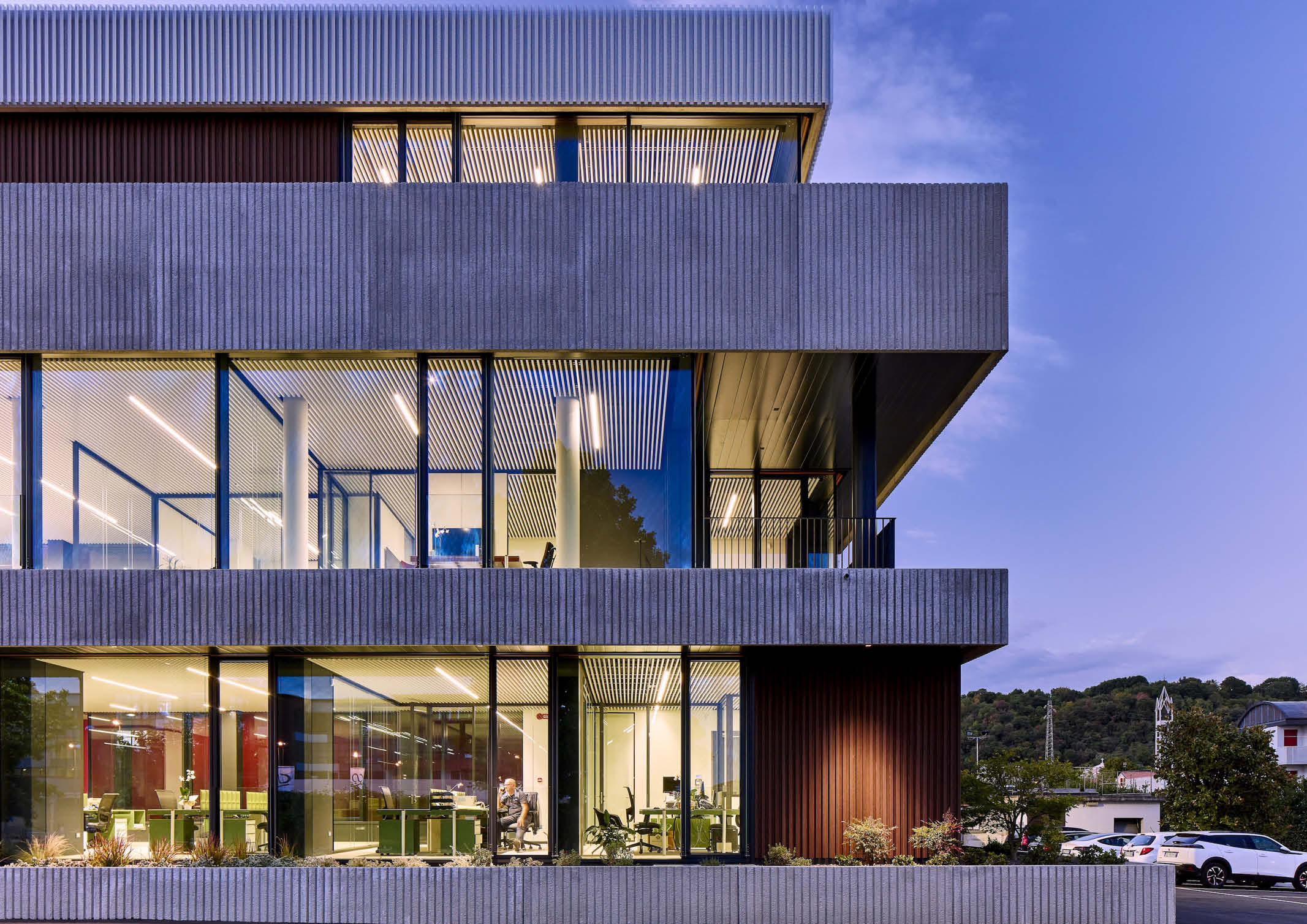
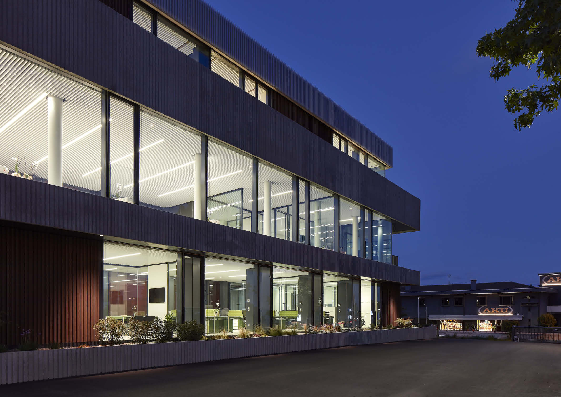
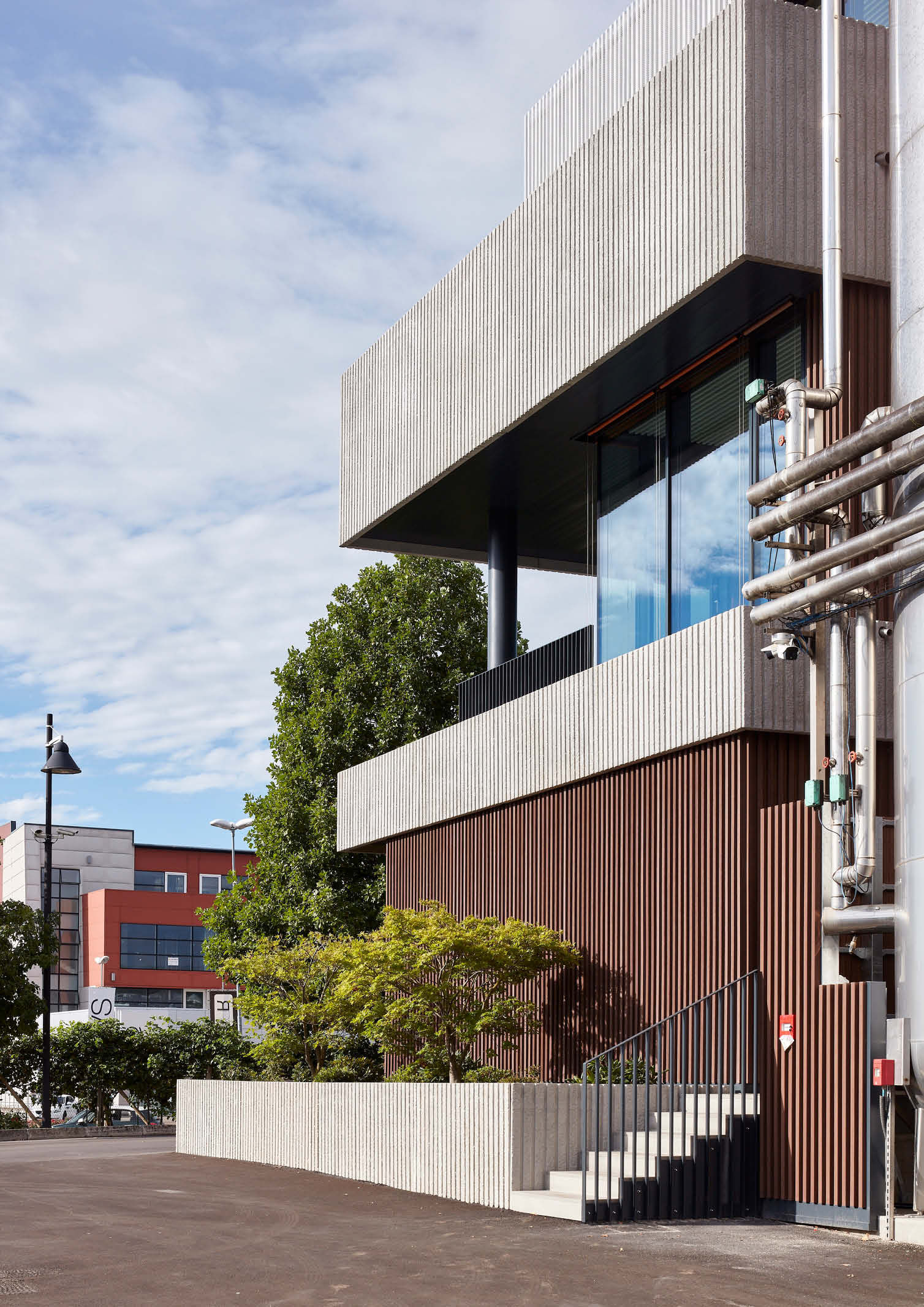
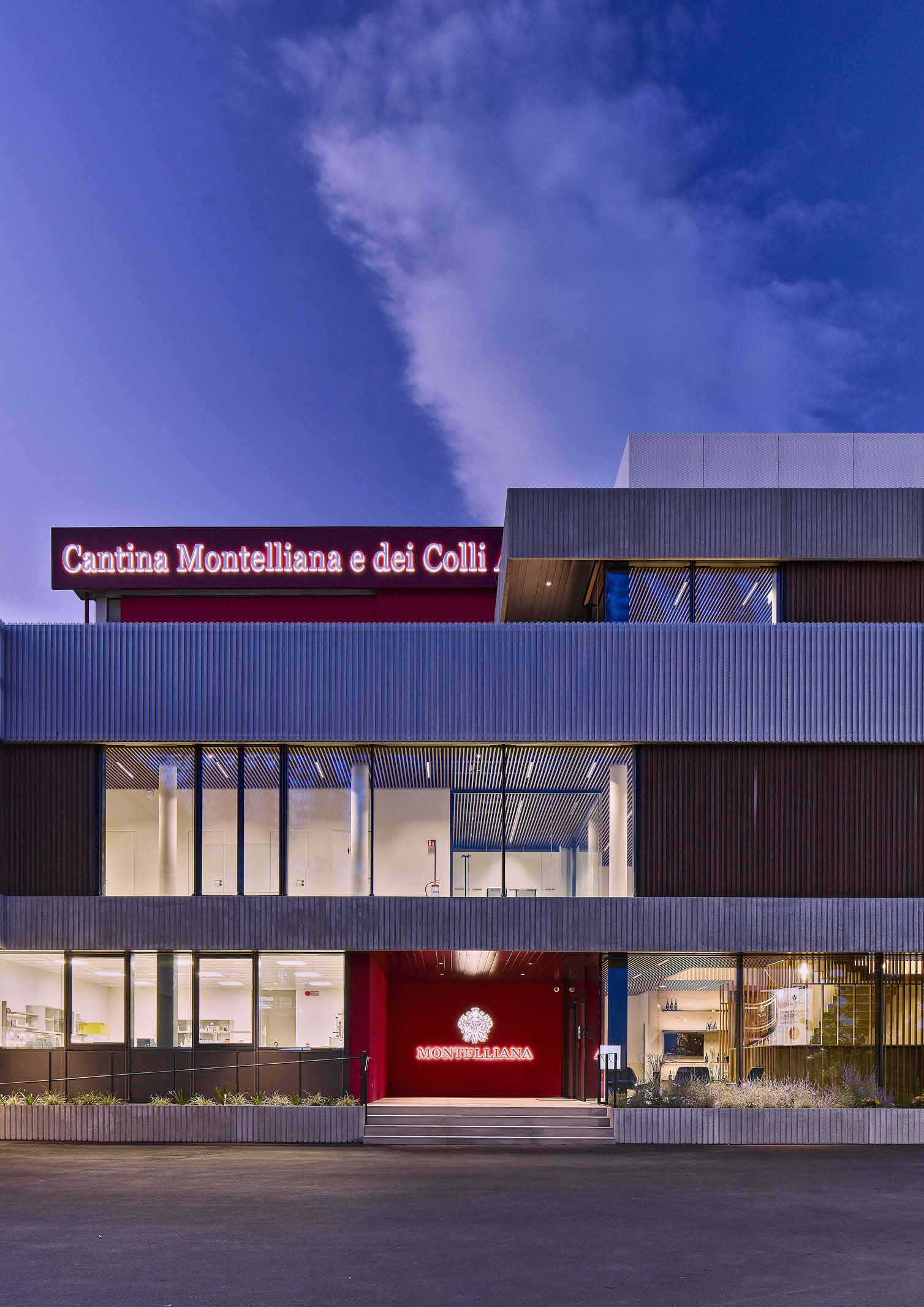
The block housing the headquarters of the wine company is situated at the very front of the production areas which features a rectangular floor plan. The area is about 50 meters long and 10 meters wide, with three above-ground floors and one basement. The total area is about 1,800 square meters. The space accommodates technical and commercial offices, a meeting room, a tasting area, the boardroom, the executive office, and a terrace for events. Its facade, which extends on the south side parallel to Schiavonesca Road, is organized in bands of different heights and with varying overhangs.
Material Contrast and Pattern
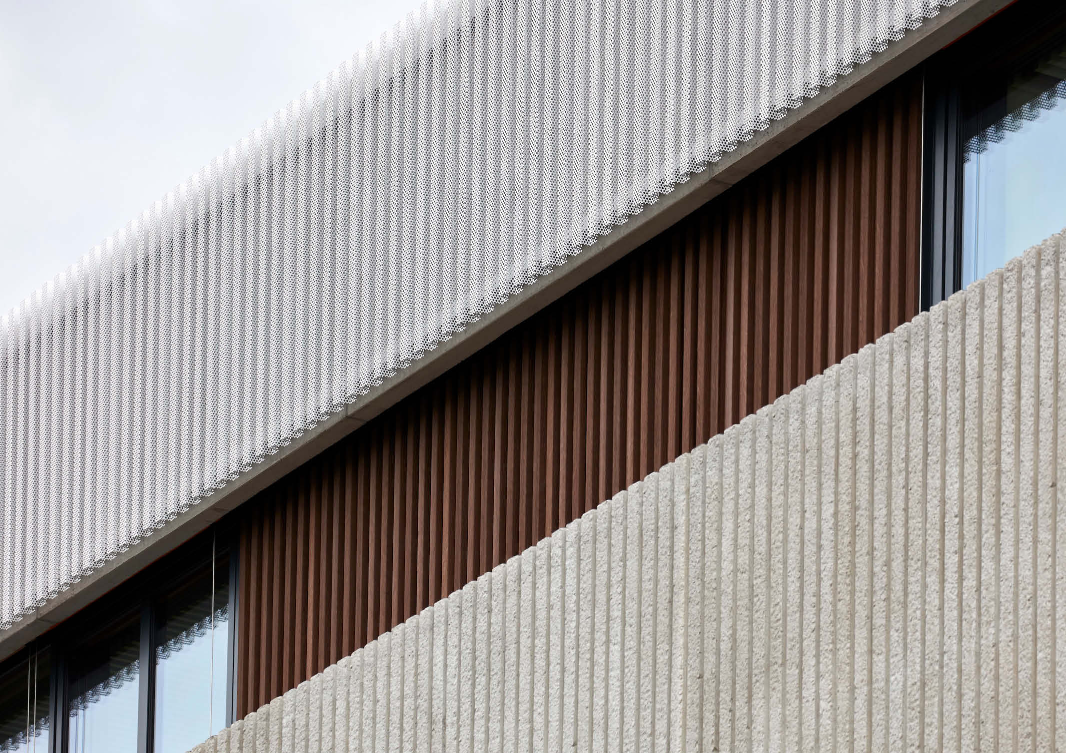
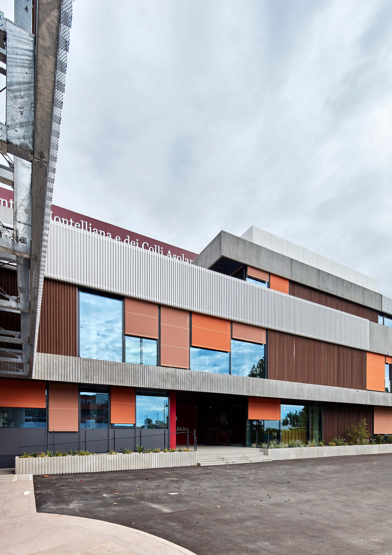
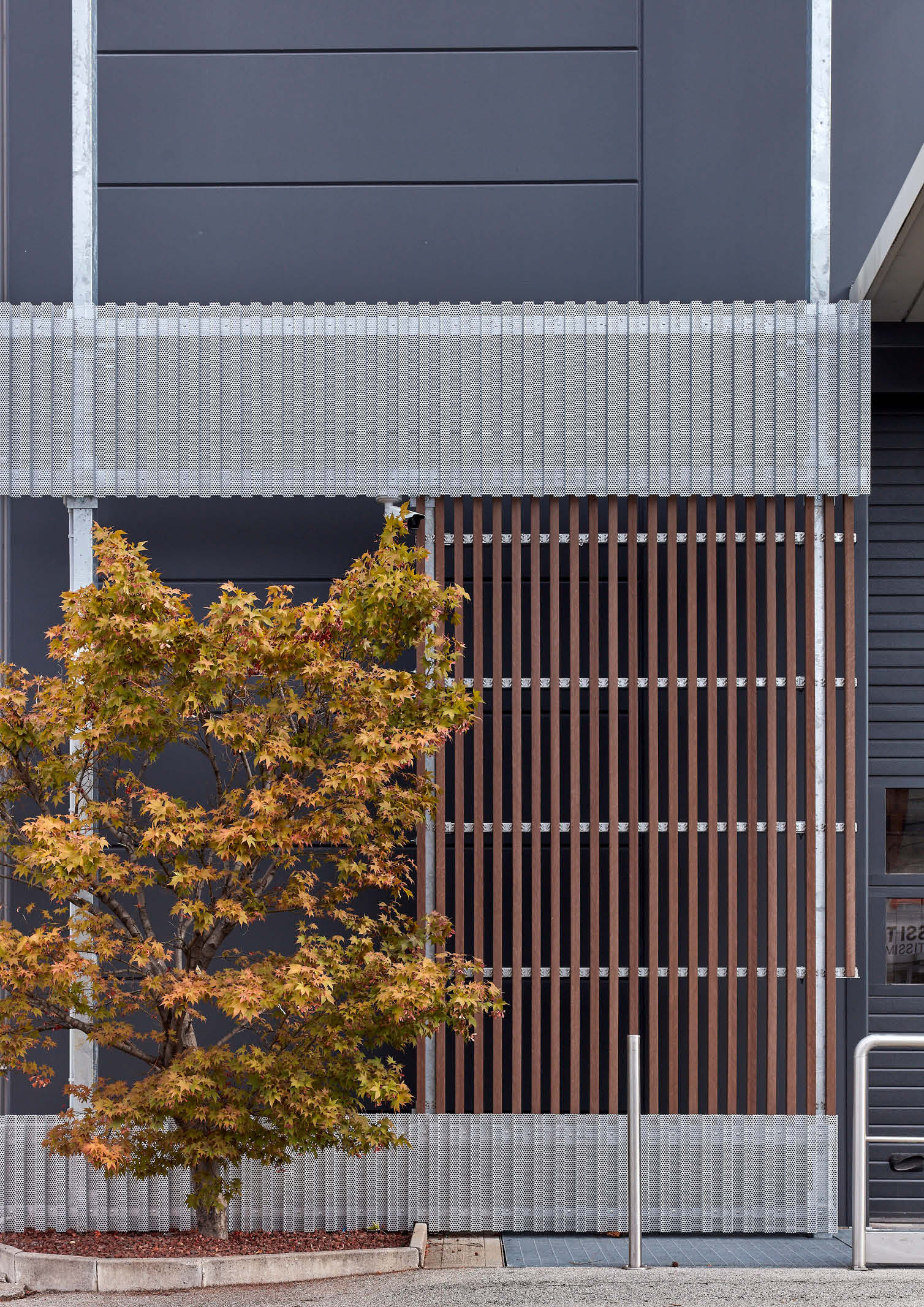
Michieli and Zanatta explain that pre-formed concrete and perforated corrugated sheet metal surfaces alternate with extensive ribbon windows, frequently interspersed with wooden screens. The concrete, sheet metal, and wooden elements repeat a pattern of dense vertical grooves that offer somewhat a counterpoint to the distinct horizontality of the overall composition. Assorted and promiscuously distributed, these elements yield a lively and coherent design, in which roll-up curtains of different widths and in two shades of orange partake, the two shades obtained by the architects by occasionally flipping the side of the curtain intended for the interior to the outside.
The Design
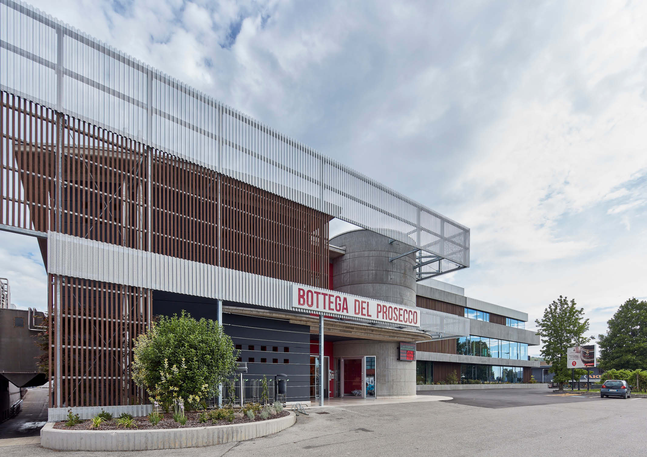
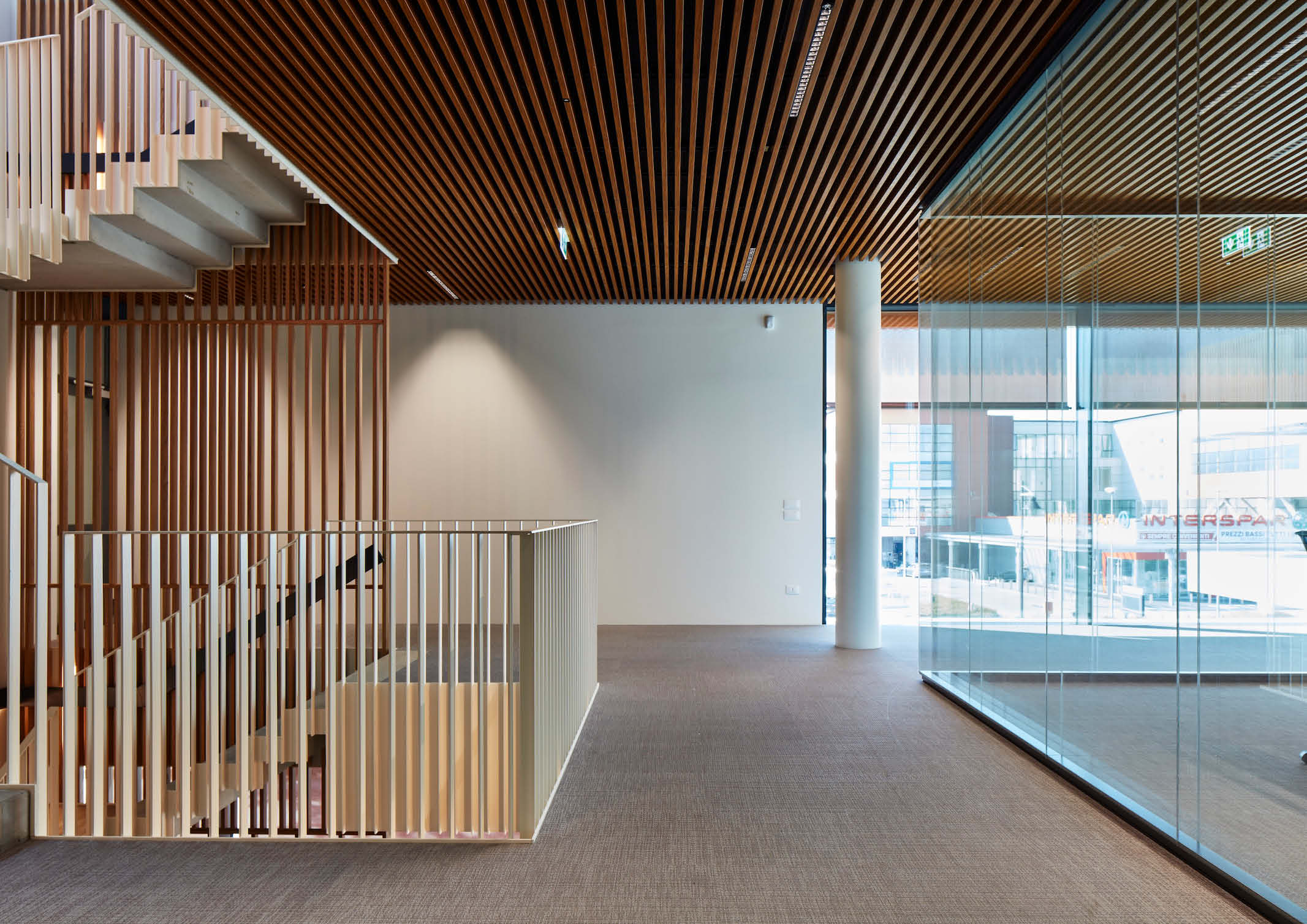
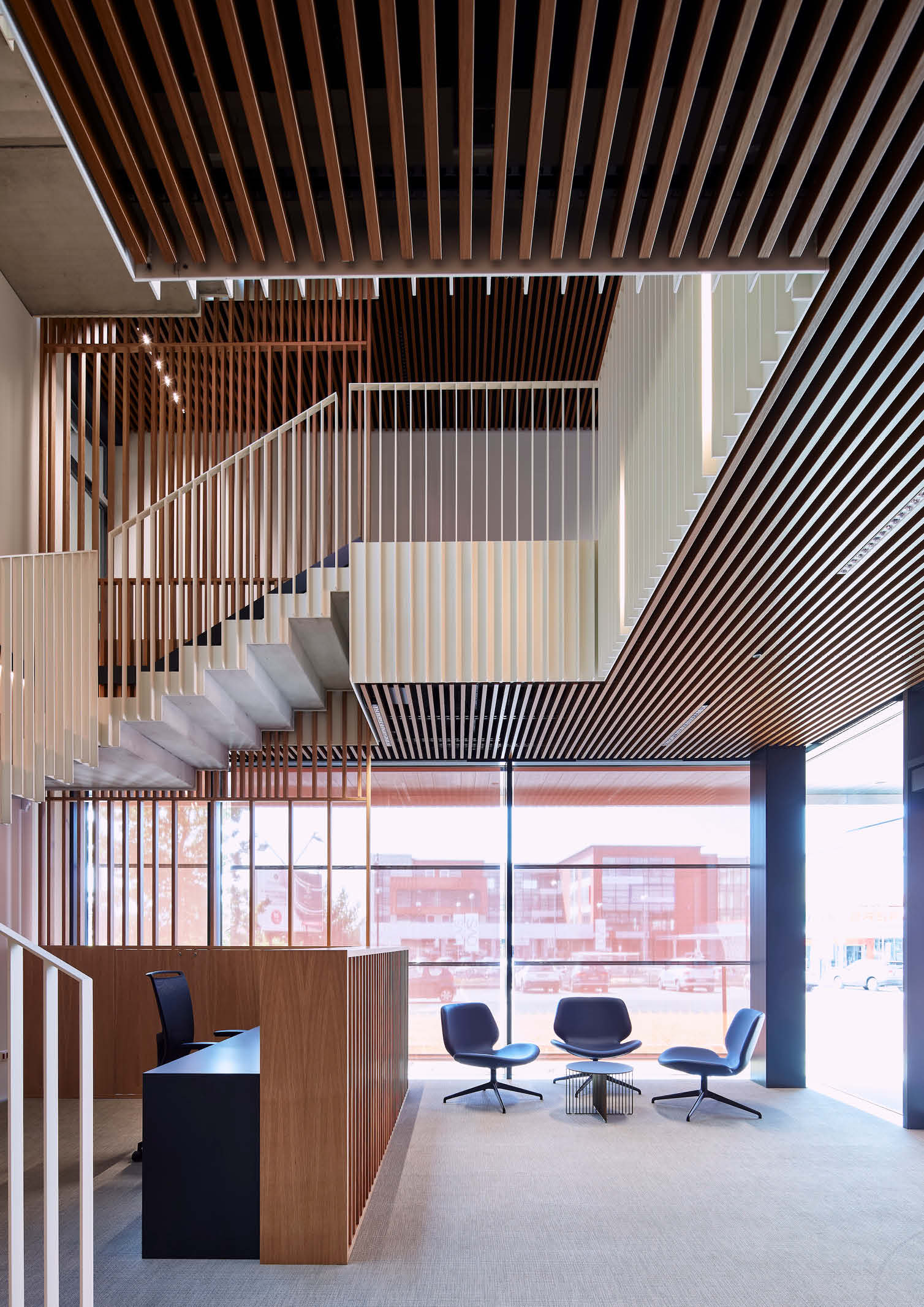
The intricate system of openings and screens also lends quality to the interior spaces, which strongly relate both to the outdoors, on the fronts facing south and east, and to the production areas located at the rear of the building, to the north. On the main façade, the architect created a spacious entrance with a recess in the ground floor. It is highlighted by a bright red septum that leads toward a grand staircase that serves the four levels. Wood counter ceilings echo the striped pattern found in the facade elements and serve a sound-absorbing function.
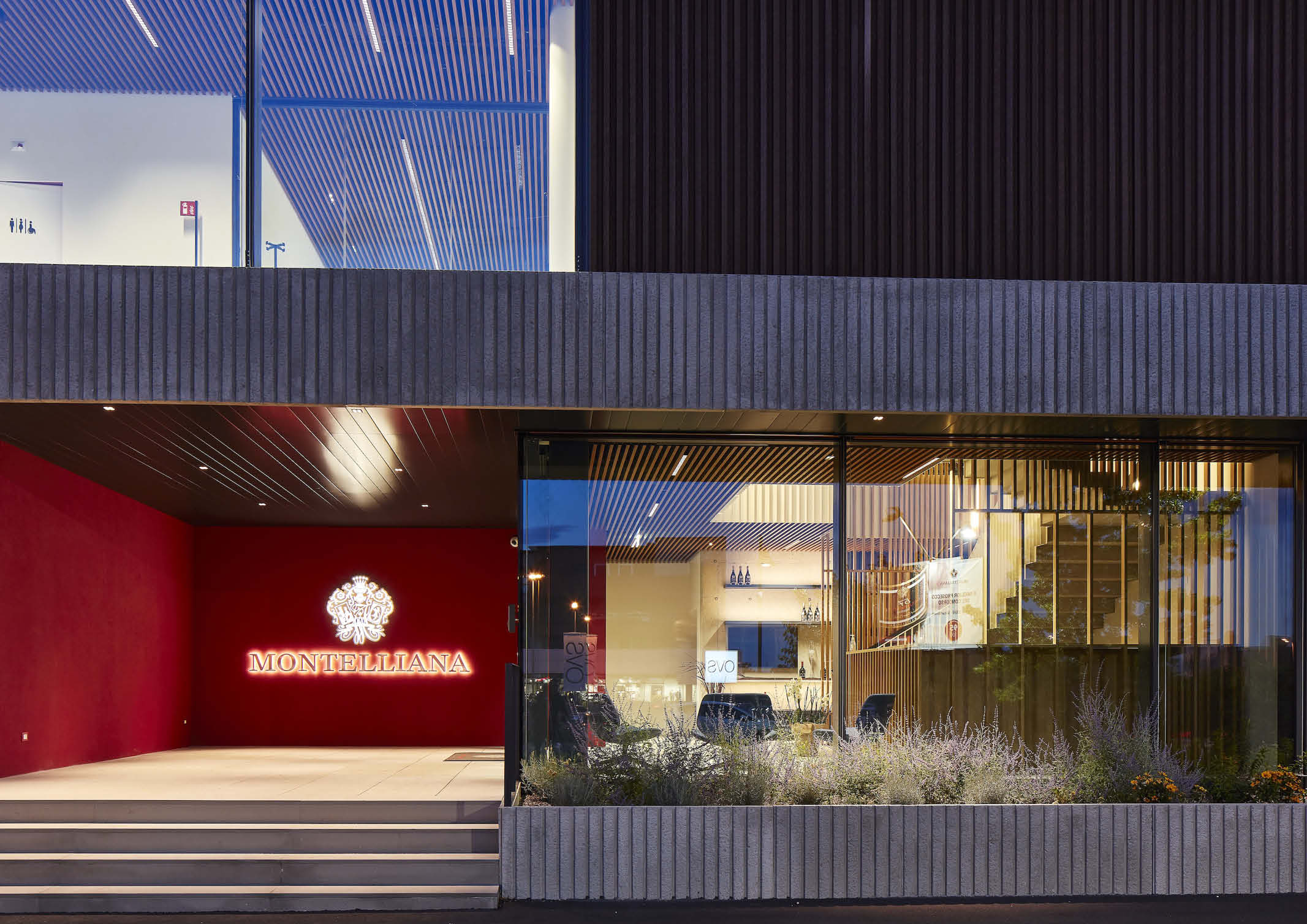
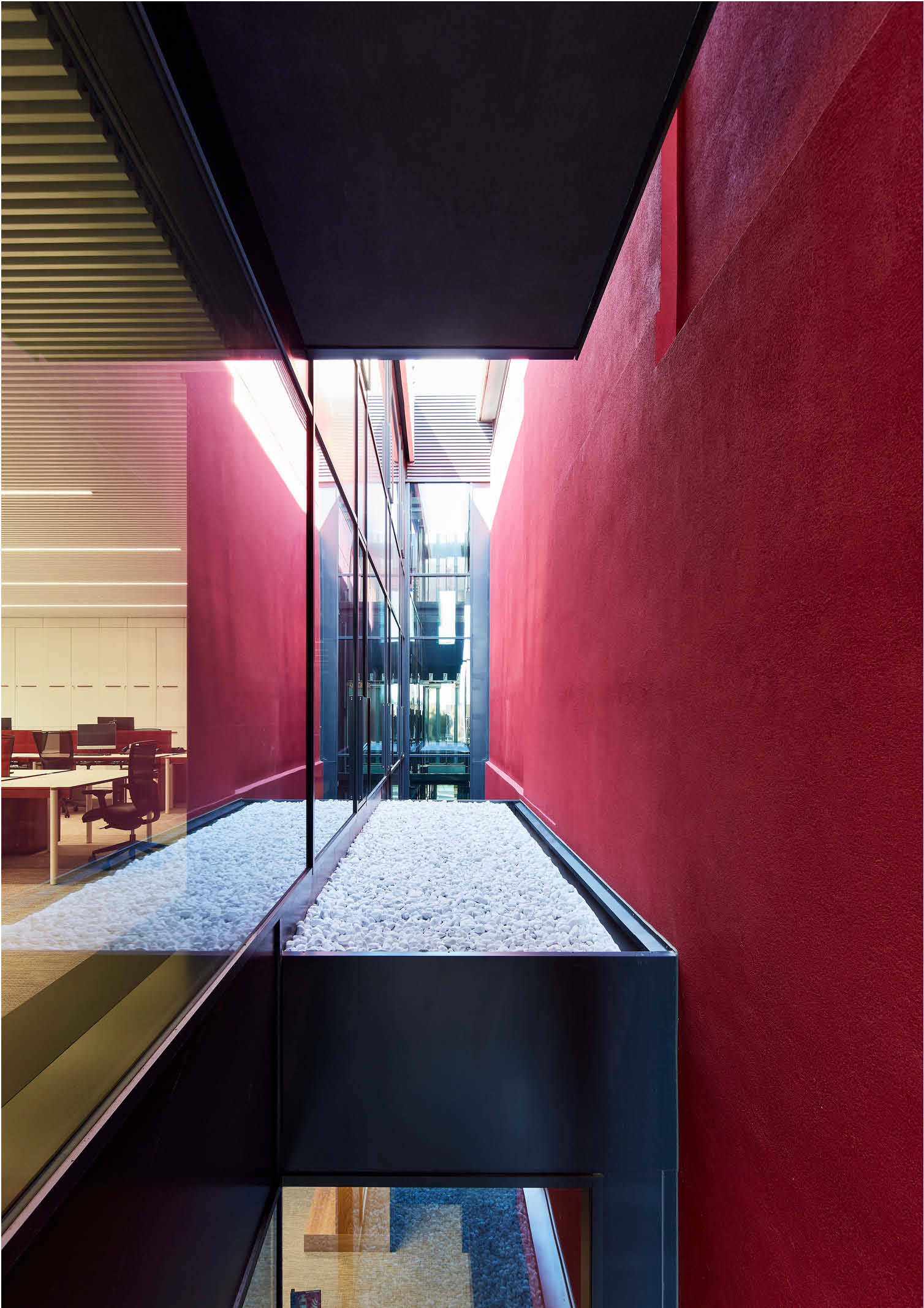
The color red reappears to mark the pre-existing building dedicated to wine storage and distinguish it from the addition behind the headquarters building. The two objects are physically separated but the space in between, which affords unexpected glimpses, is a place of connection and transition. It expresses the choice to hold even very different architectural elements together, putting them in dialogue.
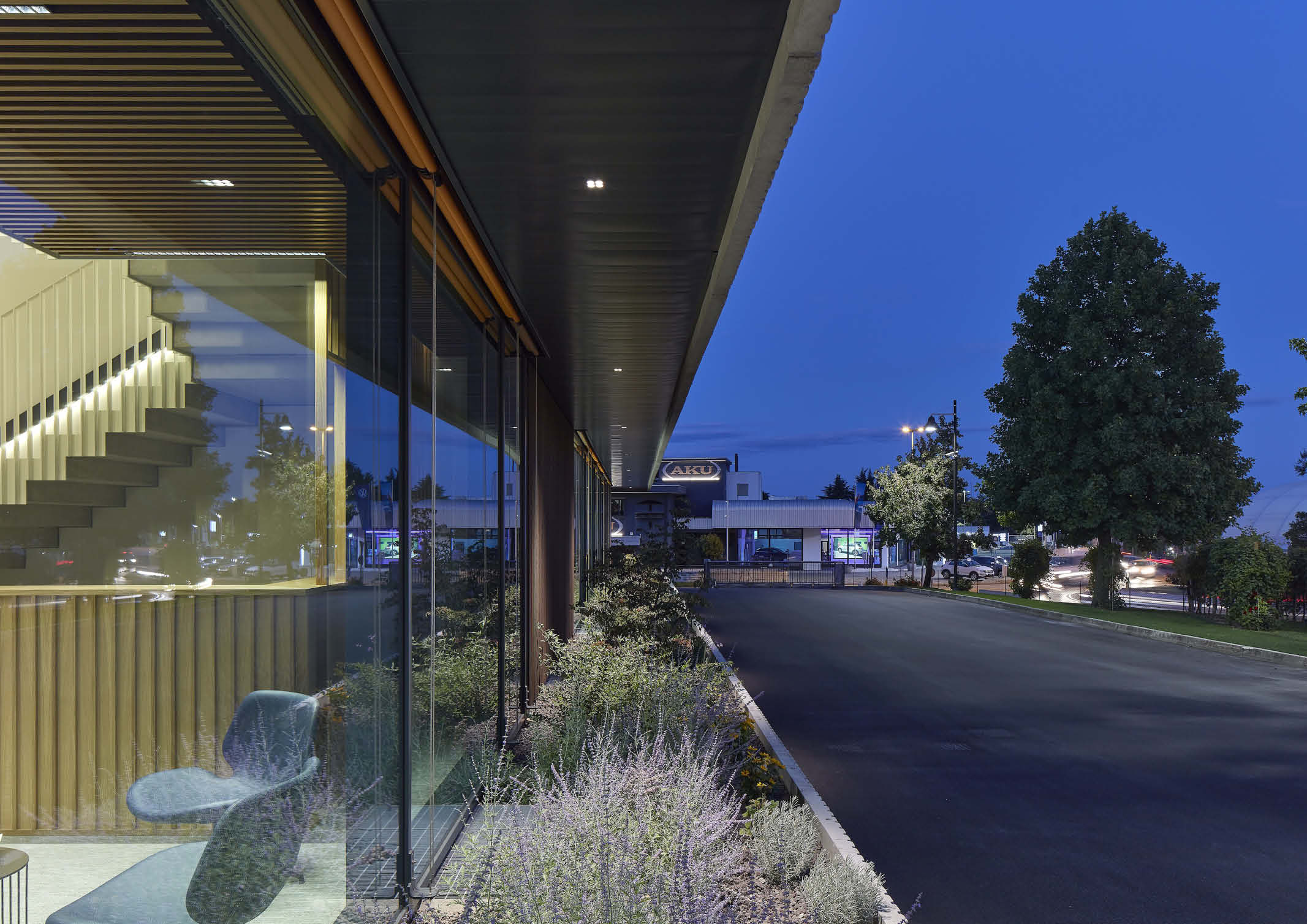
Michieli and Zanatta also share that such a choice is at the origin of the extension of the facade of the headquarters to engage the other adjacent, pre-existing buildings: a commercial outlet store and a warehouse. This project led to their successful integration. A galvanized iron frame supports a counter façade that is placed in front of the existing buildings, defining the framework on which the continuing horizontal band pattern is arranged. But it is a façade that reveals its content, both through transparency effects achieved by the metal and wooden screens and that it occasionally retracts, leaving portions of the pre-existing buildings fully visible.
The project began as a fragment in a territory that incorporates the formal inconsistency of the industrial landscape to provide a new identity and to reorganize the spaces of the entire compound. Different materials are placed side by side and dialogue.
The panes of glass, concrete surfaces, metal plates and everything they contain are for the designers something more than a reference to the industrial landscape, its assortment and its formal disorder. For Michieli and Zanatta, their understanding is a reflection of an idea of architecture that is accomplished in the ability to include and enhance the existing. This idea permeates the entire intervention, leaving it open for future additions and further development.
Photo Credits: Massimo Crivellari
