Minimal Manor: CS Design Consultancy’s Nature-centric Home
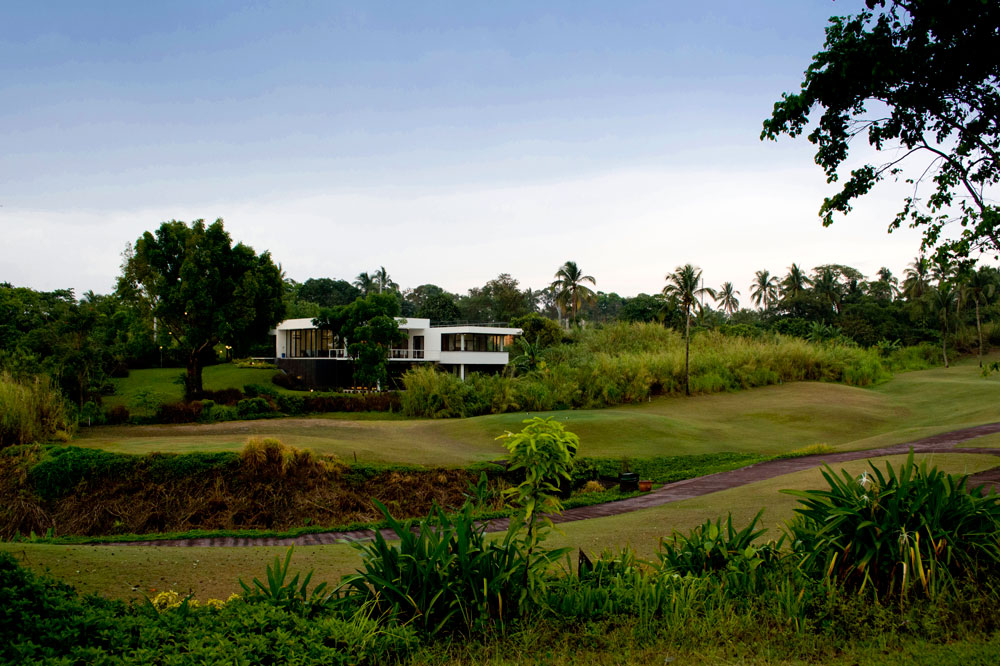
“The clients wanted a simple house that maximized views of the golf course and garden,” Anna Sy of C|S Design Consultancy explains. “Their lifestyle is very informal and casual so they wanted a house that reflected this. Aside from their space requirements, the brief was open, allowing us some freedom in the design.” The result is a minimalist home that employs a successful strategy of blending nature and modern design together.
The Plan
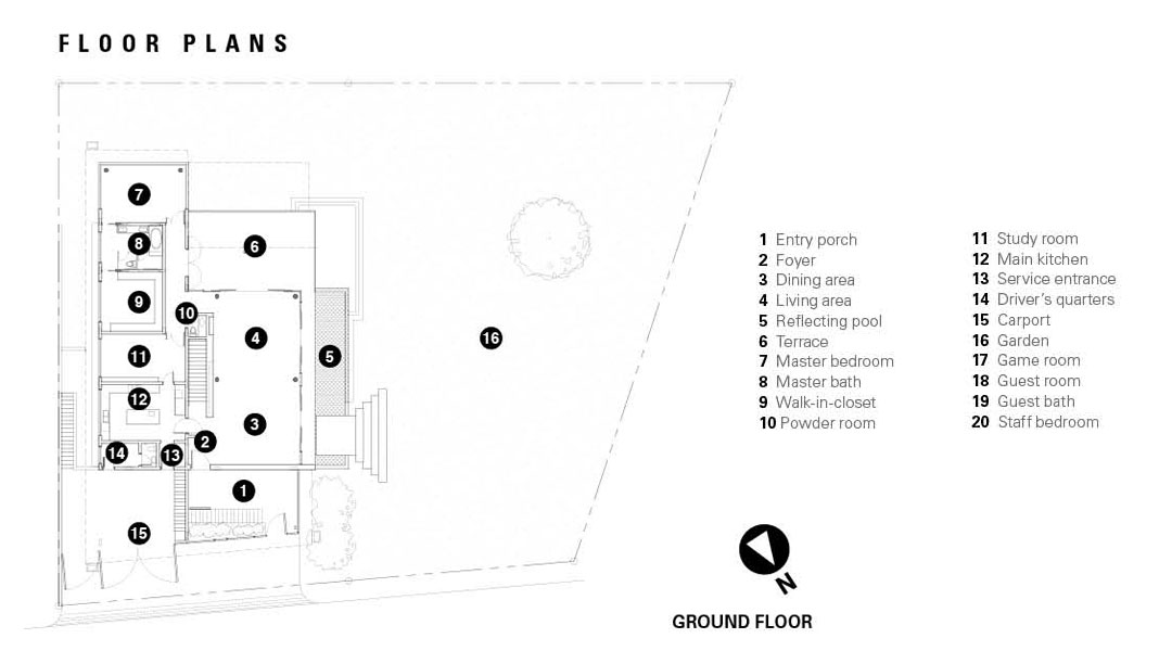
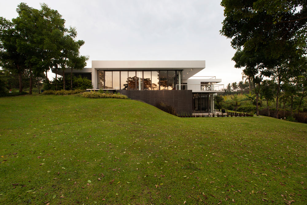
The house was intended to be the owner’s getaway from the city. The garage and pedestrian access is oriented north, public rooms face west, and bedrooms and service facilities east. The site, sloping downward from the street and into the golf course below, dictated the house’s overall design.
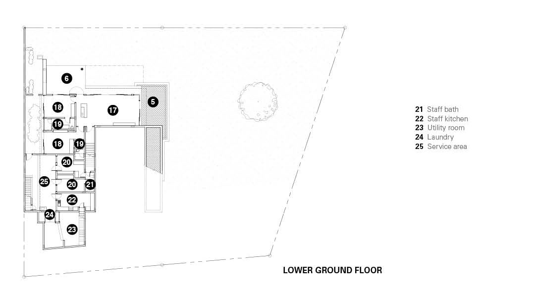
Anchored on this gradual slope, the house progresses from a single-level when viewed from the street, to a two-level structure on the side facing the golf course. Entry into the house comes in two ways: one through the discretely screened main foyer entry from the driveway and garage, and the other through the pathway from the garden on the west side. Directly across the main foyer is the staircase leading to the lower level. The staircase is dimly lit to create a more dramatic effect as one ascends or descends between levels. It also serves as a divider that splits the house into eastern and western sides.
The eastern side contains the more private areas of the house. The master bedroom, study room, main kitchen and driver’s quarters are all on the ground floor. The lower ground houses the guest rooms, staff bedrooms and service areas. Meanwhile, the western side is composed of public spaces such as the living and dining area. The game room, which opens up to the garden, is on the lower ground floor.
READ MORE: God, Man, Nature: Amara Chapel by Buensalido+Architects
The Design
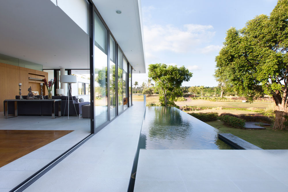
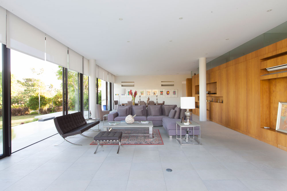
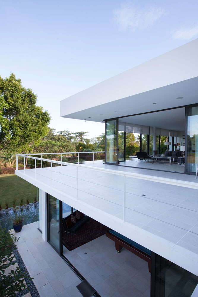
The living and dining hall embodies the “informal and casual” lifestyle of the owners. Curtain glass walls open up views to the south and west, facing the golf course and garden. Unfortunately, because of its orientation to the west, it receives the full brunt of the mid-afternoon sun. To offset this, trees were strategically planted in the garden to shield the public area. A reflecting pool on the terrace functions as a cooling feature as breezes flow in and out.
[one_third padding=”0 20px 10px 0″]
[two_third_last]
C|S kept to a minimal modern look for the interiors and exteriors which emphasize clean and simple geometries. The house keeps a predominantly white palette, with the only dark external mass being the reflecting pool’s dark gray tiles. White continues to dominate the interiors, but is now complemented by warm browns from the hardwood finishes of bedroom floors, wall panels and ceilings. The minimal look allows the house to keep a low profile and shift attention to the stunning features of the site. “The strength of the design’s aesthetic [lies] in its simplicity,” says Sy.
Minimalist and airy, the house invites the eye to closely follow the rhythms of nature (not to mention the occasional whiz of a golf ball). The house showcases C|S’s deft handling of architecture and nature, resulting in a meditative retreat from the pigeon-coop crampedness of the metropolis. ![]()
