Designed Better Extended: CCP Theater
Editor’s note: BluPrint challenged interior designer Jigs Adefuin to redesign the interiors of one of the Philippines’ most beloved architectural icons. We asked him how he might bring its interiors out of the 1960s and into the 21st century, and accommodate the Center’s many roles it did not have five decades ago. He could go a step further, we said, and explore how Leandro Locsin’s masterpiece might be made be more inclusive. That is, more welcoming to people arriving on foot instead of chauffeured cars, and more accessible to people in wheelchairs. While at it, he might want to consult experts to propose a solution to the monstrous the jams that invariably occur when hundreds of cars make their way out of the parking lot to pick up passengers from the tiny side entrance. None of these were a concern when Imelda Marcos opened the CCP’s doors to royalty and dignitaries in 1969.
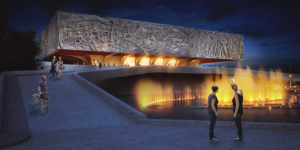
The audacious Adefuin Design Studio went many steps further, breaking boundaries to ‘tweak’ the famed brutalist façade with bas-reliefs, among other initiatives. Is the redesign skillful, suitable, or sacrilegious?
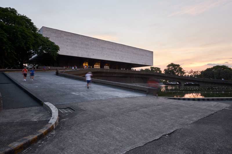
The Cultural Center of the Philippines is the brainchild of Philippine First Lady Imelda Marcos and came into being with President Ferdinand Marcos’ Executive Order No. 30. Its purpose was to promote and preserve Filipino arts and culture. It was built from 1966 to 1969 and designed by two National Artists, Leandro Locsin for the architecture and Ildefonso Santos Jr. for the landscape architecture.
Upon seeing the CCP, Henry Byroade, US Ambassador to the Philippines (1969-1973) exclaimed, “That Center makes our Kennedy Center look cheap. The Filipino architects did a good job!” That statement says a lot about the grandeur that awed foreign guests when CCP opened in 1969.
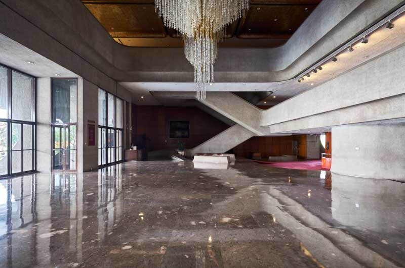
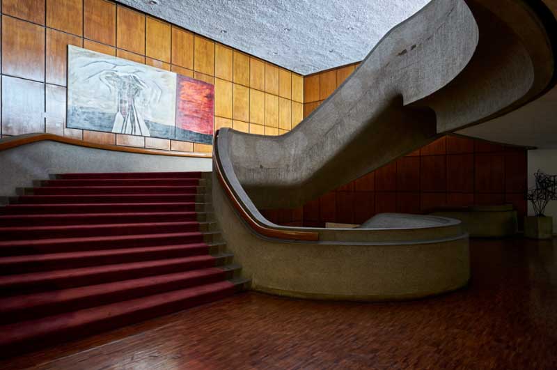
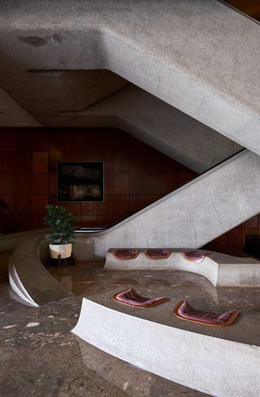
The cultural hub today holds six performance venues: Tanghalang Pambansa, Tanghalang Nicanor Abelardo, Tanghalang Aurelio Tolentino, Tanghalang Huseng Batute, Tanghalang Francisco Balagtas, and Tanghalang Manuel Conde. Also, it has six exhibit halls, the Bulwagang Juan Luna, Bulwagang Fernando Amorsolo, Bulwagang Carlos V. Francisco, Pasilyo Victoria Edades, Pasilyo Guillermo Tolentino, and Pasilyo Vicente Manansala; the National Arts Center and two satellite venues.
Aside from being a performing arts center, the CCP has become the country’s National Coordinating Center for the Arts. It is home to the following organizations: Ballet Philippines, Philippine Ballet Theater, Tanghalang Pilipino, Ramon Obusan Folkloric Group, the Bayanihan Philippine National Folk Dance Company, Philippine Philharmonic Orchestra, UST Symphony Orchestra, Philippine Madrigal Singers, and the National Music Competition for Young Artists Foundation.
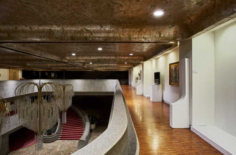
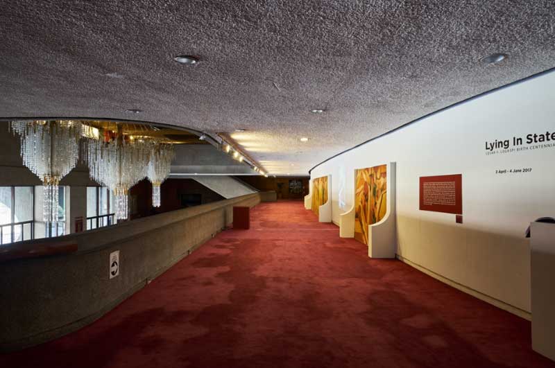
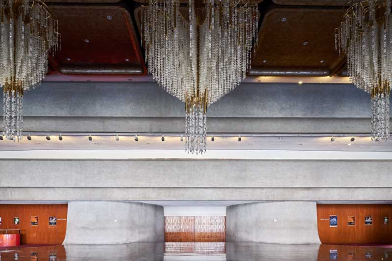
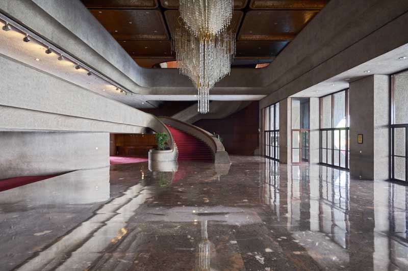
While the façade is still captivating due to its size and shape, one’s attention is easily distracted by towering new buildings in the area. The colors inside the CCP also already pale in comparison to the colorful culture and people we have here in the Philippines.
Therefore, with utmost respect to CCP’s architects, ADS decided to focus on redesigning the interior and just do a little tweaking to the exterior. Our design concept has the following goals and objectives:
- To depict the colorful culture of the Filipinos by adding more color, pattern, and texture to its interior design;
- To Filipinize the interior design by using elements and raw materials from the three major islands of the Philippines, Luzon, Visayas, and Mindanao;
- Update and upgrade the interior finishing materials for easier maintenance and elevate and improve its quality of service;
- To promote the country’s culture to both local and foreign visitors by curating informative exhibit areas inside. The unique and diverse exhibit displays (dioramas, artworks, and murals) will entice visitors to appreciate the culture of each region and minority;
- To make CCP more accessible to the masses.
The Concept
Much like Filipino Culture, our design concept is akin to a geode. It boasts of a robust exterior and an interior with surfaces, ceilings, and walls of vibrant textures and colors, and accentuated with rich and tactile elements. We want a design that will best showcase and enrich the Filipino culture by bringing the “prestige” back to its cultural hub.
While the focus of the design is to uplift the morale of the space, we ensured that the concept, as per the vision of the government, will make CCP deserving of its name and true purpose, that is, a “cultural hub.” The design is tactile, encouraging interaction among the visitors and inviting enough for individual studies and contemplation. We want to make CCP more accessible to both Filipinos and foreigners, hosting not only the country’s annual staples (such as the Cinemalaya Festival and Ballet Philippines recitals) but also a go-to place for those who want to get that much-needed cultural fix.
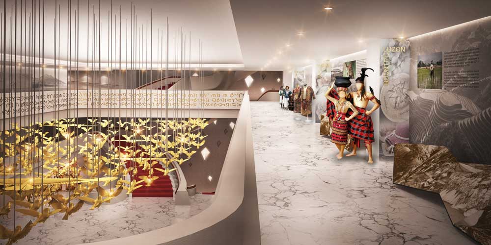
The design is a reflection of our colorful people, culture, and art. The design features bas-relief in the building’s facade, light wells the shape of kites, and natural and Filipino textures injected in the walls and ceilings. Hallways and galleries will also showcase the works of Filipino masters. Furthermore, our design is timeless, utilizing modern design elements in warm and inviting tones. The resulting spaces are precisely the kind of place you would want to bring a friend or two for a chat, cultural immersion, and a place that you’ll be proud to call your country’s cultural center. ![]()
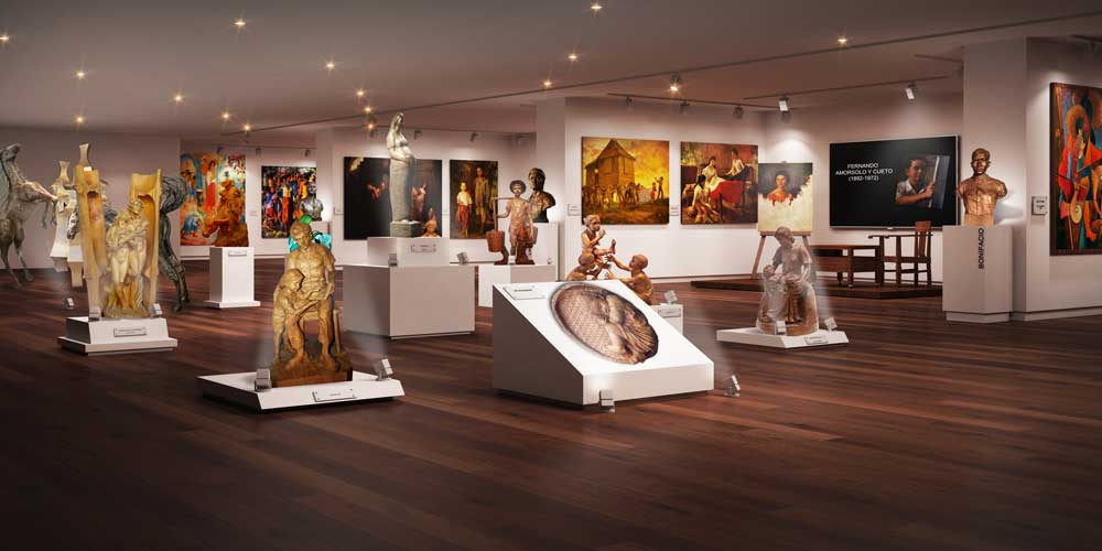
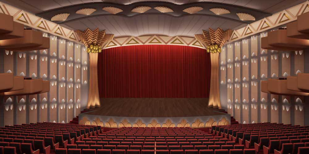
This proposal for the CCP Theater by Adefuin Design Studio is an extension of BluPrint’s latest book Design Better. The book is available in National Bookstore and Powerbooks.


