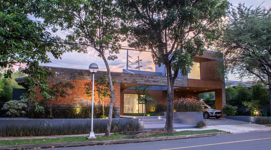
A crisp new profile greets you when approaching the southwesternmost corner of a leafy private subdivision in Makati, one that suggests a contemporary modernist architecture we are accustomed to seeing in today’s image-saturated world of design. What belies this appearance, however, is a temperate approach by LINO Architecture in updating a traditional, 1980s Filipino bungalow and maximizing its former qualities.
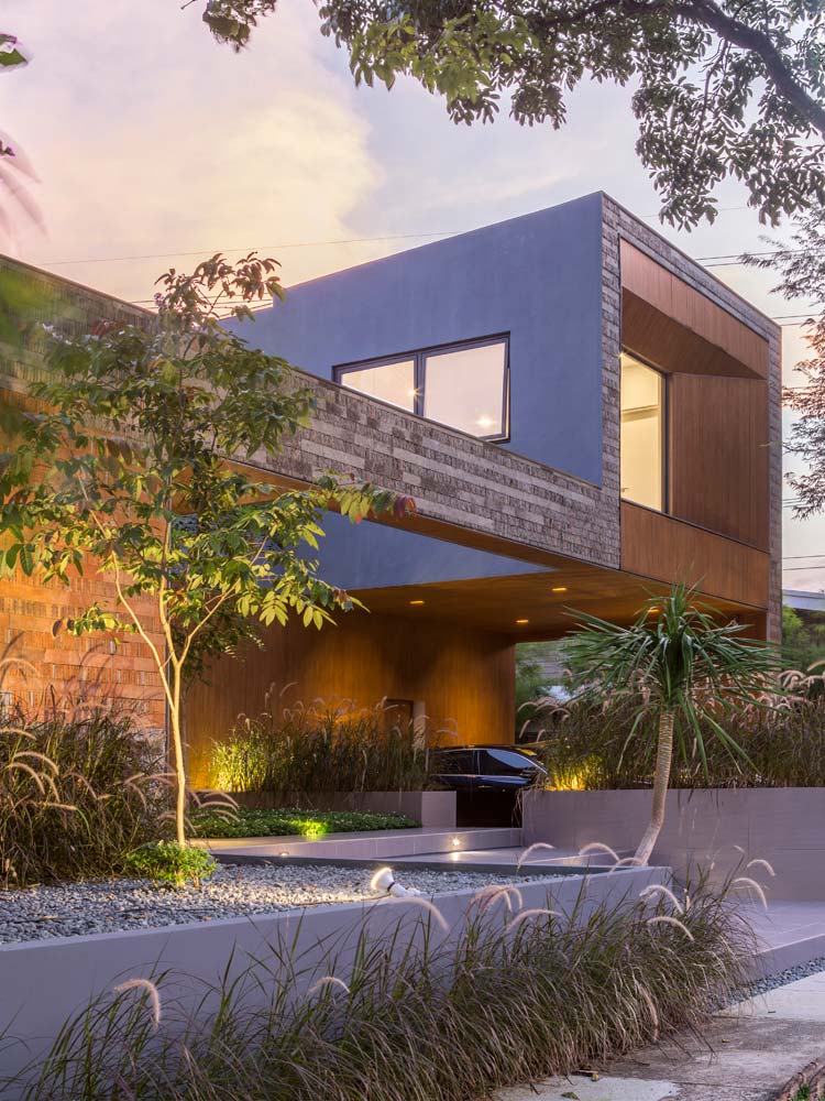
Photo courtesy of Ed Simon
Initially in collaboration with Leandro Magat, who left the LIMA Architecture partnership in January 2016 to study in Australia, Don Lino assumed authorship of the project under the firm’s new guise, LINO Architecture (renamed in May 2017). Less a departure than a continuity, the previous bungalow now embodies the sensitive and subtle design approach seen in all of Lino and Magat’s projects to date.
“It’s really about starting from the idea of showing the history of the place,” declares Lino. Through a clever reworking of the old house’s plan and materials, Lino revives the site’s past in a new manner.
Defining a refined approach
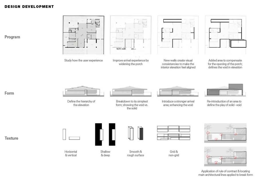
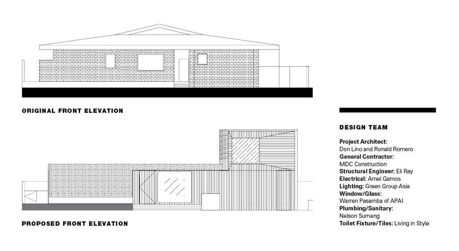
One of the key design moves Lino pushed for was a reconfiguration of the arrival and entry sequence, which he felt was lacking from the original house. By removing a room at the center of the front elevation, Lino liberated the entrance from being a narrow entry point into one splaying out onto stepped landings down to street level. As a result, the courtyard porch, which opens up to the sky, marks the culmination of one’s ascent to the main door.
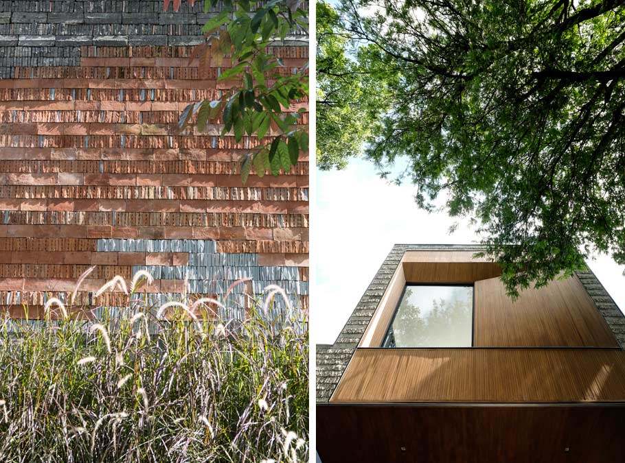
The only major and most conspicuous addition to the original house is the second-floor volume containing an extra bedroom and bathroom, a solid counterpoint to the open porch and carport below it. The box adds a perpendicular anchor to the composition and appears to hover effortlessly, courtesy of a new 14-meter beam, which Lino urged the contractor to “make it happen without columns.” The reclaimed gray stone cladding wraps around to frame and unify solid and void in the elevation.
READ MORE: Old to Bold: LIMA Architecture Renovates An Aging Villa
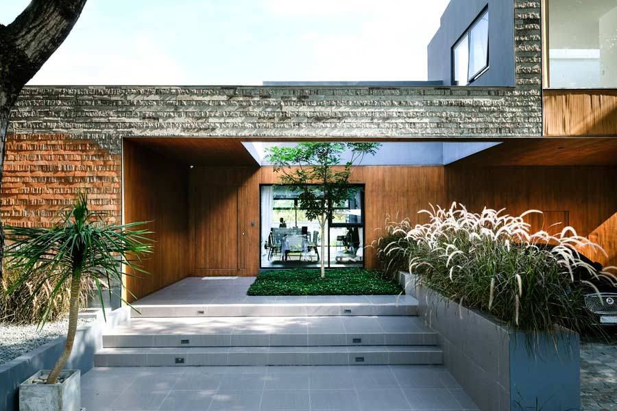
Photo courtesy of Ed Simon
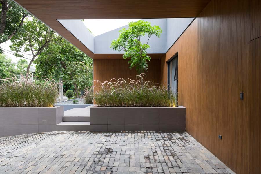
Photo courtesy of Ed Simon
The floor plan exemplifies a clarity and refinement of the house’s previous layout. Lino shaved off extraneous corners and incongruous room arrangements to align walls demarcating different quarters of the house. The wall planes of the main living areas run from front to back, creating direct visual links across the whole space.
The neutral tones of the communal spaces is a conscious effort by Lino to make the architecture recede inside, to allow for the changeable taste of its occupants and their belongings. “A lot of people underestimate that it’s about visual consistency. It’s not even about when it lines up in plan. It’s about when you stand in it, and you see a straight wall, and it makes it feel cleaner,” says the architect.
Designing a palimpsest
A palimpsest in architecture is a modified or repurposed design, which bears the physical or visible traces of previous occupations. Lino’s attempt to preserve the material history of the original house manifests itself in the reclaimed stone pieces, meticulously rearranged onto the front elevation to delightful effect. What might appear to be an arbitrary array of stones is a collage of stone types from different parts of the old house, namely, adobe, araal, and marble.
Lino explains his motivation: “I want to do architecture that’s old and new every time, even when it’s a totally blank lot with a new structure. It’s still a developing theory, me trying to find a formula, a base formula. It’s not really a style—every project is different. It’s more about the base principles you believe in that is consistent in a project.”
The aesthetic outcome is a revelation, given it was a practical and cost-effective response to ensuring the façade finish would age well in extremes of tropical climate. By laying the rough and smoothly-cut stones both horizontally and vertically, shallow and deep, onto and off the grid, Lino enriched the texture of the asymmetrical front elevation, while celebrating their material qualities. Lino extends this material logic to other parts of the house, applying the old stones in like manner to the kitchen wall and at the rear of the house facing the new swimming pool.
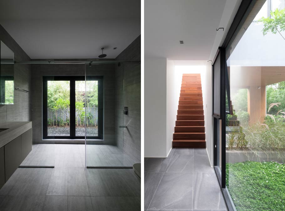
Photo courtesy of Ed Simon
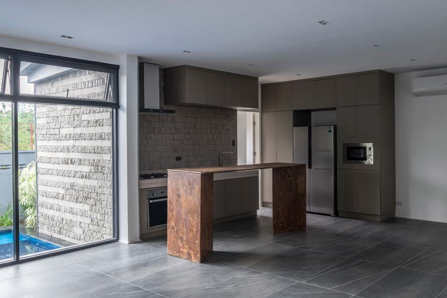
Photo courtesy of Ed Simon
READ MORE: Nothing token about passive cooling in Formwerkz’s Open House
Softening the edges
The client’s taste in flora is evident from the soft landscaping around the house. Lino is full of praise for the client’s enthusiasm and execution of this portion of the design, which complements his rigid, cubic architecture. Cogon grass, which was difficult to source, has been judiciously planted across the sharpest lines along the front elevation, cushioning the mass of the house as it meets the ground. Windows looking out from the living room, kitchen, and bedrooms have views of a variety of plants, punctuating the monochromatic palette with moments of color.
LINO Architecture has kept the contextual approach, as developed during the firm’s days as LIMA Architecture, in the same vein as their methodical renewal of old buildings for modern living. The 35-year old architect reiterates his conviction: “Even if you’re not doing a renovation, even if you’re doing something new, it should have an underlining sense of history or the culture of the place.” In this project of deft alterations and additions, Lino demonstrates a strong sensibility of reconstituting architectural elements from the past to stand the test of time. ![]()
This article was originally published in BluPrint Volume 4 2017. Edits were made for BluPrint online.
READ MORE: These 5 houses exemplify responses to our tropical climate
