Ed Calma revives a Mission Revival bungalow in Makati
We often think that heritage issues are limited to public buildings like churches, cinema houses, hotels, train stations and post offices. However, heritage is often all around us, and it is in the domestic space of the house that its legacy can be more keenly felt. In the Philippines, this has often involved ancestral bahay na bato that are threatened by dismantling, demolition or decay as homeowners migrate, streetscapes devolve into urban jungles, and newer owners would rather build a completely new house than put up with expensive repairs for an old, smelly and termite-infested one. Frequently, Mission Revival bungalows built over the past half-century are simply bulldozed since their recent vintage makes them less appealing as “historic sites.”
It takes vision and a profound respect for the integrity of built structures, as well as the culture they represent, for a new homeowner to work upon an older structure, retaining its key features while adding elements to make it livable and relevant to contemporary life. Such was fortunately the mindset of a young French-Filipino couple, Edouard and Sevrine Miailhe, when they acquired a condemned late-Fifties Mission Revival bungalow in Forbes Park after the Millennium.
The house dates back to the earliest period of Forbes’ history as a gated community, when its first-generation owners still built to the strains of Old Manila heritage of the turn of the century, with its admixtures of colonial motifs (like the California Mission style that was popular with early American colonizers) using modern construction techniques (like reinforced concrete).
Foreclosed by the bank since the Nineties, the bungalow was in a sorry state when the Miailhes first saw it: the roof was completely anay-eaten, and only some of its retaining walls remained in good condition. Standing next to a creek, the site was sometimes flooded during severe typhoons, which accounted for its advanced state of decomposition after its original owners abandoned it. But it was the colonial charm of the house that drew the Miailhes to it, and eventually they decided to give the bank a good offer, and had it redesigned and reconstructed by Eduardo Calma in 2008. They moved in a year later.
It was the couples’ decision to keep the identity of the old bungalow rather than take the more practical route of demolishing it. This is in keeping with their French outlook that old structures deserve their own “lives.” “In Europe, you don’t destroy a house,” Sevrine relates. “Once it’s there, you remodel it, you work around it. It’s almost unimaginable that you would demolish an old house in order to build a new one. It just doesn’t happen.” This kind of respect and reverence for an old structure is rooted in a cultural awareness of what an old house can teach its occupants: the history, the uniqueness, and the role of the people who lived in it in the past, and how this contributes to the unfolding story of humanity.
The decayed Mission Revival bungalow that the Miailhes got from the bank is a poignant anecdote of such a story. Introduced in the Philippines during the first decade of American rule, the Mission Revival style was actually an American orientalist attempt at framing their new trans-Pacific empire within the precedence of Spanish colonial rule, and is based on the design of mission churches and convents of Alta California, the Spanish-era Mexican province that in 1851 became the 31st state of the Union.
Few remember that these missions that formed the seeds of great cities like San Francisco, Los Angeles and San Diego also served as first aid stations to the Manila Galleon that lumbered for months in the storm-tossed northern Pacific, often arriving in California as half-dead hulks, in which salvation came in the form of oranges grown by the missions.
The Mission Revival is characterized by thick faux adobe walls finished in concrete stucco, with rectangular piers, simple Romanesque-like arches that form arcades around the building perimeter, simple fenestration with iron grille trimming, and flat tile roofs with exposed wood-beamed eaves and ceilings. Sometimes a bell-gable or espadaña, oftentimes simplified into an empty niche with tiled coping, marked a parapet or buttress wall. Ground-level flooring was either mortared terracotta tiles (such as our famous Vigan tile), or rough-hewn piedra china granite blocks.
Introduced by the likes of William Parsons, but supremely adapted by Juan and Arcadio Arellano (especially in their Gota de Leche and Casino Español buildings) and José María Zaragoza, Mission Revival in the Philippines came to exemplify the mestizo culture that was part indio, part Hispanic and part American that we now recognize as forming the major portion of the modern upper-class Filipino point of view. It therefore became the style of choice among foreign merchants and elite families in doing their houses from the 1910s all the way to the 1950s.
The Mission Revival style got a boost in the post-war period with upscale residential and church projects being done in the new suburbs, with Makati’s Santuario de San Antonio and Alabang’s Madrigal Center as key landmarks.
READ MORE: Vernacularization in Philippine Modern Architecture (part 1)
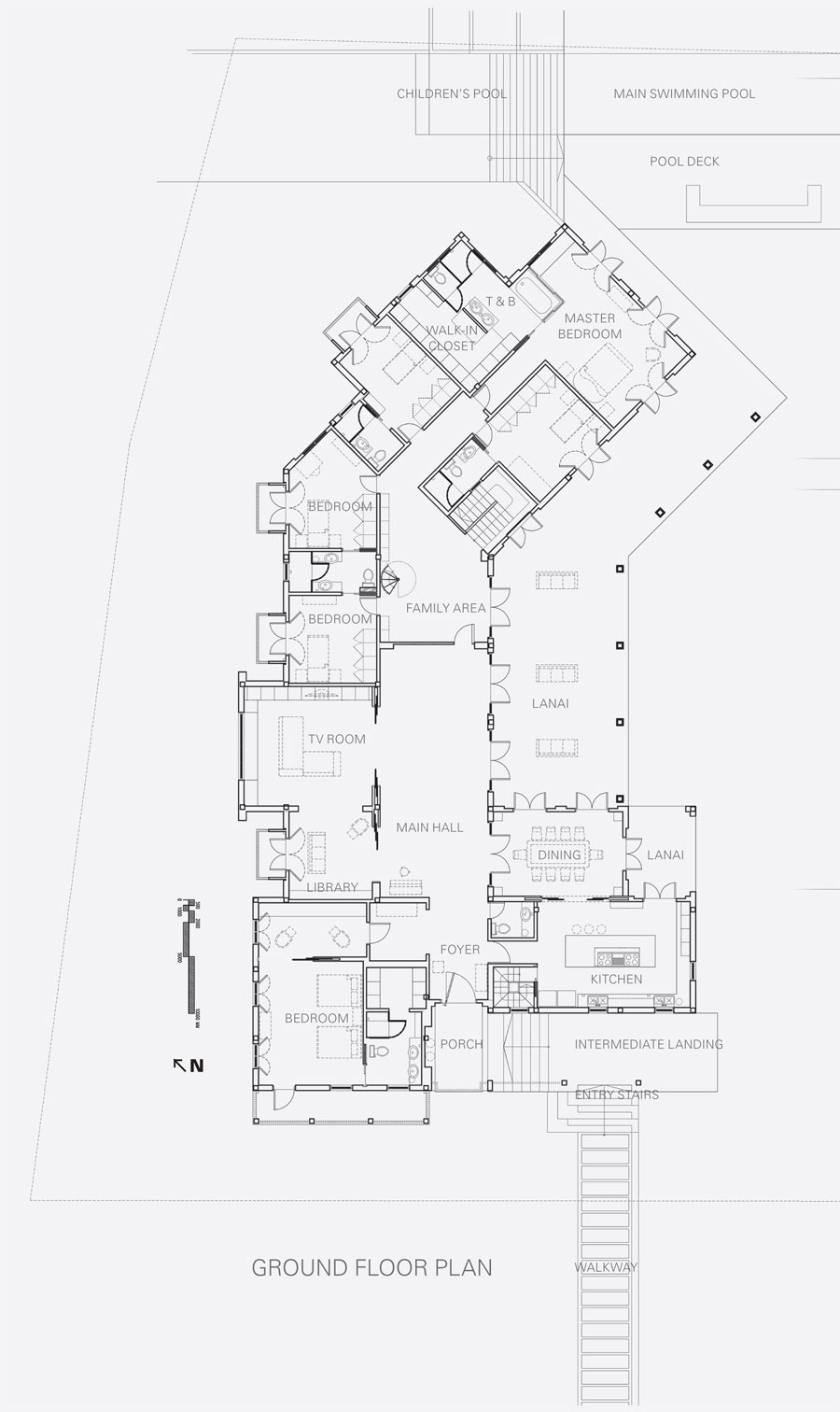
It is this suburban connection that we return to when we look at the Miailhe House. We do not know the identity of the original architect. A short distance from Santuario, it has the old world feel—the creekside lot, old frangipani trees and sloping location—that one would associate with a rural villa in, say, Provençe or Catalunya, but housed in a green oasis framed by Ayala and Fort Bonifacio skyscrapers. It was this apparent “conversation” between old and new, colonial and contemporary, that energized the decision to retain the major motif of the old house, a bay centered on the garage door, a balcony window with a gabled façade, and two modillion-shaped moldings that cap the supporting wall on its sides. Along with an arched arcade at the garden side that opened out to a loggia, these formed the thematic core upon which Calma then redesigned a new skin that followed the old structure’s footprint, taking care to preserve what piers could be saved by reinforcing them with concrete-impregnated Kevlar.
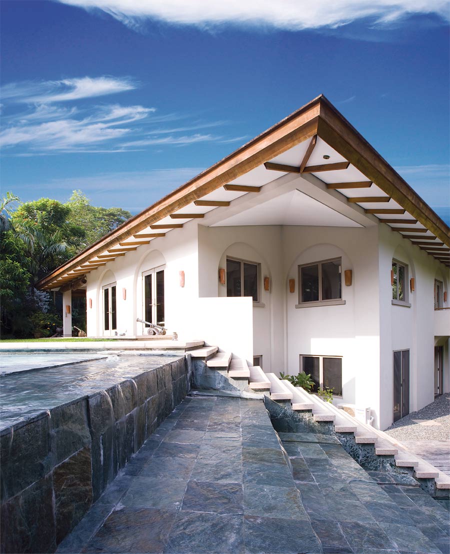
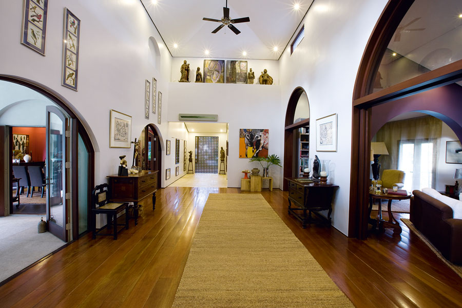
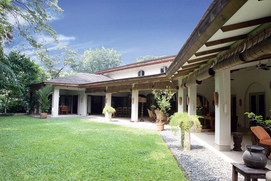
To unify the exterior, Calma resorted to the arched bay motif that was repeated in sections housing balconies, windows, and doorways. The simplified arch also served to connect the interior to the outside as thresholds and arcades that formed a repeating motif in the central space of the main hall, while allowing sunlight in and air to circulate, minimizing air-conditioning costs and following the tropical tenet of, in Leandro Locsin’s words, “space surrounded by space.”
Completing the Mission Revival theme, Calma then installed new slate tiled roofs with a dark brown finish, framed by stained wood gutter fascias. The exposed deep brown ceiling beams holding up the roofs, contrasted by the white expanse of ceiling panel, along with the plain white concrete stucco finish of the walls extend the Mission Revival agenda.
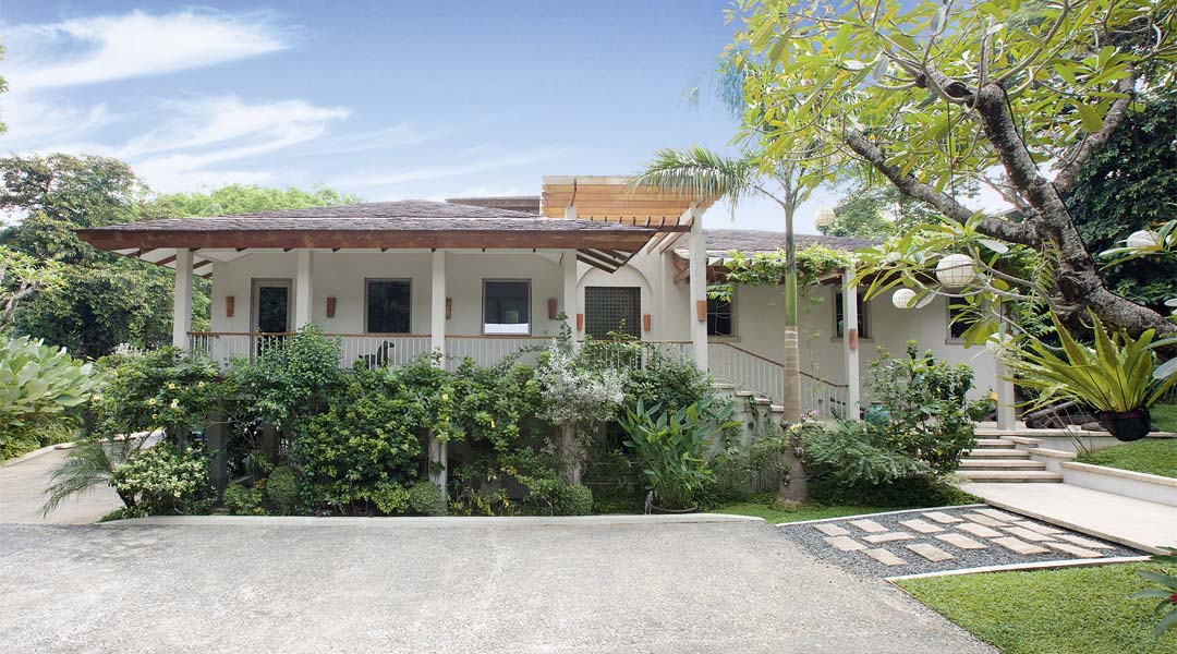
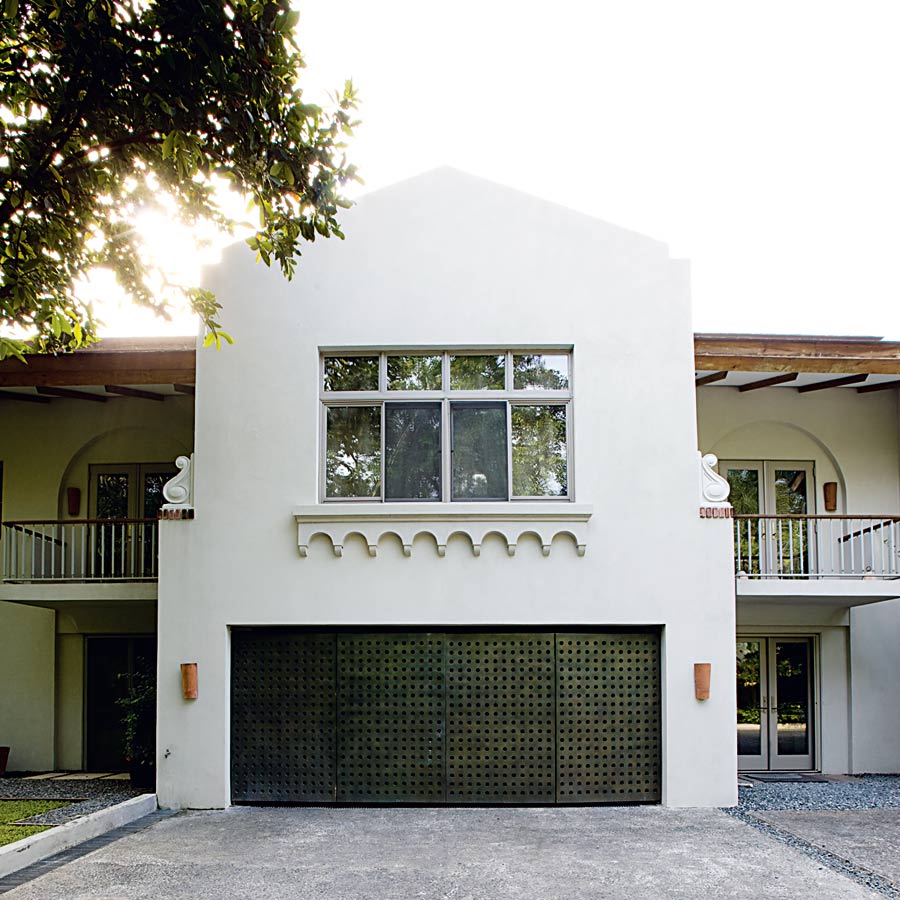
Seen from the front gate and the garden side, however, one notices the Provençal sensibility that humanizes the house with a lyrical and airy relaxation. What greets the visitor upon entering the gate is not a convent, but a two-storey farmhouse façade with wraparound wood and steel balconies on the second floor, and trellises that soften the roofline with its interplay of linear steel bars, glass plate roof, and vine foliage. A gently sloped, wide stairway to the right gives access to the front door at the upper ground level, while going down the lower level to the left continues to the carport area, which contains the helper’s
quarters and garage.
The first impression is that one has walked into a manorial farmhouse near Marseilles, called a bastide, which is a rectangular building built around a central courtyard in fine ashlar stone—and which, incidentally, is also finished in smooth stucco, or whitewashed. Planters soften this façade further and allow antiques like mounted lantakas and Martaban jars to work their magic as one encounters them en route to the modern steel perforated main door.
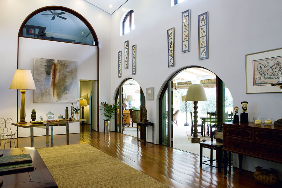
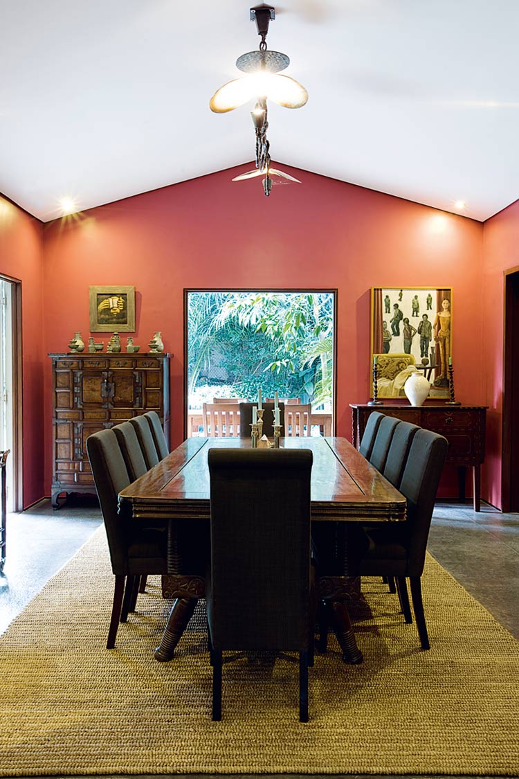
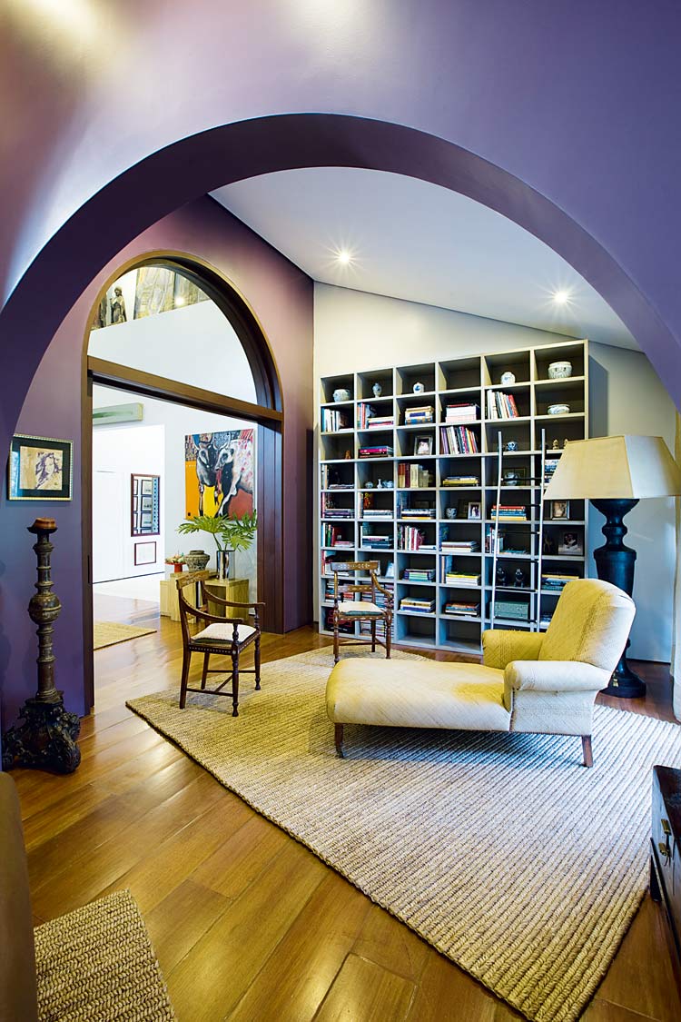
Once inside, the visitor goes through a short foyer before entering the heart of the house, a main hall whose ceilings were raised from the old house roofline to include clerestory windows finished in plain white. To either side, an arcade opens to the dining room, kitchen, lanai and garden on the right; and a library and sala on the left. This is also the most public part of the house aside from the front porch, where gatherings, meetings and parties are held without disturbing the domestic rhythm of the house. It is also the most antique and art-filled space, with old maps, prints of flora and fauna, colonial furniture, santos sculptures, and Sevrine’s modern art collection forming contrasting (and therefore conversational) details on the ecru gray and light aubergine walls.
The floor’s earthy contrast of stained wood planking and plain-weave hemp rugs complements the antiquarian décor, and returns the interior to its Mission Revival roots. What unites the décor with the structure, however, is the way that Calma framed the interior with curved archways that contrast with the angled ceilings, effectively framing each vignette in a modern farmhouse aesthetic that not only blends colonial with modern, but also brings back the Bordeaux rural sensibility into the picture. Rustic stone farmhouses in the Aquitaine-Dordogne or Gironde region of Bordeaux are famous as vacation cottages for Parisians eager for a summer farm experience with resort-like amenities.
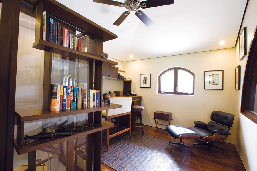
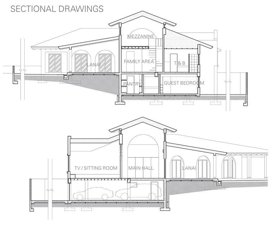
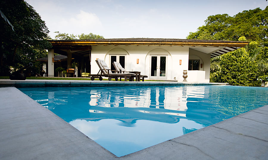
Thus, in a very deliberate way, the house is divided into a public and private area, with the porch to the main hall, lanai and lap pool being the public area, and the section beyond the main hall as the private one. This angled portion of the house between the main hall and the lap pool contains the bedroom wing, entered from the hall by a concealed door that opens into a cozy mini sala bedecked with family photos. Above this, a spiral staircase gains access to a “tower room” that overlooks the main hall where Edouard has his private loft-office.
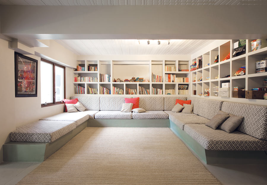
Below the mini-sala, another flight of stairs gives access to the play-and-exercise room and basement lounge with its own kitchen and bar, where the family can unwind, shielded from the public area by its location far from the main hall, and yet close to the garage and pool. Putting the play area under the bedroom wing enables the parents to monitor the children without disrupting their privacy.
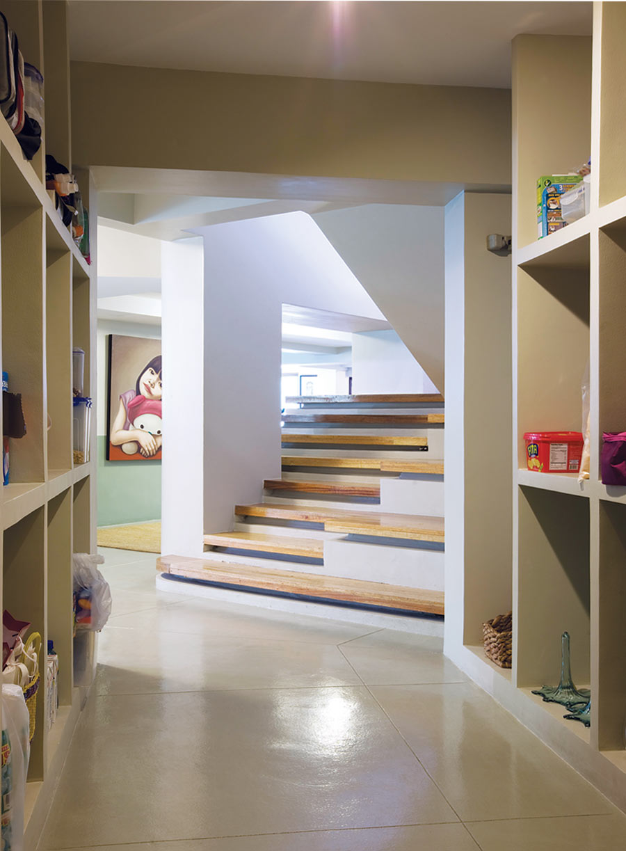
The contrasting sensibility of the play area, with its mildly industrial finishes and with the mixed antiquarianism of the
main hall is also a statement of the dual nature of the Miailhe House, one that addresses the unique cultural history of the family, as well as gives ample space for family life to unfold in all its domestic intimacy and roughhouse reality.
What gives the Miailhe House its “liveability” factor, however, is how the public and private spaces fuse to combine a feeling of intimacy and domestic harmony, eschewing the “museum look” that many antiquarian-themed mansions usually embody, while carefully delineating the historical and cultural heritage of this uniquely globalized family living in the Philippines.
“I didn’t want a house that looked like the lobby of a hotel,” Sevrine said. “They are beautiful…but they can’t tell you anything about the personality of their owners. I’ve brought in things from wherever we lived across the world, and we were lucky that Edouard’s father gave us a choice pick of the antiques he owned. I personally love Modern Art, so I added many works of Filipino contemporary artists to the house. I don’t believe in buying everything in one go for a house. You collect them over your lifetime, move things around a little, and make way for new things. I believe in a house where the things you see are related to your personal history.”
Combining the historical and cultural heritage of old Spain, colonial Philippines, early 20th Century America, and contemporary bucolic French, the Miailhe House by Calma fuses motifs, lives, and stories into a statement about life and design at the beginning of the 21st Century, when no one culture or stylistic movement can claim dominance over another; and where subtle and graceful interaction, not brute and violent confrontation, generates the compelling narrative. ![]()
Original article first appeared in BluPrint Volume 6 2012. Edits were made for Bluprint online.
READ MORE: The grand Beaux-Arts style now even clearer in Iloilo’s Lizares mansion
