Designing small spaces can feel limiting. But for those with maximalist tendencies, the challenge becomes an opportunity to make a big statement. With the right approach, even the tiniest of rooms can be transformed into a rich, layered environment that exudes personality. We tapped into the expertise of Interior Designer Ivy Almario of Atelier Almario […]
Neutral Maximalism: How to Blend Bold Design with Subtle Colors
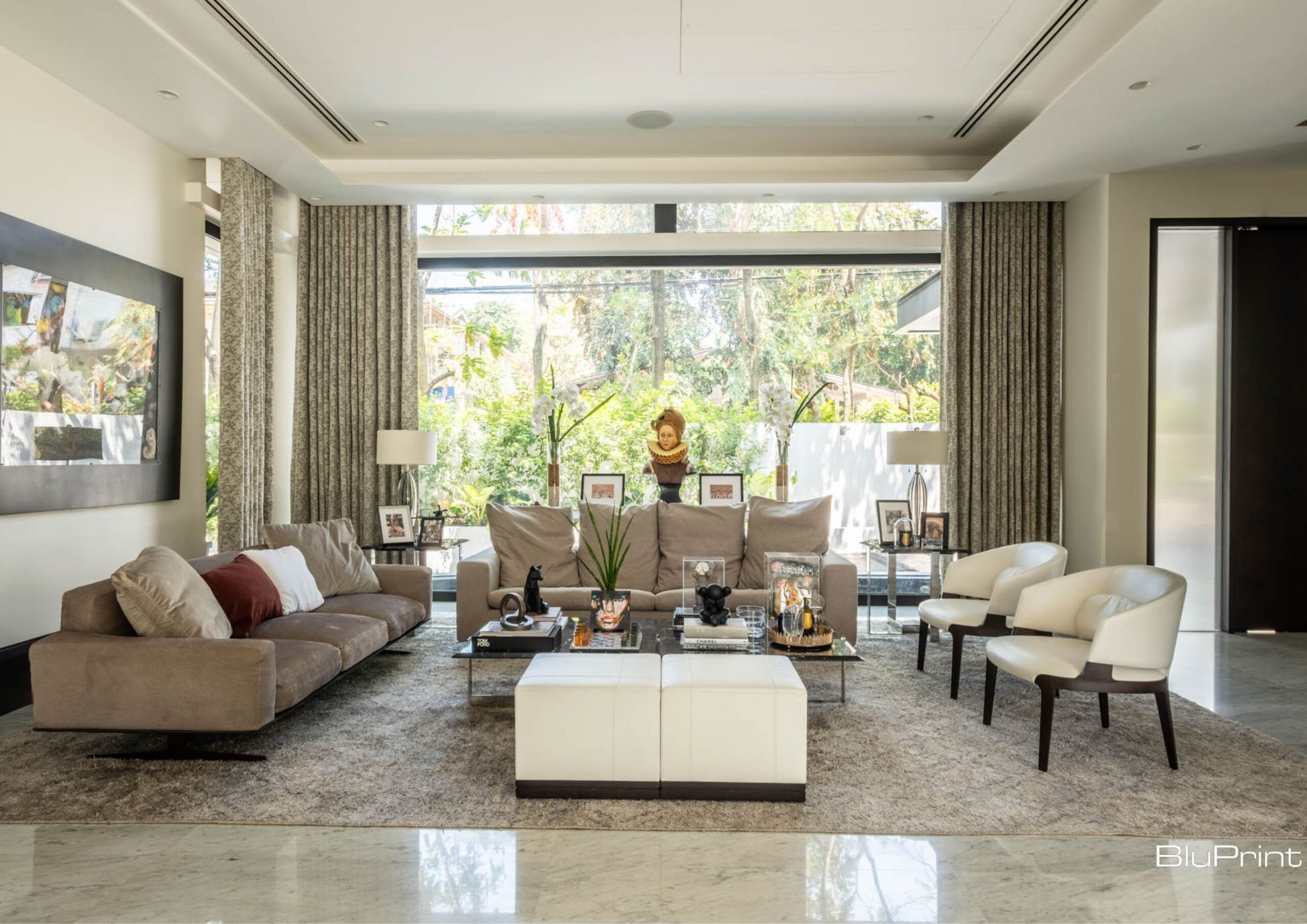
You might know maximalism as the interior style that celebrates abundance and the eclectic use of colors, patterns, textures, and decor. Every corner of the space embodies the “more is more” principle. But what if you want to achieve the same maximalist look without using bold and rich hues? Neutral maximalism lets you embrace excessive and ornate details in your home but with softer, more refined neutral colors.
Traditional vs. Neutral Maximalism
-9 - BluPrint")
Think of contrasting patterns, statement items, large-scale elements, and a curated collection of ornaments. Now imagine all of them in white, beige, gray, or black. This is neutral maximalism in a nutshell. All the common characteristics of traditional maximalism are present except for the vibrant and intense tones.
Although the color palette is its apparent difference from the typical maximalist style, neutral maximalism boasts other qualities unique to its approach. Given its usage of subtle hues, this design shies away from energetic ambiance and instead creates a calmer and more sophisticated atmosphere.
This subdued feel places greater emphasis on more prominent design elements like shapes, textures, and patterns. In a sense, the neutral colors provide the perfect backdrop for other maximalist features to shine. You could say that muted tones carry this interior style’s appeal while ensuring that it’s still connected to its roots.
As described by interior designer Shalini Misra, neutral maximalism is one way to achieve traditional maximalism’s signature use of contrasts. She explains that neutral colors make layering various textures easier and more effective since they don’t overpower the overall design. Moreover, incorporating contrasting elements becomes more noticeable when applied with muted shades.
Unlike with traditional maximalism that equally highlights its attributes, neutral maximalism skips the striking hues, which makes spaces easier on the eye. According to London-based interior designer Erik Munro, it’s essentially the softer and more organic take on maximalism.
Different Ways to Achieve Neutral Maximalism
-52 - BluPrint")
On the surface, introducing neutral maximalism to a space might be as simple as trading rich hues with soft tones. But this doesn’t mean that every design aspect should adhere to this approach. There are multiple ways to achieve this interior style aside from enveloping the entire interior with neutral colors.
Make the Base Neutral

One of the easiest ways to implement neutral maximalism is by covering the surfaces with your preferred neutral colors. Either through paint, wallpaper, tiles, or rugs, creating neutral-toned walls, floors, and ceilings help you establish a nice foundation for other maximalist furnishings. Plus, it makes layering textures, patterns, and decor less overwhelming since it can accommodate and unify a variety of styles.
For instance, you can choose different shades of the same neutral color to create a monochromatic look. Or combine colors like beige, cream, and taupe for a more textured and visually interesting effect. In this way, you won’t need to worry about matching every item to the neutral color scheme, as the base is already in line with the style.
Use Subtle Tones for Patterns and Textures
-20 - BluPrint")
No maximalist interior is complete without complex patterns and contrasting textures. But instead of opting for vibrant colors, pick those in a neutral color palette. Whether they’re geometric shapes, floral prints, soft fabrics, or textured materials, make sure the subtle tones are as prominent as the design. So, you can have more nuanced and balanced layers of contrasting elements while guaranteeing a gentler maximalist space.
Let’s say rather than colorful marble, try white with black veins for accent walls or countertops. Or if you like to incorporate woven fabrics with intricate motifs, maybe steer clear of lively colors.
You can do the same for wood materials by choosing paler types, like oak and maple, to show more obvious grains.
Display Neutral Statement Pieces

To evidently show the shift to neutrals, don’t leave out the statement pieces. This can be anything from bespoke or sculptural furniture, to artwork, or even unique lighting fixtures. Similar to patterns and textures, let these items leave a lasting impression by allowing neutral colors to take center stage. While they might have extra details like metallic finishes and exquisite carvings and moldings, ensure a subtle color scheme dominates the design.
For example, consider a large armchair in a neutral and patterned fabric like linen or velvet. The chair’s unique shape and style, emphasized by its light hue, can draw attention without overwhelming the space. Alternatively, you could hang a piece of abstract art in neutral tones on a blank wall to discreetly add visual interest. And as for statement lighting, skip gold and opt for a neutral metal finish like brushed nickel or silver.
Neutral maximalism demonstrates how the “more is more” principle doesn’t always call for rich and vivid tones. It proves that the essence of maximalism truly lies in the abundance of visually stimulating and emotionally resonant pieces you put in a space. The restrained palette allows for a deeper exploration of textures, patterns, and materials. But more importantly, it evokes a sense of calm and sophistication some traditional maximalist interiors don’t usually have.
Read more: Empty Spaces to Fill: Why Filipinos Love Maximalist Houses


Labor rights continue to be a touchy issue in the Philippines, especially with endo contractualization being a continuing problem. With Sambingay sa Ikatulo nga Kaibutan, or Parable of the Third World, artist Lorebert Maralita examines the plight of the working class with excellent crafted artworks observing their current situation. This exhibit, showing at Altro Mondo […]

The globally renowned home goods retail brand, Crate and Barrel, recently reached their 10th year milestone in the Philippines. As part of their anniversary events lineup, they hosted their second Portraits of Life in SM Makati on September 19th. Bearing the essence of shared lifestyle with key individuals, the brand collaborated with four distinguished creatives […]

As a prominent figure in the world of contemporary design, Apiwat Chitapanya brings a fresh perspective that marries the traditions of Thai craftsmanship with modern furniture design. With his works gracing international design fairs and exhibitions, he has established a unique brand that not only pushes the boundaries of creativity but also pays homage to […]

Mono8 Gallery debuted three new exhibitions this September centering around the different ways we view the creative process. Recently, BluPrint featured one of them on our site, The Heart of Every Mountain is Ocean. That exhibit reorients us with perceiving indigenous textile as artworks. The other two exhibits center on similar explorations and profundities of […]

Blue Plate, Synthetic Savor puts viewers in a meditative state through its shrewd use of lines and colors that hint towards the artist’s mindset. Gabby Prado created these works as a way of self-reflection and meditation. “What color is the void? For Gabby Prado, it radiates blue,” the exhibit write-up said. “Blue is a moment […]
Download this month's BLUPRINT magazine digital copy from:

Subscribe via [email protected]