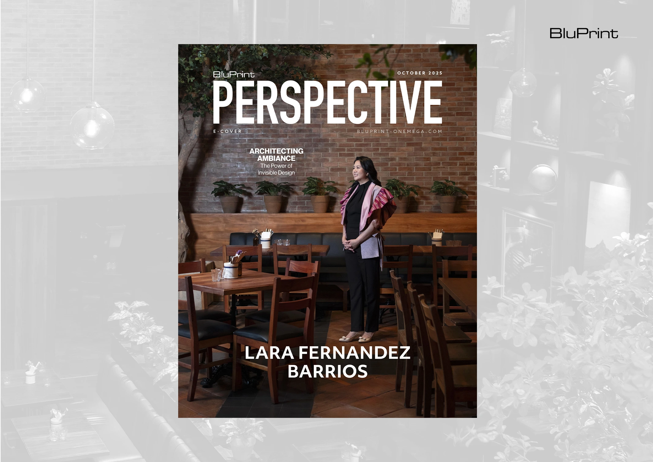
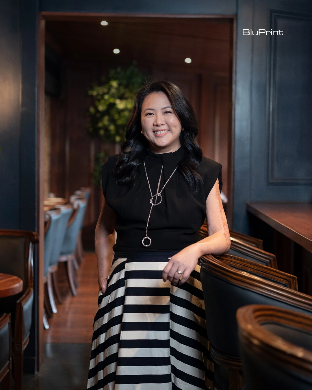
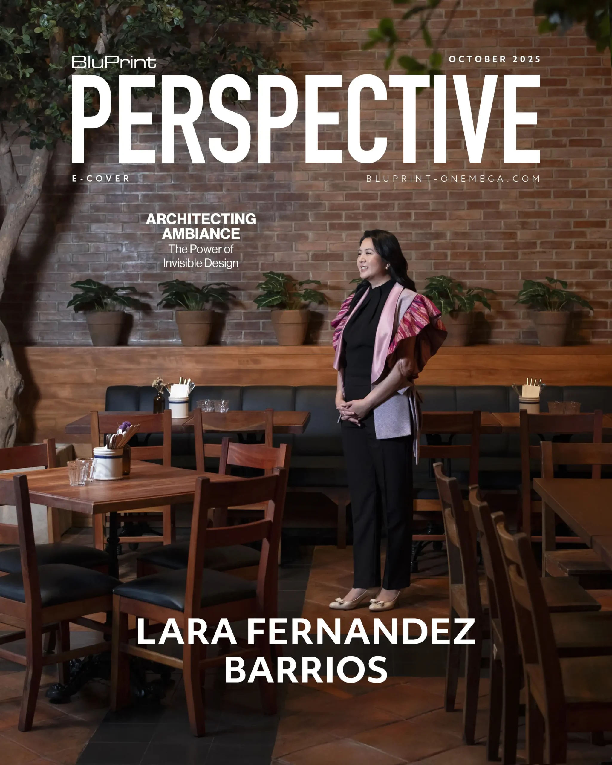
The genius of a well-designed space is often invisible, yet its presence is deeply felt. It’s there in the warmth of light that encourages you to linger, the balance of texture and materials, and in the intuitive layout that guides you effortlessly through the room. This translation of an idea into a tangible, atmospheric reality is the hallmark of Architect Lara Fernandez Barrios and her firm, Larawan Ink.
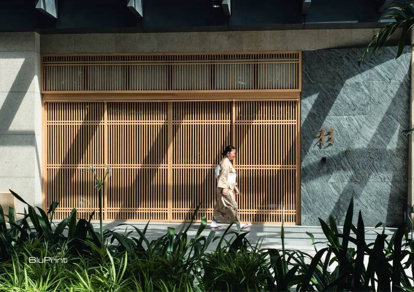
For over a decade, Larawan Ink has quietly shaped the sensory landscape of Metro Manila’s most beloved commercial spaces. The firm’s portfolio reads like a guide to the city’s contemporary culinary scene: the Zen-like interiors of Sugi, the industrial-chic warmth of Wildflour, the nostalgic Americana of Pink’s and Farmacy. Yet, despite the diversity of these brands, her work is unified by a singular, human-centric philosophy: architecture’s highest purpose is to enhance how people feel and move within a space.
Through a meticulous process of deep listening, contextual sensitivity, and a profound understanding of materiality, Larawan draws feelings into existence, creating signature environments that resonate long after the last customer has left.
Advertisement
Versatile Visions
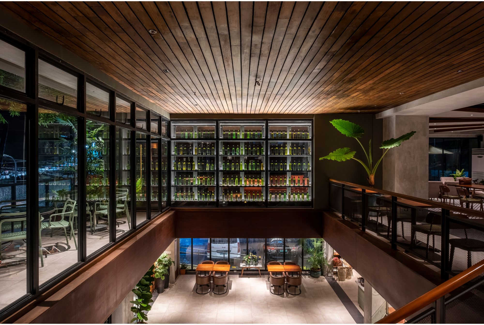
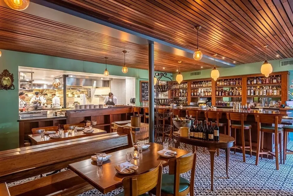
The entryway was designed to create a sense of arrival where guests are greeted by a water feature, a signature element from previous locations of Sugi Japanese Restaurant. Photo by Ed Simon.
Lara Fernandez Barrios’s path to becoming one of the country’s foremost commercial architects was not linear, but rather a journey of organic evolution, guided by what she calls a “go with the flow” philosophy. Graduating Cum Laude with a B.S. in Architecture from the University of the Philippines in 2001, she spent her formative years under the tutelage of giants. Summer internships with National Artist Francisco “Bobby” Mañosa and designer Ana Rocha provided what she describes as invaluable “real world” experiences.
Manzke Restaurant, Los Angeles. Photo courtesy of Larawan Ink.
At Mañosa’s firm, she was thrown into the deep end. “I had to take a crash course in CAD drawing prior to the internship, as it had not been part of our school curriculum,” she recalls. “It was sink or swim. I had to learn fast to be able to produce the drawings needed.” This early trial-by-fire, instilled a technical discipline and adaptability that would become foundational to her practice.
After passing the architectural boards in 2002, she continued to build a remarkably diverse toolkit. She joined Dan Lichauco at Archion Architects, focusing on the rigorous, function-driven demands of commercial and institutional projects like hospitals and schools. Later, she moved to Anna Sy’s C|S Design Consultancy, immersing herself in the world of bespoke, high-end residences where meticulous detail and client personalization were paramount.
“I thought I’d focus on custom high-end residences based on my training,” she admits. This dual exposure to large-scale pragmatism and intimate residential design created a unique professional hybrid. She could be equally comfortable with a hospital’s complex workflow and a home’s emotional resonance.
Advertisement
The birth of Larawan Ink was, fittingly, not the product of a rigid business plan, but an organic response to opportunity. After getting married, she started freelancing to gain more control over her time. A project for a friend’s fast-food outlet quickly escalated. “She decided to open multiple branches,” she explains. “As a one-person team, I realized I could not handle it on my own and took it as a sign to set up shop.”
And so Larawan Ink was born. The firm’s name, derived from the Filipino word for “picture” or “image,” proved prophetic. A chance encounter with Chef Romy Dorotan of the famed Purple Yam in Brooklyn led to a pivotal commission: designing a Manila outpost in his wife Amy Besa’s ancestral home in Malate.
Almost simultaneously, a call came from Ana Lorenzana de Ocampo of Wildflour. “She asked if I designed restaurants,” Fernandez Barrios recounts. “I told her I was currently working on some fast-food projects and Purple Yam Malate.” A meeting was set, and Larawan Ink was commissioned to design the first Wildflour in Salcedo. The rest is a chapter in Manila’s design history.
Advertisement
Life, as the budding architect learned, had other plans. “You never really know where life will take you,” she reflects. The commercial projects she hadn’t planned for became the very ones she and her firm now passionately enjoy designing.
Architecture as Identity
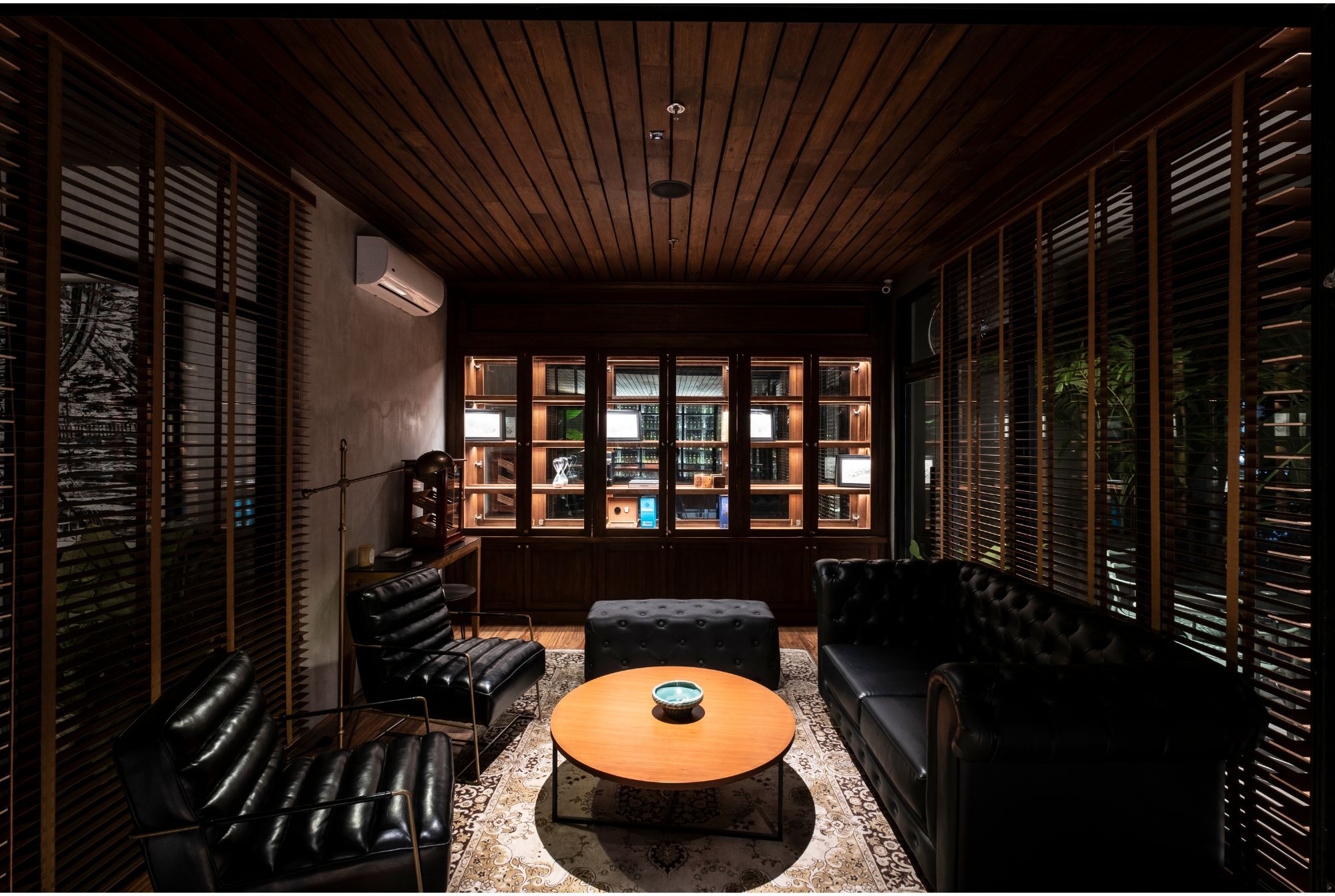
Cafe Bobs in Bacolod. Photo by Ed Simon.
What makes Larawan Ink’s work so successful is its deep symbiosis with branding. The firm does not impose a singular, repetitive style on their clients. Instead, they act as an architectural translator, distilling a brand’s ethos—its story, its target market, its soul—into a three-dimensional experience.
“A big part of successful designing is listening,” she states emphatically. “We have to listen to what the clients say and do not say in order to achieve what they want.” This forensic attention to nuance is the first step in her methodology. “For commercial projects, we study their brand, their thrust, what they’re about before we dive into the design process.”
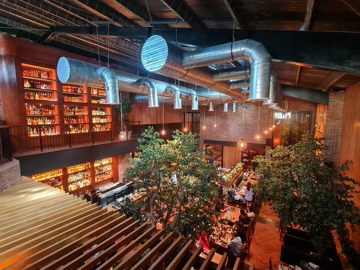
Adaptive reuse and biophilic design at Wildflour, Quezon City. Photo courtesy of Larawan Ink.
The intellectual rigor ensures each project develops its own unique “signature look.” For instance, Sugi and Yabu House of Katsu, with its clean lines, light wood, and orderly composition, evoke a sense of Japanese minimalism and precision that mirrors the art of the cuisine itself. Conversely, the design for Wildflour embraces a more eclectic, industrial vibe—exposed brick, steel accents, reclaimed wood—that speaks to its brand of accessible, rustic gourmet comfort. The look is distinct to the brand, yet the underlying feeling of warmth and welcome is a constant thread in Fernandez Barrios’s work.
This approach is always balanced with a profound respect for context. “We design and draw inspiration from our tradition and cultural heritage,” she says. It’s not about literal pastiche, but about a deeper understanding of place.
Advertisement
“In every project, we carefully select materials suited to the tropical climate: durable, easy to maintain, and built to last. This approach allows us to create spaces that are deeply rooted in culture, while remaining sustainable and timeless.” By prioritizing thoughtful orientation, energy efficiency, and locally appropriate materials, her designs are not just aesthetically pleasing but are fundamentally respectful of their environment. They are built to endure both the physical climate and the shifting tides of trend.
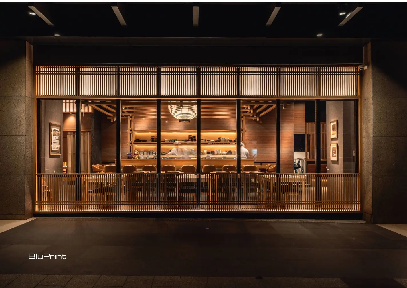
Wood, Warmth, and Whimsy
Larawan Ink reimagines Sugi Japanese Restaurant by preserving its signature warmth while introducing a contemporary aesthetic and enhanced functionality—all within a thoughtfully designed 500-square-meter space. Photo by Ed Simon.
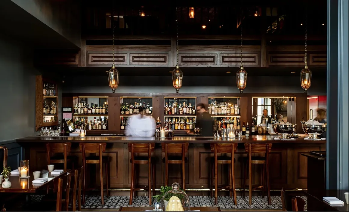
If deep listening is Larawan’s method, then her medium is a carefully curated palette of materials chosen to evoke emotion. At the heart of this palette is her favored material: wood.
“I love wood. Wood is warm,” she says with genuine affection. “It adds texture visually to any space. It’s natural and inviting to touch. People relate to wood viscerally whether they realize it or not.” In her hands, wood transcends its structural function. It becomes a primary tool for atmosphere, its grain telling a story, its surface absorbing and reflecting light with a soft glow, its presence grounding a space in natural warmth. It is the key ingredient in the “cozy and welcoming” aesthetic for which she is known.
Bicyclette Bistro in Los Angeles. Photo courtesy of Larawan Ink.
This warmth is often complemented by what has been described as a “touch of whimsy.” This is not about overt novelty, but about subtle, delightful details that prevent a space from feeling sterile. “We like to use a combination of textures and materials to bring warmth and a touch of whimsy to our designs,” Fernandez Barrios explains. “We aim to avoid stiff or overly formal spaces. We want people to be relaxed and at ease in the spaces we create.” This might manifest as an unexpected tile pattern, a playful light fixture, or the juxtaposition of a rough, industrial surface with a refined, polished one.
Advertisement
In a commercial context, the method is as strategic as it is decorative; it is. A relaxed customer lingers, connects, and returns. By designing for comfort and ease, Larawan Ink directly contributes to a brand’s commercial success, proving that good atmosphere is good business.
Function to Feeling
The cigar room at Cafe Bobs. Photo by Ed Simon.
Underpinning all of Larawan Ink’s creative output is a foundation of rigorous pragmatism. They understand that for a design to be successful, it must first be functional. Her design process is a testament to this belief. “When designing, I always start with the floor plan,” she insists. “For commercial projects, we usually start with the kitchen.”
This function-first approach acknowledges that the lifeblood of a restaurant is its operational efficiency. “One needs to consider the flow of the space and how the users will use it—both the people who work there and the customers,” she elaborates. “If you do not get that right, no matter how pretty the place is, it will not work.”
Advertisement
This pragmatism extends to the realities of project management, keenly aware of the unique pressures of commercial design. “Commercial spaces usually have tighter timelines as businesses need a return on their investments,” she notes. Furthermore, the materials chosen must be robust. “We also have to be mindful of the materials we use since public spaces are more prone to wear and tear due to the higher foot traffic, so durability and maintenance is key.”
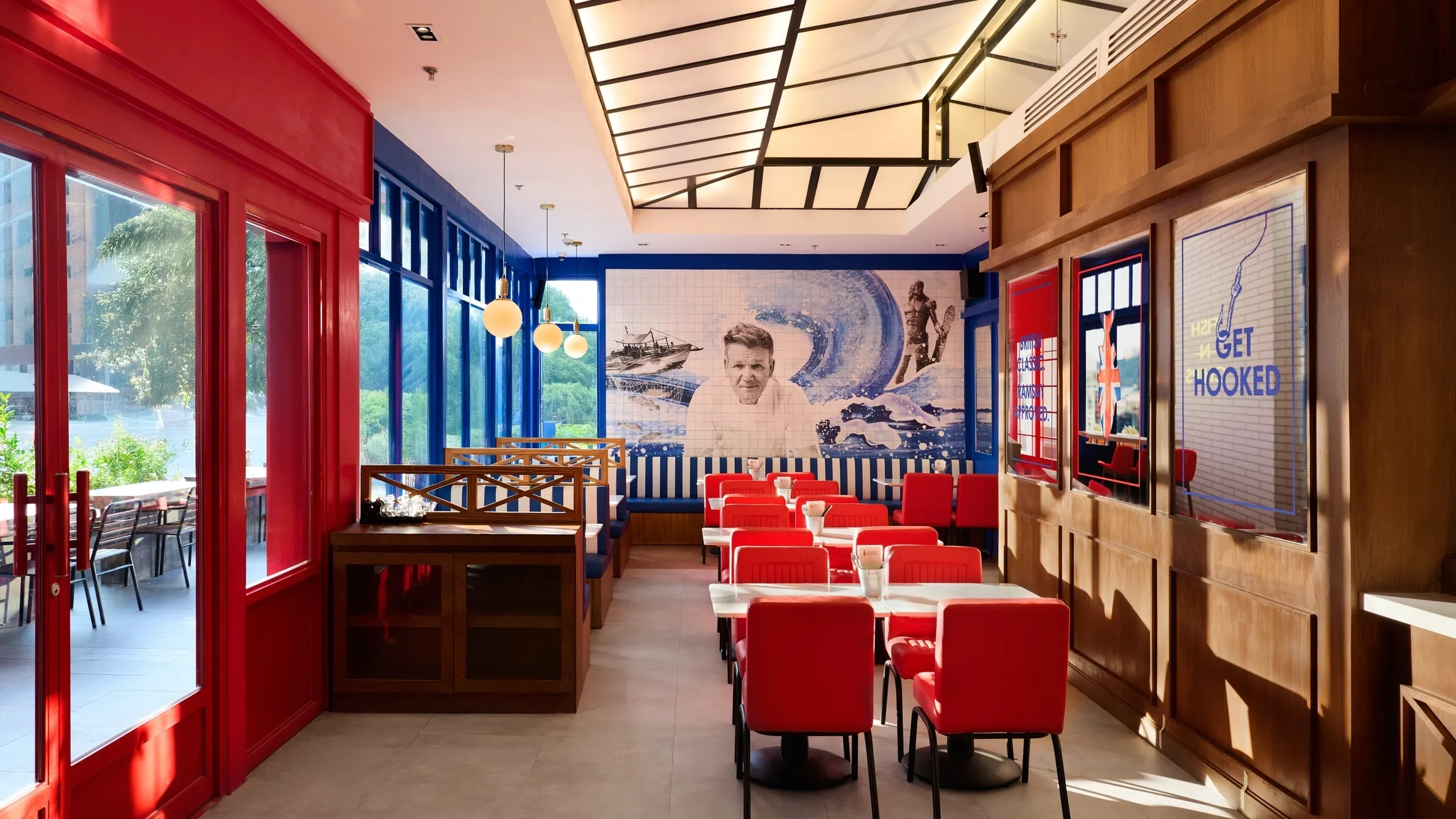
Gordon Ramsay’s Fish and Chips. Photo courtesy of Larawan Ink.
Her ability to navigate these constraints—balancing client vision, brand identity, functional flow, budget realities, and tight deadlines—is what makes her a sought-after architect. It requires a holistic vision that sees the project not as a static object, but as a living, breathing system. This is achieved by approaching every project, regardless of scale, with the firm’s core values. “We approach every project with a clear vision and a deep respect for context… We listen to what the clients want and infuse our take into the project.”
Looking to the future, the firm remains grounded but curious, her philosophy centered on intentionality rather than novelty for novelty’s sake. “There are so many new technologies out there,” she muses. “We’re always open to trying new materials as long as they meet the needs of our projects.” This constant state of learning is key to her practice’s evolution, ensuring that innovation is always paired with purpose.
Advertisement
The legacy Lara Fernandez Barrios hopes to build with Larawan Ink is one of human experience. It is measured in the connections forged over a shared meal, the ease of movement in a well-planned space, and the joy of being in a place that feels right.
“At Larawan Ink, our goal is to enhance how people feel and move within the environments they live and work in,” she concludes. “We hope the places we design allow people to feel at ease, connect with their surroundings, and experience a sense of joy.” It is a beautifully simple, profoundly human ambition. In every project, she and her team create more than just a picture; they create a living larawan, an enduring image of what it feels like to truly inhabit a space.
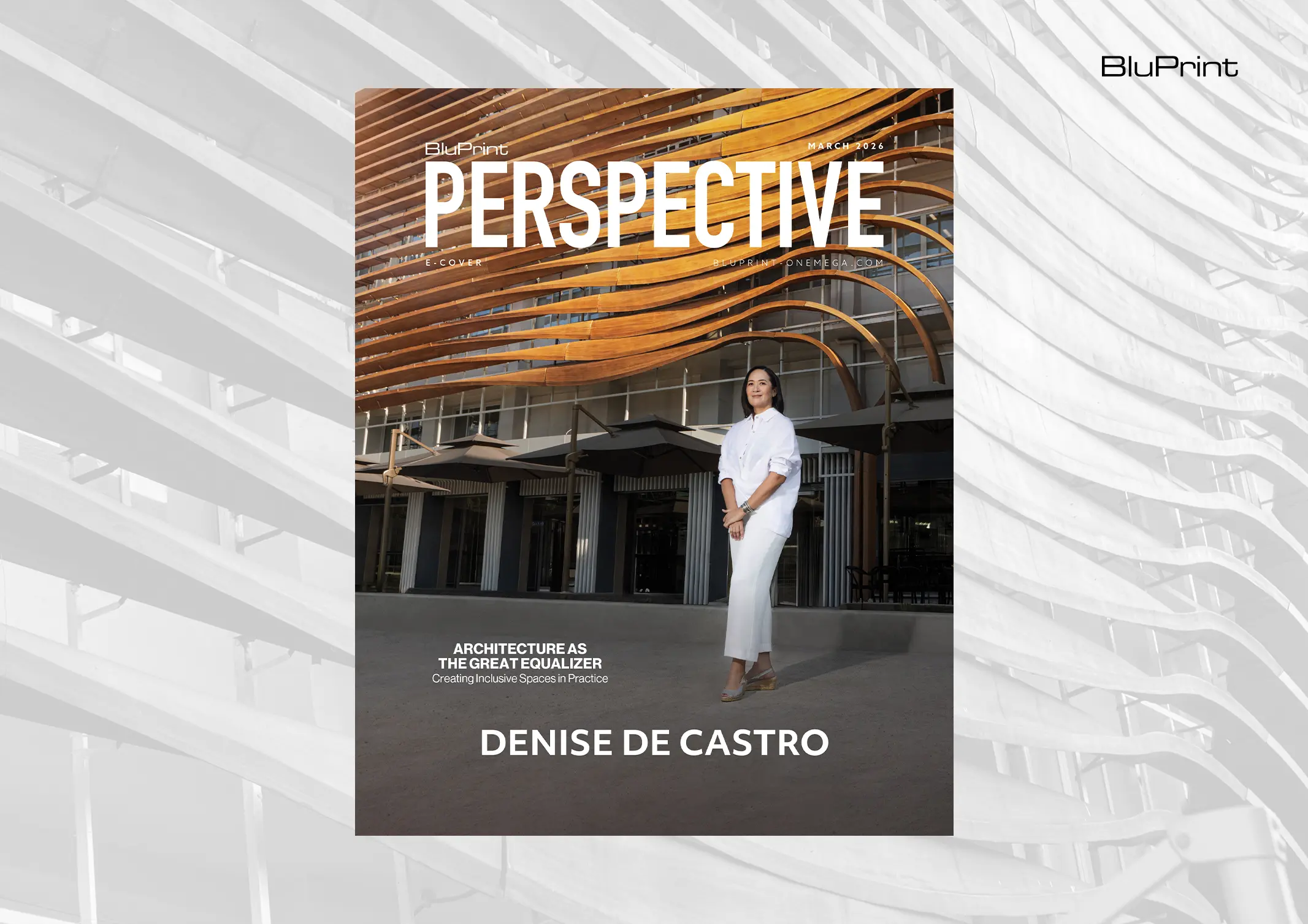
Denise de Castro, Principal Architect of DEQA Design Collaborative, believes that designing with equity in mind means starting at the workplace. Values and practices that your studio or office espouse inevitably filter down to the work that you do. Equitable design ensures that people with different needs and different backgrounds are supported through fair access, […]
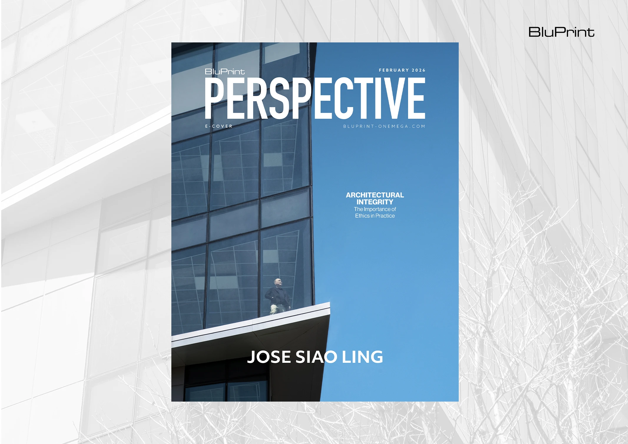
As the built environment evolves, the role of the architect demands reconsideration. For Jose Siao Ling, Co-Founder and Principal Architect of Jose Siao Ling & Associates (JSLA Architects), the role extends far beyond being a licensed professional who designs and oversees construction. By championing ethical practice, ISO-certified systems, and mentorship-driven leadership, he built a firm […]
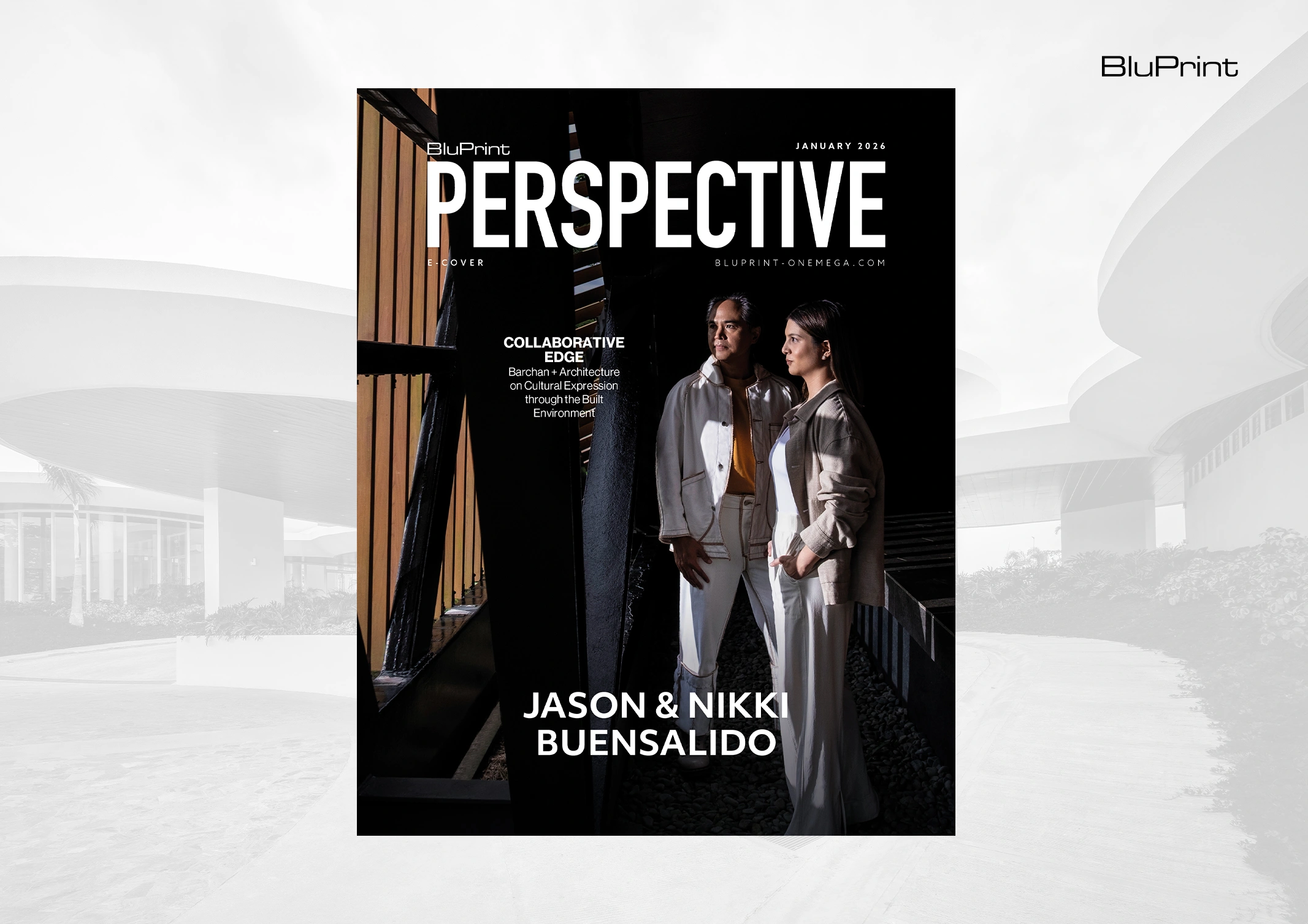
Architecture extends beyond mere structures. It has the power to hold stories that reflect our current social milieu, while also presenting itself as a solution to societal challenges. As time progresses, Barchan + Architecture continues to evolve along with the changing landscape. Standing at the forefront of progressive architecture are the firm’s Principal Architect, Jason […]
At its core, architecture has always been about the human experience. While this fundamental purpose can sometimes be overlooked amid the complexities of modern life, a renewed focus on human-first principles is taking hold. This deliberate approach is articulated in the philosophy of Life-Centric Architecture, a mandate championed and put into practice by Terence Yu […]
Dominic Galicia operates on a different timeline. For him, the distinction between a structure built today and one erected centuries ago dissolves if it possesses a “special quality of moving the spirit.” This core belief is the foundation of a career that elegantly sidesteps the false dichotomy of heritage versus modernity. Instead, Galicia, the principal […]
What is the soul of a building? For many, the answer lies in history, aesthetics, or some intangible poetry of space. For architect Don Lino, the answer is far more concrete: the soul is found in the solution. This is the guiding principle of his firm, LINO Architecture, a practice built on the conviction that […]
Download this month's BLUPRINT magazine digital copy from: