Alfredo Luz’s Ramon Magsaysay Center: A National Benchmark
It was the summer of 1967. My family lived within a square mile district that teemed with architecture. There was the Jai Alai, the World Health Organization Building, the Philamlife, Caltex, Manila Doctors Hospital, the Paco Cemetery, the Chapel at the Old Ateneo campus in Padre Faura, and the Ramon Magsaysay Center.
While my architecture vocabulary was close to nil, I nonetheless had this penchant for architectural places. For one, the Ateneo chapel, with its round plan and its centrally located altar, seemed to harbor a sense of lightness that cast a spell on me, drawing me closer to the ritual that went beyond the fulfilling of obligations. In this space, I felt I was in total communion.
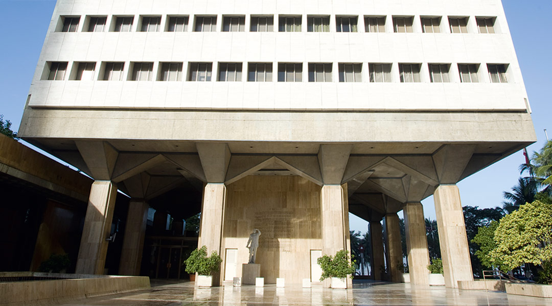
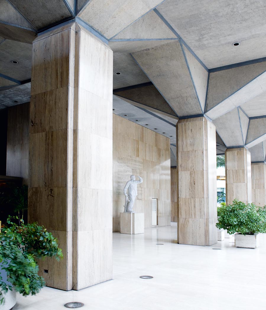
The other building that caught my fancy was the newly built Ramon Magsaysay Center. In this new building, I felt transported, the anchor of the experience being the glass-enclosed entrance foyer that gave me a feeling of being inside while outside, and whose huge stone pillars rose way higher than where I stood. There was an inviting smell from the basement cafeteria, which underscored the sense that yes, indeed, I was in a place far away, in another city, of another time—“imported,” “Stateside.”
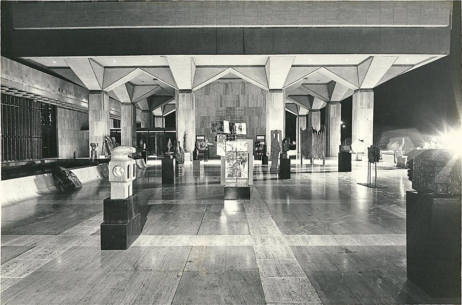
The experience of 1967 still grips me. With very little knowledge of architecture then, my experience of connection with the building was generated purely by the physical contact of my senses with it. It is experience that gives architecture its significance.
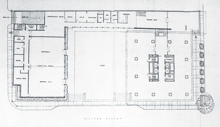
Forty-five years hence, this chance to write about the Ramon Magsaysay Center summons both a sense of nostalgia and, given the hindsight of a design practice, a sense of awe. On the day of the BluPrint round-table on Alfredo Luz, it was hair-raising to walk across the entrance plaza into an RM Hall that now seemed smaller to me than it had been in 1967.
Editor’s note: The author wrote this piece in 2012 after the round-table discussion on Luz that same year. Today, the Ramon Magsaysay Center is 51 years old.
READ MORE: A Fitting Retrofit: The Restoration of Manila Cathedral
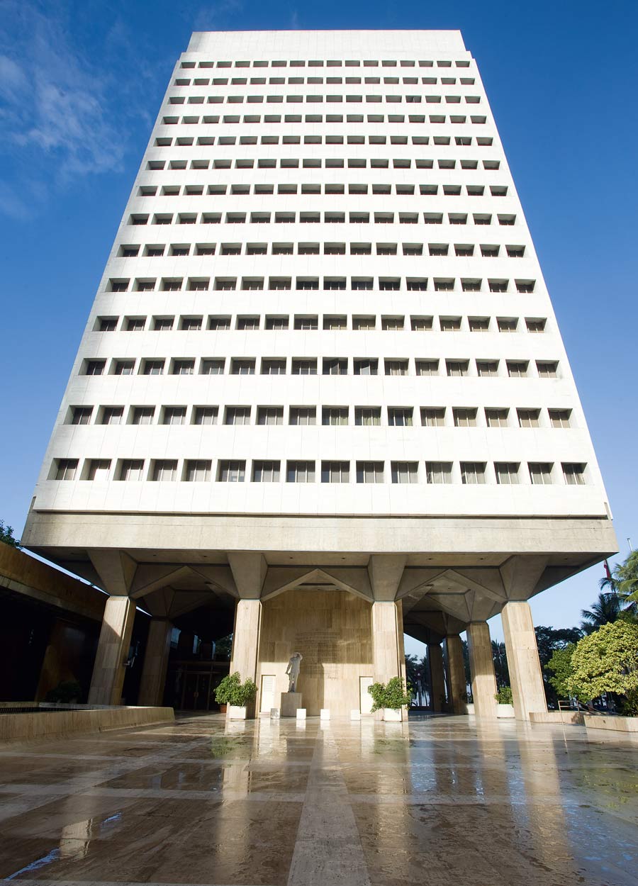
I recalled the RM Center as a tall figure standing alone, with only the meter-high seawall across the boulevard. Today, it is hemmed in on three sides by taller buildings and more dense developments. The excellence of craft is just as perfect as it has always been though, and entering RM Hall, walking the long corridor of the museum that leads into its library, it seemed that time had stood still.
RM Center is uniquely positioned because of its purpose, as a monument to an individual that planted values for our nation. The monument’s “authors,” Alfredo J. Luz, Pietro Belluschi and Alfred Yee, ensured the equivalence of architectural intent with pragmatic purpose. The RM Center is a paradigm of a past era that should inform today’s information society, creating a distinct discussion relevant to both architecture and experience.
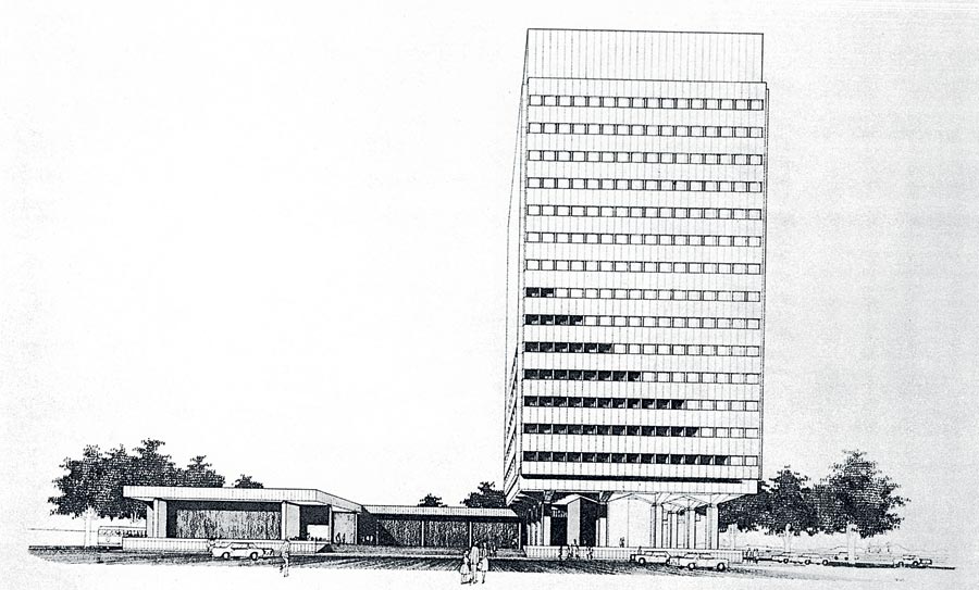
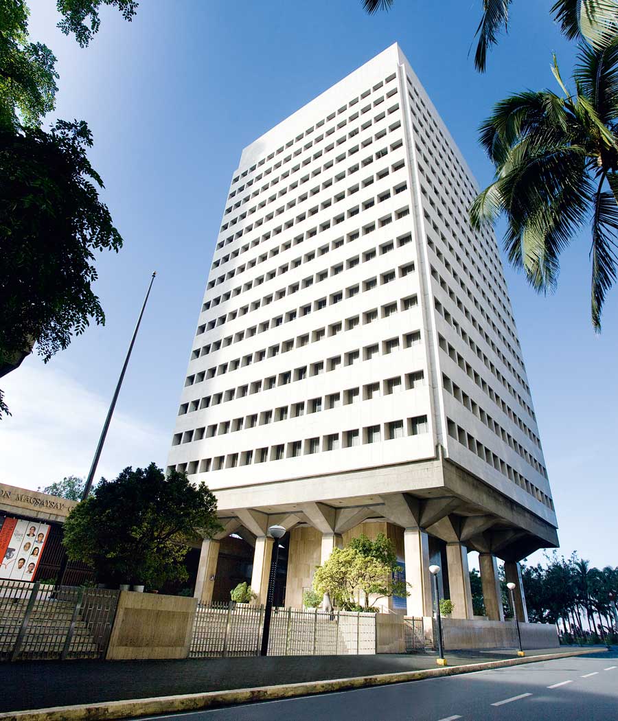
The vertical structure rests on a phalanx of 12 pillars whose tapered brackets enhance in a subtle way both the visual acuity and the form structure of the building. These pillars ensconce the central shear wall core that houses the elevators. They are designed as a moment frame to resist lateral structural loads. They traverse the three-storey high intermediary void that separates the 14-storey high office building from the base plinth below.
The main structural core where the elevators are located shoots all the way up. Between the core and the perimeter, there is nothing but space. Structural columns are distributed evenly between windows along the building’s exterior façade. This structural strategy liberates the building interior to adapt to variable space programming requirements. This has been a good
economic strategy because throughout its 45 years, the building has been able to adjust to changing tenancies with hardly any vacancy. Large tenant organizations like J. Walter Thompson and the United States Agency for International Development, or USAID, have been supplanted by a larger number of smaller offices.
READ MORE: High-Tech Hope for Our Heritage: 3D Scanning by Digiscript
The window recess is almost a meter into the exterior face of the building, shading the face of the window from direct heat gain. The windows are also part of a pre-stressed, pre-cast window wall system that is an exemplar of modularization, integrating with the building as a whole so seamlessly that it aligns with the joints between flooring tiles at the base plinth below. Vertical gridline of window wall merges perfectly with horizontal gridline of flooring, a fact that Ruben Payumo, the project architect for RM Center under Alfredo J. Luz, should be proud of. At the BluPrint roundtable, the other participating architects all congratulated Payumo for his involvement in a building of such exemplary level of detail and craftsmanship.
Another quality that sets the RM Center apart from buildings today is the generosity of its public entrance plaza. Today’s buildings may have the cleverness of mixed-use programming, but many of them lack the civitas, or public citizenship, of RM Center. Today, buildings maximize densities, filling all space, including the interstitial, with function, because of the exigencies of contemporary real estate.
In the past, space used to spread out horizontally. Today, architects have to build vertically. The Dutch architect Rem Koolhaas’ manifesto on Bigness from the mid-1990s, among other well-known critiques of contemporary architecture, underscored the need for program densification and scale manipulation in order to make projects work for both architects and developers. The RM Center marries meticulous craft and building technology with revolutionary ideals and the public consciousness.
The thrust of contemporary building is performative, with Building Information Modeling, or BIM, maximized to perfection. In current practice, computer-aided drafting has superseded hand drawing, which most architects still practiced until a decade before the 21st century. My point, however, is not about the new methods being better or worse than those of the past, considering the quantity and complication of today’s drawing requirements.
My point is that the new methods displace that crucial contact between graphite and paper. Design will always be more receptive to materials that we can feel and experience. This nuance is apparent in RM Center.
The setting of the plinth above the street could easily be seen as a response to the site’s proximity to Manila Bay, but Payumo clarifies that Luz’s intention was to showcase the idea of the plaza as a public amenity, mediating between Roxas Boulevard and the surrounding neighborhood. Ermita and Malate were low-rise residential havens, with quaint neighborhood shops and patisseries on MH del Pilar. On the other hand, the Roxas Boulevard strip was like the shoreline of the French Riviera, its nightclubs glittering nightly.
The RM Center’s plaza was, in one sense, a gift of the Rockefeller Brothers to the neighborhood, while in another sense it was a manifestation of monumentality. The motivation is in both cases humane, but at different scales.
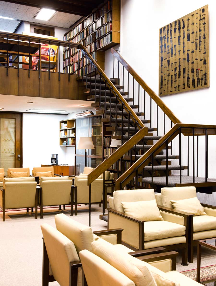
The library is modest in size, with a second floor containing more books. It has a cozy yet stately atmosphere that in my impression is more European than American. The impeccable balance of details here is missing in many new buildings built today.
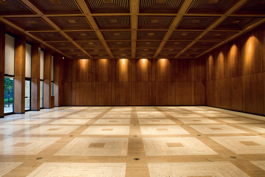
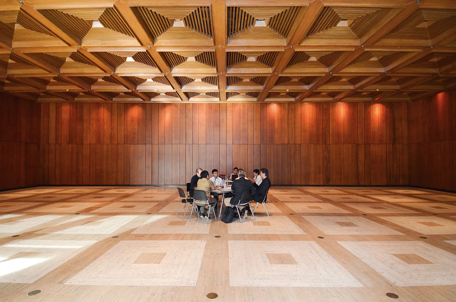
RM Hall, on the other hand, is a magical box, a powerful space with three sides of finely detailed and meticulously selected narra wood paneling, as well as a coffered ceiling in alignment with the flooring pattern below. Here is the stupendousness of history, a monumental aura that leads to exhilaration. Here is History. Here is Time.
Is the RM Center an architectural or an engineering feat?
The Sixties were an era of rupture and awakening: man landing on the moon, the Vietnam War, the Anti-War Movement, psychedelic drugs, Twiggy. The upheavals of a new generation sent shock waves into aspects of lifestyle, including architecture.
The RM Center, despite the formality of its structure, assimilated the prevailing psyche of its times, that of moving out of the box. Via the extraordinary gesture of placing its foyer three meters above street level and the audacity of using it merely as a circulation device, the RM Center eschewed the conventional notion of a showcase building lobby. Instead, circulation occurs in
the negative space between the columns. Ironically, key circulation is hidden inside the solid form of the central core.
Three things stand out in the RM Center: discipline, elegance, and technique. There seems a unique union of ideology common among its creators, anchored in efficient planning, cost of building, and structural integrity. Could it be that the common psyche among them created the necessary synergy? Payumo gamely describes the atmosphere in their studio at that time. Attention to the interconnection of all elements helped Luz ensure that the work was not only good but also ultimately cost-efficient.
READ MORE: The Net Metropolis in BGC champions BERDE, the Philippines’ green building rating system
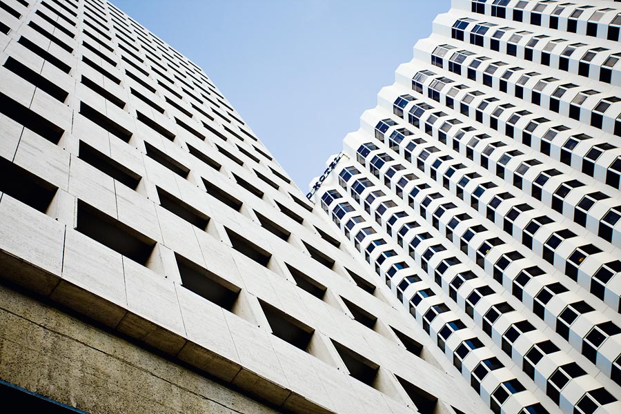
The RM Center’s pre-stressed, pre-cast methodology fuels the continuum of a sustained development in modular building technology all the way to the present. RM Center’s collaboration of ideas echoes architecture today, whereby professionals from divergent fields gather in a meeting of minds in order to create good architecture.
The luxury of seeing this building 45 years after it is built is that it provides an opportunity for an objective critique, expressed in a new vernacular. Hence, how I view RM Center differs from the words of authors that described it in 1967. Semantics are contextual to each given time and to prevailing architectural viewpoints. Fortunately, architecture does not need a museum to contain it and for it to be appreciated. In architecture resides the better line of communication with its viewer, that of experience.
To preserve its perfection, the RM Center needs to remove the eyesore mechanical apparatus installed on its main foyer and above the roof of the library, fronting Roxas Boulevard. To me, they tend to decrease the merit of the rooftop mechanical plant room that for many years synergized with the overall plan of the building.
New requirements and technical developments must adhere to the discipline that was present at its creation in 1967. Conversely, as the building reaches its half-century mark, functions and equipment that have lost their usefulness can be eased out, without detracting from the building’s overall design integrity.
Architecture outlives the architect. In the eyes of many, architecture conveys its presence via its physical imagery, through photographs or as spatial backdrop. It is at the more poignant level of event, experience, celebration that architects will aim to create their architecture, leaving impressions that are metaphysical, emotional, sensual, even timeless. The RM Center transcends its own physical presence as a marker in architectural history.
Buildings such as the Ramon Magsaysay Center can become benchmarks for our nation, showing us that we can be good with our hands if only we allow our hearts to live in our craft. ![]()
Original article first appeared in BluPrint Volume 6 2012. Edits were made for Bluprint online.
