Simple Façade, Neat Interiors: San Studio Architecture’s Precast Office Building
There’s always a thin line in designing workspaces. One could be making an output-driven controlled layout, or it could be having open-plan offices that are sometimes too comfortable, which compromises productivity. As with other things, having the right balance is the key. Understanding the end users’ workflow will further give clarity to the design. In addition, the incorporation of sustainable and green design solutions will not only allow a healthier workplace but will also help the environment. These factors were all infused with the architects’ vision on the creation of their very own San Studio Office with an overall feel that is close to home.
The San Headquarters
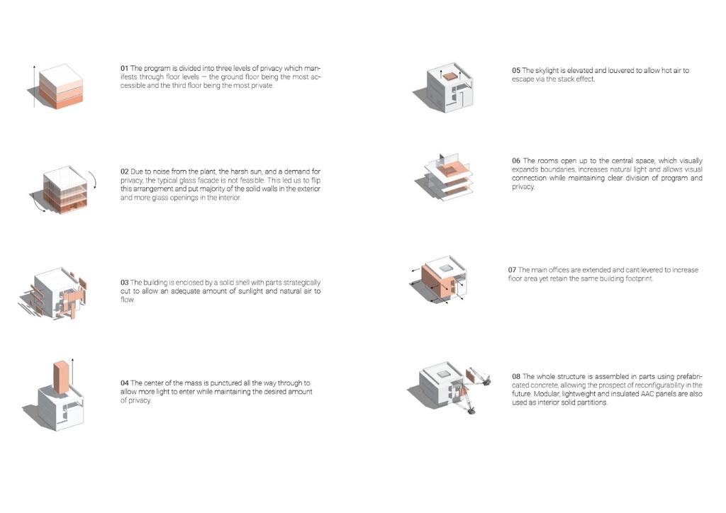
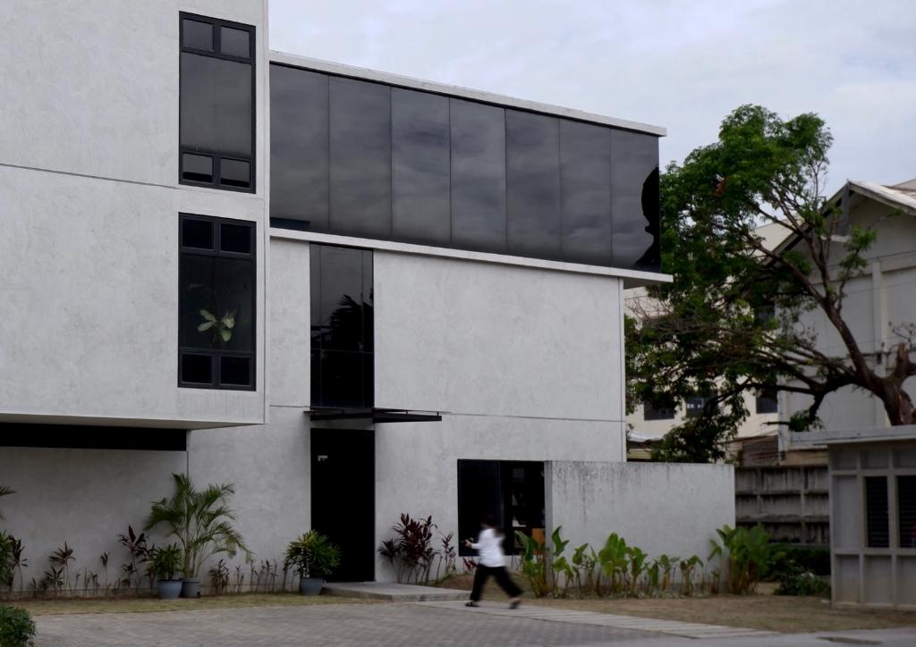
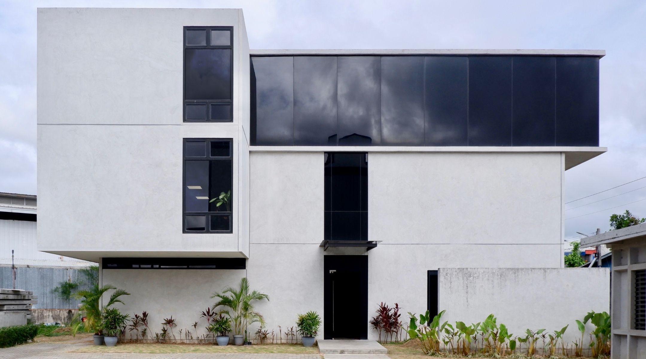
Completed in 2019, the 3-story precast office building is situated on a 300 square meter lot in Mandaue City, Cebu. Designed by the young architects from San Studio Architecture, who is also Cebu-based, the structure offers a gross built area of 717 square meters. The large area will not only cater San Studio office itself but two more affiliated companies. The design took a lead from the clients’ request for privacy and quiet workspaces yet also allows free flow of air and invites openness inside the building. Evident are San Studio’s three main design philosophies – purposeful design, meaningful spaces, and thoughtful construction. These philosophies gave way to the four main concepts where the whole project evolved.
The Spaces
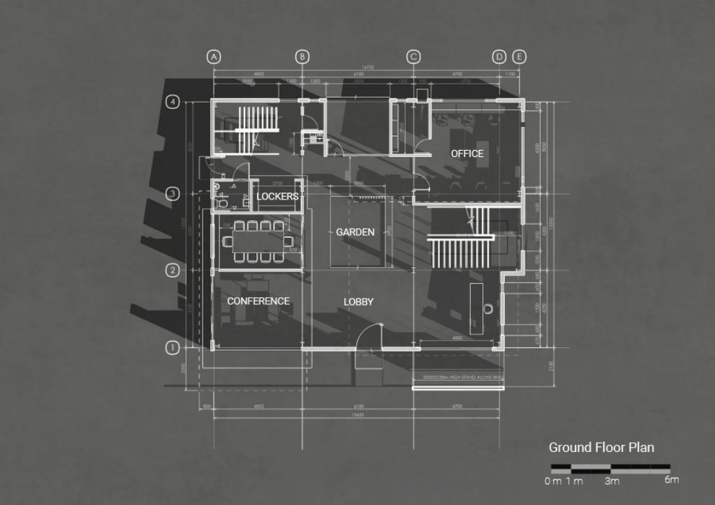
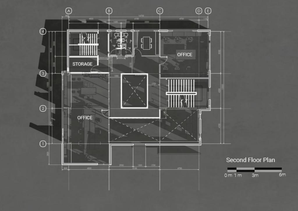
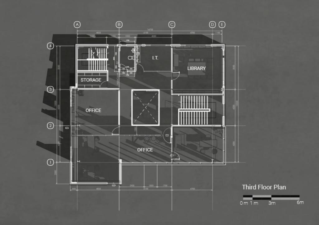
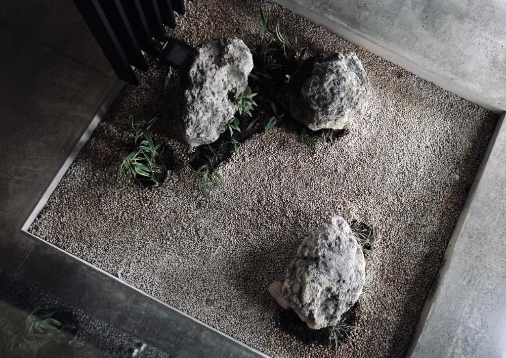
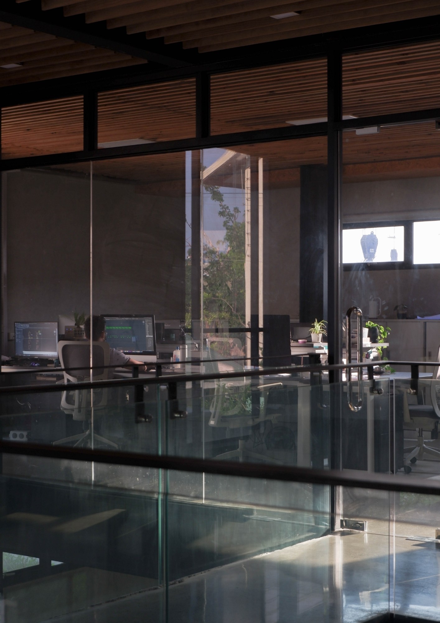
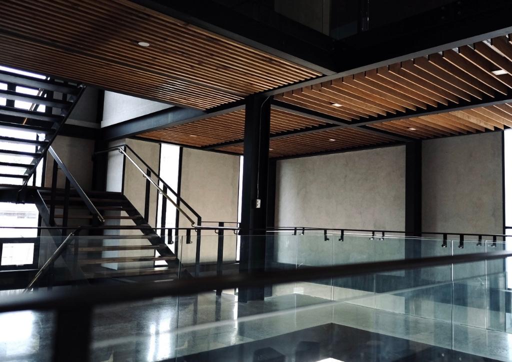
Because the whole building houses three companies, the architects wanted to give each department its own distinct and private spaces. Similarly considered are spaces allowing easier collaboration between the companies. The design achieved this by creating a central atrium openly connected to the offices. This atrium also serves as a light well for the concrete mass and a small garden was also perfect for it.
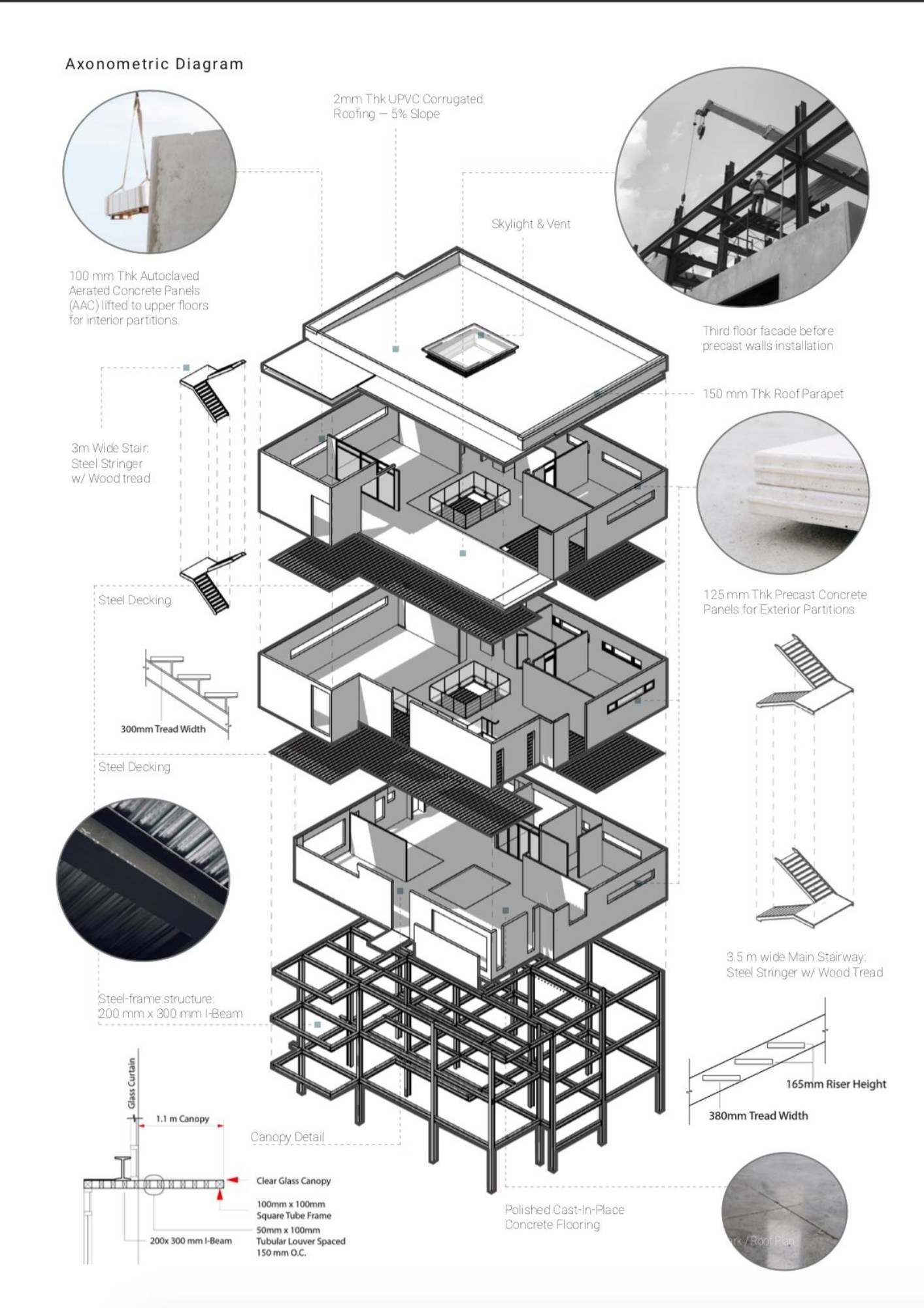
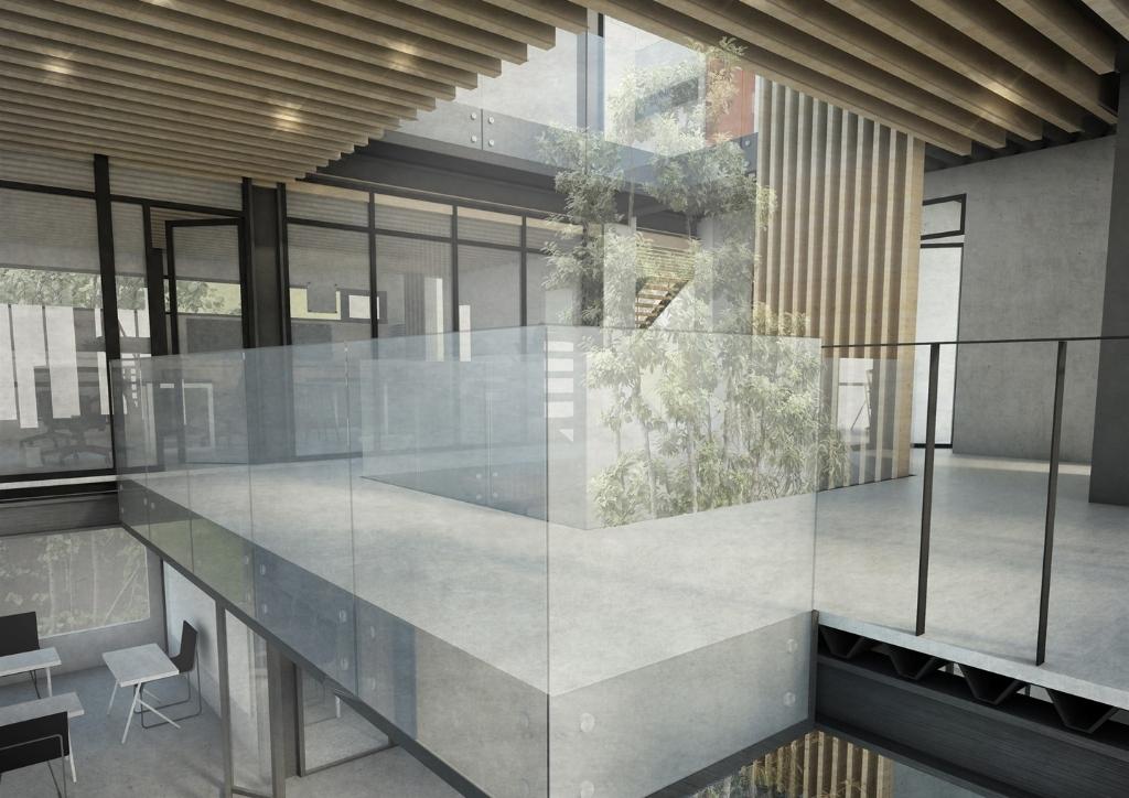
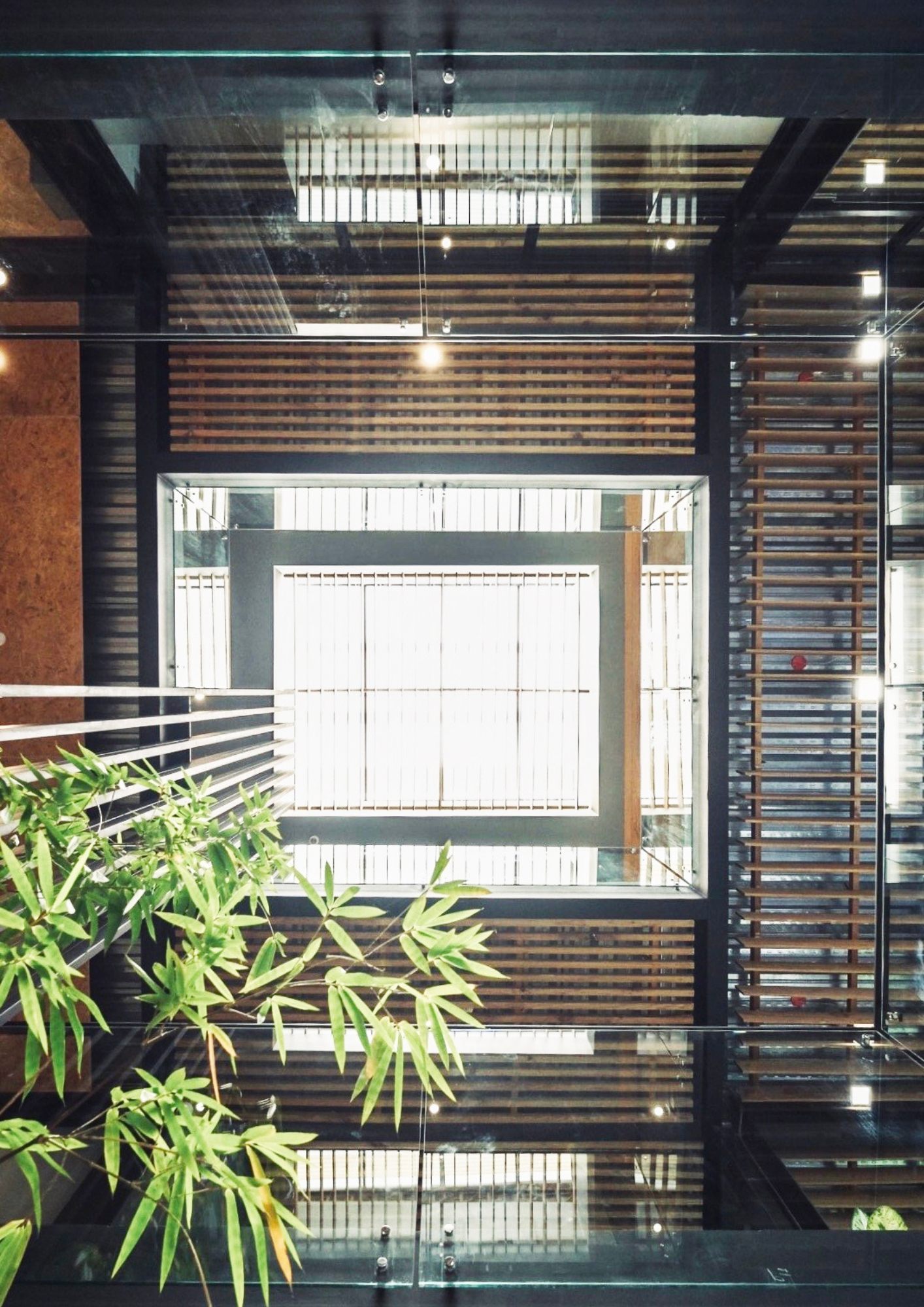
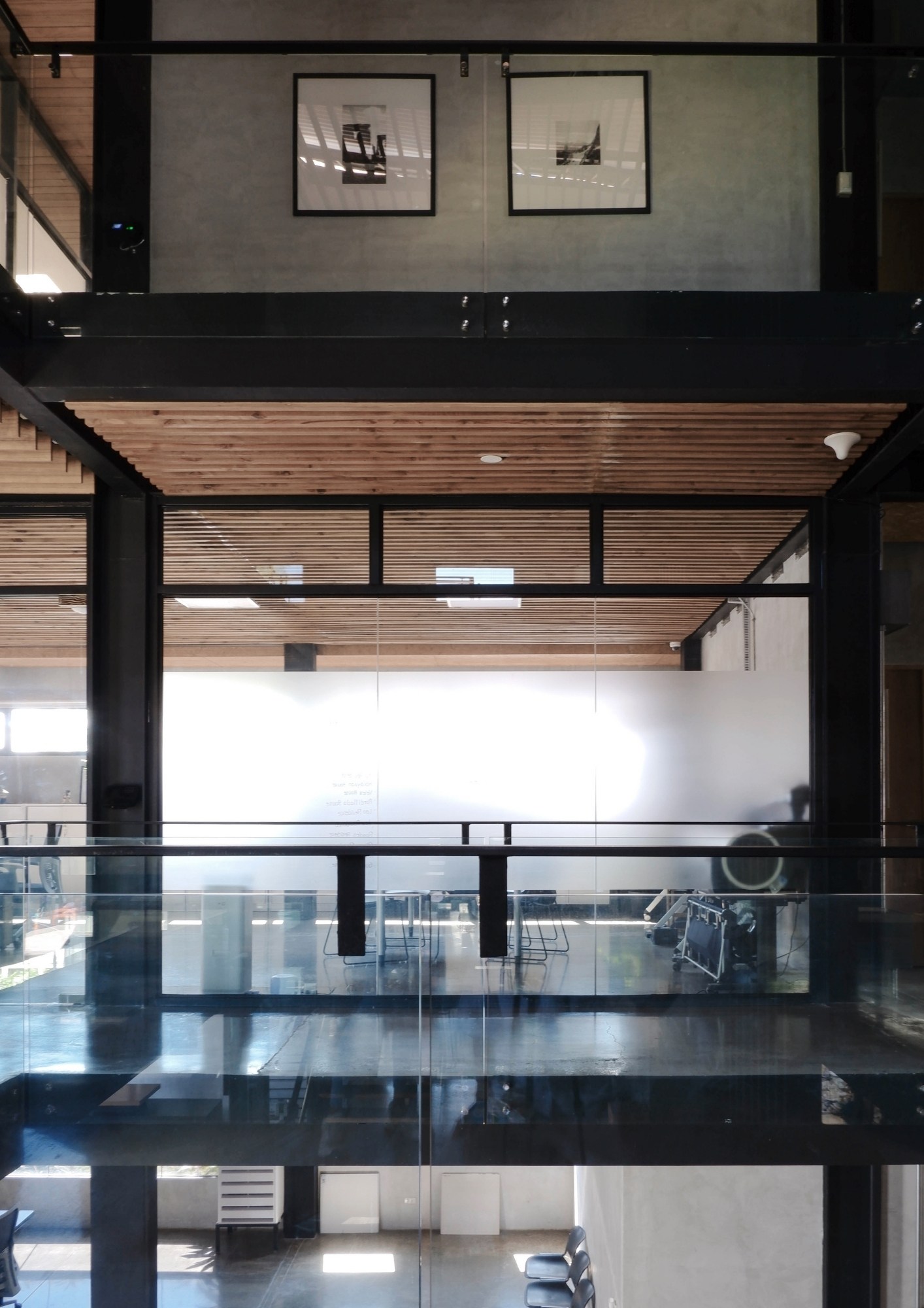
Divided into three levels of privacy and manifested through the different levels was the design program. Found on the ground floor are the lobby and conference room as it is the most accessible. The second floor concentrated on two large office spaces while the third floor, being the most private, is where the library is situated. Cantilevered were the main offices, increasing the floor area without affecting the building footprint. Also integrated was the landscape inside and around the building.
The Experience
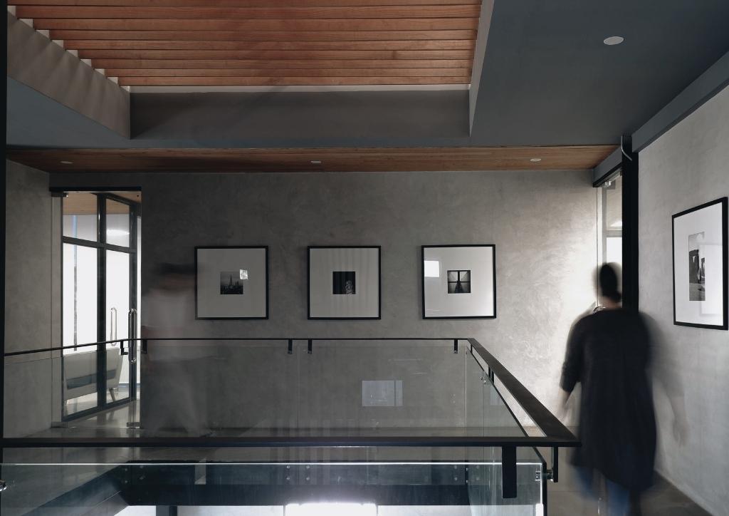
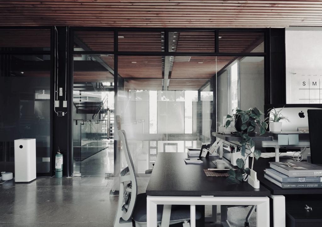
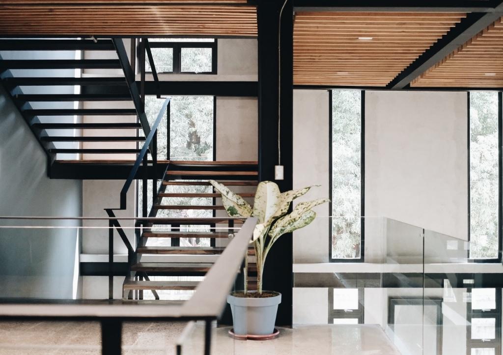
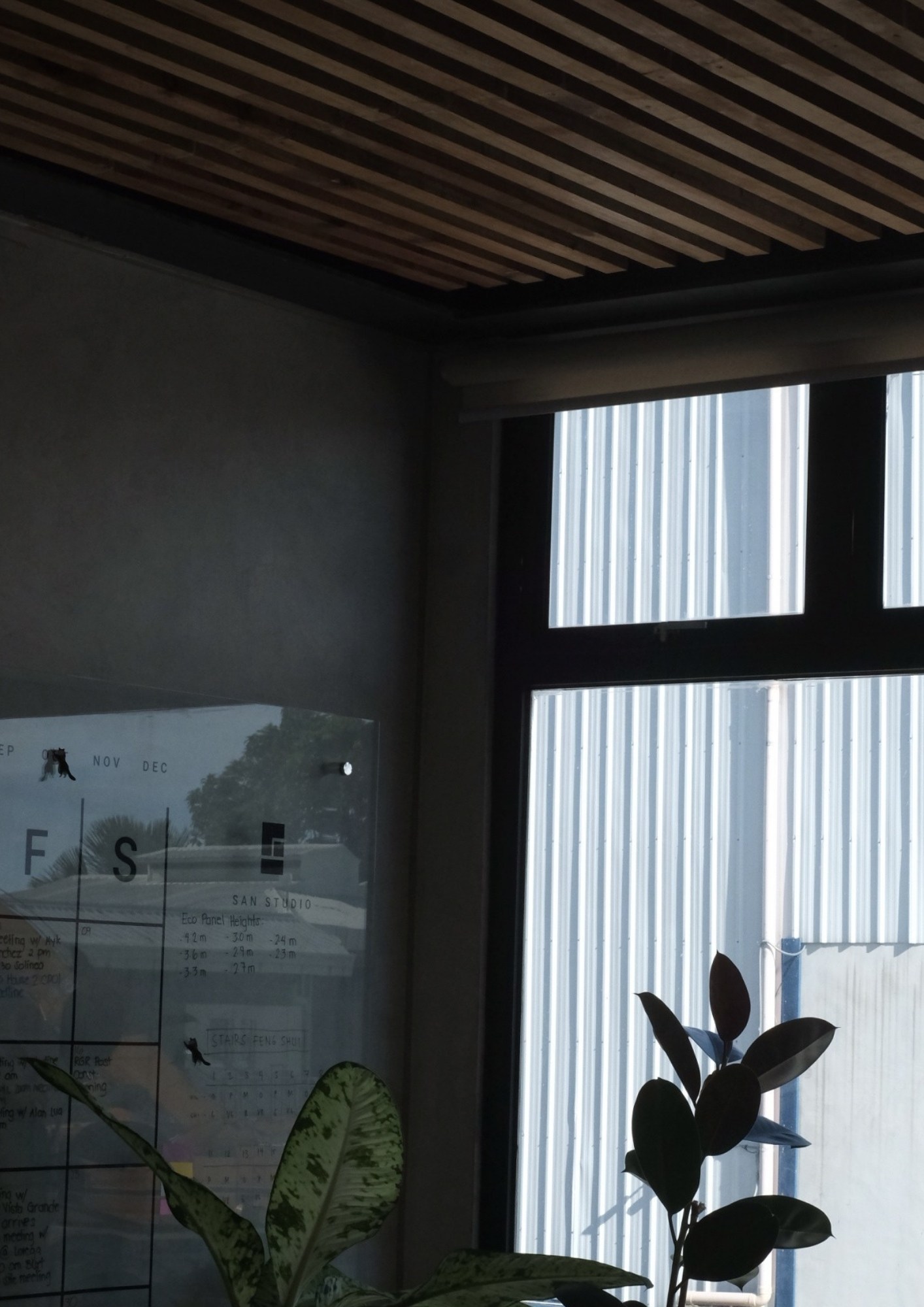
The architects needed to break the stereotypical office atmosphere. Experiencing an inspiring workspace is what they have in mind. The simplicity of the structure brought out the design focus of appreciating the surrounding nature – the changing light and shadows throughout the day and the views framed by openings. The high ceilings and double volumes added character that helps enhance creativity.
We designed this office to be an extension of our homes, a place that inspires productivity but also gives a sense of peace and calmness. The project elevated the appreciation for concrete as a beautiful canvas for light and shadows, the warmth wood brings into the spaces, and pockets of greens balancing visual transparency and privacy.
SAN STUDIO ARCHITECTUREAdvertisement
Materiality
One of the design foci is to bring out material authenticity. The architects valued the beauty of subtle weathering of materials as time passes by. According to the architects, “This reminds us of Juhani Pallasmaa’s fascination on natural materials in his book, The Eyes of the Skin – Architecture and Senses, which ‘express their age, as well as the story of their origins and history of human use, all existing in the continuum of time.”
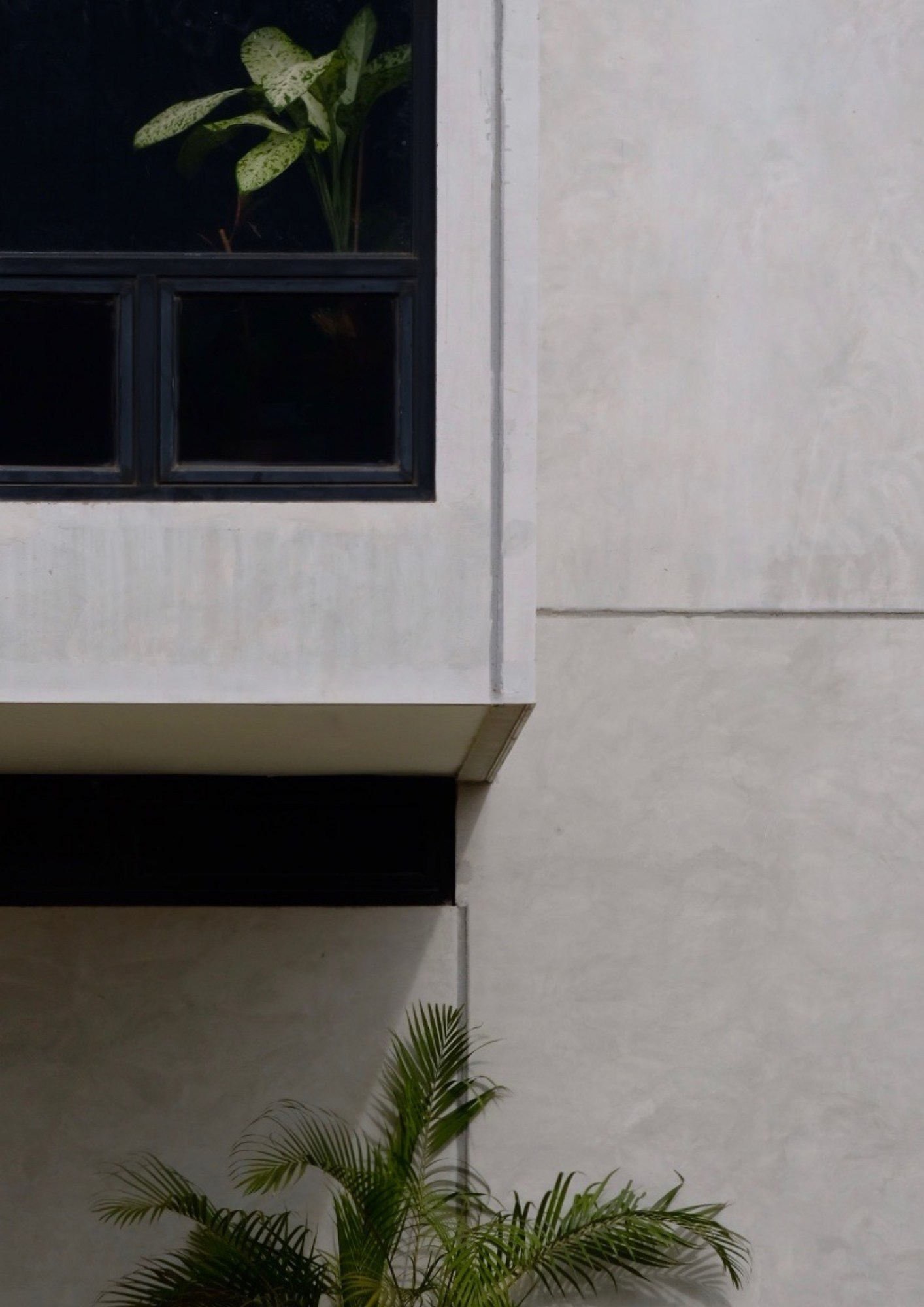
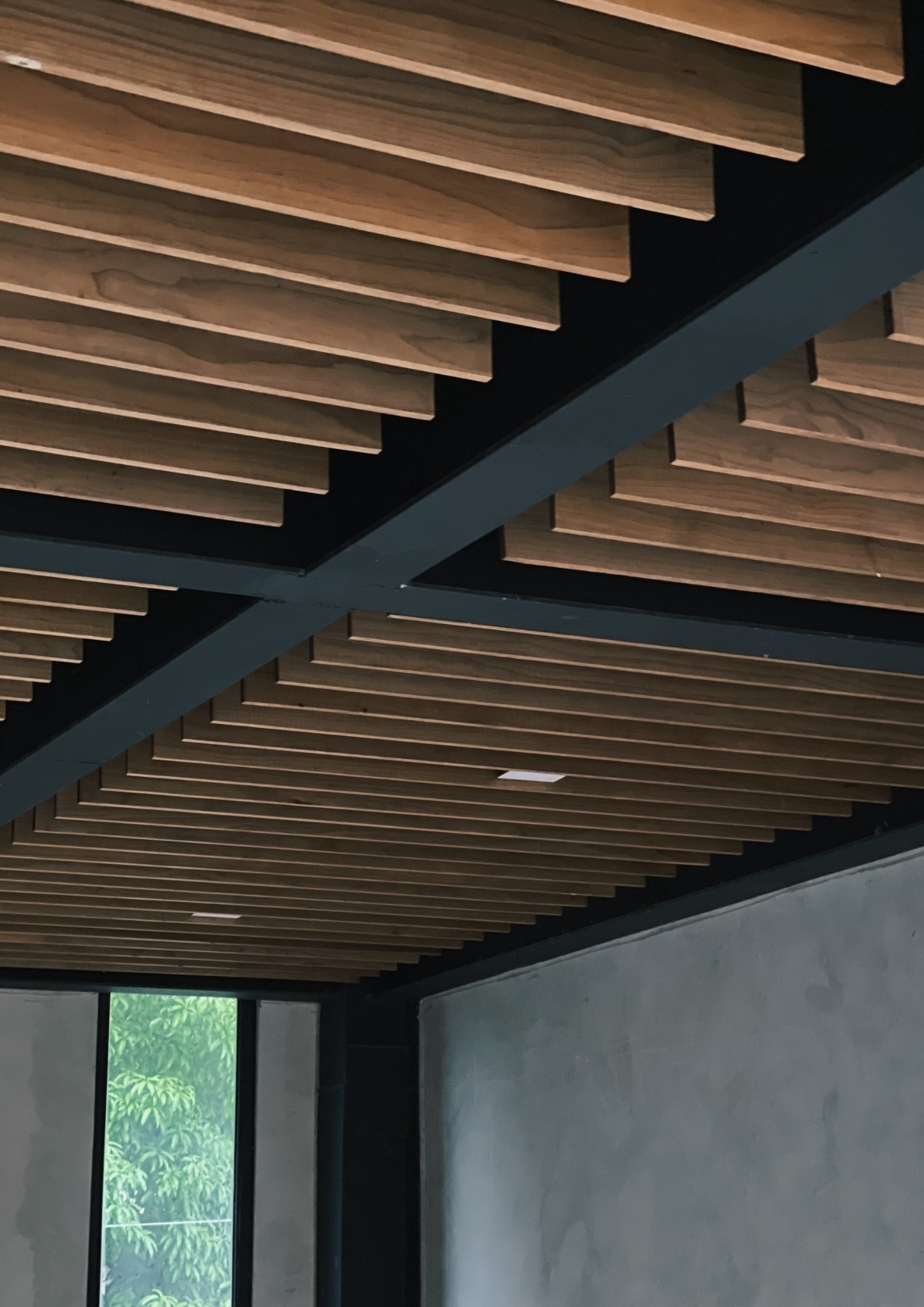
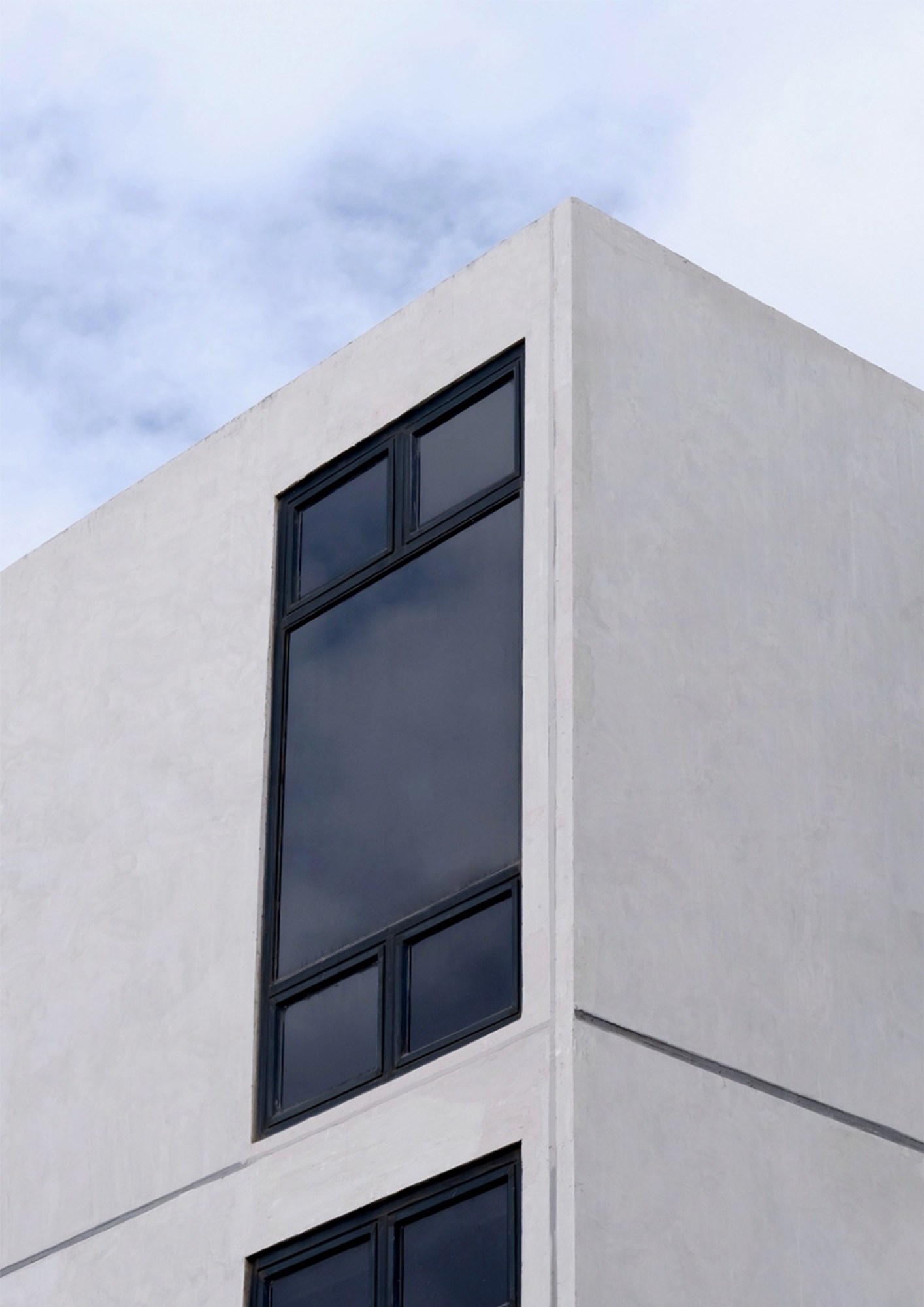
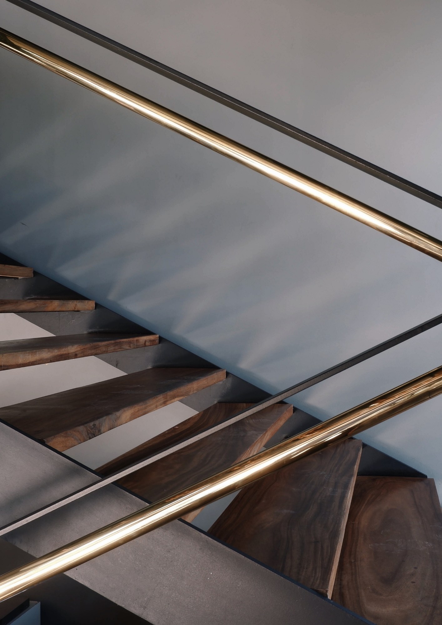
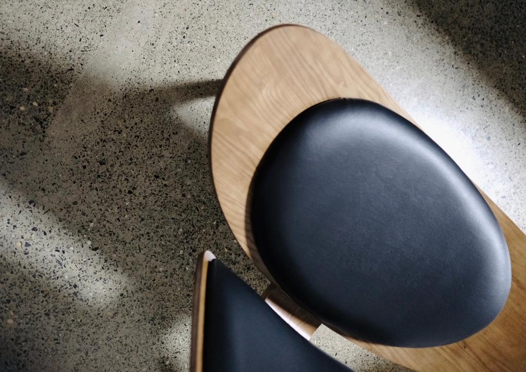
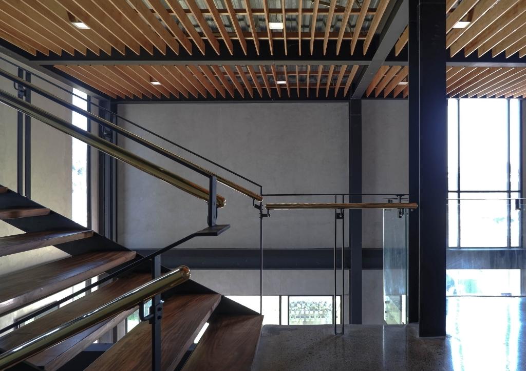
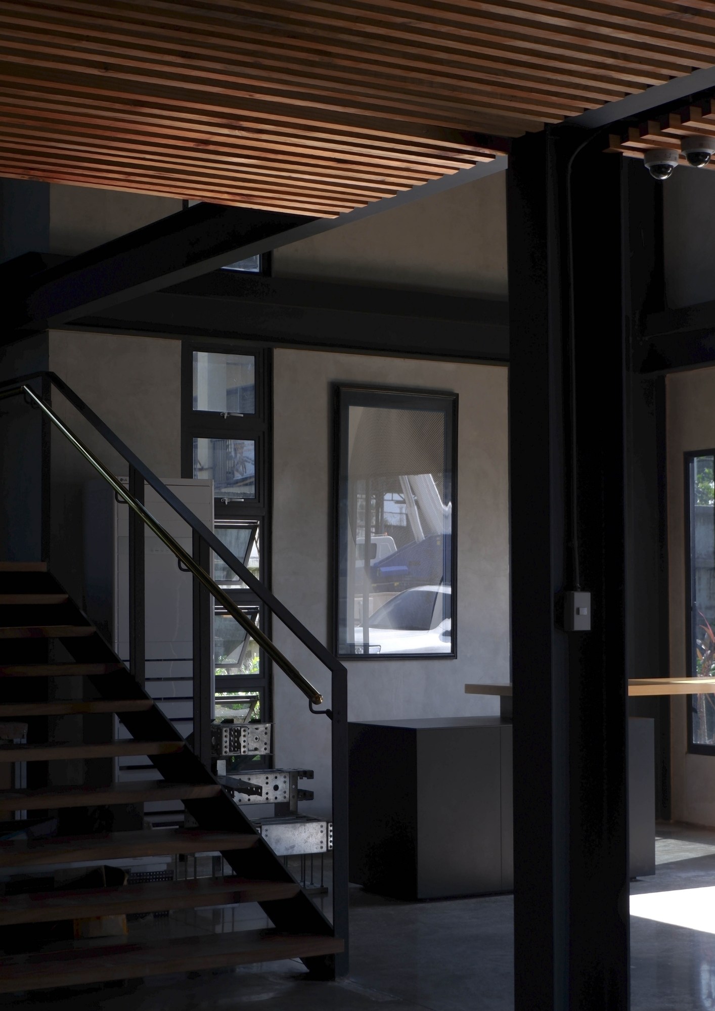
The flooring is simply polished concrete which gives a nice terrazzo-like effect. The walls are of precast concrete. Fabricated in a controlled environment, quality after casting is already good so there is no finishing needed. The warmth of wood elements complemented the steel structure and glass partitions. The ceiling wood slats also added a sense of unity and connectivity.
Sustainability
Assembled in parts using prefabricated concrete was the whole structure. As connected modular components, this allows for easy reconfigurability for future expansions. Also used are lightweight and insulated AAC panels for interior partitions. There has been minimal construction waste due to the prefabrication of most materials. “The lightwell and vent in the center act as an escape for hot air promoting cross ventilation within the office. The communal areas stay cool and comfortable despite the harsh heat of the sun. And because of the noise from direct surroundings, the harsh sun, and a demand for privacy, the typical glass facade is not possible,” shares the architects.
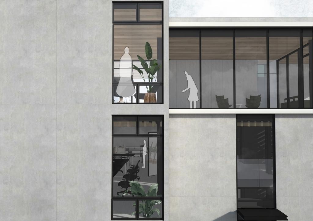
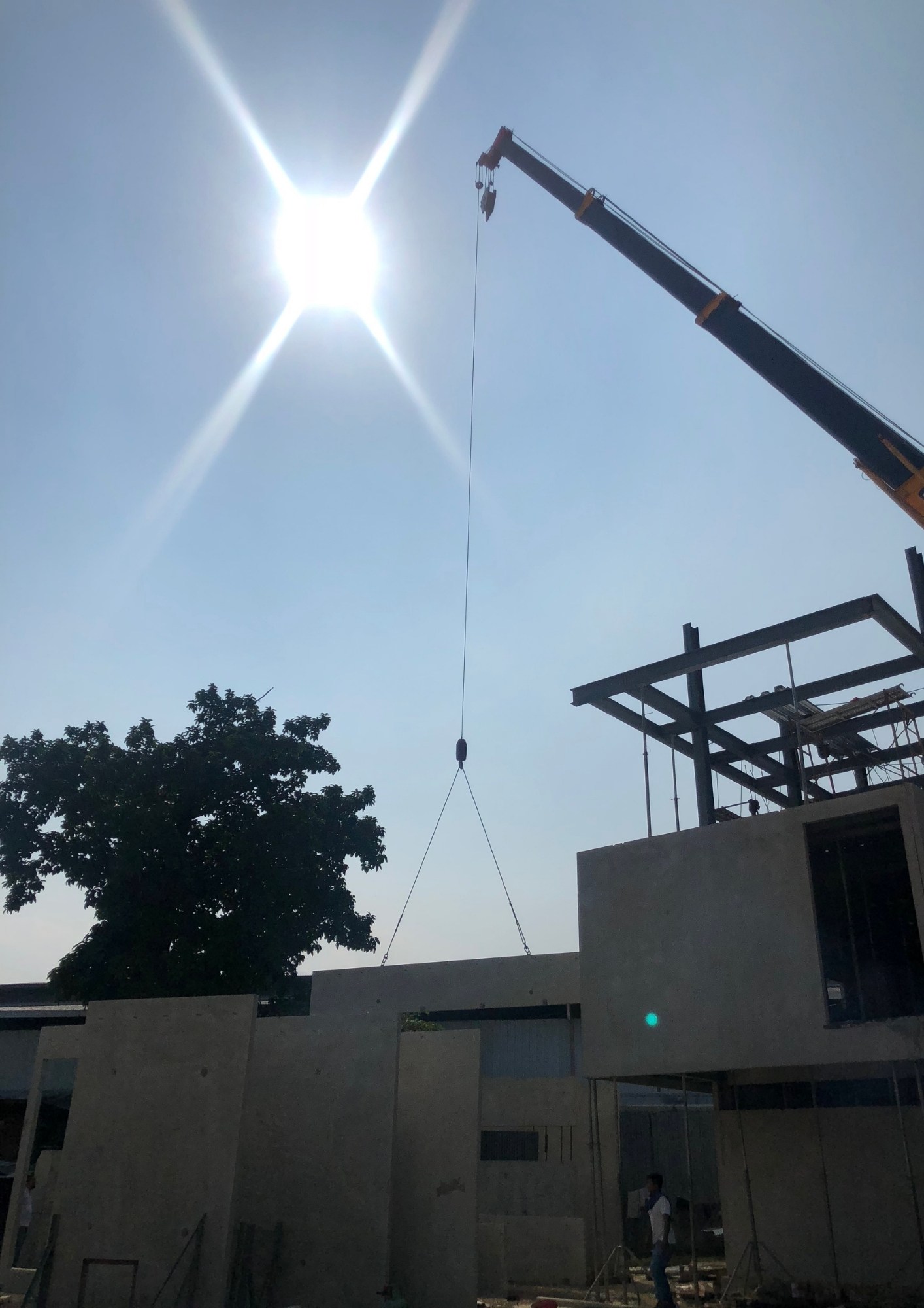
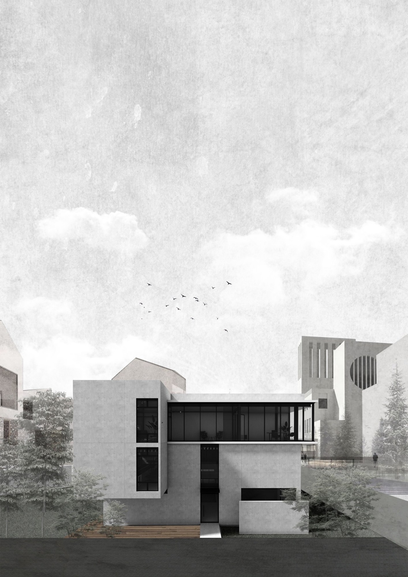
For a closer look at The San Headquarters, please visit San Studio Facebook Page.
Article Credits: Drawings and Images courtesy of San Studio Architecture©
