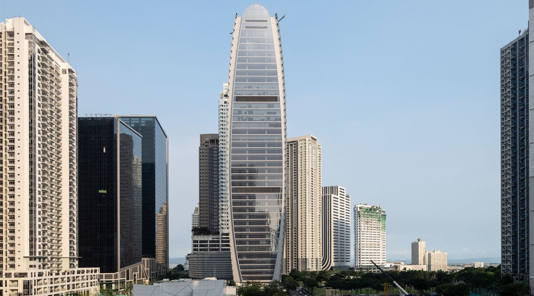
The Finance Centre is a tonic to the rest of BGC’s skyline of glass cuboids
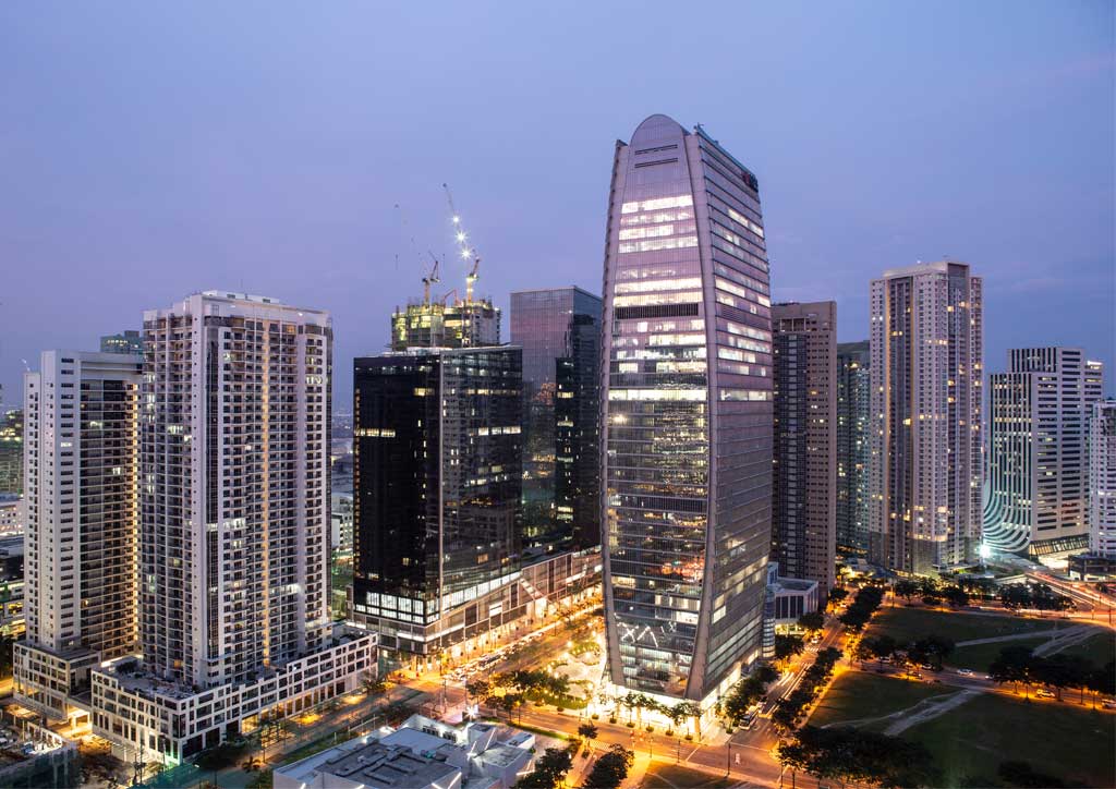
As the installation of the unitized curtain wall panels gradually cloaked the concrete structure if The Finance Centre during its construction, onlookers were witnessing the rise of something they had not seen before. The new 42-story skyscraper, whose profile can be read like a capped pair of parentheses, is a tonic to the rest of Bonifacio Global City’s (BGC) already busy skyline of glass cuboids. However, everyone involved in the project—the developer, Daiichi Properties in collaboration with international firm Gensler and local partner Aidea, Inc.—collectively thought it was the best place to build the edifice. Rey Fuentez, Daiichi vice president of the project management group, said that Daiichi worked with Gensler to develop an iconic design for BGC, one which at first glance may perhaps resemble something similar to the ‘Gherkin’ in London. Even for a highly-developed district like BGC, this was a tall order indeed.
For the third consecutive time in 2018, the World Architecture 100 names Gensler as the number one firm in building design, while Aidea received honors by ranking 47th in the world by the same survey. Given their impressive portfolio and massive achievements in the field of design and architecture, they were tasked by Daiichi Properties to uphold its mantra of becoming what Fuentez declares as “the benchmark for the local real estate sector.” The Finance Centre is the third project that the trio has teamed up for within the business district and, along with their previous developments—One World Place (completed 2015) and One World Plaza (completed 2017)—they have each scooped the Asia Pacific Property Award for Five-Star Best Office Development in the Philippines. The collaboration between the said parties appears to be leaping ever forward and shows no signs of abating—a fourth is already on the way.
Beyond the status quo
Fuentez made it clear that while each project contributes a wealth of transferable knowledge for future projects, the developer is intent on not churning out formulaic office developments. “Since we have standardized the design processes and details from our previous projects, it makes it easier for us to set our expectations higher and incorporate improvements for a new project,” Fuentez explains. As the project nears full completion at the time of writing, The Finance Centre is already shaping up to be the world-class office development the above accolades and pedigree involved are indicative of.
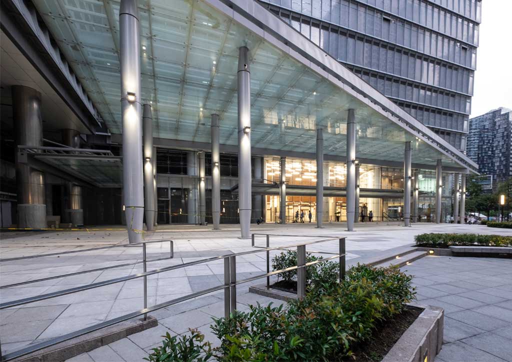
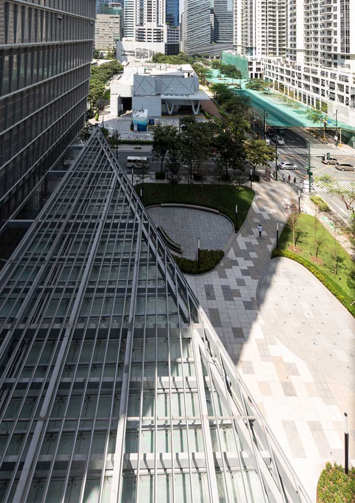
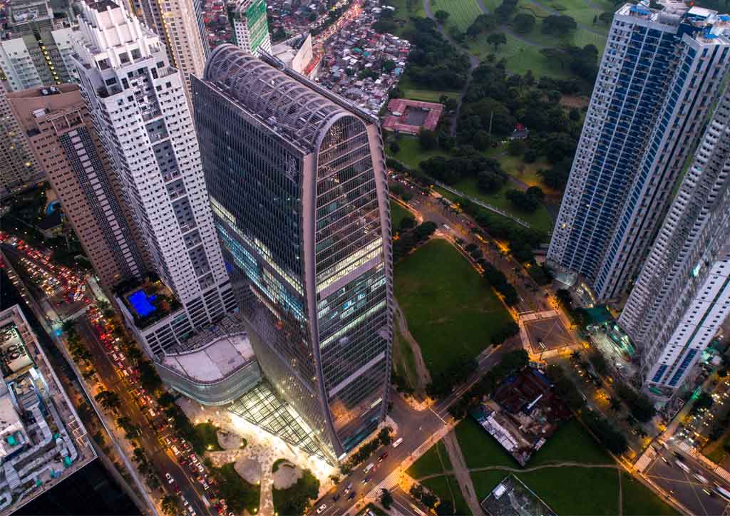
Located on a double wedge-shaped 5123-square-meter lot with two open corners, the developer immediately sa the opportunity to build something bigger and taller. The massing of the building could be made freer of the constraints of building right up against another high-rise (or two, as is typically the case in BGC). The lower eight-story block, which will contain commercial establishments, pinches inward together with the base of the tower to form a generous triangular plaza.
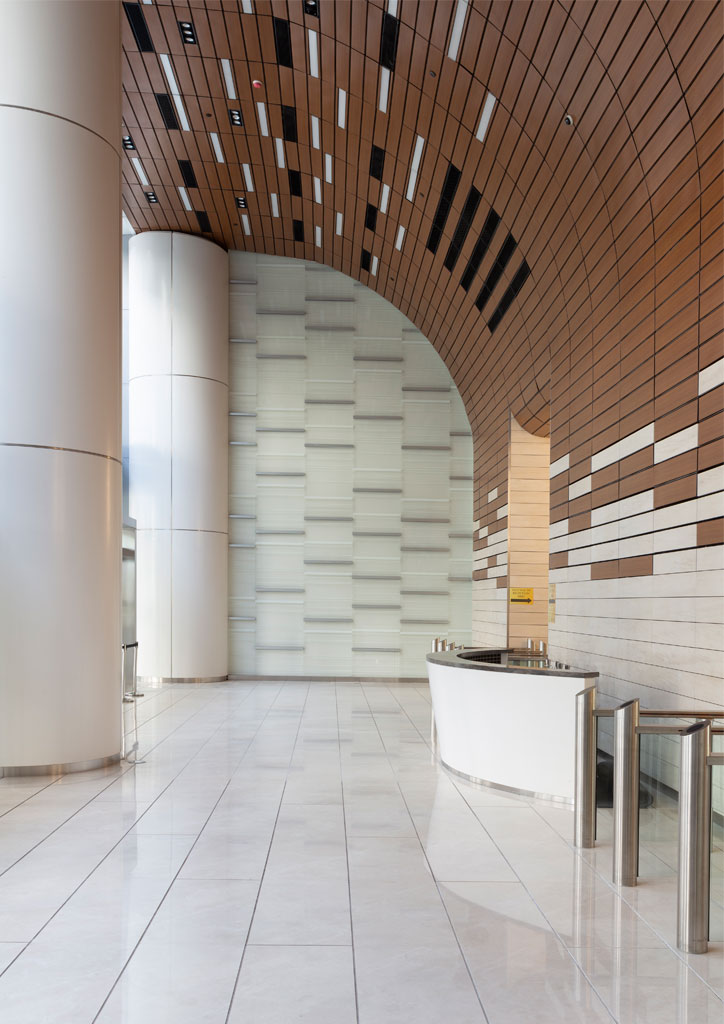
A diagonal stainless steel strip across the plaza demarcates the actual site boundary, while the rest of the public realm beyond this is owned by BGC, totaling an open area of 1700 square meters. The developer was keen, however, to complete the works on both sides to the same specification of hard landscaping to promote the use of openness of the space to all. Aleksandar Sasha Zeljic, principal and design director at Gensler, expresses his delight at the engagement the plaza creates as a result: “We wanted to make sure the plaza is an extension of the larger network of green spaces in BGC and supports the community, not just tenants in the building.” One can logically trace a similar gesture made at the front of the World Plaza, albeit at a larger scale here.
READ MORE: Menarco Tower leads the way with wellness-oriented design
Furthermore, the roof deck on the 8th floor gives the occupants of the building an additional amenity and is a great vantage point from which to appreciate the views across BGC. Both the building and the locale benefit from these shrewd moves which help the building to breathe, even in spite of future development on adjacent sites. The restraint of not building to the edge of the lot was not one of preference but determined by a given maximum floor area ratio of the lot to establish the gross floor area (GFA) of approximately 61,000 square meters to be built. The advantage of the double lot meant that the project team could exercise freedom in how they could design the rest of the urban space once the quota was met—a luxury that other developers do not usually have in BGC. The calculations to achieve maximum efficiency and meeting the requirement for leasable floor space gave the architects the testbed from which they could strive for a more iconic form. Meeting the GFA was never in question; the savings made from the efficiencies could, then, be better spent on high-quality architectural finishes and the quality of the space itself.
Working up the standards
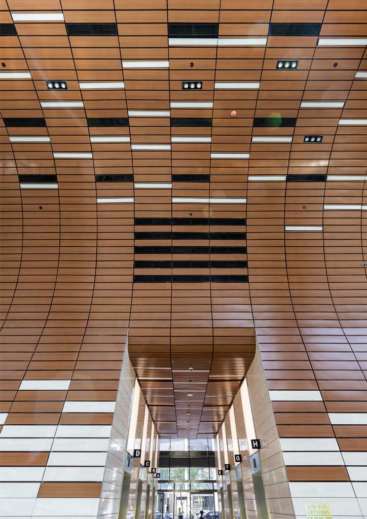
Daiichi Properties believe that one of the keys to any company’s success is talent retention, and to provide the best office environment for tenants to do so forms the underlying design principle for all of the company’s projects. With The Finance Centre, its clients commonly requested an ample floor-to-ceiling height of about 2.8 meters and as is the trend today with millennial-type office spaces, exposed ceilings baring all utilities. A destination dispatch system for elevators, which groups passengers heading to the same level in the same elevator, was also a high priority for tenants to reduce waiting and travel times.
Back-of-house needs included the provision of backup power in the event of power loss. The use of a variable refrigerant flow system for air conditioning also offers the occupants the flexibility of switching the air conditioning on or off as required, without having to rely on a centralized control system.
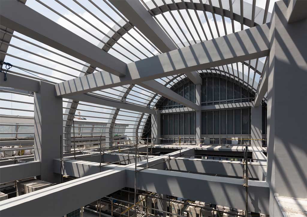
Although we were not able to visit a typical office space of a current tenant, one could already get a sense of space at the upper levels, in which the ceiling height was much higher to compensate for the tighter floor plate. The variety of office space gives The Finance Centre an appeal to prospective companies that an identical floor plate throughout simply would not have.
The architects and developer revealed that the final outcome of the building came after a rigorous design process in which three different forms were developed. The first two options were towers of a more conventional nature, blocky, and not too dissimilar to its BGC counterparts. The options were modeled in Rhino with Grasshopper, which allowed the architects to make inputs with a generative algorithm plug-in called Galapagos, and hence “iterate and refine an almost infinite number of form variations,” elucidates Zeljic. Due to the restriction of the GFA, the first two options were shorter in height and fewer in levels, while the elliptical form of the third option, having smaller floor plates toward the base and the apex, meant that the building could be much taller.
So much so, with the GFA of the office space already being met by the chosen form, the developer and architects could insert two mechanical floors at levels 19 and 35, in addition to the ones o level 8, which is above the car parking, and the roof deck.
In parallel to generative form-making, Aidea used a Revit BIM (Building Information Modelling) model to coordinate inputs from all the project’s partners and consultants. The base model was then used as a platform to feed other types of analytic parameters and visual-related outputs—Autodesk Vasari, Ecotect, and Integrated Environmental Analysis—was used for energy analysis, while a combination of 3D Studio Max, V-Ray, and Octane was used for visualization.
READ MORE: Alex Medalla ditches CAD and BIM in designing an apartment annex
The collaboration between Gensler and Aidea on multiple projects was symbiotic in terms of what each party could bring to the table. Gensler holds the Revit BIM process in high regard and Aidea was keen to learn from the standards, despite the latter having already used BIM for six years when they first partnered on One World Place in 2011. On the other hand, Gensler was pleasantly surprised to learn the fastidiousness to which Aidea would resolve all aspects of a design by drawing every item to the last detail. Rhys Carlo Abon, project architect at Aidea, spoke admirably about Zeljic’s care of duty on the project well beyond Gensler’s remit had finished.
Zeljic would call Abon in the middle of the night to flag up a detail built differently to what had been specified, spotted on an image of the building found on the internet, and urge for the project team to rectify it in order to keep the overall vision intact. It is this work ethic and passion that Fuentz feels obliged to reciprocate and make sure that both the architects, as well as the tenants, are happy with the end product.
Already pre-certified LEED Gold, the building has been designed with attracting multinational companies in mind, who seek for this global certification as a minimum when looking to set up an office. But rather than just utilizing the aforementioned simulation programs to achieve the baseline, Gensler proposed that the building could better mitigate the tropical solar gain and monsoon rains by installing a unitized ‘shingle’ curtain wall panel. “We used a highly reflective double glazed panel with low emissivity coating, which helps keep the heat out and reduces the glare while allowing the entry of daylight,” describes Zeljic. Similar to the way a traditional shingle tile roof works, the overlapping panels minimize the problem of water entering at any joint while the triangular vertical fins provide shading across the curved façades. The first of its kind in the Philippines, this system appears to be one of the better attempts of a high-rise at handling the tropical climate’s diurnal and seasonal extremes.
READ MORE: Localizing green buildings: Will BERDE take the LEED?
An aligned approach
When asked why Daiichi Properties likes working with Gensler, Fuentez seems to find it tricky to narrow it down to just one thing that sets them apart from other firms. He highlights its work ethic to achieve the highest possible standard as being second to none. Fuentez and Abon agree that all of their viewpoints are aligned and that this forms a strong basis upon which to strive for the best office development they can produce. When a particular detail is not met to the expectations of either the architect or the developer, the other members of the project team are willing to share in the setback and take the necessary steps to rectify a situation. Fuentez elaborates, “Although we’ve had contrasting opinions from time to time, the team is willing and open to come up with a positive and collaborative solution to the design challenges.” With less than a quarter of the leasable office space occupied as of Q4 2018, Fuentez is casting his eyes on 2019 as being a year in which its current and prospective tenants will further reveal the value and qualities of the architectural design. As they would have you believe, the design prowess of the project team is only as good as their last building. Judging by the quality of the building as it readies for the next financial year, there’s more to come from the Finance Centre.![]()
This article was first published in BluPrint Volume 4 2018. Edits were made for BluPrint online.
Photographed by Ed Simon and Owen Raggett


