This tropical minimalist home by Valencia and Go stands out in Iloilo
After two years of being lived in, there isn’t a nook or cranny in the L family’s home that betrays an oversight or afterthought by either architect or interior designer. That is quite simply extraordinary. The house stands out from its neighbors for its strong, sensible lines. It has little of the superfluities many homes in middle-class and upscale subdivisions in Iloilo City—or for that matter, the rest of the country—indulge in, thanks to Mr. and Mrs. L’s daughter, a type-A personality who took over from her parents and told architect Paolo Valencia and interior designer Isabella Robles Go what she wanted.
“A modern, tropical, minimalist house in white,” Robles Go recounts. Sounds cliché, but where ostensibly modern silhouettes are too often blurred by copycat embellishment, and a locale where salmon pink, sunflower yellow, and California orange abodes abound, Valencia and Robles were happy to oblige.
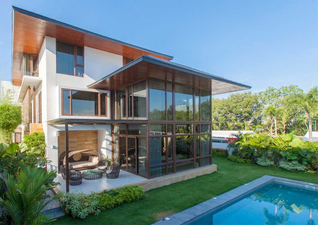
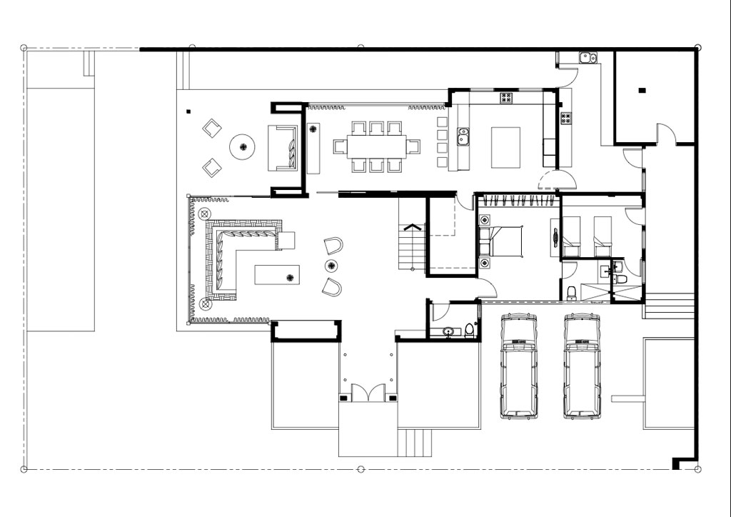
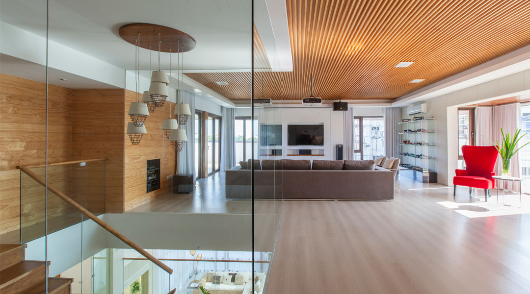
Valencia, who worked for Bong Recio in Manila before setting up practice in his home province, produces designs recognizable for their levelheaded handling of volumes. Typically, there is one standout space amongst the boxy extensions. In Mrs. L’s house, it is the double-height living room, which stays cool despite the glazing on three sides because it faces north, is sheltered by deep eaves, and is protected against the harsh afternoon sun by a thick bank of tall trees to the west. Indoors, gauzy white curtains bathe the living area in a cloud of softness, gently filtering outside views and making the inside space feel safe, fresh and clean.
READ MORE: Tropical Mid-Century Ranch: House Number 17
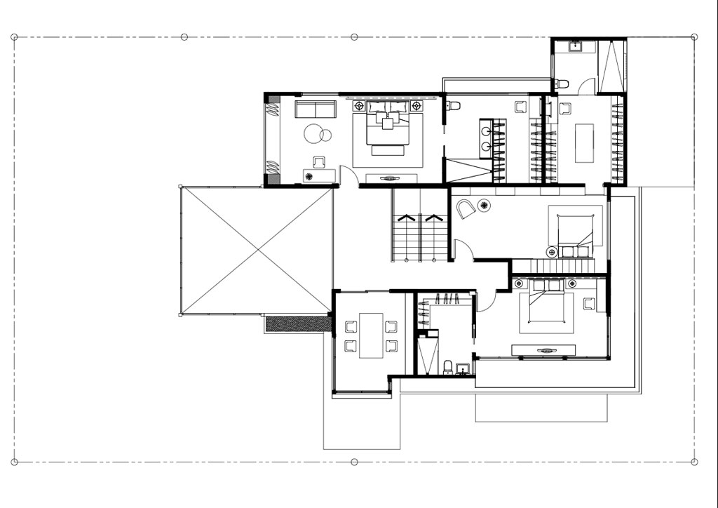
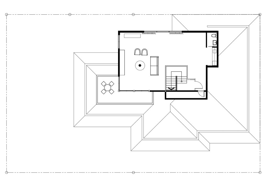
Valencia’s play with volumes comes not from gimmickry but honesty, and serves to give each space inside its own unique feel. Each volume on the façade corresponds to a distinct space inside. By having some spaces advance and others recede, Mrs. L’s office on the second floor, for example, enjoys sightlines it otherwise wouldn’t have. A bay window on the third floor bumps outward to cup a conversation nook inside, while bedrooms on the street side retreat, literally withdrawing from the outside world and hiding from view, yet still able to see out over balconies and through brise soleil.
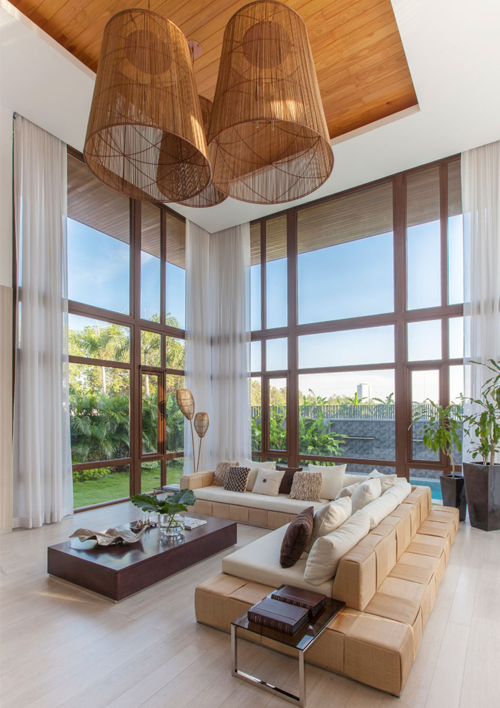
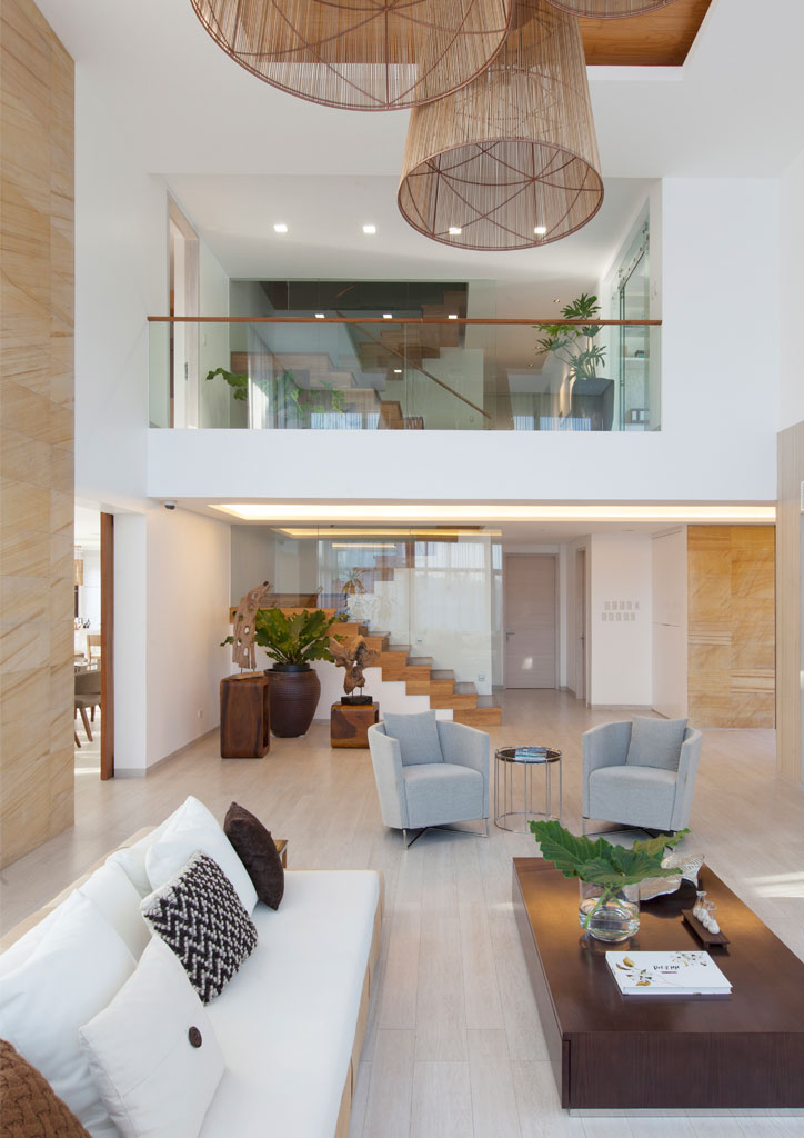
Robles Go is a fan of Valencia’s play with volumes and how he considers the relationship of interior spaces to the outdoors. The two often collaborate on projects, both meeting with clients from the get-go. “He covers the exterior design and most of the space planning. I design and specify everything inside the house—floors, walls, ceiling treatments, lighting, and all the furnishings. I appreciate how he considers my input. For example, he always asks whether the location and size of the bathroom that comes with the bedroom is acceptable to me. Sometimes, I ask for windows to be larger (I like big bedroom windows) and he’s willing to adjust so they still fit the architecture.”
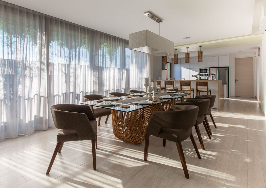
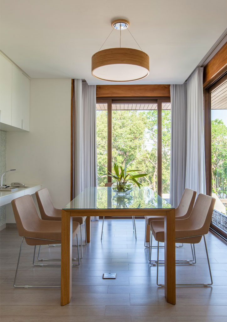
Mrs. L’s favorite space in the house is the dining room and kitchen, another space suffused with soft light. Facing east, the room is cheery and refreshing at breakfast, the slender and airy silhouettes of the pole bamboo outside casting long and feathery shadows along the filmy drapes and across the light wood floor. At night, with curtains drawn to a starry sky, the room with its pale surfaces is cool and elegant.
Although Mrs. L says she and her husband went with whatever their daughter wanted, the couple gave substantial input to the designers. They gamely acted out their daily routine and how they envisioned living in their new home to help Valencia and Robles Go design spaces that would enable and enhance the lifestyle they wanted. Says Robles Go: “They walked me through how they saw themselves entertaining in the living room as well as in the dining and kitchen. They even role-played how they would communicate from the second floor to the living room, and how they saw themselves working and being able to look out to nice views—thus the home office that was originally a family room.”
READ MORE: Modernism meets Asian resort in Conrad Onglao’s C House
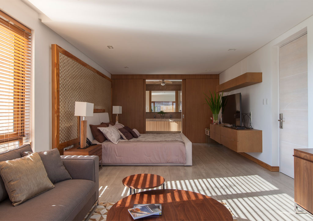
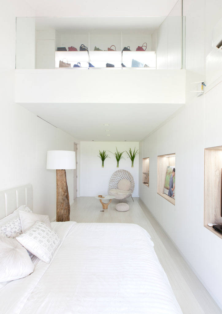
Robles Go says she had the most fun designing the room of the daughter, who adamantly wanted zero clutter, but is in reality a bit of a hoarder. “The challenge was how to keep ALL of her stuff! So Paolo and I did several proposals in terms of space planning, and ended up with a loft to display her bags and shoes; concealed cabinets the entire length of her room; and a secret door to her wardrobe, vanity, toilet, and bath, which contains lots more storage.” The result is a luminously serene space that looks just as pristine as when the house was turned over to the family in 2014.
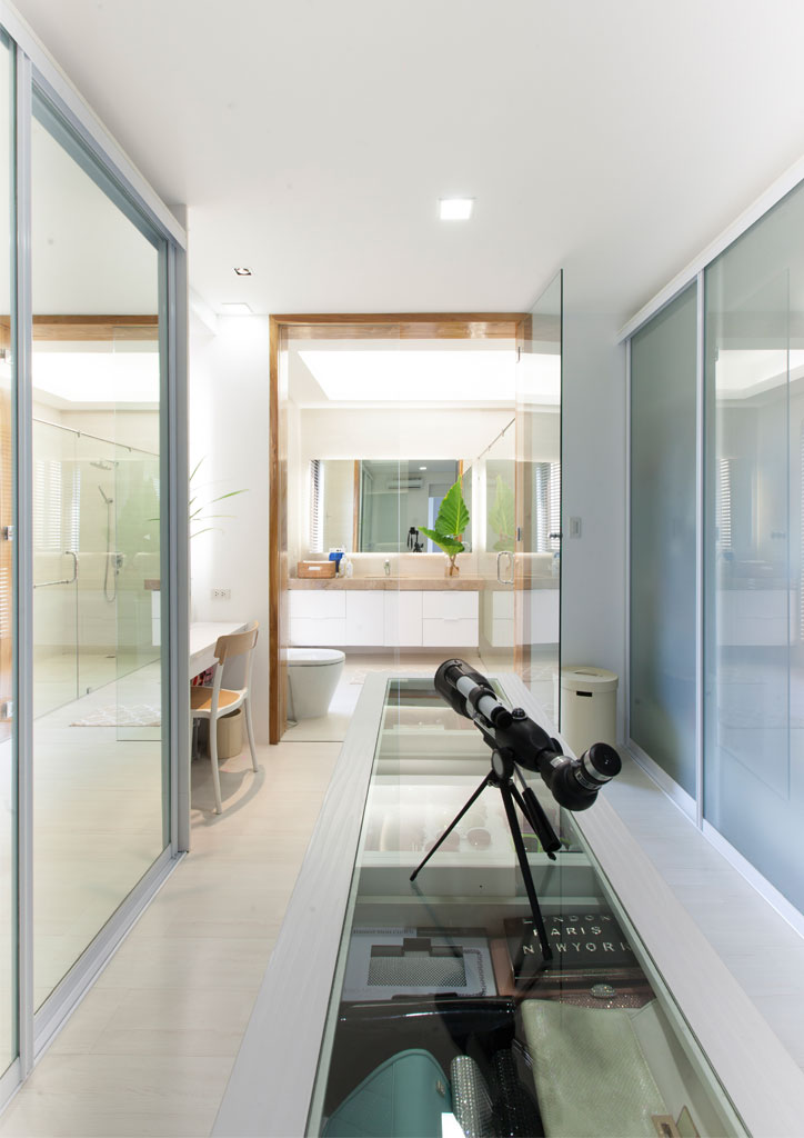
The L family’s home is remarkable for the seamless marriage of architecture and interior design. Everything still works as it should. The hidden closets, cabinets, and miscellaneous storage spaces tucked away in every conceivable corner of the house still have room to spare for more acquisitions. It turns out Mrs. L is more of a hoarder than her daughter, and cannot resist stocking up on groceries, household items, clothes, and seasonal décor whenever they’re on sale.
The revelation makes Valencia’s and Robles Go’ achievement even more remarkable. Both designers have enabled and enhanced their clients’ lifestyle through the strength, functionality and sheer thoughtfulness of the architecture and space planning, down to the easy accessibility of switches and outlets. The attentiveness to their clients’ wishes and weaknesses is both empowering and forgiving, like a soft light that brings out the natural good looks of people better than bright light can, and renders their little imperfections invisible. ![]()
This article first appeared in BluPrint Volume 5 2016. Edits were made for Bluprint.ph.
READ MORE: Minimal Manor: CS Design Consultancy’s Nature-centric Home
