The career trajectory of JJ Acuña reads like a global odyssey—one that stretches from a quiet Texas suburb to the skylines of Hong Kong and, most recently, Manila. Across each locale, he honed an approach he calls “spatial DNA”. It’s a bespoke methodology that weaves client aspirations, cultural context, and intuitive materiality into environments that […]
Colorful Minimalism: Clean, Streamlined Design in Vibrant Colors
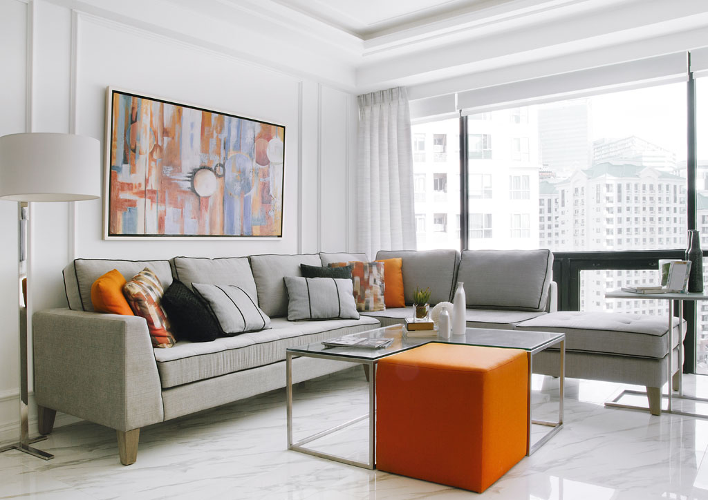
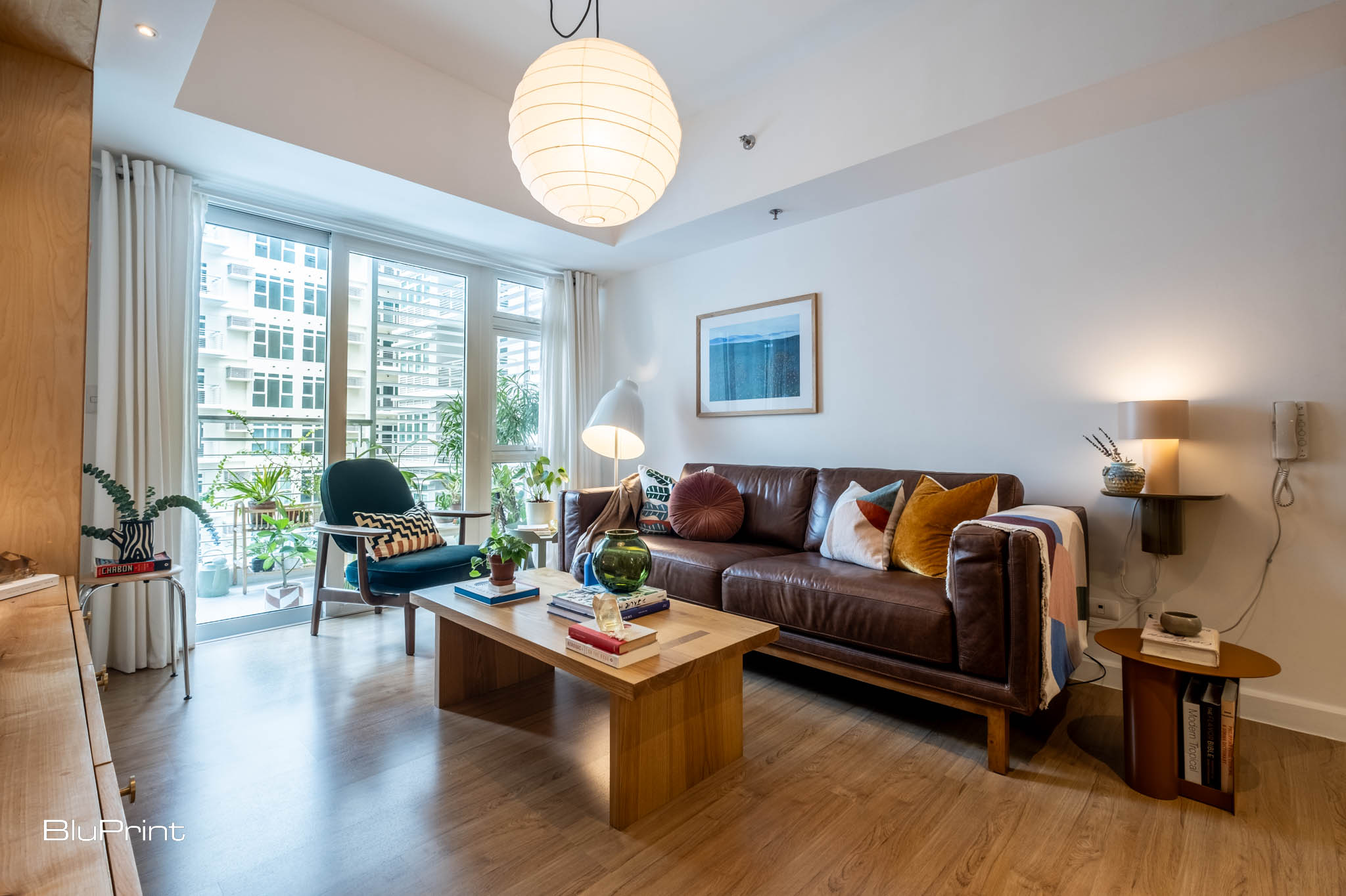
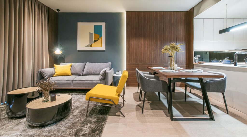
A minimalist interior design often comprises clean lines, natural materials, simple and minimal decor, and a neutral palette. It demonstrates the “less is more” principle by ensuring that every design aspect prioritizes function before aesthetics. That’s why this style can sometimes come out as plain and colorless. Good thing there’s a way to turn this blandness into something more tasteful and visually appealing. Colorful minimalism offers the same serene and uncluttered approach in a space but with vibrant pops of hues.
A More Forgiving Type of Minimalism
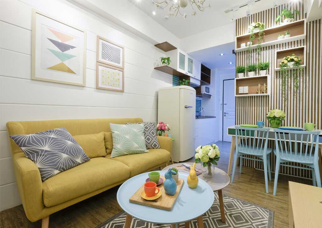
To put it simply, colorful minimalism shares similar attributes with the typical minimalism except for the usual neutral color scheme. Instead, this interior style allows a wider range of bold colors to break the sterility and add character to a space.
Picture a streamlined room with straightforward architectural elements and few understated items, not in subtle monochromatic shades, but in more diverse and vivid tones. This maintains minimalism’s simple, laid-back, and practical qualities while highlighting its capability to create an interesting and distinctive design.
STUDIO KEETA Principal Kristina Khersonsky further describes it as an approach to establish a tranquil ambiance “without compromising on color.” This means that despite the presence of a striking color palette, it doesn’t disrupt nor overpower minimalism’s innate calmness.
You could argue that this is sort of where minimalism receives a hint of maximalism through a burst of color. Additionally, it acts like the complete opposite of neutral maximalism, where neutral tones replace maximalism’s customary intense hues. But more importantly, colorful minimalism is the perfect compromise when you want to achieve a clean and functional space without limiting it to neutral colors.
How to Make Minimalism Colorful
Similar to neutral maximalism, colorful minimalism can appear as merely swapping neutral colors for splashes of bright hues. Although you’re free to choose whatever hue you like, there is more to it in making minimalism colorful.
Ground the Space with a Neutral Backdrop
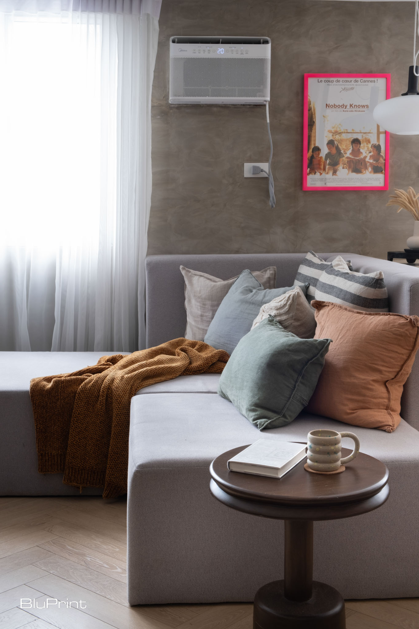
Colorful minimalism doesn’t mean completely abandoning neutral colors. In fact, these subtle hues are essential to make your chosen pops of color more prominent. And the best way to utilize these achromatic tones is by applying them in larger surfaces like walls, floors, ceilings, trims, and even anchor pieces.
Having the majority of your space in neutral colors reduces the chance of creating an overwhelming eclectic look. But most of all, it allows your eyes to rest. Interior designer Bethany Adams describes it as the “soft landing spot” where you can recover from the bright colors incorporated in your home.
In this case, you can use the usual minimalist colors like white, beige, gray, brown, or pastels to prepare your senses for more vibrant hues.
Introduce Color Through Furnishings
Since the background has to be in neutral hues at most, introduce colors through furniture, accessories, and other decorative items. This creates a visually appealing contrast that draws the eye to the colorful elements in the foreground. Blackberry Farm Design Director Christine Carney explains that visual difference helps a colorful minimalist room to have an exciting “area of focus.”
You can choose to highlight the statement objects, larger decor, minimal pieces, or a mix of them to establish an interesting focal point. But make sure to begin from the bottom up to ensure a logical flow and order in a space.
For instance, you can start by placing a colorful rug on the floor to ground the space. Then, add a few vibrant tiny art on the wall to draw the eyes upward. Or you can use a brightly colored armchair as a centerpiece and accessorize it with complementary cushions and throws.
Curate Your Colorful Minimalism Palette Thoughtfully
Designers Hope Austin and Niki Papadopoulos suggest limiting your colors to two or three only. They say that by doing so, you can maintain colorful minimalism’s inherent streamlined style. Plus, you can repeat them in every part of your home without being too excessive and intense.
However, Khersonsky points that it’s fine to explore more color combinations than sticking to the same repeated three hues. For her, it doesn’t matter whether the colors complement each other or not as long as they spark joy in the space.
Designer Linda Hayslett additionally recommends aligning your vibrant colors with the undertones of your neutral background. She explains that it helps in maintaining a cohesive look despite showcasing different hues. The only catch is that undertones aren’t easy to spot. Sometimes, they only appear when combined with certain colors and lighting conditions. So, it’s worth taking the time to analyze your neutral surfaces to build your color palette thoughtfully.
Colorful minimalism lets you break free from the strict neutral colors we typically see in minimalist spaces. It’s a bright and inviting alternative that celebrates both simplicity and expressiveness, proving that tranquility and vibrancy can coexist harmoniously.
Read more: Midimalism: How to Balance Minimalism and Maximalism

A growing coalition of heritage conservationists and cultural advocates is calling for the urgent call to declare the Pasig River a National Cultural Treasure (NCT). They cite the river’s irreplaceable historical, cultural, and ecological significance. The move comes amid renewed concerns over the Pasig River Expressway (PAREX), a controversial 19.37 kilometer, 6-lane expressway that critics […]

There is no excerpt because this is a protected post.

For Unveiling Perspectives, Quezon City-based art gallery Kaida Contemporary assembled a group of artists to create different compositions that portray their daily lived experiences. It shows them in a way that illustrates their individuality as artists, with different materials that are important to them and their craft as a whole. “Art has a way of […]
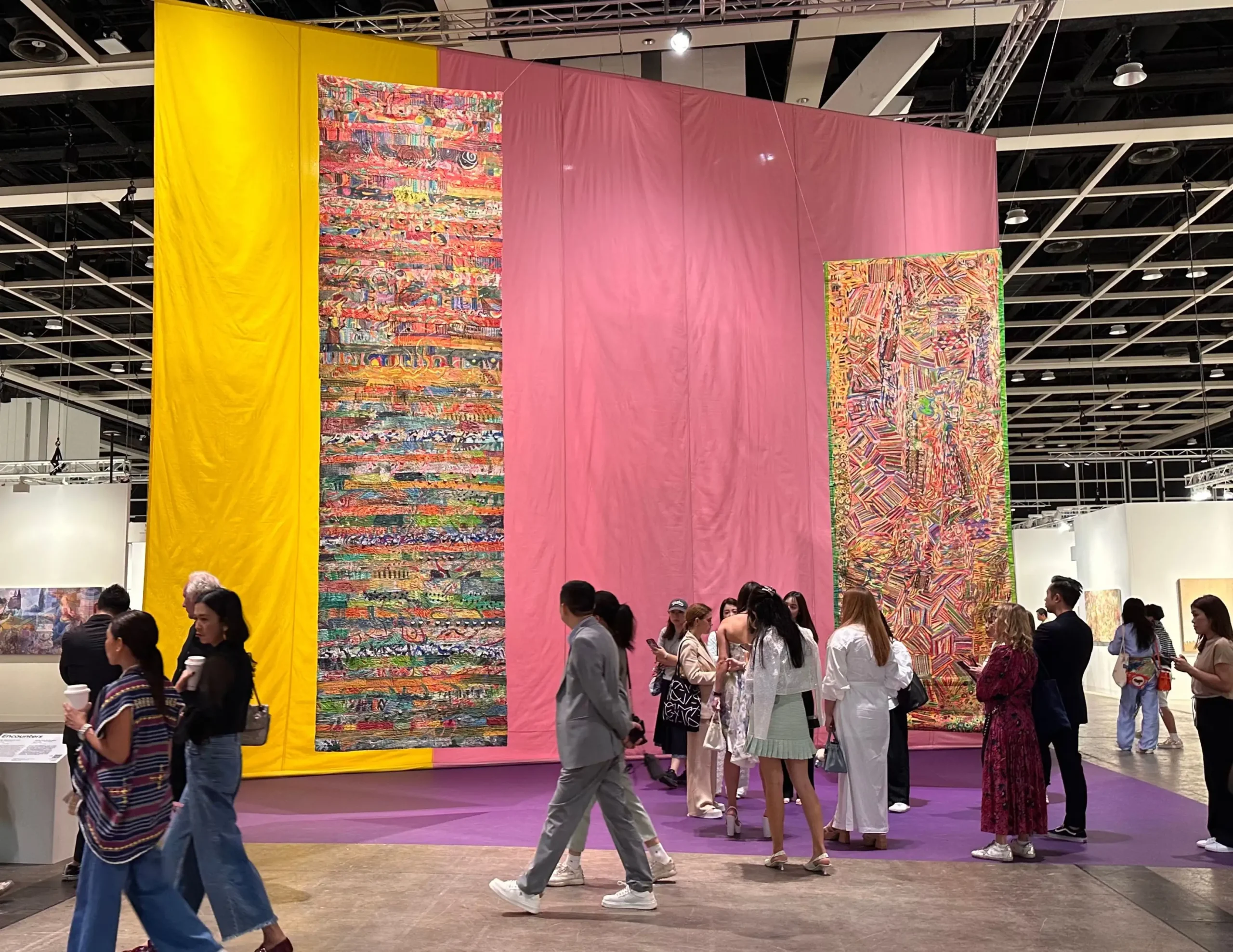
Six years and a global pandemic later, I finally found my way back to the Hong Kong Convention and Exhibition Center for this year’s Art Basel Hong Kong — but this time, with my husband, litigation lawyer and business owner, Atty. Fred Young. Founded by gallerists in 1970, Art Basel is the leading global platform […]

Gloss with a Purpose combines the artworks of Filipino photographer Lee Morale and American artist Kia LaBeija. The exhibit highlights the artifice and performance that exists in queer communities—and its importance in the way we define our own identities as a whole. Hannah Jaugan curated Gloss with a Purpose as her senior thesis for AB […]
Download this month's BLUPRINT magazine digital copy from:

Subscribe via [email protected]