Through materiality, a structure can express its values and personality. CEO and Founder of Nippon Hasha group of companies, Ryan Cruz, acknowledges that each of his brands have a distinct personality in which he wishes to express in the dining experience. Restaurants such as Kazunori, Mendokoro, Yushoken and Marudori each have a level of distinction […]
Unexpected Red Theory: The Trick of Random Pops of Red
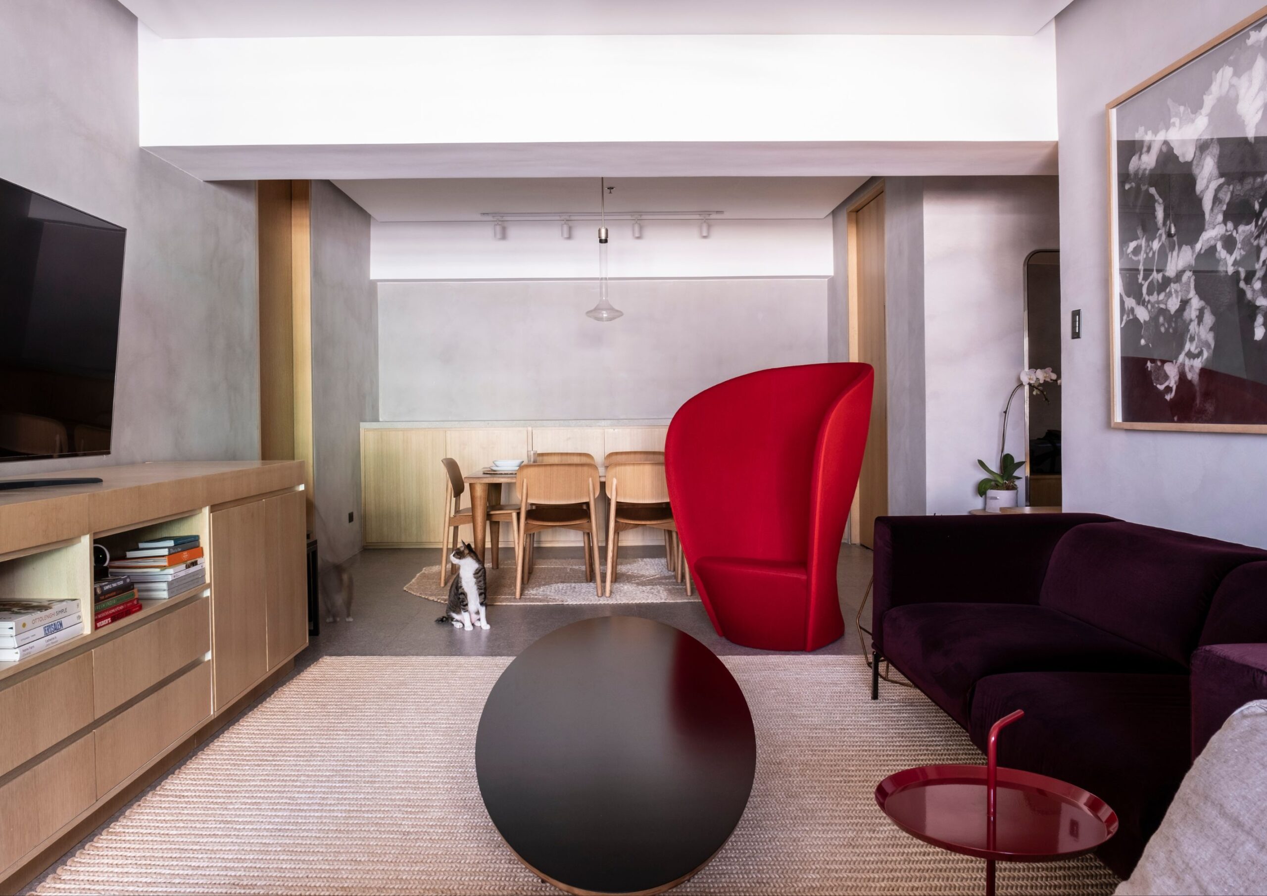
When designing homes, crafting a plan is an essential step to make every element feel intentional. But what if there’s a way to arrive at the same results without following a strict blueprint? Don’t overthink the answer because you could immediately elevate your home with a random pop of red color.
Introducing Red in a New Light

The Unexpected Red Theory suggests that red instantly makes spaces, where it is least expected and needed, interesting and intriguing. First popularized on TikTok by Brooklyn-based interior designer Taylor Simon, this notion highlights red as the random element you can easily add to automatically make your home look better. It can be anything from furniture, decor, paint, or any home item and detail of any size and form.
In theory, since this design method has a more devil-may-care approach, it should only work with downright dull-looking spaces. But it surprisingly complements even deliberately created interiors with elements that don’t require red at all. In a way, red now becomes as forgiving and versatile as neutral colors.
It might seem like the result of trial and error, but there is more than probability to support this premise.
Red Analysis
 - BluPrint")
In color physics, red has the longest wavelength that sits in the range of 620 to 750 nanometers among visible colors. Due to its dominant property, this color is the most detectable by the naked eye. So, regardless of its saturation, it stands out even when blended with other striking colors like yellow and blue.
Such a rigid characteristic leaves a lasting impression, and this is where color psychology enters the discussion. Although imparted psychological effects may vary due to a number of factors, red prevailingly induces intense emotions. It spans from affections (love and passion), warnings (fear and sense of danger), or increased impulsions (dominance, desire, and aggression).
This then creates a butterfly effect to our physical body in the form of heightened involuntary movements generally referred to as arousals. Increased metabolism, appetite, excitement, blood pressure, and eye blinking are all indicators of this physiological response. Consequently, we tend to be more alert in this state, making us extremely focused either in a pleasurable or agitated way. This is why the “unexpected red” easily catches our attention.
But another angle to look into is how mainstream interior design conditions our perception. As modern designs follow a rather monotonous and clean approach, we get used to spaces with stripped down colors. As a result, even a small pop of red color surprises our senses since it breaks and counterbalances the blandness.
Testing the Hypothesis

More than breaking plainness and neutrality, the unexpected red theory proposes red as the focal point to establish your space’s character. This means overfilling your home with red or carelessly putting red accents doesn’t automatically do the job.
The International Association of Color Consultants suggests testing this theory “with caution.” As red causes physiological acceleration, we often perceive it as visually pleasing. But according to interior designer Samantha Stathis Lynch, the theory shouldn’t be simplified into simply throwing a red color and expect a perfect outcome. In fact, it shouldn’t be called a “theory” in the first place.
Interior designer Kishani Perera claimed that a pop of red color is “one of the oldest tricks in the book.” Color expert Maria Killam reiterated that by calling red accents as a “theory” emphasizes how it’s infrequently used in the past.
But Simon defended her point by stating that unexpected red theory thrives on intentionality. For things like picture frames and lampshades, which are always in neutral colors, a sudden touch of red makes them more appealing.
Granted, this design method can make the added red element feel intentional even if it’s not in the initial plan.
How to Make the Unexpected Red Work
-62 - BluPrint")
Similar to other formulated theories, the unexpected red theory delivers the best and most accurate results in goldilocks conditions.
Mix with complementary and analogous color schemes. Using the color wheel, combine red with colors directly across it, which are blue and green. These complementary colors establish a balanced contrast by collectively following a uniform value and chroma. Its analogous colors, orange, yellow, and purple, creates a warm and forgiving environment for red accents to effortlessly pop. With this, you can ensure classic and safe color pairings, especially if you’re testing the theory for the first time.
Opt for warmer tones. Remember that red shouldn’t be as dull as the other interior elements where it will be added. The key to a successful application of the unexpected red theory is to keep the red color warm. Burgundy, cherry, and ruby are a few of the eye-catching tones you can use in your space.
Apply on statement pieces. Statement pieces naturally draw attention regardless of their color. So, adding a touch of red on them further enhances their prominent features. Whether on artwork frames, throw pillows, rugs, or table tops, you can make your red element the center of attention. You can also turn your bland walls, ceilings, and other architectural features like columns and arches into statement pieces by making them red.
The unexpected red theory, beyond being a novel design, reminds us that good things can also arise from happy accidents. And that element of surprise is what makes this method intentionally beautiful despite not being a part of the initial intention.
Read more: Galley Kitchens: Making the Most of Every Inch


Wallpaper is making a stylish return to interior design, but not in the ways you might expect. Gone are the days of muted florals and predictable damask prints. Today’s wallpaper trends are all about being bold, quirky, and unconventional. To get a deeper understanding of these emerging styles, we turned to renowned interior decorator Ram […]

August, also known as the Buwan ng Wika in the Philippines, demonstrated the uniqueness of the Filipino art scene in its continued evolution. BluPrint covered some of these August art exhibits, from discussion of the Chinese diaspora to profound explorations of generative AI. With the abundance of art out there, we at BluPrint wanted to […]
 - BluPrint")
Stepping into the home of fashion designer Michael Leyva feels like entering a space where dreams, memories, and passions come to life. Built in 2017, the house is a tribute to family, a reflection of Leyva’s creative mind, and a canvas that showcases his love for art and design. For Michael, this home holds deep […]
 - BluPrint")
“Sustainability is my passion and it’s tied to my design practice,” architect Liza Morales says. “When I went to school in Columbia in New York, I knew from day one I was going to move back to the Philippines. My heart was set on doing something sustainable. Fifteen to 20 years ago, sustainability was unheard […]
-06 - BluPrint")
Sustainable design takes many forms—one of the most compelling being biophilic design. This approach intends to close the divide between humans and nature, particularly in increasingly urbanized environments. And it’s even more inspiring when it’s embodied through another facet of sustainability, which is adaptive reuse. The Stone House, as the perfect realization of these design […]
Download this month's BLUPRINT magazine digital copy from:

Subscribe via [email protected]