
Creating Spaces to Love with Perfect Shades of Red
When it comes to designing eye-catching interiors, red is among the colors that will undoubtedly do the job. But, as with anything about design, there’s more to incorporating this fiery hue than adding splashes of color. Interior Designer Rossy Yabut Rojales, who heads HEIM Interiors, says the first step is to find the right shade that you can be comfortable with.
Like any color, Rojales reminds us that red can represent several different emotions and personalities. The perfect shade of red, therefore, is one that fits your personality, energy, passions, and taste. “The spaces you use should ultimately reflect YOU,” she stressed.
“From scarlet to Rosso Corso, finding the right shade of red is the first step to feeling comfortable about this bold color. Next, check your vision board and add reds,” she described the process in a nutshell. “See how the combination of colors makes you feel. When you’re satisfied with how it looks, that’s when you can take the next step.”
Picking the red that reflects you
The basic color psychology of red identifies it as as the color of power, energy, good luck, and passion. However, if you’re new to exploring its boldness for your spaces, she suggests looking deeper into your personal motivations to help you pick the perfect red.
“As human beings, as we evolve, our judgement on visual things such as color, change depending on where we are right now in life. Are you aiming for a top level position in your company? Are you looking for a new romantic relationship?” These, she said, can help you find the best shade that will match your energy or the energy you want the space to radiate.
“What I have learned in my years of designing spaces is that color can change. And before diving into choosing the right one, think about your goals for the space and for yourself. “
The perfect red for different spaces
As an interior designer, Rojales is more inclined to select colors based on the key features of the space. These include the illumination, styling, and interior architecture details.
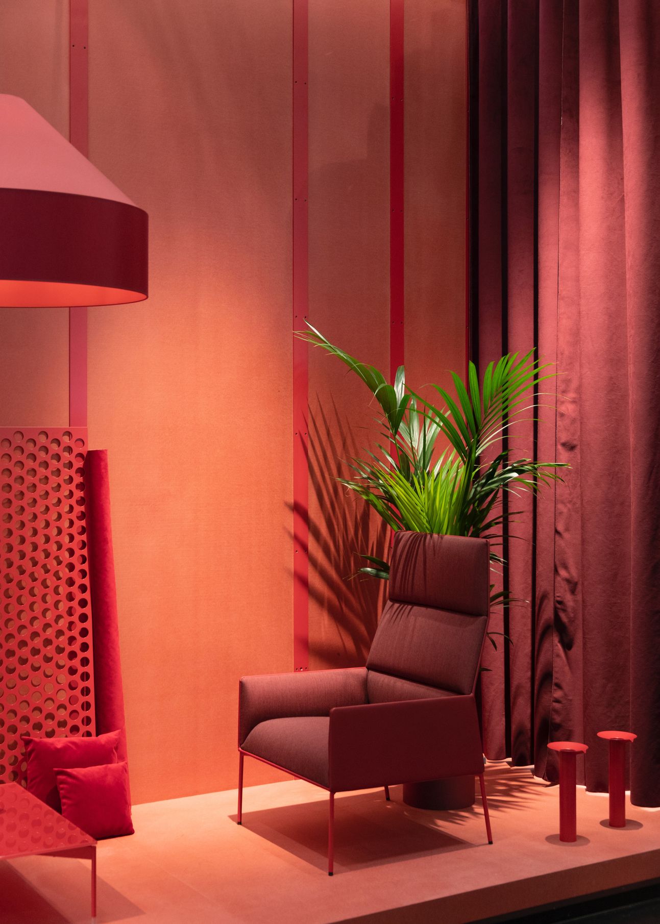
On that note, she finds the scarlet shade a good choice for an area with a lot of activity, such as a den, movie room, or a game area. Dark textiles and dimmed lighting will complete the look as fitting accents. Underrated colors, such as wine or burgundy, are also perfect for decking up a space with boldness in mind.
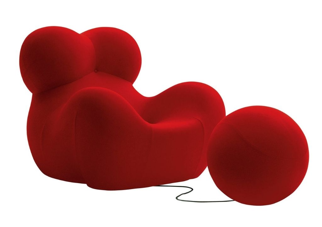
Meanwhile, bright red shades, like candy apple or rossa corsa, will look spectacular for a light-flooded room. However, she suggests using them sparingly, like the back of the bookshelf or a statement furniture piece. “Imagine a room with white walls and a library with a 1969 Red ‘Big Mama’ Chair sitting at the corner.”
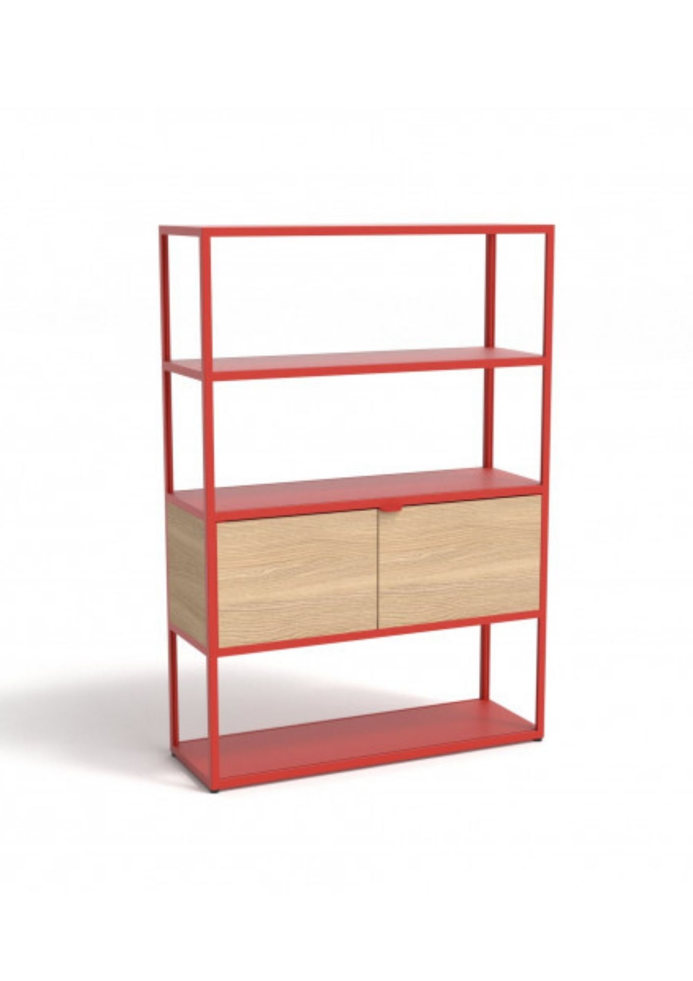
Another great tip she shared is to think about an unexpected application. “Instead of what we usually see like a red leather chair, consider using a jasper red colored stone for a powder room, or red cabinetry doors.”
Don’t get caught red handed
As much as red is a versatile favorite when it comes to sprucing up spaces, Rojales cautions against some common mistakes.
The first she noticed is the lack of prioritization. For example, some homeowners may know from the start that they want red as a key color in a space. However, it’s usually applied in a way that doesn’t tell a story. “Adding a red pillow or a red vase? Why is that color there? What do you want the user to feel?” she asks.
Lighting is another main concern, since red is a tricky color to illuminate. “Like buying a red apple from the grocery, it has to look fresh and juicy. There are certain technicalities to be considered, like CRI or the color rendering index. Your designer should be able to guide you on that.”
Lastly, she noticed that people tend to feel confined to using the usual materials when incorporating red shades. ”Aside from paint and textile, there are many ways to apply this color. Consider your kitchen counter, doors, or shower walls. Don’t be limited and surprise yourself.”

Rossy recommends
Of course, a chat with an interior designer wouldn’t be complete without asking about her recommendations. Aside from expressing her hopes to see more wine and burgundy, she shares her preferred colors to pair with reds, and a few iconic red pieces to decorate with this year.
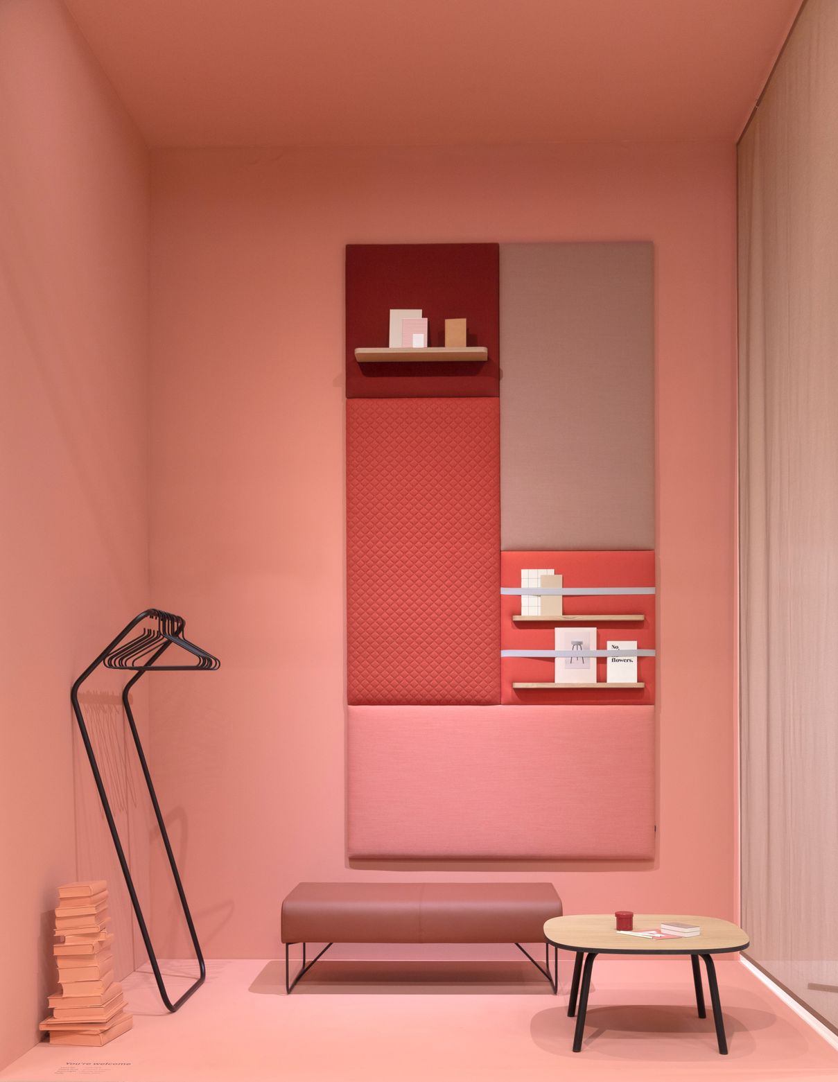
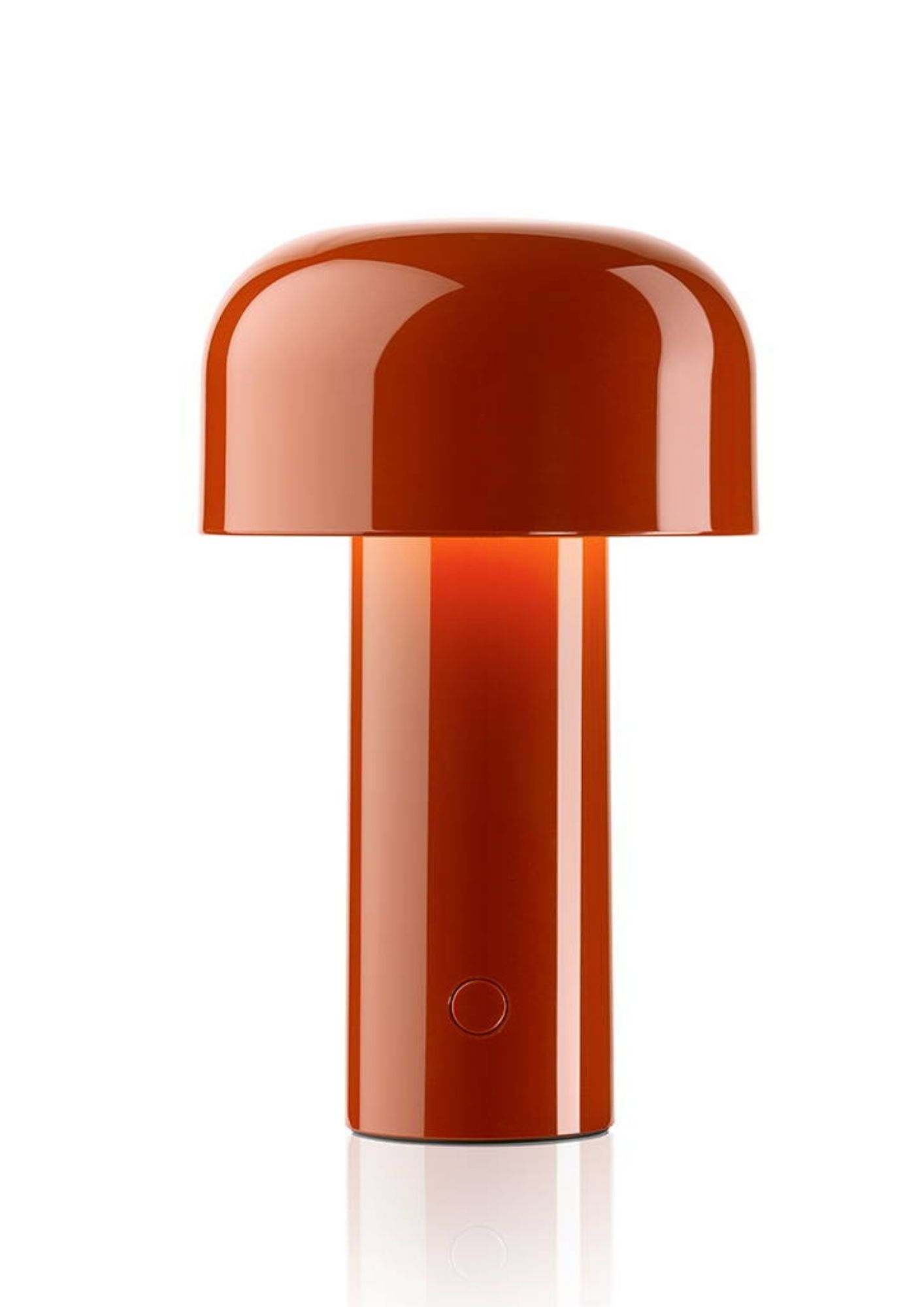
“I prefer combining red to cool shades such as celadon, mint and cobalt. Adding neutral shades like tan and pale rose is a refreshing addition too. For red furniture or accent pieces, my personal favorites are B&B Italia’s Up 50 ‘Big Mama’ Chair , the Cassina Utrecht Chair, Flos Bellhop Lamp, and Hay’s New Order collection. All are iconic and stand out pieces in different shades of red.”
Cover Photo by Inside Weather on Unsplash
