Working with bold and rich hues can be tricky at times, and are typically envisioned to have the exact opposite effects that bright colors have on small spaces. While these dramatic hues are seen to be gloomy, encasing, and heavy, the right use can bring about spaces that are daring, dramatic, and dynamic. Believe it or not, dark colors create an intimate and cozy vibe, and an illusion of an endless and expansive space as these colors blur the corners of the room. Still not convinced? Here are ways you can pull off dark colors in your condo, no matter how small it is.
1 | Start Small
In every new thing you try out, it’s always advisable to take baby steps. Instead of painting all your walls and ceiling in dark hues all at once, try it out in a small portion in your condo first. Take your compact kitchen for instance. Paint a neutral but deeper and darker matte shade on the area and tie it in with furniture or décor pieces in a contrasting shade or a backsplash with a glossy finish. Go for deep earth tones or a warmer shade of terra cotta for the walls, a high-gloss stainless backsplash, and complete it with black bar stools. Doing so creates a visual separation between living areas and depth for a spatial illusion.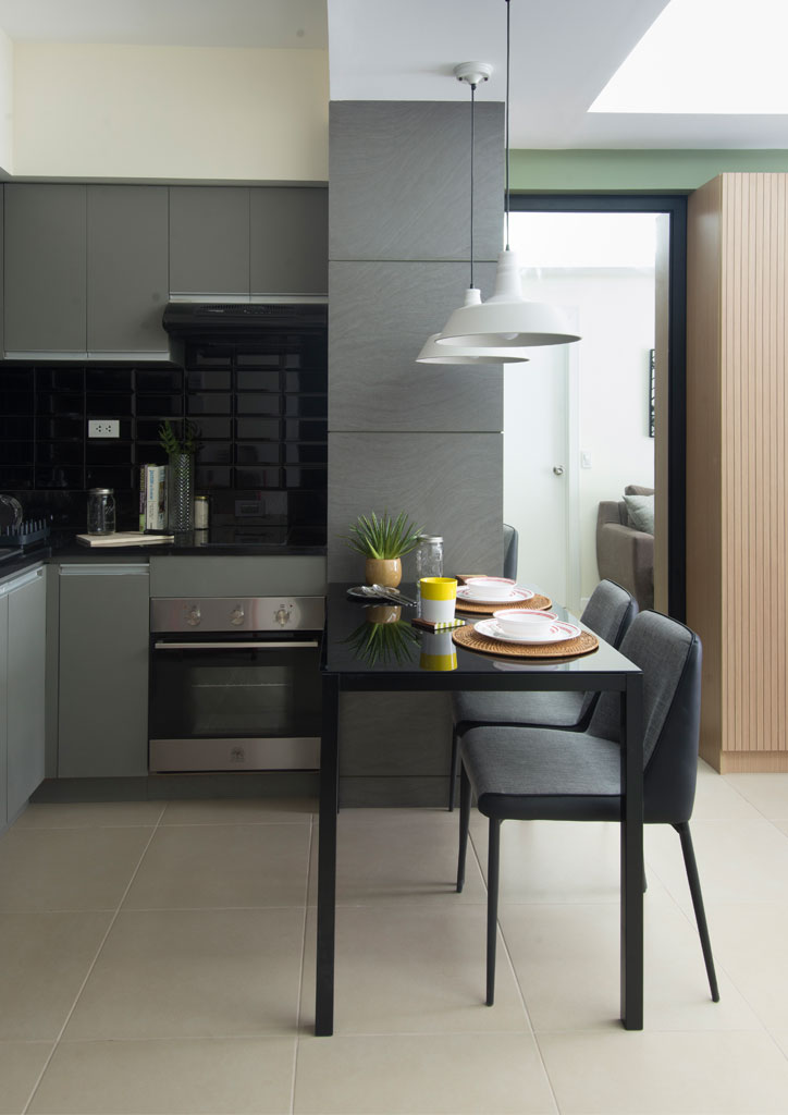
See More Of This Condo: This Bachelor’s Pad Is The Perfect Space For Every Homebody!
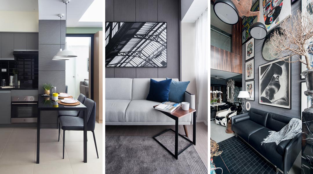
2 | Add Reflective Surfaces
Given that dark colors absorb instead of reflect light, adding reflective surfaces into the space allows light to still spread throughout the room. Break the monotony of walls with floor-to-ceiling slats of mirror or go for ultra modern vibe with stainless steel accent furniture. Not only do these shiny surfaces reflect light; these also create depth and drama, and a touch of luxury.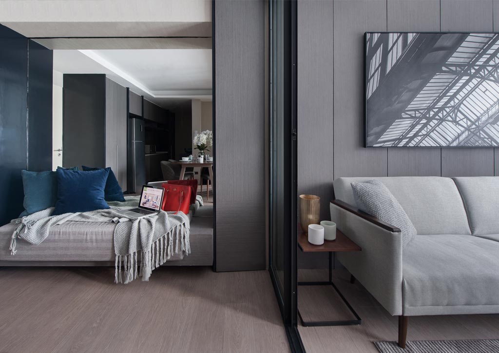
See More Of This Condo: Dark Colors And Textures Play Up In This 60-Sqm Minimalist Unit
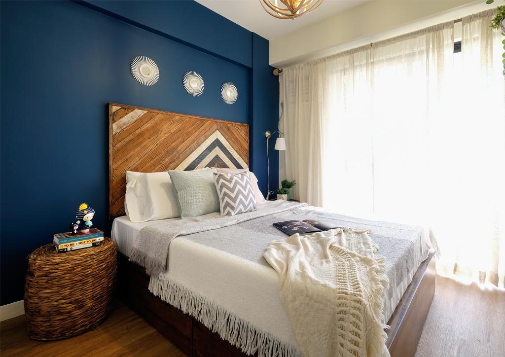
3 | Put In Patterns
A solid block of dark color can be boring, so don’t be afraid to play with patterns. Instead of sticking to a plain matte paint color, mix in an interesting print courtesy of wallpaper for a dynamic twist. If you’re not up for wallpapers in your condo, you can throw in patterns through throw pillows or rugs. Make sure, however, that whatever pattern you incorporate into the design still ties in with the color scheme or at least with the look you’re going for. We are loving classic prints such as quatrefoil and fleur de lis against navy or dark gray.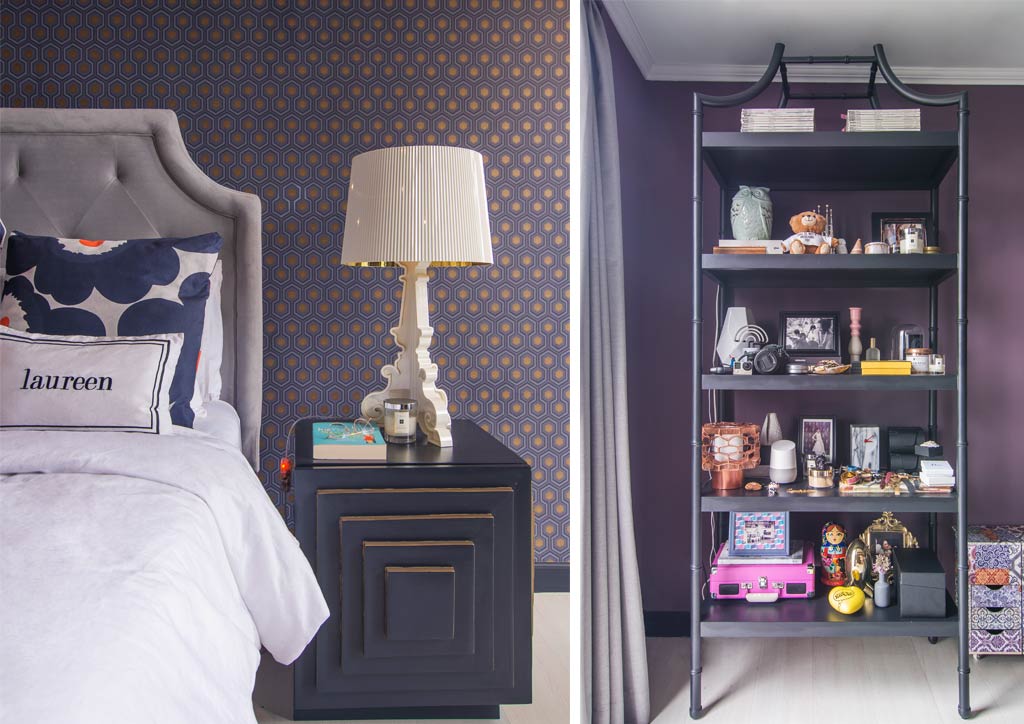
See More Of This Condo: Laureen Uy Tours Us Inside Her Newly Renovated Condo!
4 | Blend Big And Bulky Pieces
So as not to make your small space look even tinier and cramped, incorporate big furniture pieces into the mix. This visual play creates more tension compared to the same composition arranged in a space done in a lighter palette.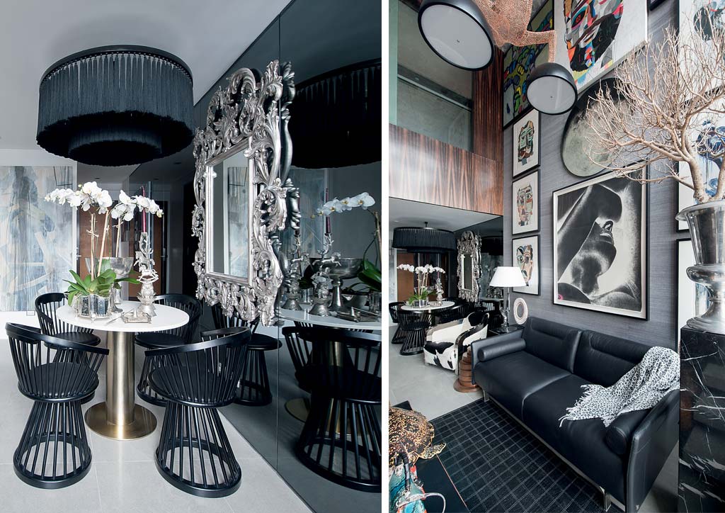
See More Of This Condo: Chat Fores’ Loft Condo Is An Eclectic Art Collector’s Dream
5 | Contrast Colors
To avoid looking like a cave, contrast your chosen dark color with a lighter tone. White, pastels, and other neutral colors like beige, off-white, and light gray are great for contrast as they reflect more light and add a clean and fresh look. Natural colors from wood and plants are also good color contrasts as they bring out the richness of the color they are in contrast with.