<
DO: Give Hints
If you don’t want to seem like you’re trying too hard, you can incorporate Gen Z Yellow as an accent color. Have it in smaller proportions like a stool in the living room or your workspace, the outline of your doors or windows, and other accessories. This allows you to be trendy in a more subtle way. 
DO: Make a Statement
For any space in your condo, choose one or two large statement pieces in a Gen Z Yellow hue that matches your design philosophy. This can be a velvet chesterfield sofa or a huge art piece on your neutral-colored or muted walls. If you’re bolder than this, you can paint your walls to vivify your pale-colored living room set.
Do: Go All-Out.
Whether it’s a specific room or your whole condo, you are free to go all-out Gen Z Yellow as long as you can commit to it.
Don’ts

DON’T: Forget Complementary Colors
Yellow can be eww when paired with the wrong color. Check your color wheel and then to keep yourself from committing a crime. Some of the usual formulas include:
yellow + gray
yellow + pink + cream
yellow + brown
yellow + red
yellow + black + white
yellow + green
DON’T: Be Afraid of Yellow-on-Yellow
Sure, it seems unhealthy for the eyes, but you can do this by using a lighter or more muted hue against a bolder and richer one. You can also play with textures and patterns in Gen Z Yellow.
DON’T: Go Overboard
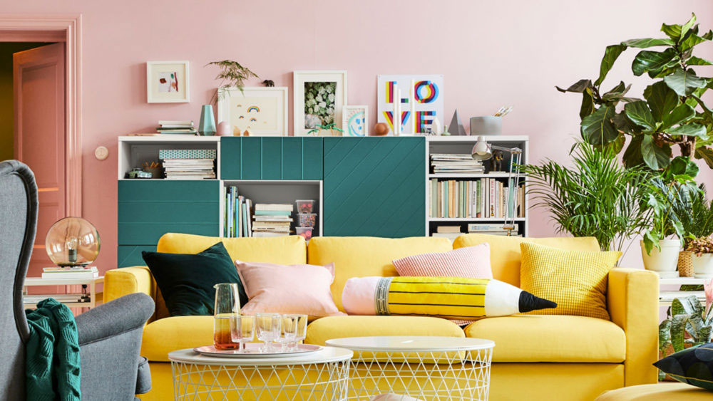
While we encourage you to experiment with Gen Z Yellow, we can’t let you go astray. Be more critical when deciding which pieces to put together, especially when they’re in similar and almost identical hues. If you’re doing one space in full yellow, allow accents in different but complementary colors. Photo courtesy of IKEA
Frequently Asked Questions
If you want to join the trend without overwhelming your space, substitute full-room coverage with small “hints” or accent pieces. Use Gen Z Yellow in smaller proportions, such as a single stool in your workspace, the painted outlines of your doors, or minor decorative accessories. This allows you to stay trendy while maintaining a sophisticated, understated vibe.
The secret is to play with varying saturations, textures, and patterns rather than using one flat shade. To keep the look “healthy for the eyes,” layer a lighter, muted hue against a bolder, richer one. Combining different textures—like a velvet yellow sofa against a matte yellow wall—adds depth and complexity, preventing the space from looking one-dimensional.
A frequent mistake is pairing yellow with the wrong hues, which can result in an unappealing aesthetic. To fix this, stick to proven “flavor” formulas such as yellow with gray, pink and cream, or the classic high-contrast yellow, black, and white. Always consult a color wheel before committing to ensure your palette remains vibrant rather than clashing.
Position one or two large statement pieces, like a yellow velvet chesterfield sofa or a massive art piece, against neutral or muted walls. This “stores” the visual energy of the color in a centralized location, making a bold statement without going overboard. If you choose to go all-out on the walls, ensure your furniture provides a pale-colored anchor to balance the vivacity of the room.
The core ingredients are commitment and critical curation. While you can go full yellow in a specific room, you must allow for small accents in complementary colors to break up the monochromatic weight. Be critical when putting pieces of identical hues together; without a “break” in the visual recipe, the design can lose its impact and become visually exhausting.
