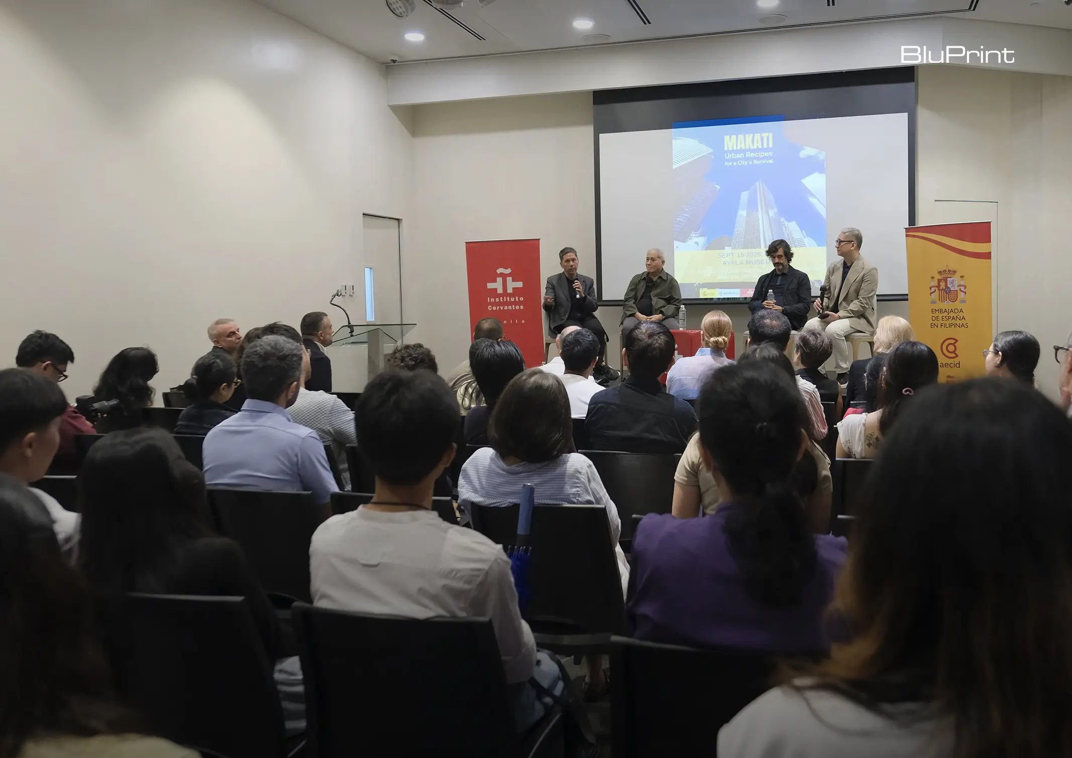
How can better-planned cities create the conditions for more creative, livable, and resilient urban environments? “Makati Urban Recipes for a City’s Survival,” a colloquium held at the Ayala Museum on September 15, brought together architects and practitioners from the fields of urbanism and the creative economy to discuss how design, planning, and collaboration can address […]
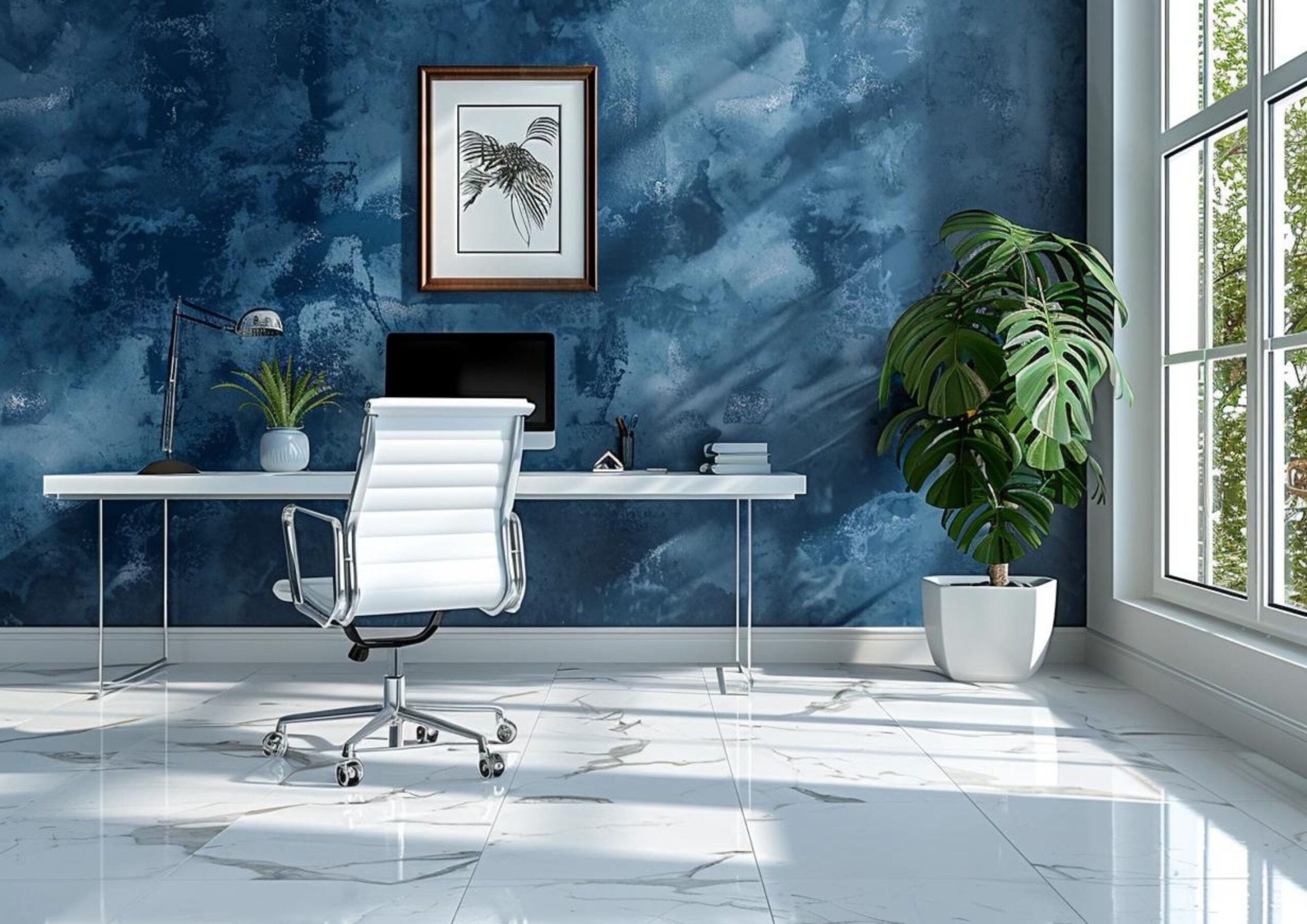
How to Use Color Psychology to Enhance Your Mood at Home



Every color carries meaning. We often associate them with emotion, and this can alter our moods based on our own perceptions and cultural associations. In the Philippine setting, colors play a crucial role in one of the significant representations of our community’s values—home. With the rise of modern Filipino houses widely adopting neutral and muted tones, we now see a shift toward adding pops of color to our spaces, which can change how we experience life at home.
The Filipino Color Psychology
Filipinos have a positive regard for bright and popping hues, which are often reflected in our festivities. This is due to our mixed cultural influences and the tropical climate that enhances their vibrance. While colors are collectively attractive to the eyes, each of them exudes a different Filipino feeling particularly to home designs.
Red: The Color of Passion and Energy
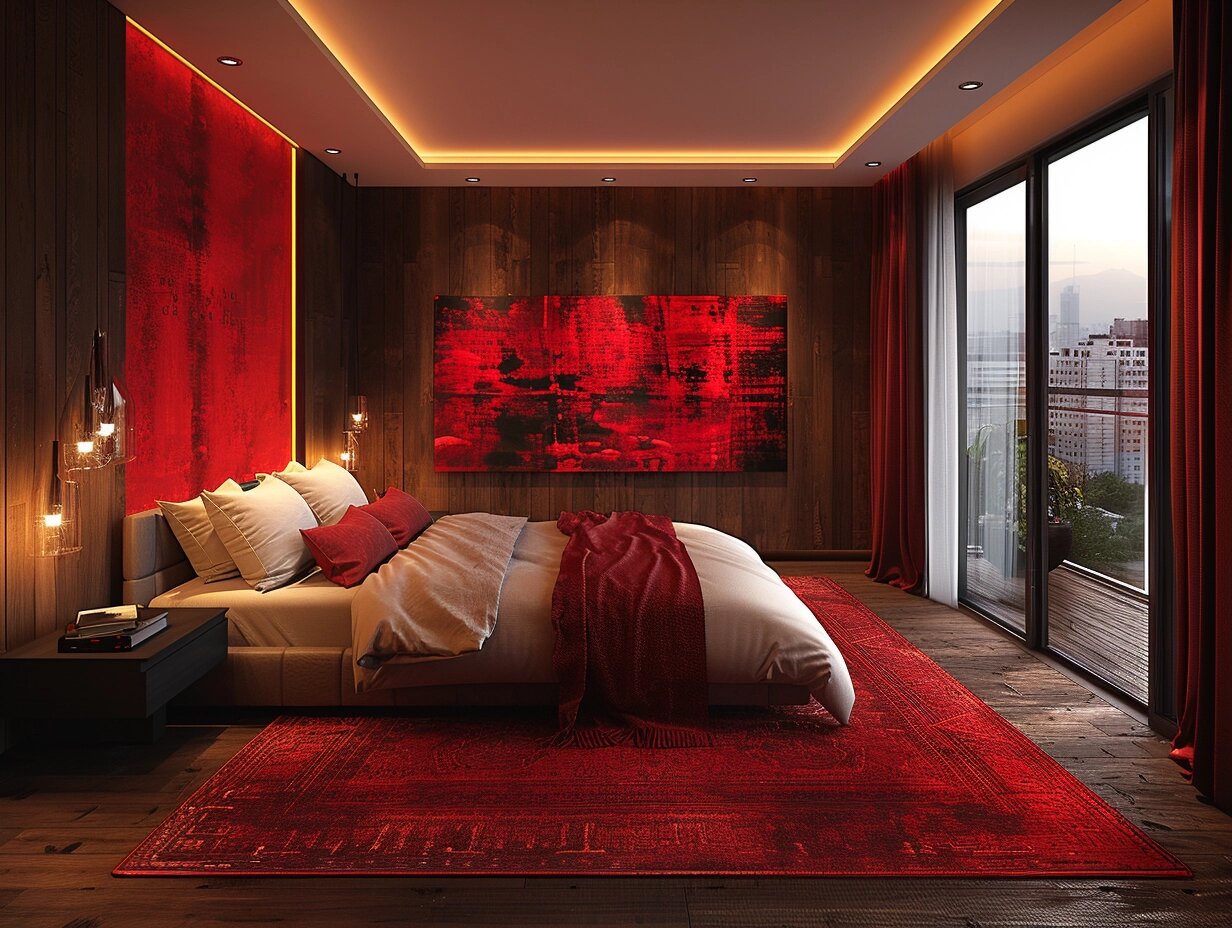
For Filipinos, red embodies bravery and patriotism as most remarkable social movements carry this color in their emblems. Due to our long history with Chinese tradition, we also associate it as a lucky color. With its innately intense wavelength and eye-catching strength, red is a bold choice for home decor.
Just a few additions of red decor would suffice to bring its strong energy inside your house. It can create a dynamic and inviting atmosphere, making it ideal for social spaces like the living room. Red can also stimulate appetite and conversation, making it perfect for dining rooms. However, due to its intensity, it can increase negative emotions like anxiety and aggression, so using it in the right spaces is important. It’s advisable to use red in moderation, perhaps as an accent wall or through decorative accessories, to avoid overwhelming the space.
Yellow In All The Bright Places
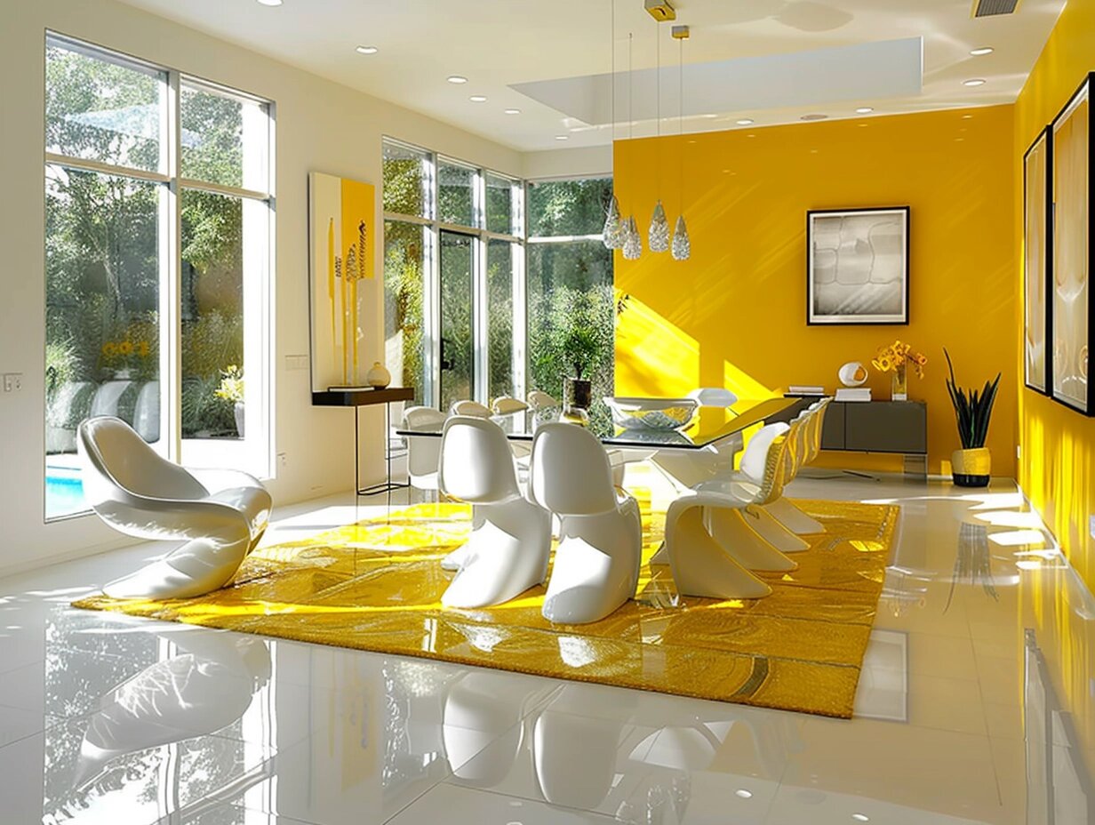
Yellow sets a natural feel to a house’s interior as it blends well with the color of the sun, bringing brightness and cheerfulness to any space. The celestial connection to ancient Filipino culture evokes hope, liberty, and prosperity. It also creates a sense of familiarity through its warmth, mirroring the Philippines’ weather.
Reflecting the most amount of light among colors, yellow interiors can easily generate a cozy yet cheerful atmosphere even with minimal lighting. It’s perfect for kitchens, breakfast nooks, or any area that benefits from a sunny boost. Yellow can also stimulate the mind, making it a great choice for home offices or creative spaces.
But because of its reflective property, it can also produce a harsh ambiance that can raise tempers and assertive behavior. Pieces like a throw pillow, chair, or accent wall can do the job in keeping a light indoor mood. Whether you choose a soft buttery hue or a vibrant lemon shade, yellow accents can energize a room and lift the spirits of its inhabitants.
Healing Green
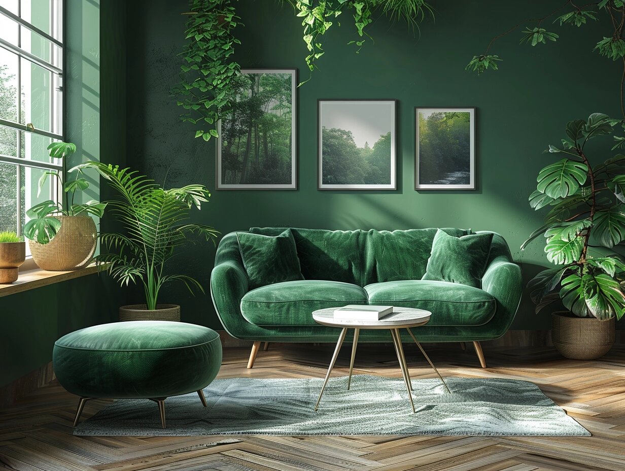
Wealth, freshness, and growth define the color of green. It represents the Filipinos’ connection to the country’s diverse landscapes and topography. Its mix of warm and cool hues mimics the calmness of nature, making the house ideal for relaxation and meditation. This makes it an excellent choice for bringing a sense of balance and calm to a home.
With its natural and healing vibe, green can also lessen the risk of depression and anxiety. Lighter greens can freshen up a space, making it feel more vibrant and alive, while darker greens add elegance and depth. Its versatility adds to its restorative characteristics as it evokes comfort and liveliness. As such, homeowners have the freedom to incorporate this easy color in any part of their house. Incorporating green through indoor plants, wall colors, or fabric can create a soothing and nurturing environment.
The Cool Hue of Blue
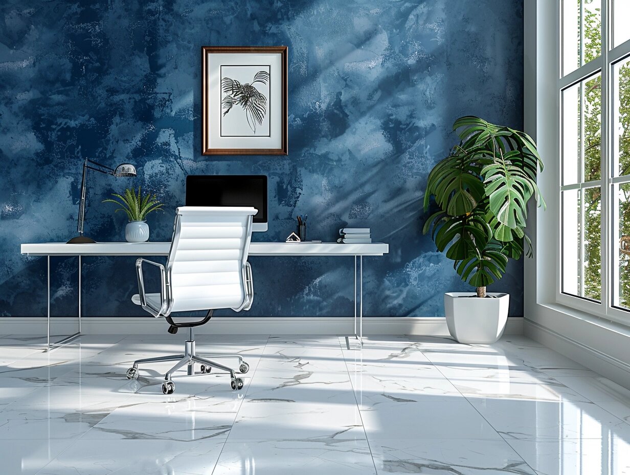
Seen as the color of peace and justice, blue gives off clean and serene energy. With much observable abundance in nature, blue could symbolize the clear skies and bodies of water. It is also attached to divinity founded on Filipino Catholics’ religious faith and devotion.
Regarded as the coolest color, its soothing effect makes it an excellent choice for bedrooms and bathrooms where relaxation is key. Blue even suits workspaces because it relates to wisdom and productivity. However, compared to red, it can induce a gloomy feeling if put in lively areas like the dining room, kitchen, and gym.
Lighter shades can make a room feel more spacious and airy, while darker shades add depth and sophistication. Incorporating blue through wall paint, bedding, or bathroom tiles can transform your space into a peaceful retreat.
The Spectacle of Purple
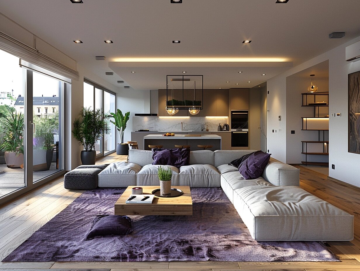
Purple might not appear too often in nature, but it is most evident in Filipino food culture. It projects itself as sweet but bold, melancholic but calm, rare but royal. Containing the strength of red and coolness of blue, purple displays an uplifting yet delicate emotion. This perfect balance of its contrasting qualities creates stability for homeowners.
Purple might be too overpowering because of its striking presence. But thanks to its rarity, it attracts a curious and elegant mood, adding a touch of sophistication and creativity to your home.
Lighter shades like lavender are soothing and can create a tranquil bedroom environment. Deeper hues like eggplant or amethyst add depth and luxury, ideal for living areas or accent pieces. Purple can stimulate the imagination, making it a great choice for creative spaces in areas designed for relaxation and contemplation.
Mix And Match to Set the Mood
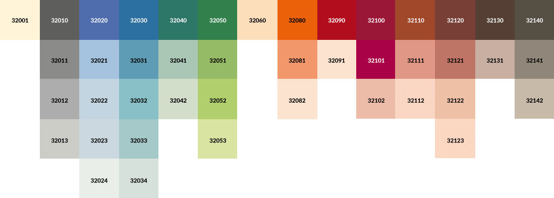
When incorporating these colors into your home decor, consider the mood and atmosphere you wish to create in each room. Use color psychology as a guide, but personalize your choices to reflect your style and preferences. Mixing and matching different hues, experimenting with textures, and layering various shades can add dimension and interest to your space. More so, determining the appropriate color combinations establish the atmosphere you desire for your spaces.
First is knowing the colors you are comfortable with. Selecting a base color with gray tones, dark shades, or white tints simplifies the process of choosing complementary colors. Understanding the color wheel and its schemes will simplify choosing functional colors for your home.
Analogous colors work when achieving a soft harmony in your house. If you opt for uniformity and little contrasts, a monochromatic color scheme might be best. Complementary and split complementary colors both create high contrasts. For more colorful spaces, try using triadic colors. And if you feel a little more creative, you can experiment on the visual hierarchy of square and tetradic color schemes.
Having a plethora of color combinations allows extensive possibilities to improve how they influence the owners’ mood. And it all boils down to finding the right mix that will make your house a home.
The thoughtful application of color can profoundly impact the aesthetics and atmosphere of your home. Red, blue, yellow, green, and purple each offer unique benefits and can be tailored to create specific moods and styles within your living spaces. By understanding the psychological and cultural associations of these colors, you can harness their power to create a home that resonates with your personal taste and enhances your daily life.
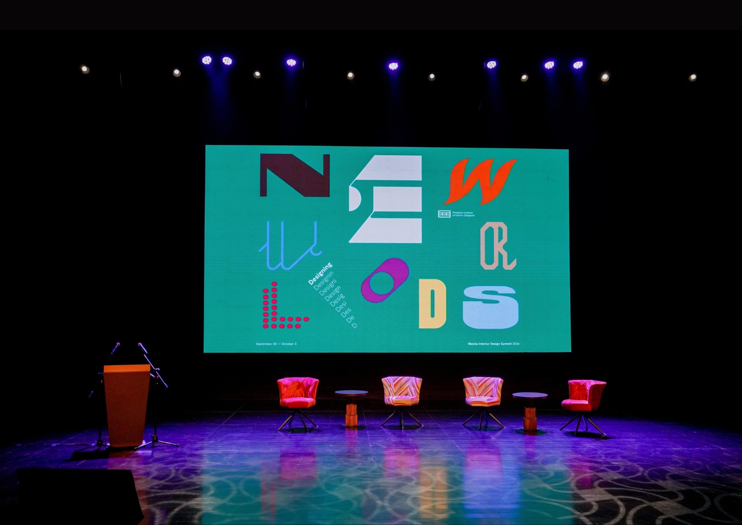
The fourth Manila Interior DesignInterior DesignThe discipline of planning and shaping interior spaces for function, comfort, safety, and beauty. It covers layout, lighting, materials, finishes, furniture, and color, and in the Philippines is a licensedGo to Interior Design Glossary Summit (MIDS) brought together more than 300 delegates for four days of conversations, exhibitions, and design […]
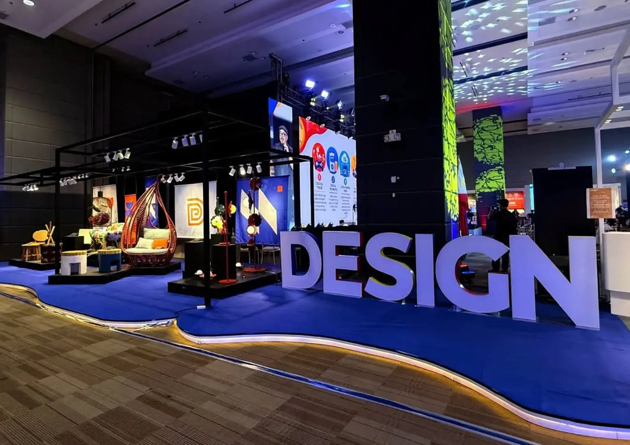
Held at the SMX Convention Center Aura in Taguig City, the first ASEAN Creative Industries Expo by Malikhaing Pinoy (ASEAN MPEx) features nine creative domains, including design, visual arts, digital interactive media, and performing arts. Organized by the Department of Trade and Industry (DTI), the event includes exhibitions, cultural performances, industry talks, and pitching sessions […]
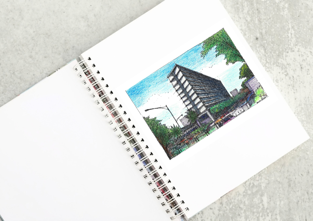
The SSS Building as an Expression of Civic Modernism My favorite modernist landmark in Quezon City is the SSS building on East Avenue. Designed by National Artist for ArchitectureArchitectureThe art and science of designing and constructing buildings, structures, and spaces that are functional, safe, and aesthetically pleasing. It encompasses the planning, design, materials, and techniques […]

Archie G. Carrasco, Chairman and CEO of AGC Power Holdings Corp. (AGC PHC), has been named to The BoF 500 Class of 2026 under the Media category, joining The Business of Fashion’s global community of individuals shaping the fashion industry. Carrasco is among 100 new members from 33 countries and 48 nationalities selected for the […]
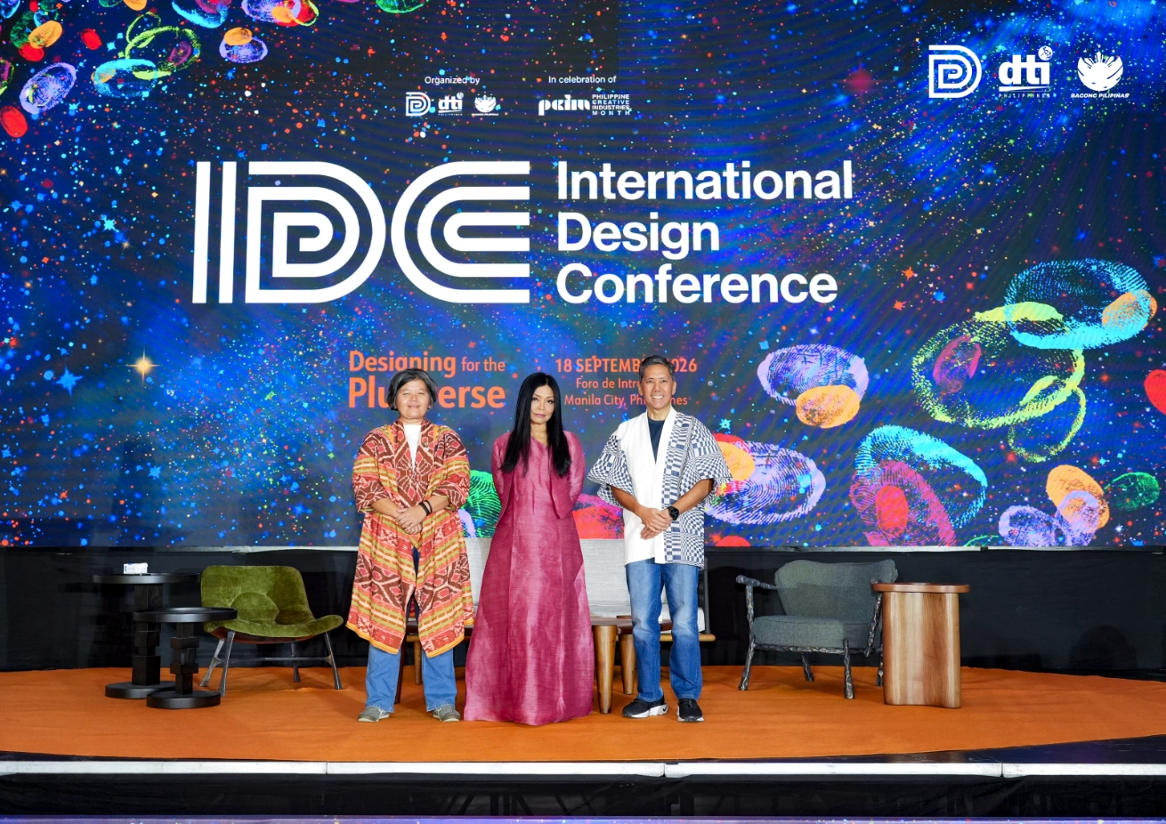
Culture in design does not always announce itself through a recognizable motif, material, or symbol. It can also be embedded in the relationships designers build, the knowledge they listen to, the materials they choose, and the decisions they make in response to communities and their environments. This distinction emerged throughout the 2026 International Design Conference […]
Read the issues.

Collect the volumes.

Recommended Video
Tap to Unmute
Unmute
0:00
0:00