PXP Design Workshop Co.
Referred to by a common architect friend, David was the most hands-on in this project, according to architect Patrick Espiritu of PXP. “It helps that he is always on site to check the progress and the quality of the works,” Patrick says. He adds that David did not let his wife Karen see the construction process until the furnishing stage. He intended for it to be a surprise for her.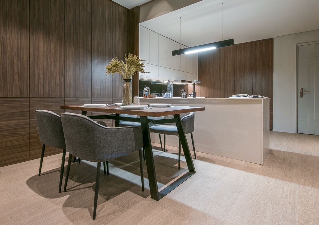
Upon entry to the unit, one would be welcomed with a spacious kitchen. Patrick says that there used to be a small maid’s room and toilet in the unit. However, the family does not plan on having a house-help, so they knocked down the room. This move afforded the kitchen more space.
Read More: This Minimalist Rustic Mancave is The Perfect Staycation Spot!
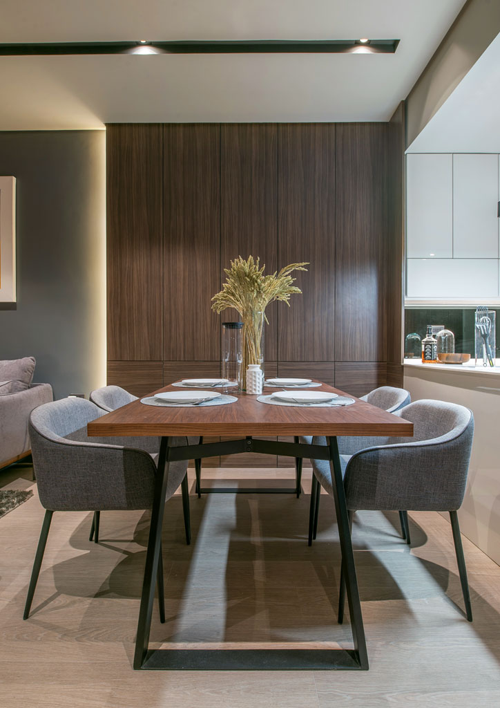
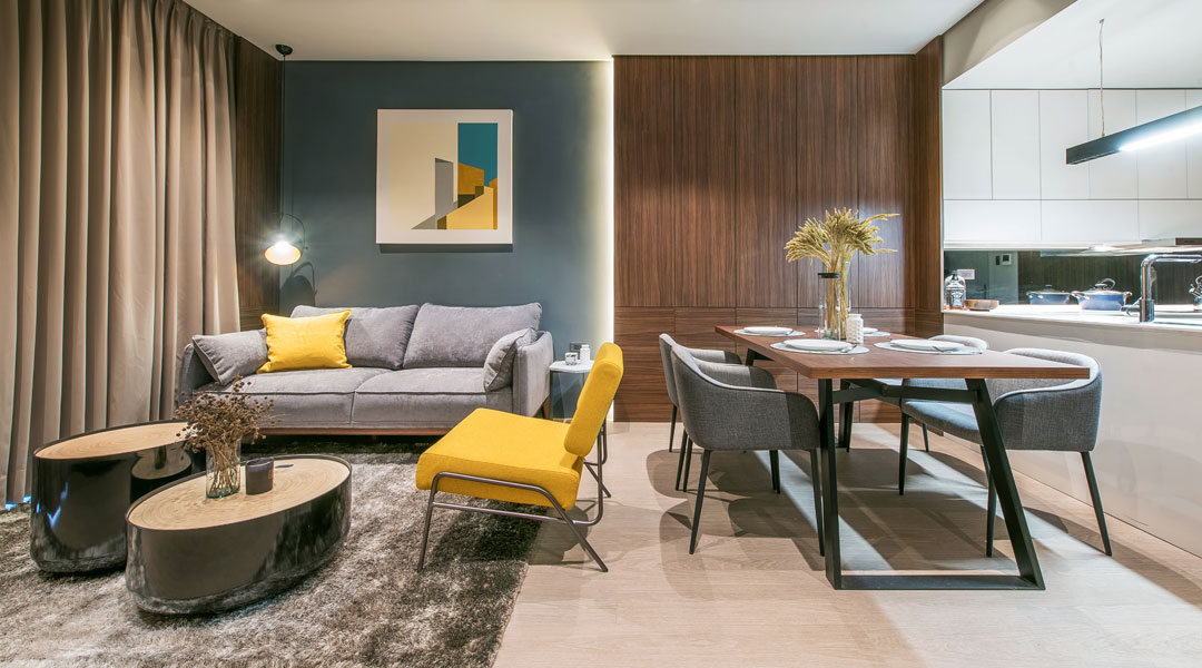
The young family also asked for ample storage and bigger living spaces, so the floor plan is kept open. Although the layout is an open concept, the arrangement of the furniture pieces in the shared spaces still gives a sense of division among the living, dining, and the kitchen areas. While one side of the L-type kitchen serve as a division between the kitchen and the dining area, the area rug in the living area helps distinguish the living and dining from each other.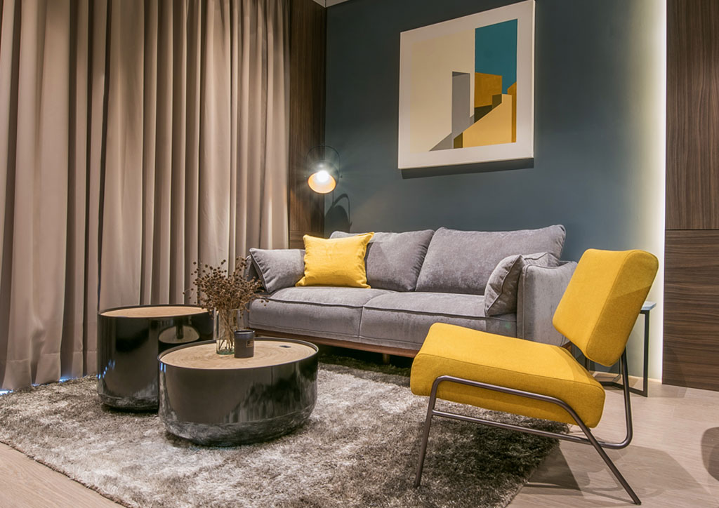
Neutral colors fill the unit, with warm wood and mustard yellow serving as accent colors. The combination does not just enliven the space but also gives off a warm and sunny vibe—as seen in the living area, that’s next to the balcony beyond the curtains. An artwork by Espajo anchors the space, mirroring the colors of the accent chair and the slate gray accent wall behind the sofa. “We put clean looking and modern furniture, which are mostly neutral in color, so all colors come from the loose accessories like the throw, the cushion, and the artwork,” explains Patrick.
Read More: Dark Colors And Textures Play Up In This 60-Sqm Minimalist Unit
Opposite where the dining and living area is separated, a hallway leads to the bedrooms and the toilet and bathroom (T&B). On the left side is the T&B, while on the right is the first bedroom, which is the toddler’s room. Straight ahead is the master bedroom with an en suite bathroom and a modest walk-in closet.
In the first bedroom, a massive bed sits at the center, guarded by two night stands on both sides completed with dangling pendant lamps in concrete finish. By the foot of the bed is the built-in wardrobe and desk area, with the topmost shelf is inhabited by the toddler’s toy figures, highlighted by the built-in lighting.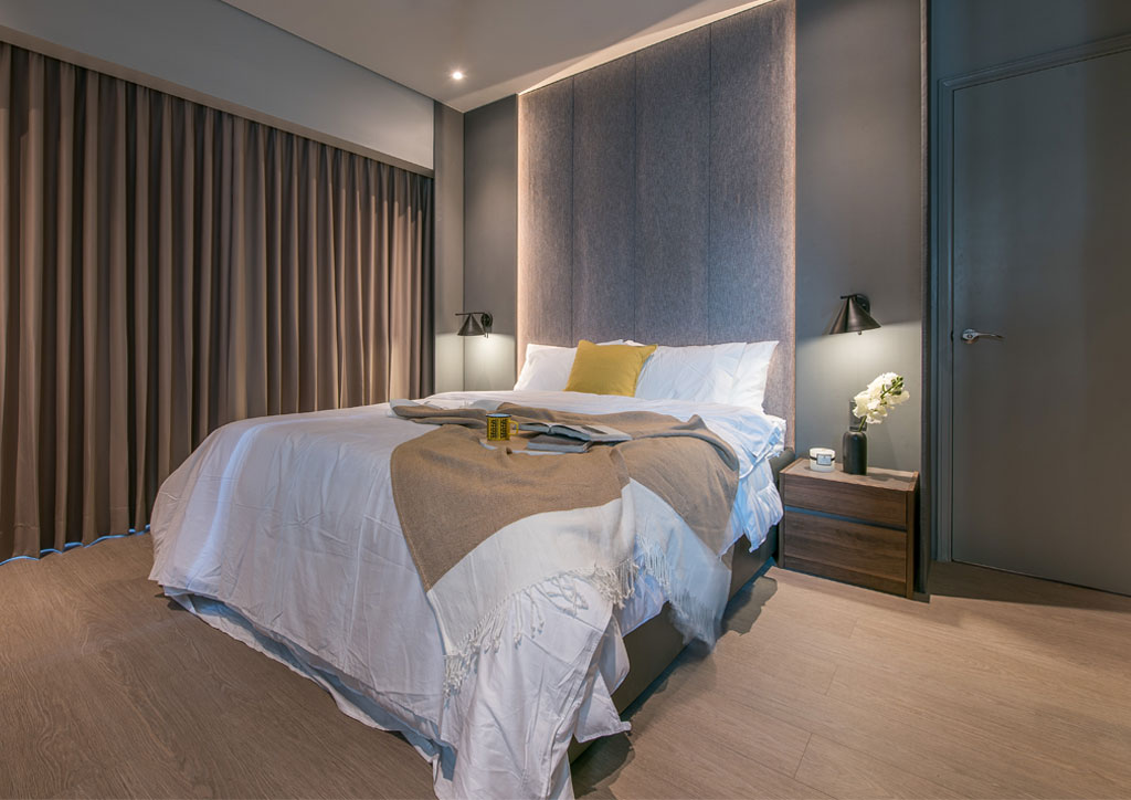
On the other side of the room is David and Karen’s room that at first glance looks so much like a hotel suite with its huge bed taking over the space. On either side are wooden night stands illuminated by two wall-mounted lamps. While the bed frame is without a headboard, but the fabric-clad wall at the head of the bed frame acts as one. On the left of the bed are the windows, while on the right is the closet and bathroom. In the corner is a desk-vanity area for the couple.
Within two months, the unit has become a modern minimalist young family condo in the world’s oldest Chinatown, providing a stark contrast to the traditional Filipino-Chinese sensibilities. Nonetheless, it suits the young family so well.
“It pays off getting to know the clients so you can capture their needs accordingly. The condo has to satisfy the needs of the clients more than anything else. So, be accurate with all the dimensions; and, remember that condo living is a compact lifestyle, so every inch counts when you are designing,” Patrick concludes.
