SM Home recently collaborated with Boysen Paints in one of SM Home’s Design Series “Living in Color”. This two-week collaboration brings together four interior designers styling vignettes with products from SM Home and walls based on Boysen’s Color Trends for 2018. The collaboration invites homeowners to be more creative with incorporating color in everyone’s home. However, just because you have a faovrite color doesn’t mean you have to pick up a paint brush and paint your entire home with one color. “Cohesion is what makes a design work, and choosing the right color palette for your design objective is essential towards creating cohesive living spaces,” says SM Home AVP for marketing, Tom Castañeda.
“The good news is that designers will always take a client’s color preference into consideration, and no matter which hues you’re most fond of, a great designer can find a way to make it work.” Tom enthuses, “And that’s what our In Living Color series is all about, we’re setting out to give our customers a sense of how color plays into design as a whole, and helping them find the perfect palettes for their own spaces,” he concludes.
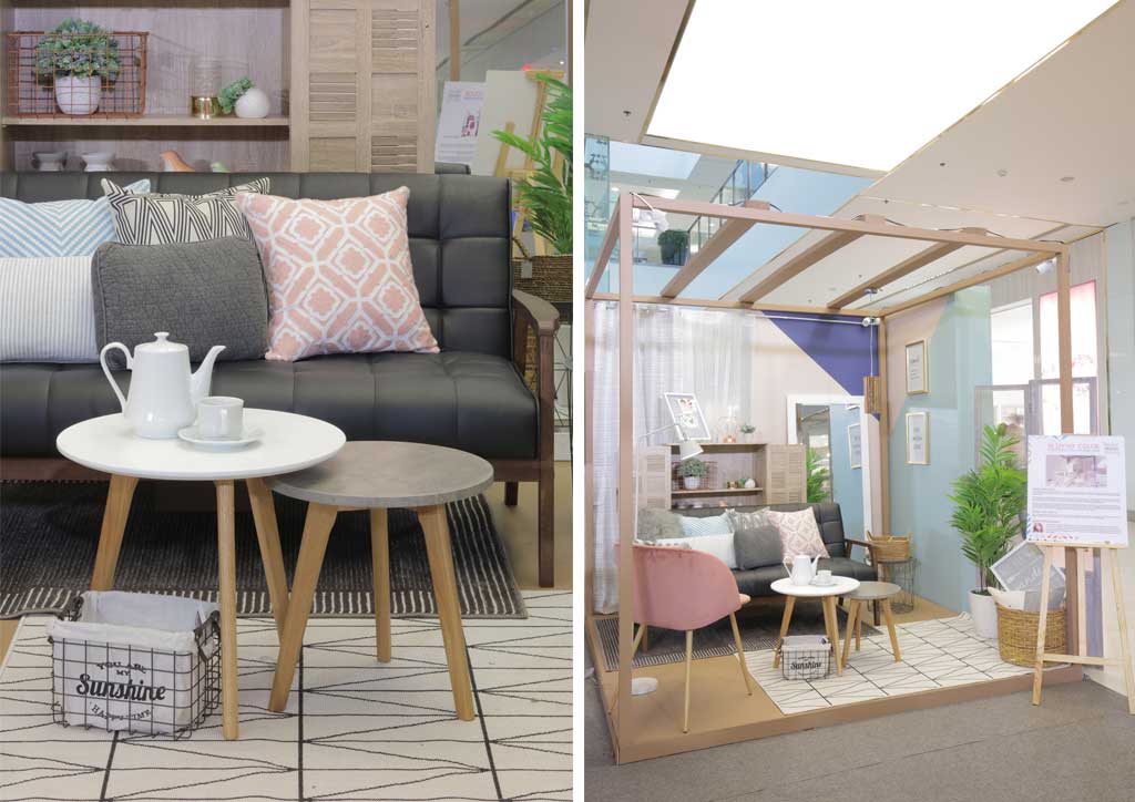
Here’s the three of the four vignettes and what you can learn from them!
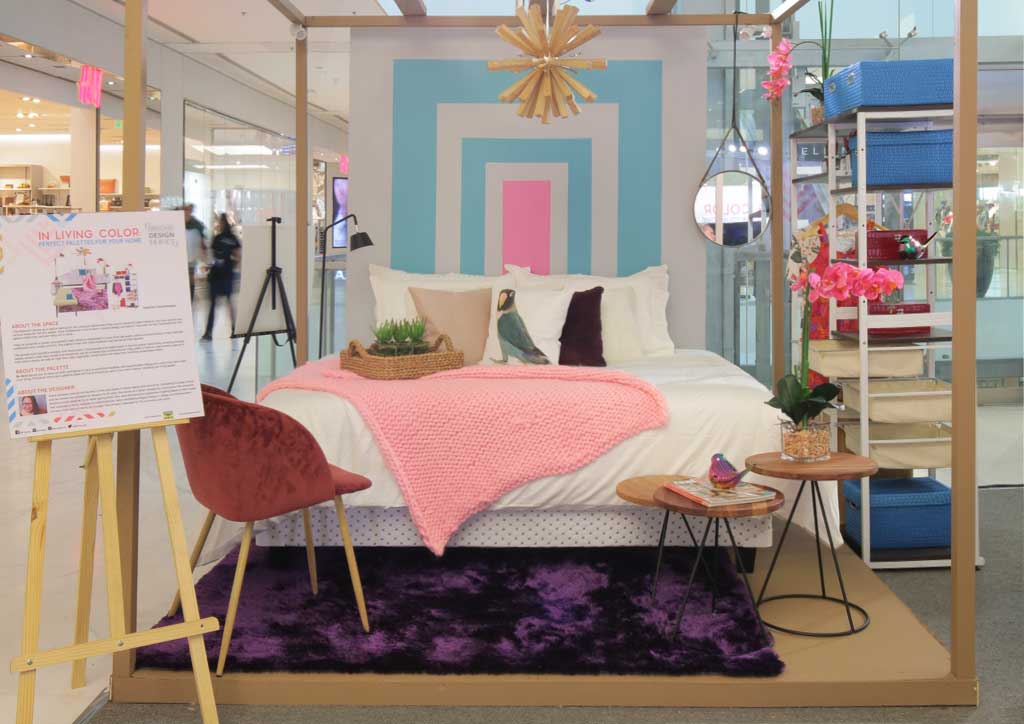
1 You Can Mix Your Paints
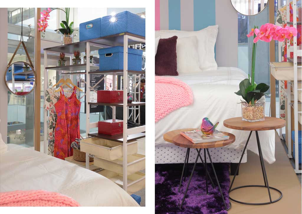
If you love two colors, you don’t have to just choose one! Why not mix them together for a colorful mural in your space? In Grace Mosrales’ bedroom vignette, we see a mixture of pink and blue for a serene living space.
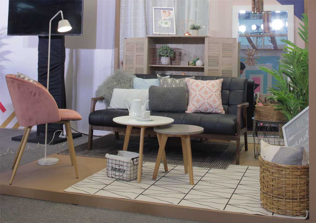
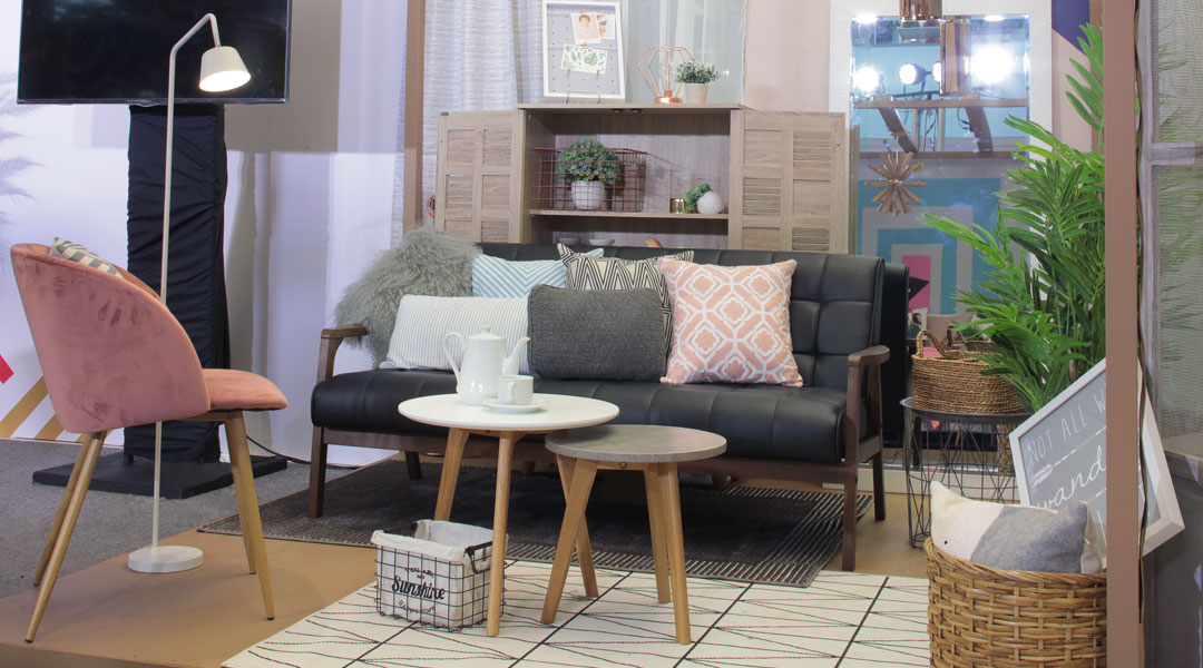
2 Separate Spaces with Storage!
Live in a small space? Consider using a cabinet to divide your space so it can also function as additional storage. Also, having an open cabinet allows you to flaunt off your fancy wardrobe!
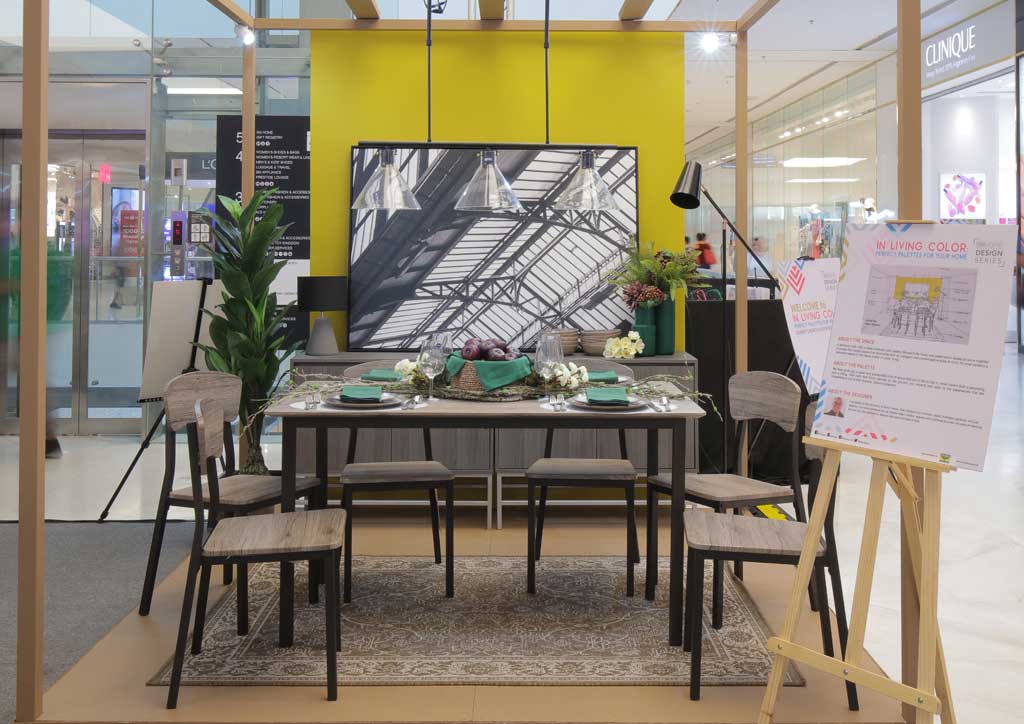
3 Accent Walls Will Never Go Out of Style
In the dining room vignette by Allen Oblena, the yellow accent wall takes center stage. Yellowstone Park is a color Boysen predicts to be a BIG color this year. To tone down the yellow, an architectural detail monochrome artwork from SM Home was added,
Read More: Decorating with Gen Z Yellow, Here’s How to Do It Right!
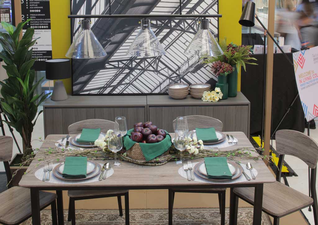
4 Add color through your accessories!
In the dining room vignette, green napkins were used on the tablescape. This is a complete contrast to the cool wooden furniture from SM Home. Accessorizig your table with colorful napkins is a very affordable way to give life to your dinner parties! Also adding a green punch into the space are some faux greeneries!
5 Opt for Pastels to let your Eyes Relax
In the living room vignette by Dawn Sy, pink and blue pastels reign supreme because Boysen predicts that these colros are here to stay. Aside from providing a Scandi-Cool space, pastels can help your eyes relax, as opposed to strong and bright colors. According to Boysen, this pallette of expansive neutrals give the deep serene blues space to breathe in and breathe out.