The Manila’s Metropolitan Theater’s Art Deco Style Has Influenced This Skincare Brand’s New Store
Arts Décoratifs, also known as Art Deco, is a style of architecture which became popular in the 1920s. The movement is characterized by its linear motifs, geometrical patterns, and zig-zags. In the Philippines, the Art Deco movement came by during the 1930s with groundbreaking projects from local architects, such as Juan Nakpil, Andres Luna de San Pedro, and Juan Arellano.
Manila Metropolitan Theater is one of the most prominent Art Deco buildings in the country. It was inaugurated in 1931 and has been dubbed as the “Grand Dame of the Philippines.” The grandeur of the theater made it culturally significant and has influenced several modern architecture.

Aesop, a skincare brand established in Melbourne, Australia, has opened its third store in the Philippines located at SM Aura Premier in Bonifacio Global City, Taguig. The new store pays homage to the decaying splendor of Manila’s architectural heritage. The brand’s in-house design team looked to the harmonious lines of the city’s Art Deco Metropolitan Theater, while also studying the gridded, luminous language of traditional Capiz shell façades.
In an exclusive interview with BluPrint, Marianne Lardilleux, Aesop’s Global Head of Store Design, explains that each Aesop store always has a distinct look while still following the brand’s cohesive ethos when it comes to store design.
“For Aesop SM Aura, our in-house team were inspired by the Filipino Art Deco style of Manila’s 1931 Metropolitan Theatre and the way it fuses local and international elements. We were also struck by the dignity of the building—how it has survived over the past 92 years despite the damage it has suffered; the wisdom held in its now-restored structure,” Lardilleux shares.
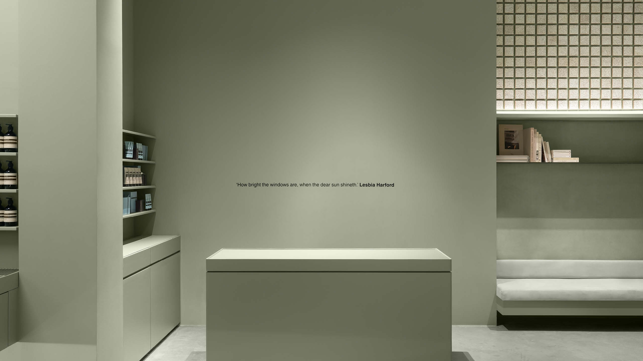
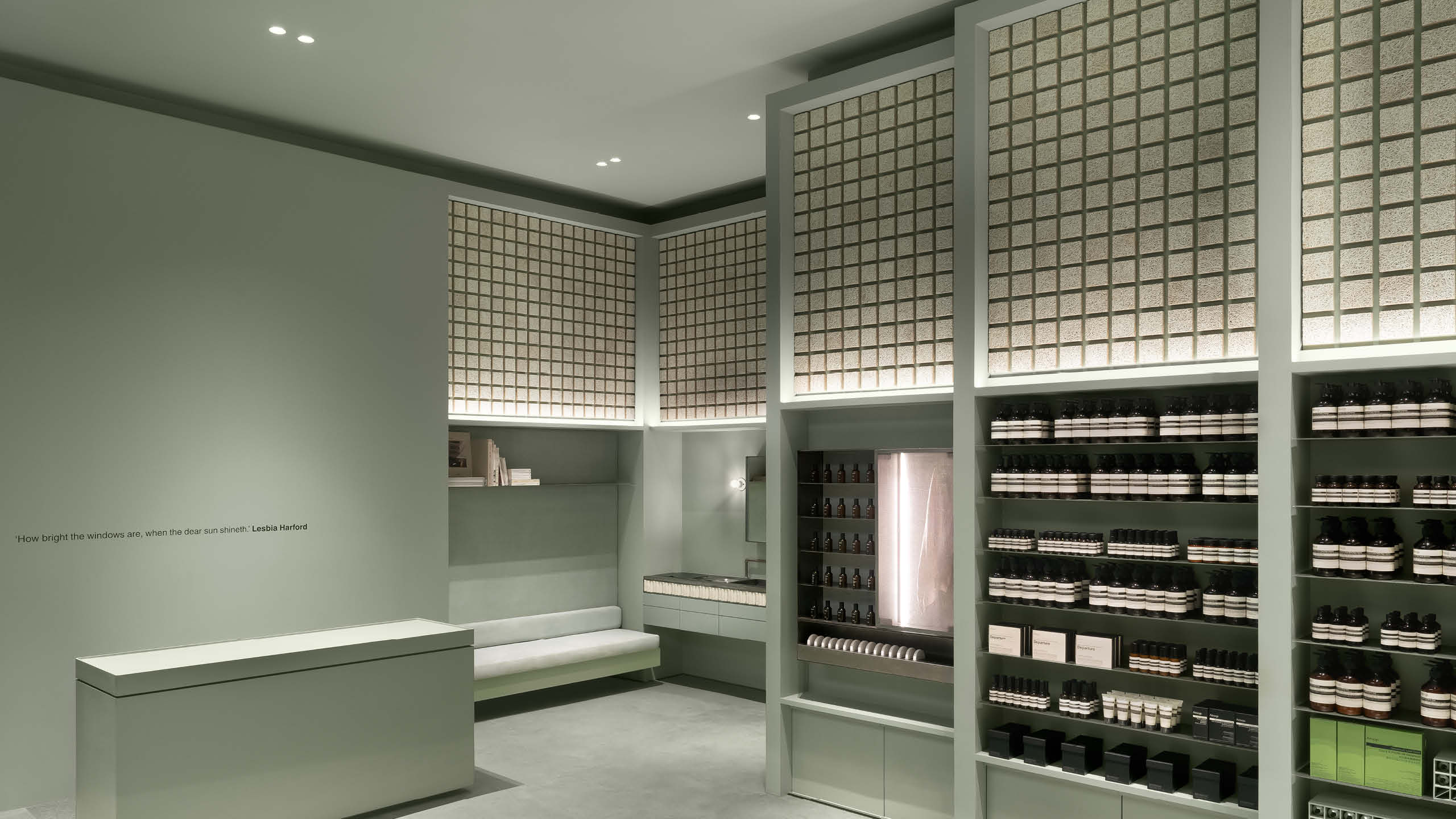
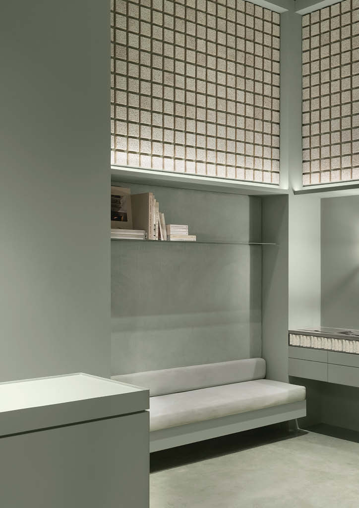
The team reimagined the details from the historic theater’s original interiors as terraced plaster walls where verdant hues wash over every surface. Within these stepped frames, a grid of wood wool tiles resembles the Capiz shell installations seen on the MET’s façade.
“Of course, Aesop has been fueled by an appreciation of the arts since the company was founded 36 years ago—looking at a cultural institution such as the MET felt like second nature to our designers,” says the designer.
The team draws constant inspiration from the arts and continues to cultivate cultural partnerships as an avenue to learn and engage with the brand’s customers. Along with a healthy skin care regimen, they aim to make the stores as a quiet reminder that any balanced lifestyle must include frequent engagement with the literary, performing, cinematic, and visual arts.
Related Read: https://bluprint-onemega.com/architecture/heritage/juan-arellanos-mastery-and-his-art-deco-buildings/
Incorporating Local Design Vocabulary Without Losing Brand Identity
Aesop has multiple stores globally, each featuring unique design while staying true to the brand’s identity and locally relevant. According to Lardilleux, the design team aims to marry a locally relevant design vocabulary in each store around the world with an underlying aesthetic and attitudinal consistency. They draw material and conceptual inspiration from each location.
“For Aesop SM Aura, our in-house design team learned from the cultural understandings that emerged in the design processes of our first two Manila stores and undertook their own meticulous research into the history of the site and its context,” explains Lardilleux. She told BluPrint that their designers visited Manila and spent a significant amount of time traversing the neighborhood and interacting with the brand’s local staff to understand the needs and desires for their third space in the Philippines. The team gravitated towards the poetics of Manila’s heritage architecture and were guided by the enduring local presence of the Art Deco movement, as well as the traditional Capiz shell installations.
Lardilleux highlighted that while two Aesop spaces are never the same, when a customer enters any door around the world, they encounter the familiar: the products on the shelves, the knowledge, gracious hospitality and service extended by the brand’s consultants, and an aesthetic anchored not only to the brand’s sensibility but also to local culture, traditions, and materials.
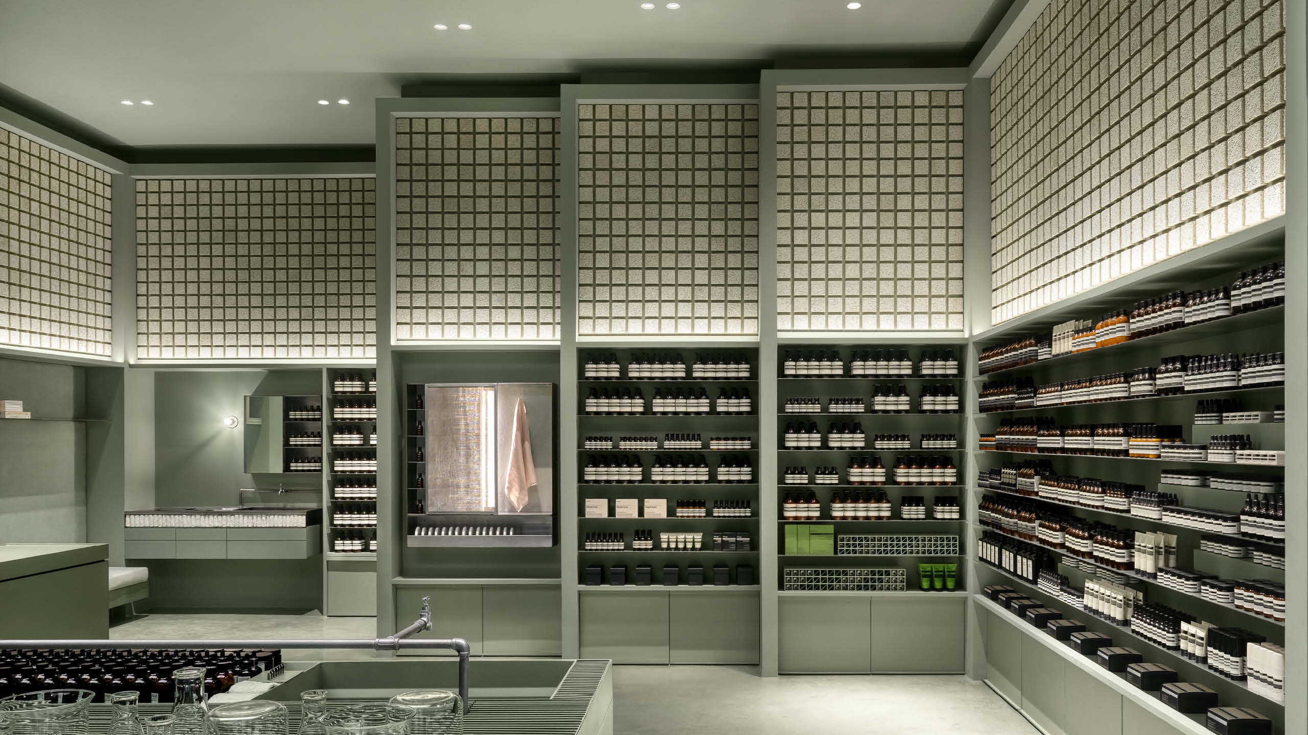
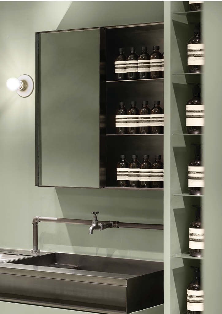
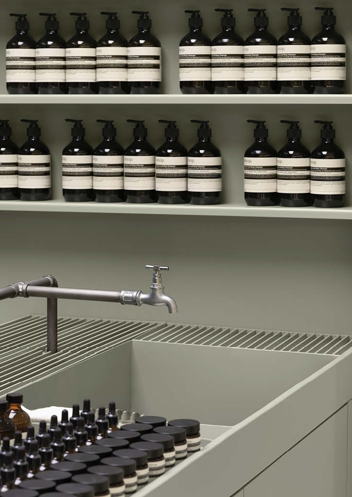
When it comes to the materials, Aesop SM Aura used matt vibration-finished stainless steel which Lardilleux describes as a humble and familiar utilitarian material. The store also features exposed stainless-steel plumbing, drainage grills, and garden taps that weave an emotional connection to the enabler of hygiene and hydration, and color-pigmented concrete that forms the continuous ground plane of the store.
Additionally, the store used Forest Stewardship-certified plywood that is kept untreated for all internal joinery carcasses and dressed in natural paint throughout. Walls and ceilings are coated in low-VOC, water-based paint. Above the shelves, walls are covered with wood wool tiles in reference to the Capiz shell installations. Apart from the aesthetic value, this detail also helps absorb sound and enhance the store’s air quality.
Lardilleux explains that the moss-green shade of the store provides a sense of calm and serenity. The team chose this color after they saw photographs of the MET’s original interior, whose dimpled walls were washed in a similar hue.
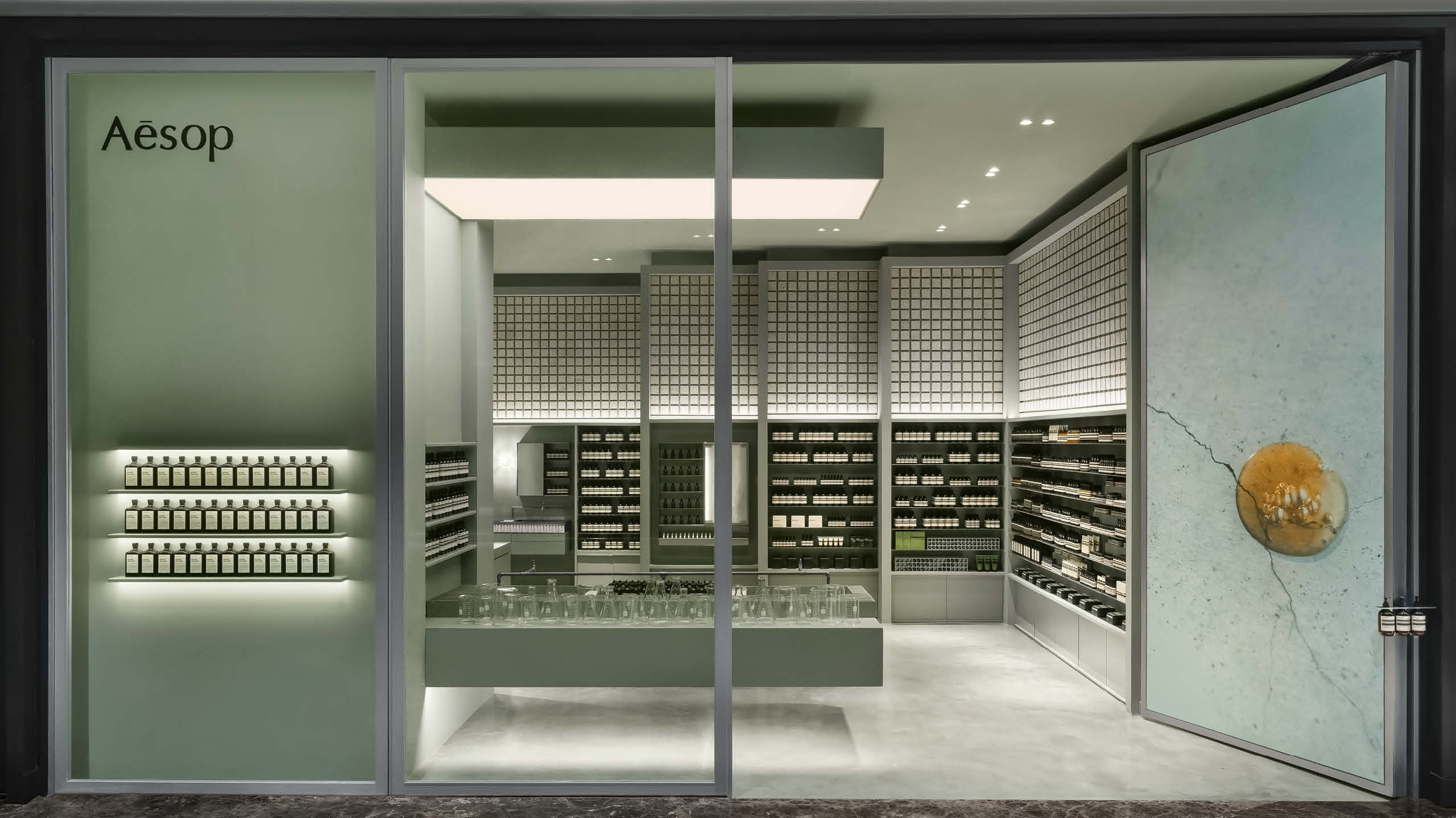
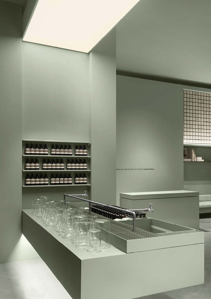
For its stores in shopping centers, Aesop aims to provide reprieve from sensorial bombardment. “With Aesop SM Aura, we created a space of subdued acoustics through the use of articulated matte wood wool paneling, and visual respite with a palette of calming moss green and thoughtful lighting. We hope customers feel a sense of serenity and curiosity upon entering the space. If they venture into the store’s depths, and so choose, they will have the pleasure of an individualized consultation at an intimate individual basin,” explains Lardilleux.
Related Read: https://bluprint-onemega.com/architecture/concept/exclusive-a-look-inside-aesops-bahay-kubo-concept-store/
New Store, New Experience, Same Brand
The third Aesop store in the Philippines offers a different experience for its customers. The SM Aura store introduces two further elevations of customer experience: an ‘ensuite’ basin for personal skincare consultation at an intimate, domestic scale and a Fragrance Library that showcases Aesop’s growing range of unconventional fragrances. In the Fragrance Library, visitors can infuse a garment with the Eau de Parfum of their choice before venturing outwards into the world.
When asked her favorite design element, Lardilleux said it’s the Fragrance Library. “Here, curious noses are invited to participate in an olfactory programme of unconventional aromas. Their owners can then infuse an item of clothing with their preferred Eau de Parfum—a memento of the fragrant recital to bring along into the outside world,” she explains.
Aesop believes that the best way for customers to engage with the brand is through direct skin contact with their products. For the team, the most engaging way to do this is at one’s own pace in the uplifting environment of the brand’s stores. The generous central trough becomes a communal podium for encounters with Aesop’s skin, hair and body care formulations, while an individual basin at the rear of the store accommodates more intimate consultations.
Photos Courtesy of Aesop Philippines


