Color is and has always been mysterious to those studying it as part of science or design practice. It eludes definition because it’s an experience as well as a cerebral sensation that’s influenced by three things: the person viewing it, the light in the environment that the viewer is in and their relationship or understanding of the object or space they’re viewing. So with that perspective in mind, color is not actually a thing in itself but more of a personal experience. This is because color in interior design is largely subjective in nature, making it a truly exciting area to study in interior design. Color can influence your mood & feelings, have an impact on your decisions & behavior and affect your overall wellbeing.
When most people think of colors, they see it as something that only has a purely aesthetic impact. However, colors actually play a vital role on the psychological impact of the interior design application on its users, especially in interior spaces where people stay for long periods of time. In design school, we cover Color psychology separately to understand the nuances within the theories and applications of color. It is truly an interesting subject that influences us as users and designers every day. It’s a discipline that researches how color influences human behavior & decision making.
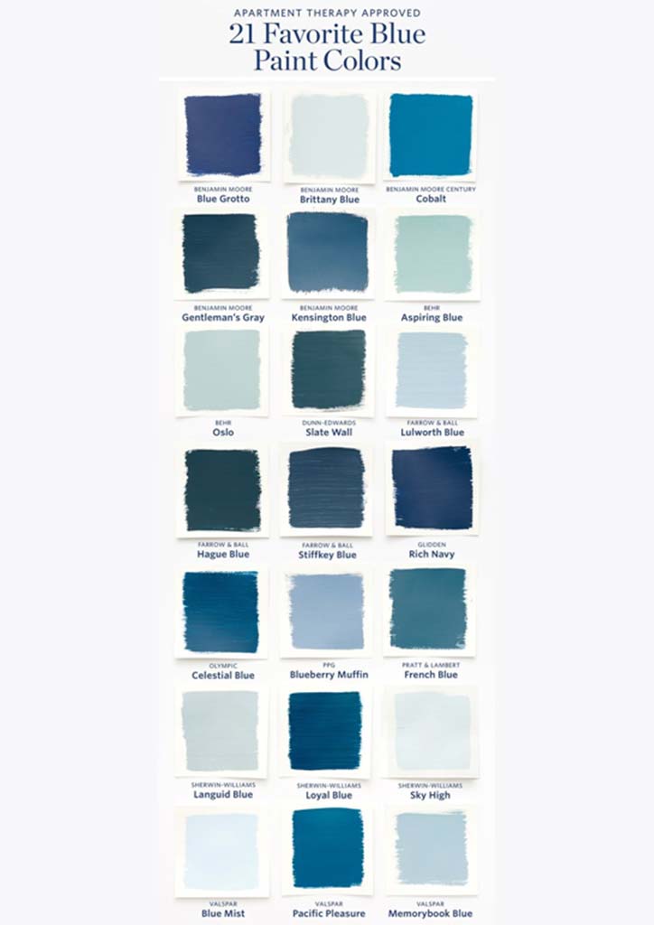
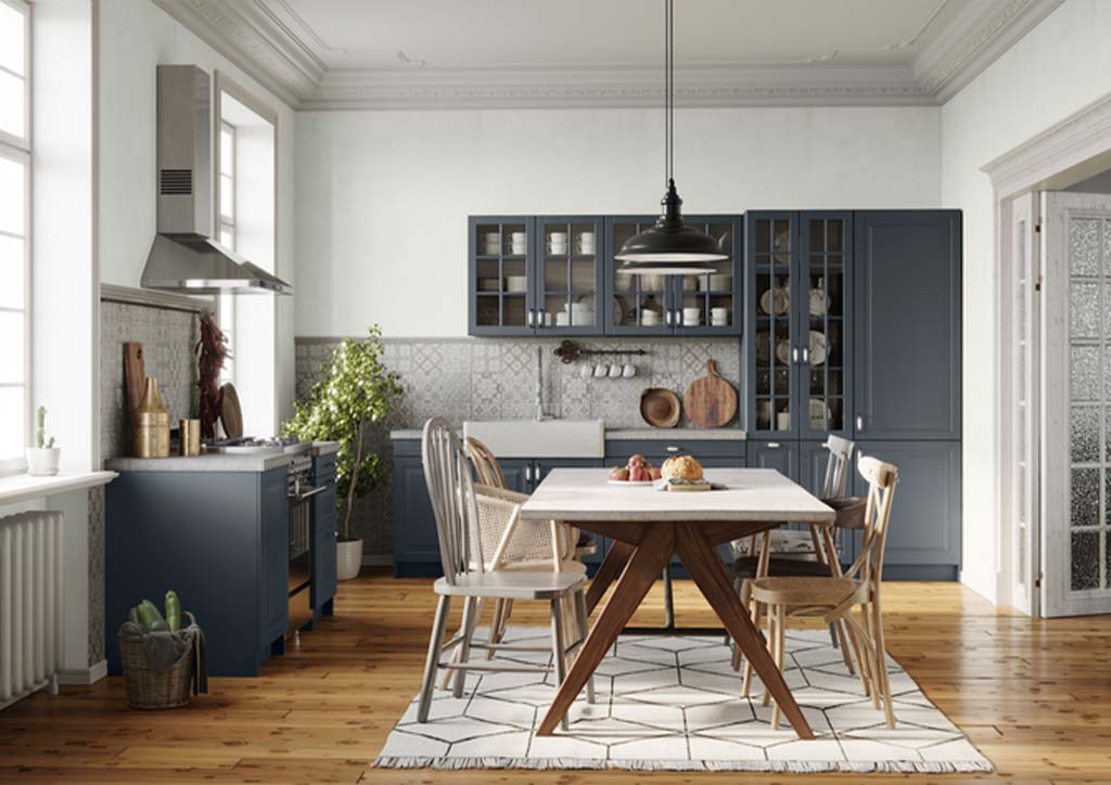
As an interior designer, there are times where we are inclined to use one color more than the others because of themes we have in mind, a brand guide provided by a client or because logically, it may be more appropriate to choose based on the purpose of the space. However, most of the time, this comes down to the emotions evoked by certain colors & how the user of the space aka our clients & how they connect with that emotion. It’s good to note that your feelings about color are often deeply personal and rooted in your own experience or culture. For example, the color white, though technically not a color, is used in many Western countries to represent purity and innocence, but it is seen as a symbol of mourning in many Eastern countries. Blue on the other hand, transcends cultural boundaries the same way we share the same sky and the sea cuts across the globe. The color of blue, reminiscent of the heavens above and bodies of water below, is considered a color of calm worldwide. It soothes us the way sitting in the sand to watch gentle waves wash ashore soothes us. This is also the reason most airplane interiors are blue, to comfort anxious flyers.
On the warmer side of the spectrum, we have colors like oranges and reds that have been globally associated with passion, energy & increased metabolism. However, on the flipside of that coin, we have to understand that it can also have a negative impact when done incorrectly. That same color can actually increase blood pressure, cause irritability and even eye strain after prolonged exposure.
So the solution? Don’t focus on just one color but a range of colors that work harmoniously together and to know the ideal amount you should use in a space.
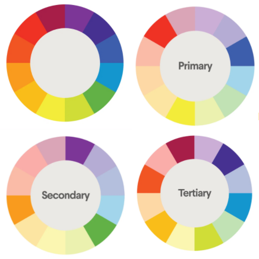
Here enters the study of color harmony. By definition, the term harmony describes something that is pleasing to the eye. It engages the viewer and it creates an inner sense of order or a balance in the visual experience. When something is not harmonious, it’s either boring or chaotic. An essential tool to have is a 12-pie color wheel and the first thing you have to know is that there are warm colors, generally associated with energy, brightness, and action, and cool colors, which are often identified with calm, peace, and serenity. When you recognize that color has a temperature, you can understand how choosing all warm or all cool colors in space can impact mood & how people within that space behave and interact.
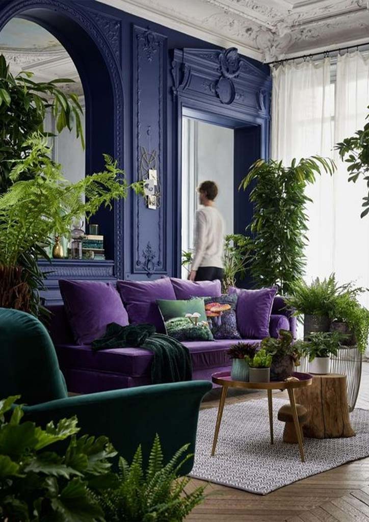
First on the list are Complementary colors. These are two colors found at the opposite side on the color wheel—red and green, for example. To help you remember them better, these colors can be thought of as “soulmates” because these opposites attract and complement each other by producing a sharp contrast between the two colors, making the imagery or arrangement pop. These contrasting color matches, like a perfectly paired couple, work exceptionally well together as they complement each other’s beauty. As a decorating color palette choice, there’s a whole range to choose from. Let’s not forget that pink is derived from red and greens can come in a range of tones too, just look at the vast difference in plant varieties!
The second general category is called Analogous colors. These 3-4 colors sit next to one another on the color wheel—red, orange and yellow, for example. When creating an analogous color scheme, one color will dominate, while another will accent. In spaces, analogous color schemes are very pleasing to the eye and can easily be expanded to include up to four or sometimes even five colors that sit next to each other in the color wheel and it will work because these colors are all very similar hues.
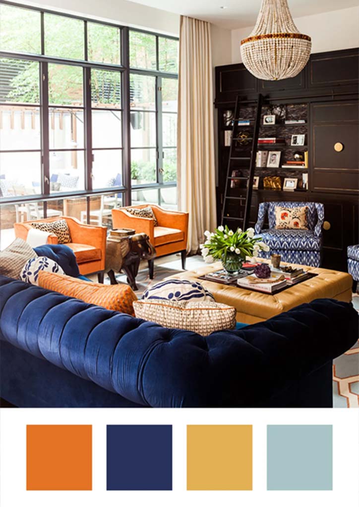
The third are called Triadic colors. These are 3 colors evenly spaced around the color wheel and tend to be very bright and dynamic–red violet, yellow orange and blue green for example. Using a triadic color scheme in your interior space will create both visual contrast and harmony simultaneously, making each item stand out while making the overall visual effect a delightful one. Take caution though as these colors are tricky to distribute. The best approach is to try going for a 60, 30, 10 rule. 60% goes to large areas like walls, 30% goes to furniture & soft furnishings and the remaining 10% goes to decorative pieces like light fixtures and accessories. Don’t forget to consider the tones of your natural finishing materials too like stone, wood, glass & metal! Those should be part of the planning process of your color palette as well.
It may seem daunting but color is an experience in itself and can be very subjective. These theories exist to help us understand the effect of colors, knowing the rules also allow us to break them every so often. So don’t be afraid of trying colors that personally bring you joy and lift your spirits. It’s something that we definitely need more of now.