Organized biennially by the Design Center of the Philippines, the Good Design Award Philippines (GDA) champions a distinctly Filipino approach to design rooted in malasakit (caring). It posits that good design goes beyond balancing form, function, and innovation—it creates meaningful solutions that respond to society’s most pressing challenges. The awards also advances the United Nations […]
Unexpected Red Theory: The Trick of Random Pops of Red
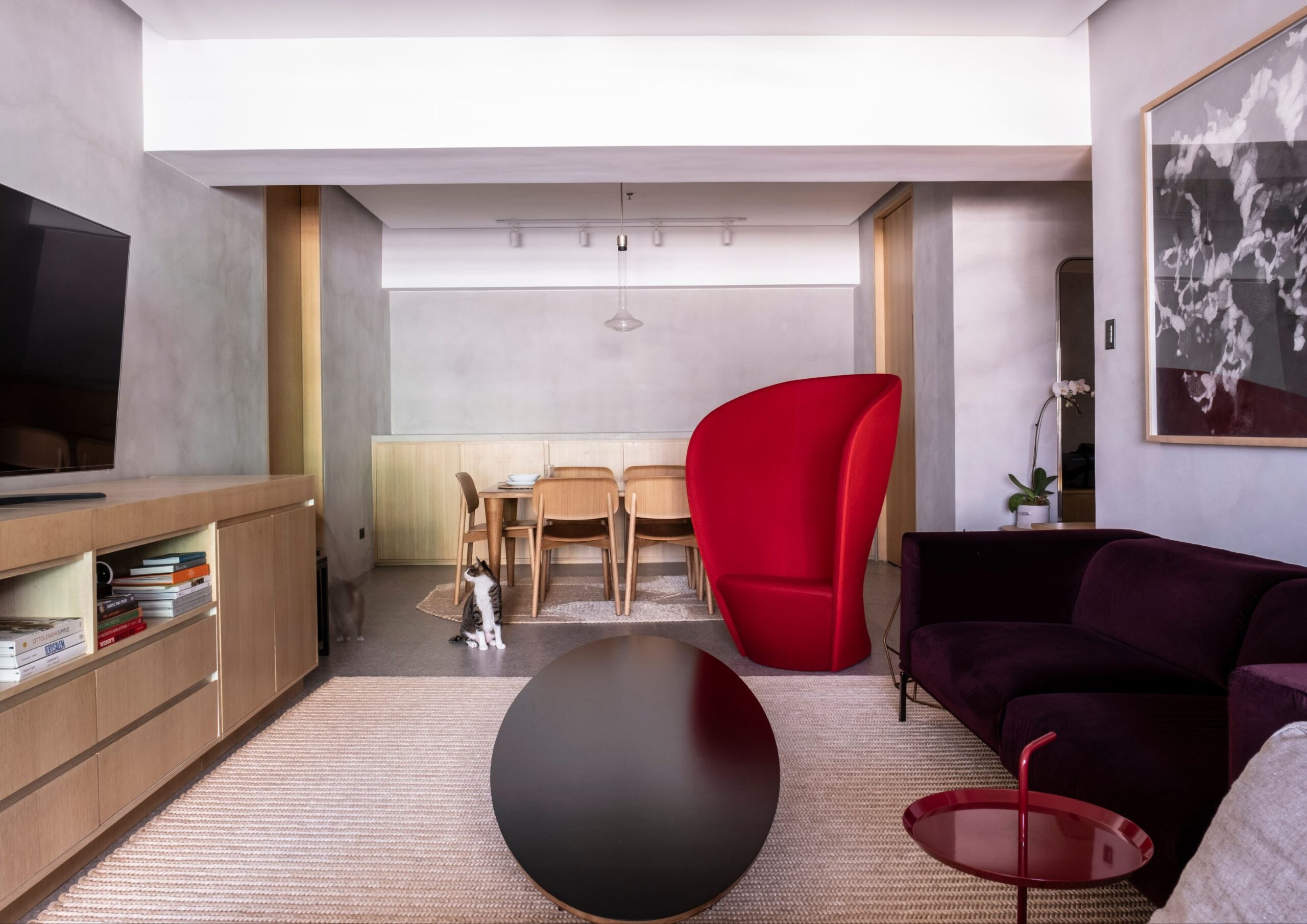
When designing homes, crafting a plan is an essential step to make every element feel intentional. But what if there’s a way to arrive at the same results without following a strict blueprint? Don’t overthink the answer because you could immediately elevate your home with a random pop of red color.
Introducing Red in a New Light

The Unexpected Red Theory suggests that red instantly makes spaces, where it is least expected and needed, interesting and intriguing. First popularized on TikTok by Brooklyn-based interior designer Taylor Simon, this notion highlights red as the random element you can easily add to automatically make your home look better. It can be anything from furniture, decor, paint, or any home item and detail of any size and form.
In theory, since this design method has a more devil-may-care approach, it should only work with downright dull-looking spaces. But it surprisingly complements even deliberately created interiors with elements that don’t require red at all. In a way, red now becomes as forgiving and versatile as neutral colors.
It might seem like the result of trial and error, but there is more than probability to support this premise.
Red Analysis
 - BluPrint")
In color physics, red has the longest wavelength that sits in the range of 620 to 750 nanometers among visible colors. Due to its dominant property, this color is the most detectable by the naked eye. So, regardless of its saturation, it stands out even when blended with other striking colors like yellow and blue.
Such a rigid characteristic leaves a lasting impression, and this is where color psychology enters the discussion. Although imparted psychological effects may vary due to a number of factors, red prevailingly induces intense emotions. It spans from affections (love and passion), warnings (fear and sense of danger), or increased impulsions (dominance, desire, and aggression).
This then creates a butterfly effect to our physical body in the form of heightened involuntary movements generally referred to as arousals. Increased metabolism, appetite, excitement, blood pressure, and eye blinking are all indicators of this physiological response. Consequently, we tend to be more alert in this state, making us extremely focused either in a pleasurable or agitated way. This is why the “unexpected red” easily catches our attention.
But another angle to look into is how mainstream interior design conditions our perception. As modern designs follow a rather monotonous and clean approach, we get used to spaces with stripped down colors. As a result, even a small pop of red color surprises our senses since it breaks and counterbalances the blandness.
Testing the Hypothesis

More than breaking plainness and neutrality, the unexpected red theory proposes red as the focal point to establish your space’s character. This means overfilling your home with red or carelessly putting red accents doesn’t automatically do the job.
The International Association of Color Consultants suggests testing this theory “with caution.” As red causes physiological acceleration, we often perceive it as visually pleasing. But according to interior designer Samantha Stathis Lynch, the theory shouldn’t be simplified into simply throwing a red color and expect a perfect outcome. In fact, it shouldn’t be called a “theory” in the first place.
Interior designer Kishani Perera claimed that a pop of red color is “one of the oldest tricks in the book.” Color expert Maria Killam reiterated that by calling red accents as a “theory” emphasizes how it’s infrequently used in the past.
But Simon defended her point by stating that unexpected red theory thrives on intentionality. For things like picture frames and lampshades, which are always in neutral colors, a sudden touch of red makes them more appealing.
Granted, this design method can make the added red element feel intentional even if it’s not in the initial plan.
How to Make the Unexpected Red Work
-62 - BluPrint")
Similar to other formulated theories, the unexpected red theory delivers the best and most accurate results in goldilocks conditions.
Mix with complementary and analogous color schemes. Using the color wheel, combine red with colors directly across it, which are blue and green. These complementary colors establish a balanced contrast by collectively following a uniform value and chroma. Its analogous colors, orange, yellow, and purple, creates a warm and forgiving environment for red accents to effortlessly pop. With this, you can ensure classic and safe color pairings, especially if you’re testing the theory for the first time.
Opt for warmer tones. Remember that red shouldn’t be as dull as the other interior elements where it will be added. The key to a successful application of the unexpected red theory is to keep the red color warm. Burgundy, cherry, and ruby are a few of the eye-catching tones you can use in your space.
Apply on statement pieces. Statement pieces naturally draw attention regardless of their color. So, adding a touch of red on them further enhances their prominent features. Whether on artwork frames, throw pillows, rugs, or table tops, you can make your red element the center of attention. You can also turn your bland walls, ceilings, and other architectural features like columns and arches into statement pieces by making them red.
The unexpected red theory, beyond being a novel design, reminds us that good things can also arise from happy accidents. And that element of surprise is what makes this method intentionally beautiful despite not being a part of the initial intention.
Read more: Galley Kitchens: Making the Most of Every Inch


In the business district of Bonifacio Global City rises a residential development designed around low-density living. Aurelia Residences brings together architecture, interiors, landscape, and art to create an elegant and culturally-resonant living environment. Related Reading: Shang Summit: Shang Properties Unveils New 250-Meter High Rise Architecture, Interiors, and Landscape Design Arrival plays a central role in […]

Architecture awards often document more than just individual achievements. They also recognize the work, effort, and vision behind any architecture project, revealing the priorities, values, and trajectories of a profession at a given moment. The United Architects of the Philippines’ (UAP) Outstanding and Beyond Recognition Awards (OBRA) continues to serve as one such marker, recognizing […]

For 66 years, the Ateneo Art Gallery (AAG) has been at the forefront of preserving modern and contemporary Philippine art. Today, its home at Areté reflects an expanded mission: to extend beyond exhibitions to cultivating education and creative exchange. Building a Home for Contemporary Art The AAG was founded in 1960 after artist, collector, and […]

A kitchen is one of the hardest-working spaces in a home. It must withstand daily wear, changing routines, evolving technologies, and shifting lifestyle needs while remaining visually coherent within the larger architectural narrative. While every project has its own requirements, experienced designers often return to a similar set of considerations when evaluating a kitchen. Here […]

The modern kitchen has evolved beyond its traditional role as a place for preparing meals. It is the heart of the home – a space where daily rituals unfold, conversations linger and the rhythm of everyday life takes shape. As open-plan living continues to redefine residential design, the kitchen is no longer a separate room, […]
Download this month's BLUPRINT magazine digital copy from:

Subscribe via [email protected]
Recommended Video
Tap to Unmute
Unmute
0:00
0:00