How can better-planned cities create the conditions for more creative, livable, and resilient urban environments? “Makati Urban Recipes for a City’s Survival,” a colloquium held at the Ayala Museum on September 15, brought together architects and practitioners from the fields of urbanism and the creative economy to discuss how design, planning, and collaboration can address […]
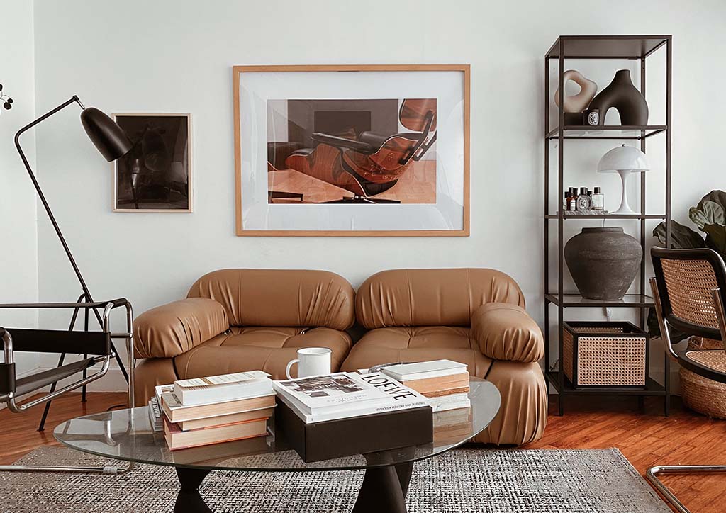
Espresso: A Unique Neutral Color Adding Warmth and Drama to Interiors



Driven by the popularity of soothing living spaces, neutral colors have become a fundamental choice to counterbalance vibrant hues. Since they innately exude a relaxed and understated ambiance, they typically pair well with most interior styles. But there’s a new, deeper shade that’s trending—espresso. Different from other neutrals, it works as a base color or as a striking statement. Discover more about espresso and how it can be strategically incorporated to add warmth and drama in your home.
That’s That Shade, Espresso
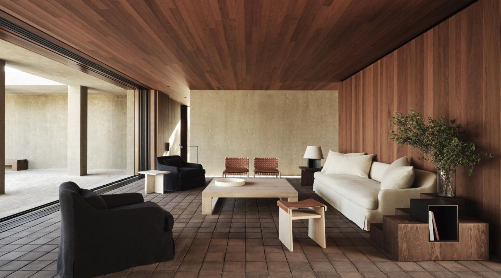
Espresso, as its name suggests, is a dark and rich shade of coffee brown due to its black undertones. Basically, it’s darker than most browns and lighter than most black colors.
Due to its variations, ranging from ashy to chocolatey, many interior designers choose it as an alternative to black. However, espresso doesn’t come out as harsh and edgy because of its inherent warmth. In spaces with little to no natural light, this color might look like a true black. But its reddish brown tones appear once exposed to direct sunlight.
Although it can be categorized as a bold color, its sophisticated and grounding presence sets it apart. After all, espresso is still neutral and it’s only natural for it to blend seamlessly with other color palettes and interior styles. This is why it’s ideal as a focal and backdrop color and even in accent pieces and accessories.
While it’s difficult to pinpoint the exact origins of this trending color, it started to gain traction alongside the rise of modernism. In particular, the surge of mid century modern interiors often features neutral colors, including deep brown and black. This further grew in popularity when people began hyping the coffee culture, the same way the cafecore trend was born.
Regardless of its roots, espresso stands out as one of the most unique and versatile interior color designs today.
What Pairs with Espresso?
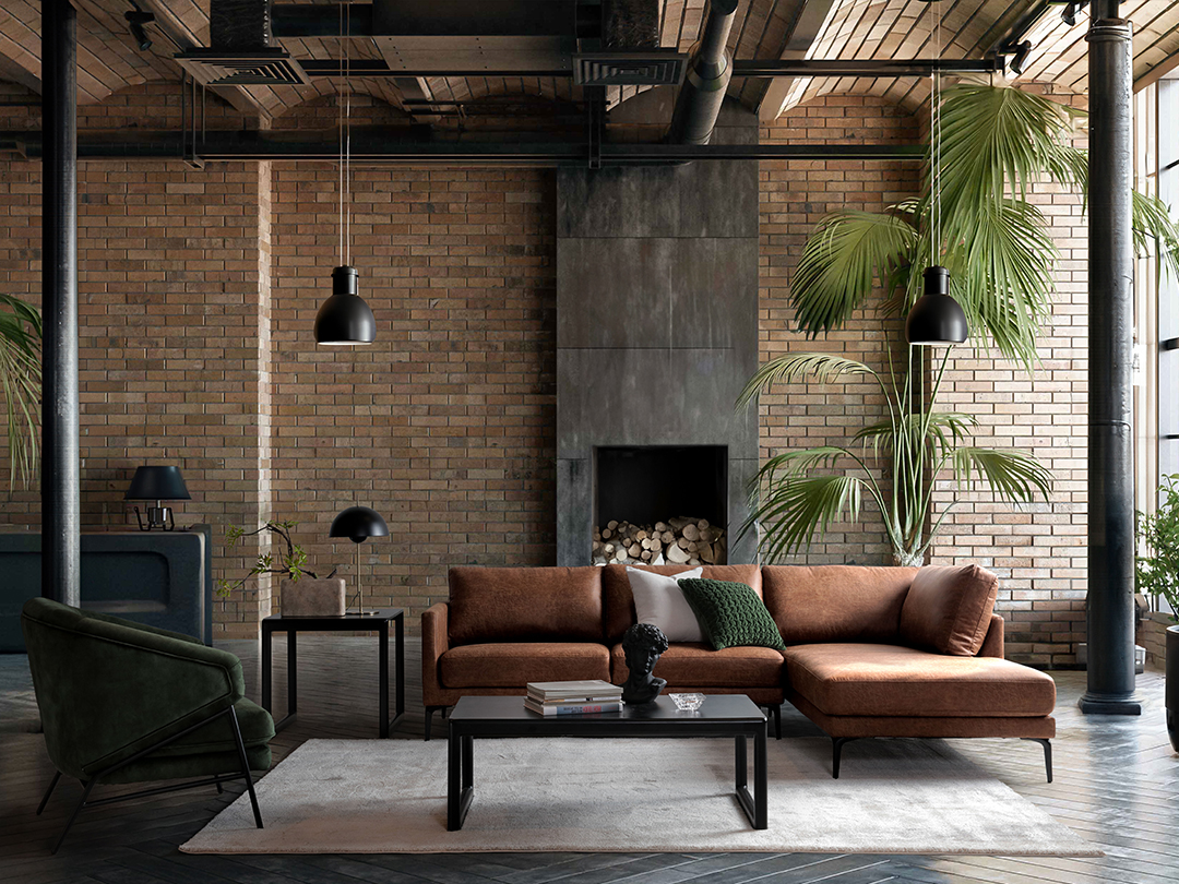
As a dark color, it’s common to combine espresso with lighter neutrals and pastels for a balanced look. But since this trending color is also neutral, it goes perfectly even with other bold hues and finishes.
Earth Tones. Since espresso and earth tones are both inspired by nature, this combination creates a harmonious and inviting atmosphere. Soft neutral colors or those with red, green, and yellow undertones balance the intensity of espresso, preventing the space from feeling too dark. This subtle contrast further establishes a sophisticated and dramatic ambiance in the space.
Vibrant Hues. Thanks to espresso’s dark tones, vibrant hues can pop and shine to make visually stimulating and energetic interiors. Pairing this trending color with teal, mustard yellow, burnt orange, or fuschia adds dynamism and a contemporary feel to a room. Plus, espresso stabilizes the high contrast of the brighter colors, preventing the space from feeling chaotic and overwhelming.
Metallic Finishes. When used with tiny details like fixtures, hardware, and decorative accents, they can make espresso appear more complex and interesting. The reflective property of brass, copper, and gold further highlights espresso’s richer and deeper tone, particularly if it’s used for larger spaces and pieces. Moreover, metallic finishes allow espresso to exude a luxurious feel, elevating the overall aesthetic of the room.
Other Dark Neutrals. Besides creating contrast, espresso needs supporting colors to help it shine. Dark neutral colors like browns and grays serve as a cohesive foundation that complements the depth and richness of espresso. Additionally, it creates a unified and moody look, perfect for sophisticated and contemporary spaces.
Warm and Dramatic Interior Color Design Ideas
Since it’s both a statement and base color, you can integrate espresso in almost every part and item of your house. Here are some of its best applications to get you started.
Espresso Accent Wall
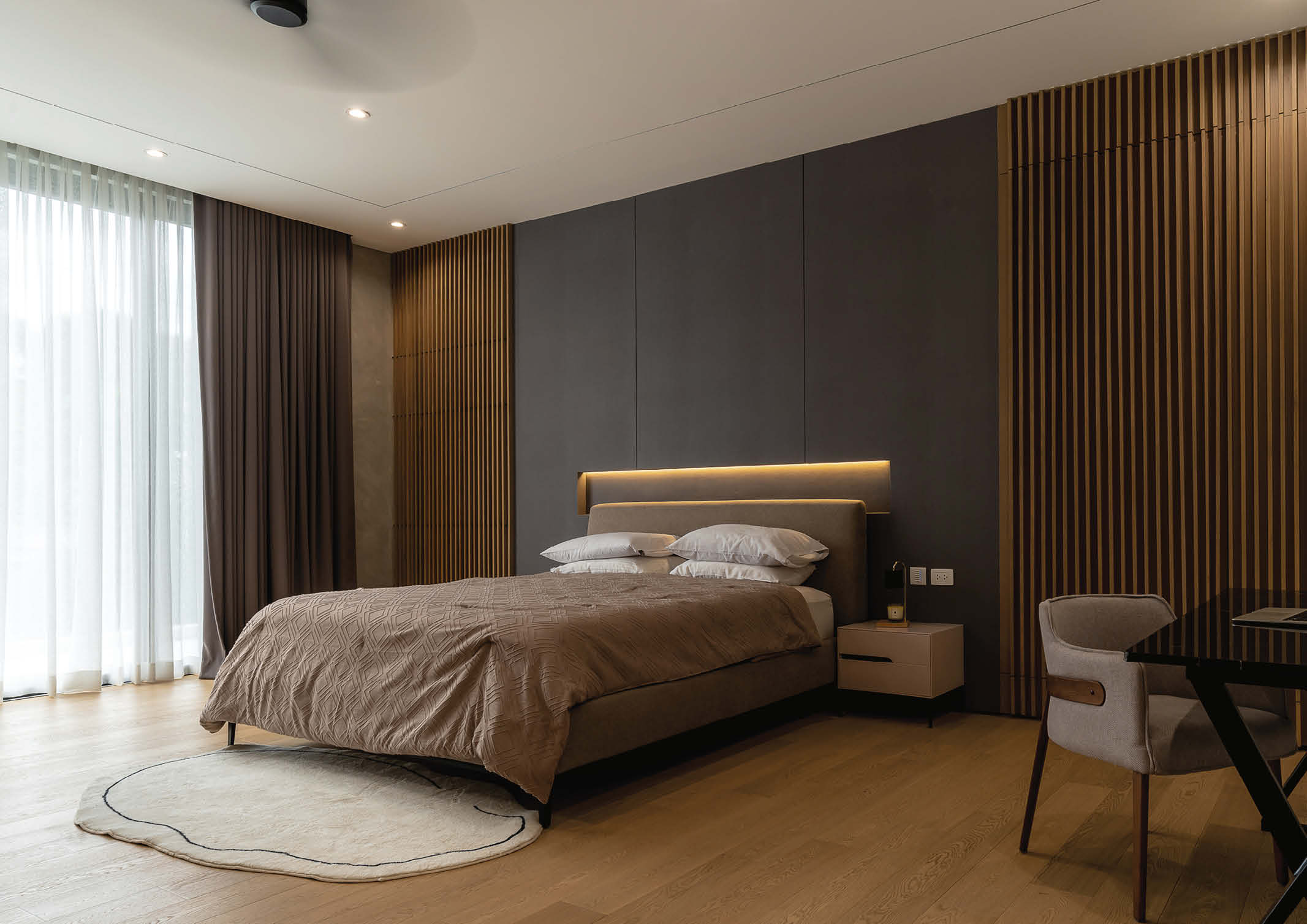
Using espresso for accent walls is more effective when you surround it with lighter and warmer shades of brown. Since it’s the darkest shade in the room, it anchors the space and prevents it from feeling too bland or overwhelming. Better if you place it near a window to help accentuate the espresso’s unique color.
Emphasized Architectural Element
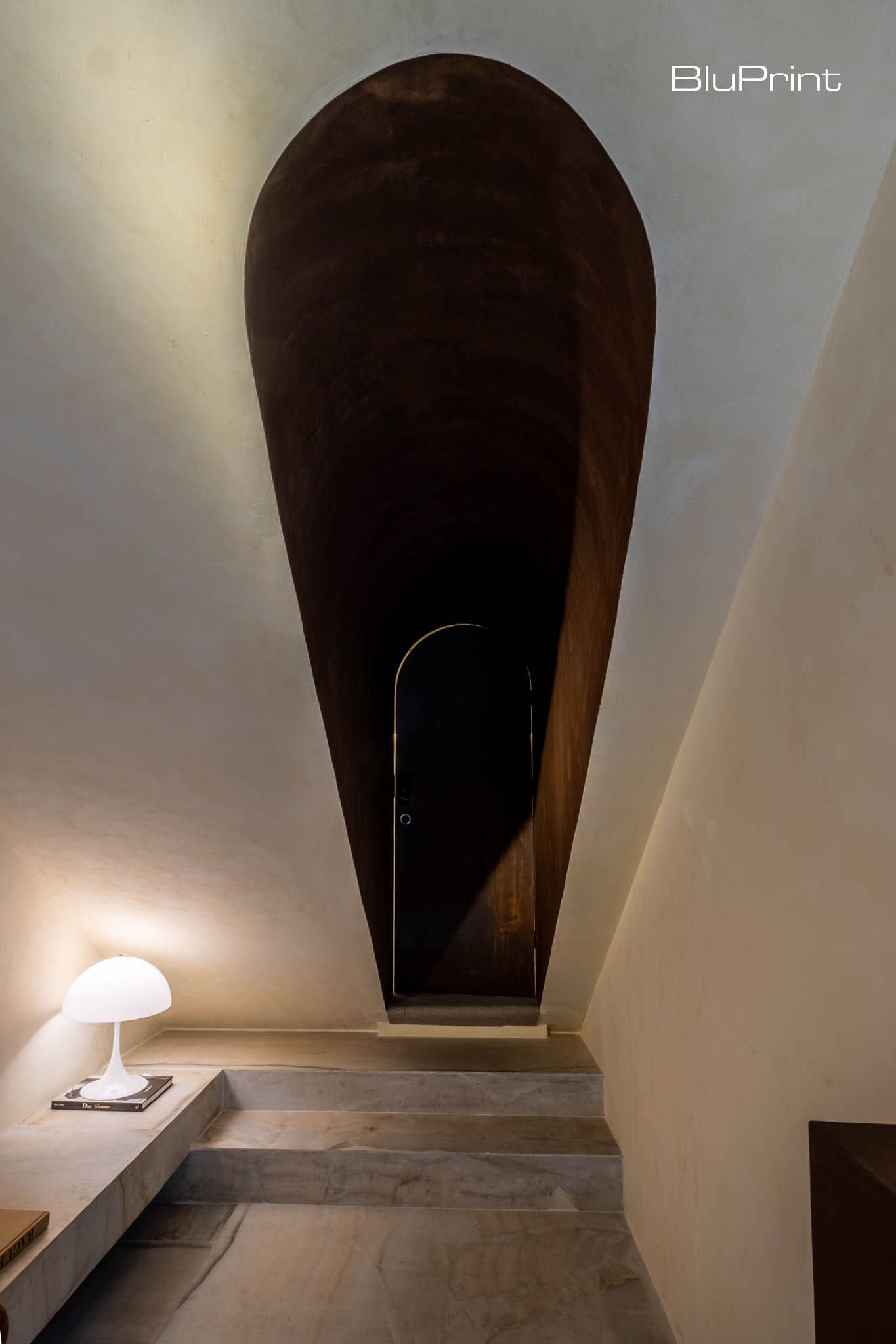
With its eye-catching shade, espresso can instantly highlight architectural elements to add depth and dimension to the space. Due to its shade close to black, it can seemingly cast shadows, especially if the space is draped with light colors. On top of it, it makes even the awkward areas noticeable and turns them into another focal point of interiors.
Built-in Closet
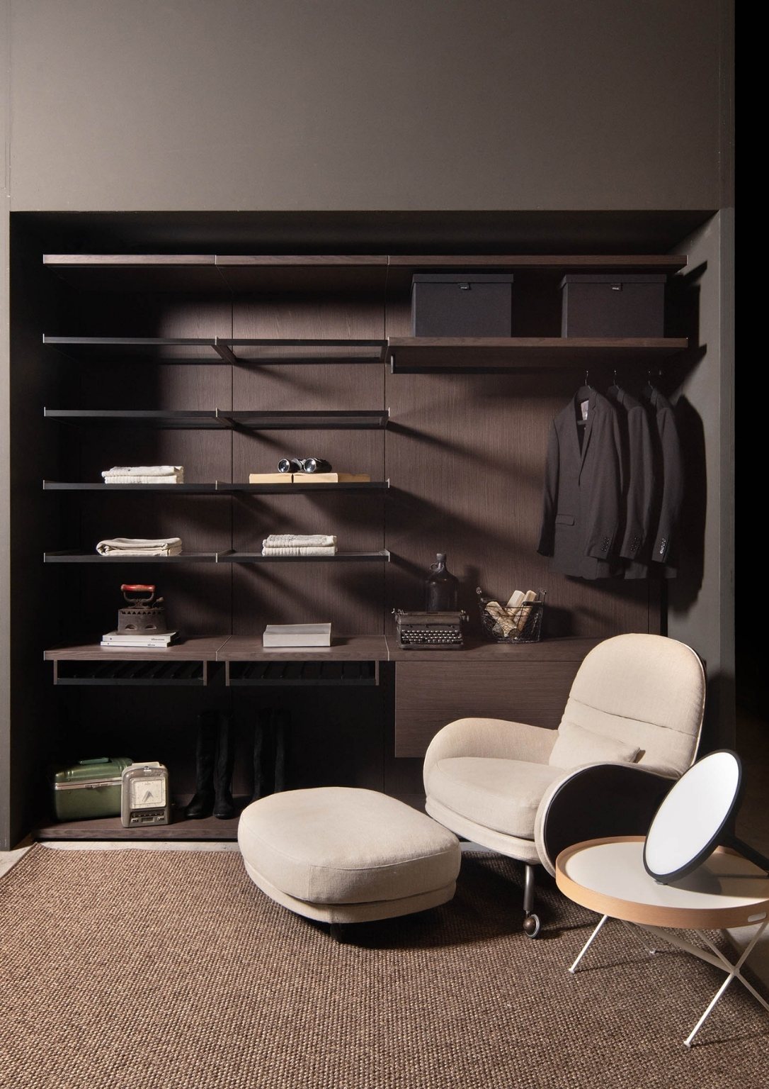
Using espresso for built-in closets is probably one of the smartest choices if you’re into modern and minimalist styles. Its dark hue helps camouflage the storage elements within the closet, such as shelves and hanging rods. This allows the focus to remain on the clothing and accessories displayed, enhancing the overall presentation.
Espresso isn’t just a striking new alternative to traditional neutral palettes. It’s a dynamic color redefining the function and effect of neutrals in modern interior spaces. And with this versatility, it allows homeowners to reimagine their spaces with newfound depth, sophistication, and warmth.
Read more: Brat Green Is the Audacious Color Trend Taking Over Interiors
Frequently Asked Questions (FAQs)
Espresso is a deep, rich coffee-brown with black undertones. It is considered a unique neutral because it is darker than most browns but lighter than true black, providing warmth without being harsh.
Espresso’s inherent warmth makes it an excellent choice for a cozy atmosphere. It can be paired with lighter neutrals and pastels for a balanced look, or with earthy tones for a harmonious and inviting feel.
Espresso can be paired with both light and vibrant colors. It looks great with lighter neutrals and pastels, but also creates a dramatic effect when combined with colors like teal, mustard yellow, burnt orange, or fuschia.
Metallic finishes such as brass, copper, and gold are recommended. These metals highlight the richness of the espresso tone and add a luxurious, elegant feel to the interior.
Espresso can be used to create drama by serving as a striking statement color. It can be applied to an accent wall, used to emphasize architectural features, or on built-in closets for a sophisticated and unified look.

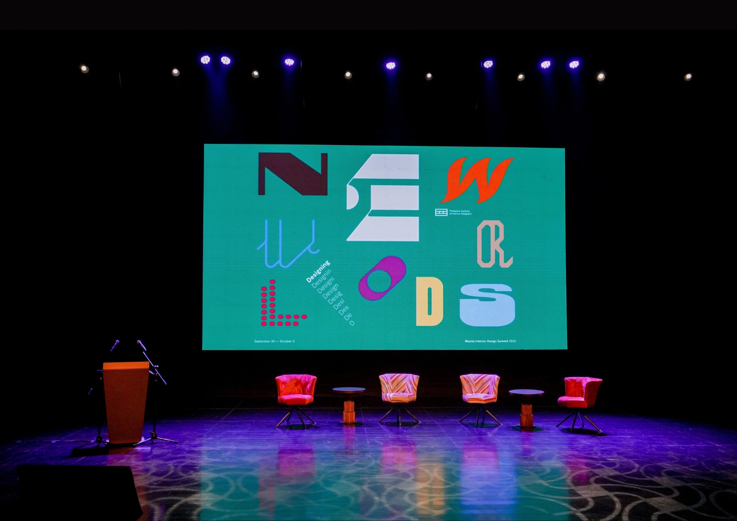
The fourth Manila Interior DesignInterior DesignThe discipline of planning and shaping interior spaces for function, comfort, safety, and beauty. It covers layout, lighting, materials, finishes, furniture, and color, and in the Philippines is a licensedGo to Interior Design Glossary Summit (MIDS) brought together more than 300 delegates for four days of conversations, exhibitions, and design […]
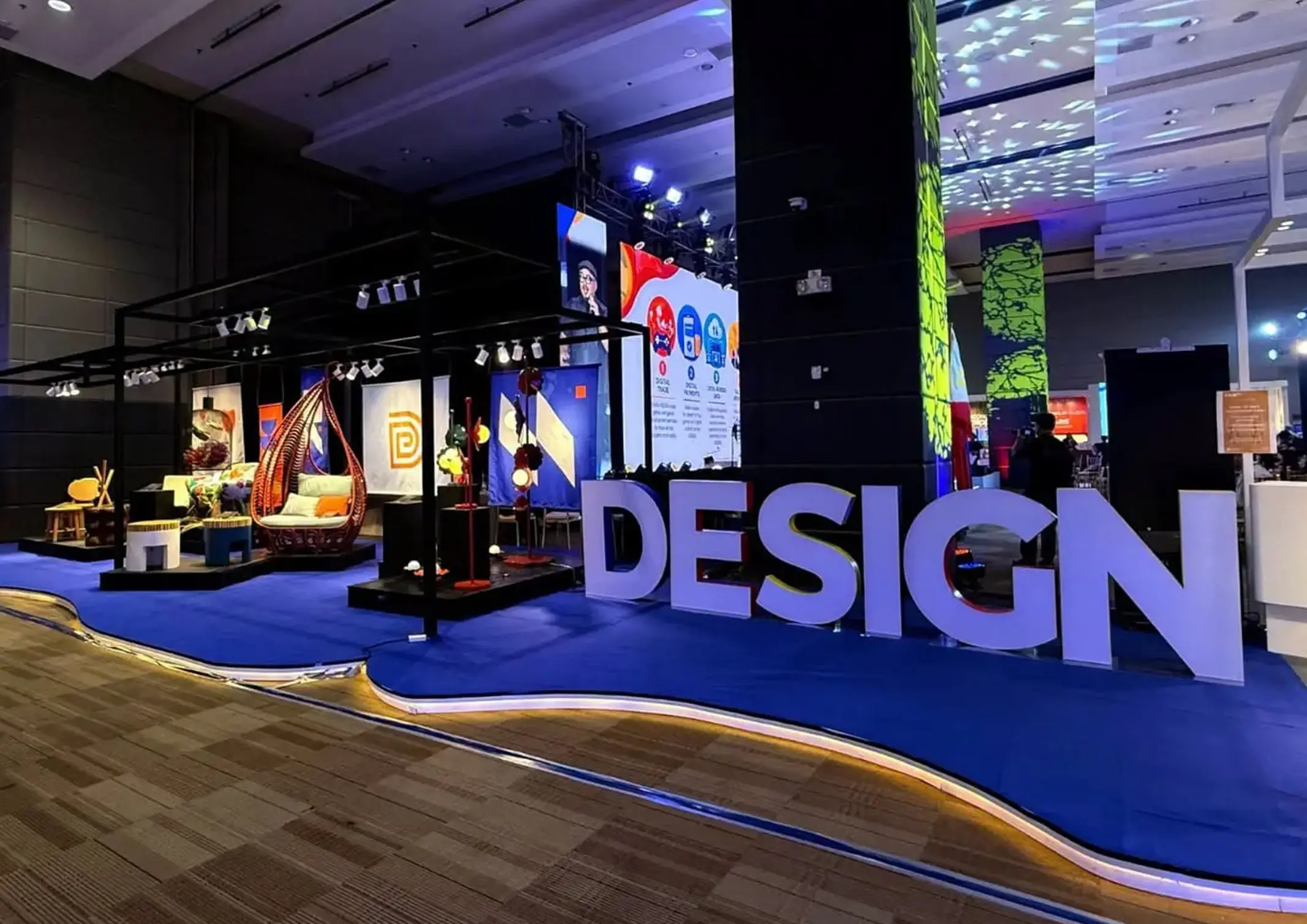
Held at the SMX Convention Center Aura in Taguig City, the first ASEAN Creative Industries Expo by Malikhaing Pinoy (ASEAN MPEx) features nine creative domains, including design, visual arts, digital interactive media, and performing arts. Organized by the Department of Trade and Industry (DTI), the event includes exhibitions, cultural performances, industry talks, and pitching sessions […]
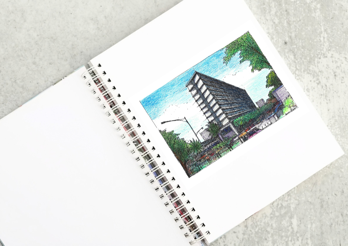
The SSS Building as an Expression of Civic Modernism My favorite modernist landmark in Quezon City is the SSS building on East Avenue. Designed by National Artist for ArchitectureArchitectureThe art and science of designing and constructing buildings, structures, and spaces that are functional, safe, and aesthetically pleasing. It encompasses the planning, design, materials, and techniques […]

Archie G. Carrasco, Chairman and CEO of AGC Power Holdings Corp. (AGC PHC), has been named to The BoF 500 Class of 2026 under the Media category, joining The Business of Fashion’s global community of individuals shaping the fashion industry. Carrasco is among 100 new members from 33 countries and 48 nationalities selected for the […]
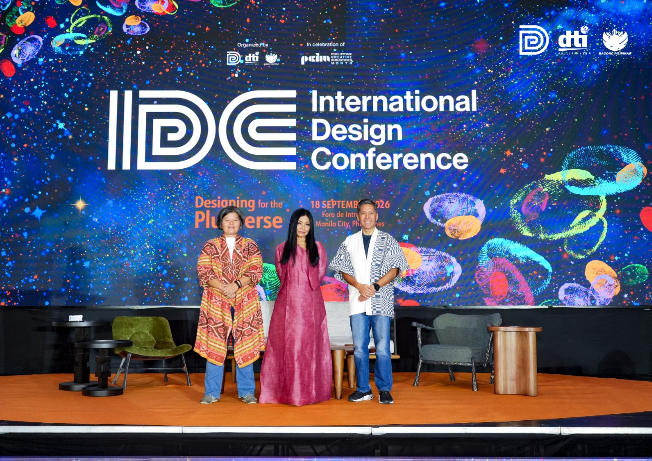
Culture in design does not always announce itself through a recognizable motif, material, or symbol. It can also be embedded in the relationships designers build, the knowledge they listen to, the materials they choose, and the decisions they make in response to communities and their environments. This distinction emerged throughout the 2026 International Design Conference […]
Read the issues.

Collect the volumes.

Recommended Video
Tap to Unmute
Unmute
0:00
0:00