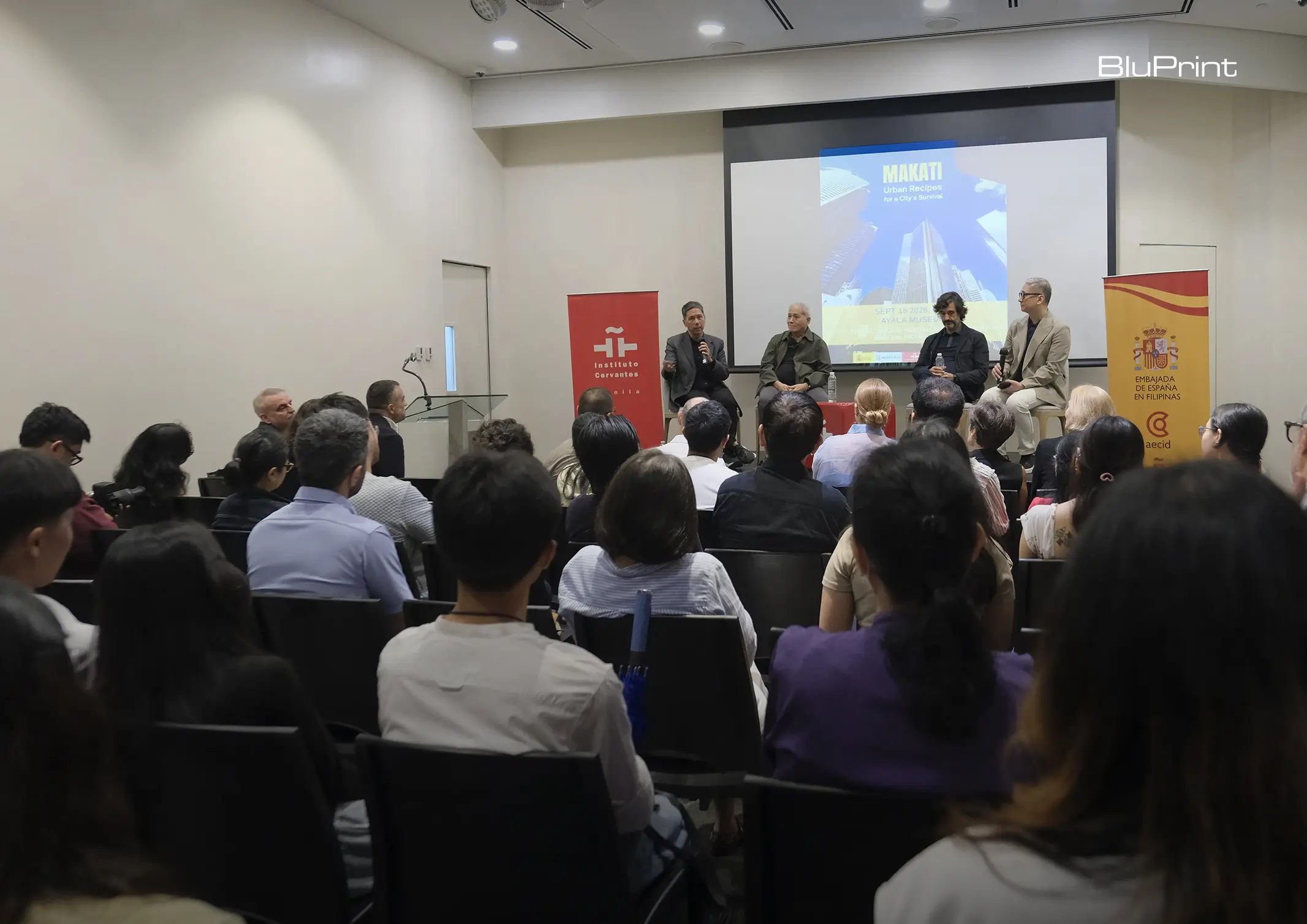
How can better-planned cities create the conditions for more creative, livable, and resilient urban environments? “Makati Urban Recipes for a City’s Survival,” a colloquium held at the Ayala Museum on September 15, brought together architects and practitioners from the fields of urbanism and the creative economy to discuss how design, planning, and collaboration can address […]
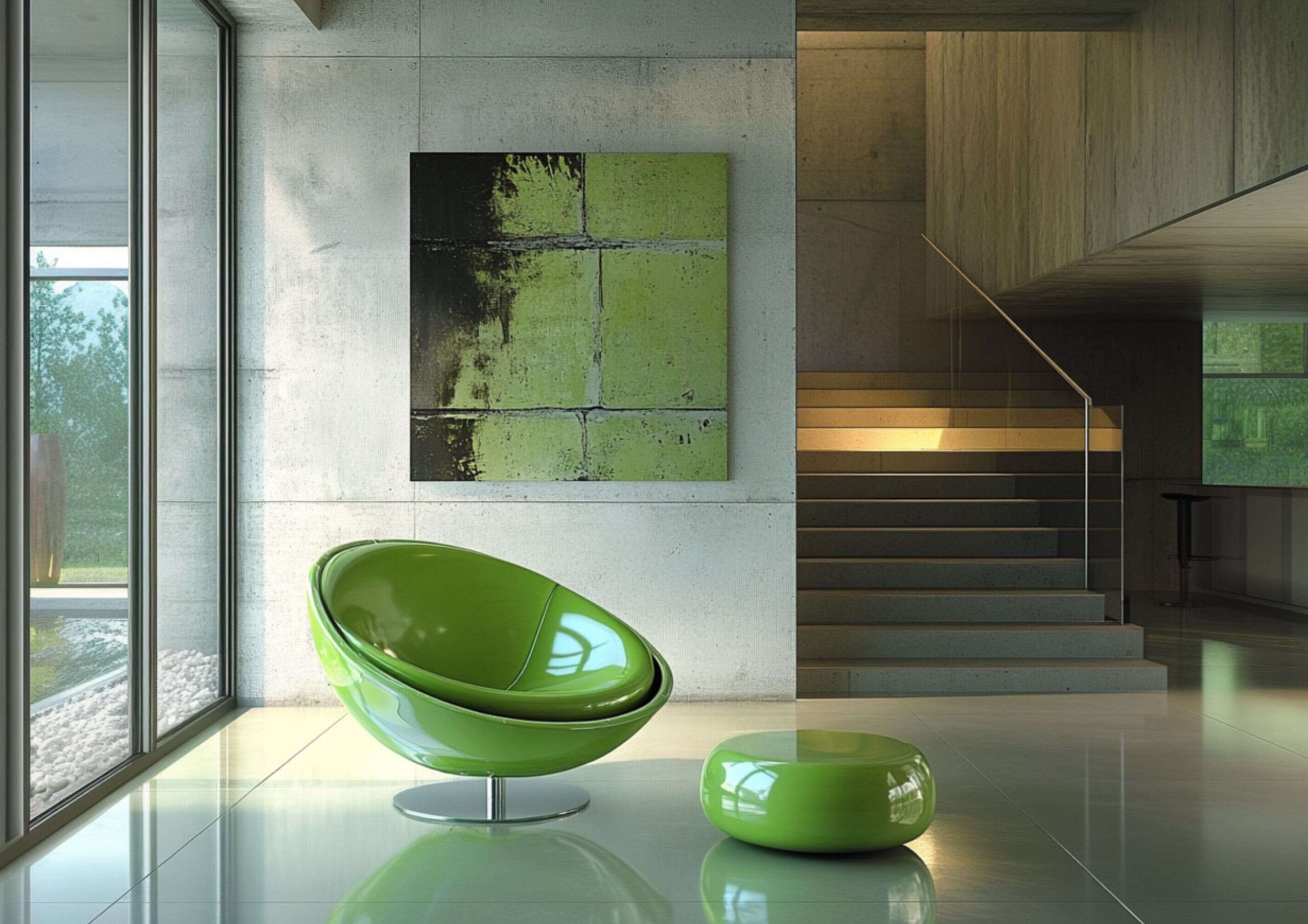
Brat Green Is the Audacious Color Trend Taking Over Interiors



Over the recent years, you might have seen color trends influenced by pop culture, from Barbie pink to Y2K neons. This growing fascination with vibrant hues has led to an unexpected new favorite—brat green. It’s a bold, in-your-face shade of green you’ll often see in arcades and rave parties. Its undeniably captivating disruptive tone has defined the Western summer and taken the Internet by storm. And with such an impactful presence, homes are no exception. So, let’s break down how brat green is taking over interiors with its audacious aesthetic.
A Brat is Born
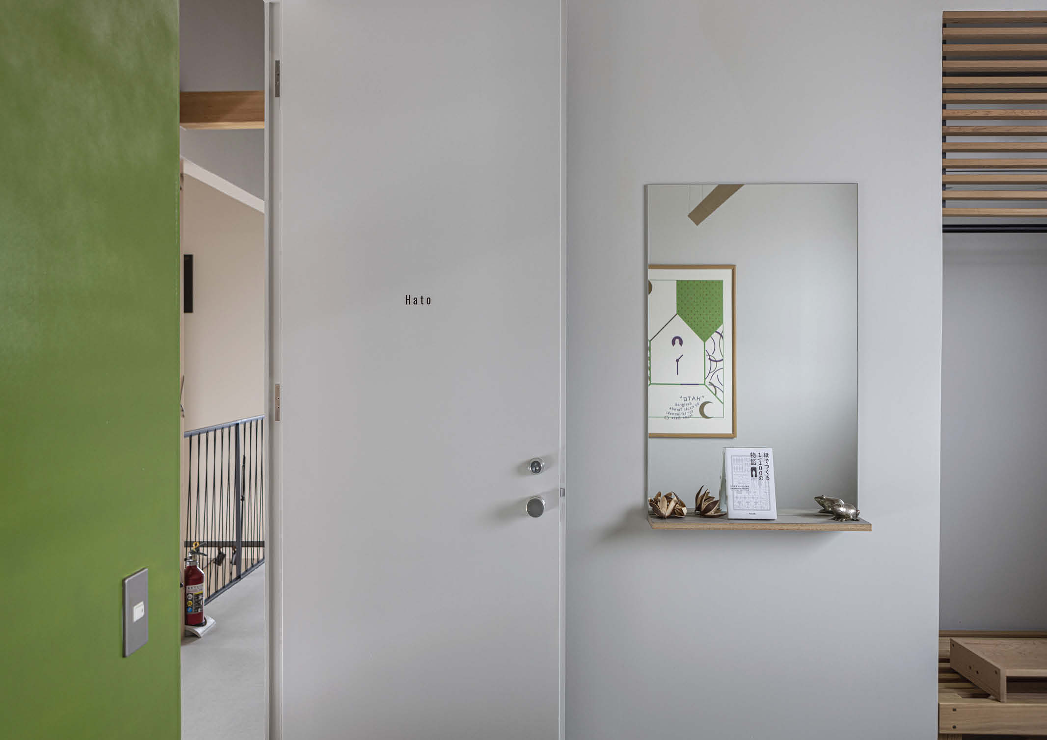
Brat green surged into the mainstream with Charli XCX’s acclaimed electronic pop album, “brat.” Using the electric acid lime green as the color for the cover, it exudes a loud and feisty vibe.
The artist describes the album as “disorienting,” “uncomfortable”, and her “most aggressive and confrontational record.” She also revealed that it’s a throwback to her early career years in rave clubs. That’s why she specifically chose the odd-looking shade as the perfect visual representation of this rebellious energy.
Since the album’s release, brat green has become a popular sensation across social media platforms, adopted for memes, branding, and design elements. It quickly permeated to the fashion and beauty industry, appearing in runways, street style, and fast fashion collections. Businesses are also capitalizing on this color trend by releasing brat-inspired products. Surprisingly, it has even become a political color associated with US Vice President Kamala Harris’ presidential campaign.
It’s literally everywhere. And as The New York Times says, you can’t avoid hopping into this mainstream craze—even in your home. You might have only seen it in decor, accessories, and some details of furniture before. But brat green has never been this evident and bold in interiors.
The General Response to Brat Green
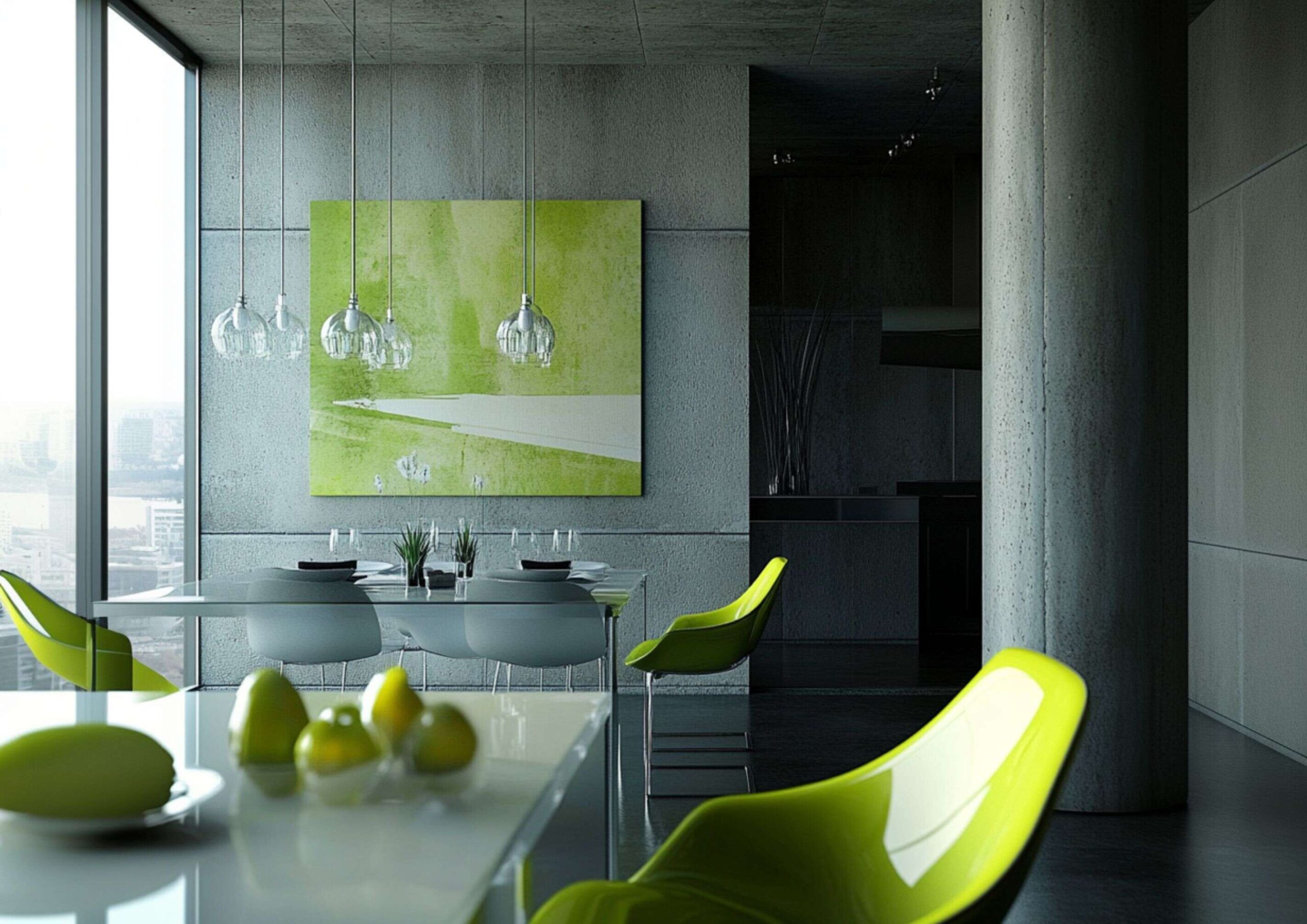
There’s no denying that brat green’s popularity is the result of Charli’s authentic brand marketing. But even the color alone has an innate appeal people naturally respond to.
According to architect and artist Suchi Reddy, it has something to do with neuroaesthetics—a scientific study of how the brain reacts and responds to beauty and artistic expressions. She points out that people are normally drawn to nature’s hues, like green, even in unusually vibrant shades.
While lacking the calming quality of muted and earthy green tones, this color has a certain frequency that commands attention. Similar to the unexpected red theory, it comes as surprising but in a way still familiar.
Charli’s creative director Imogene Strauss accepts that brat green isn’t for everyone as it might appear ugly and jarring to some. But it’s this color’s paradoxical effect and ability to intrigue that keeps you engaged, even if you don’t fully like it.
On the other hand, designer Leah Ring perceives this color trend as an outlet for people’s childhood playfulness and curiosity. This explains why it resonates not just with Gen Zs, but to those who also need a daring escape from the mundane and ordinary.
Bratty Interiors
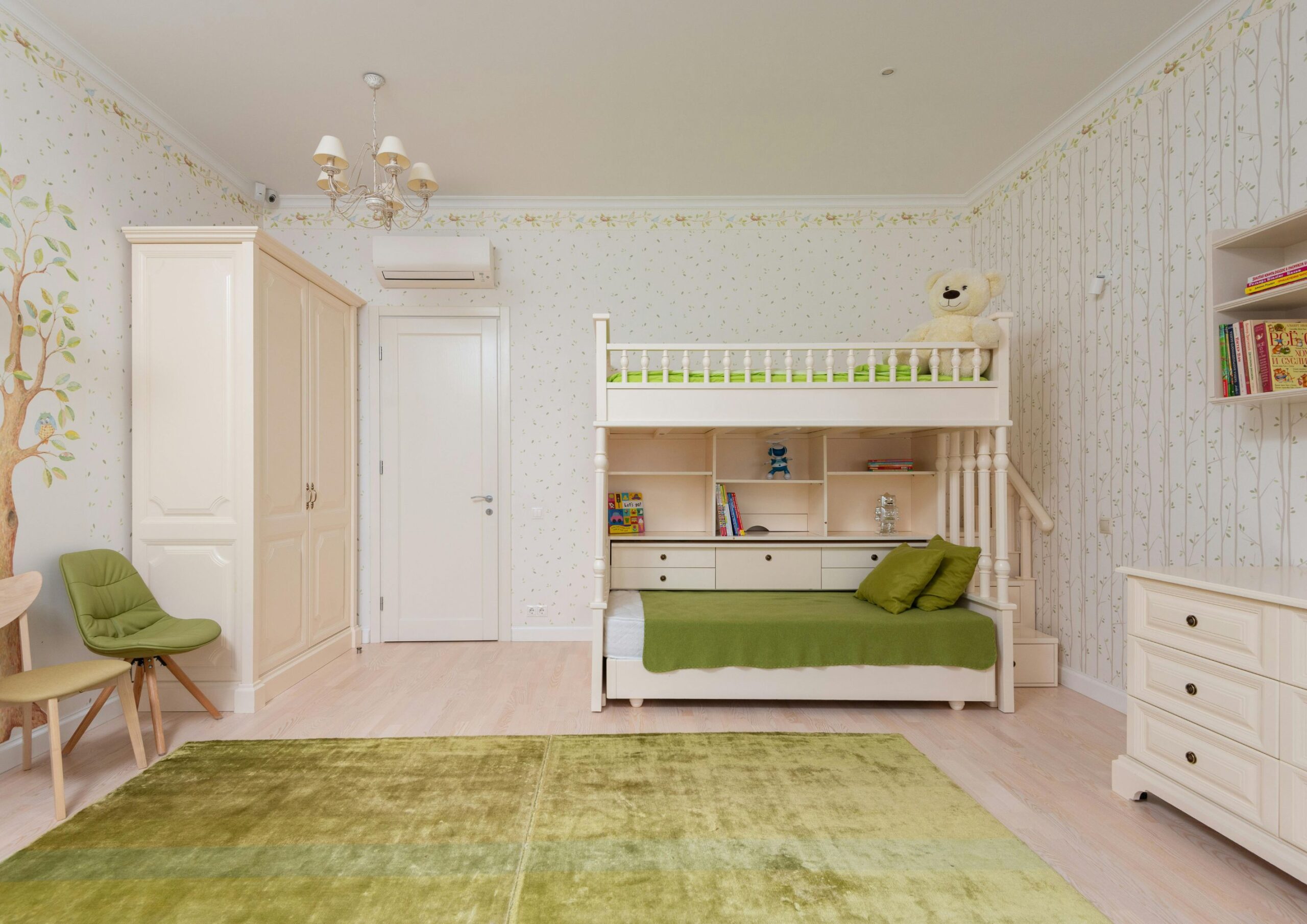
Similar to other striking colors, incorporating brat green into your home is fun and risky at the same time. Although it gives off a playful, retro feel, it might appear too imposing and inharmonious. At best, it’s not advisable to color drench your home with this trend, especially for beginners.
While using brat green’s hex code is ideal for precision, matching the exact shade isn’t essential to follow the trend. Consider incorporating shades of green similar to the trending color like neon, lime, apple, spring and chartreuse. Despite their slight differences, these hues also embody brat green’s bold and energetic spirit and bring the same surprising effect in your home. Whether used individually or in combination, these lively colors give more flexibility to add interest and variations in your space.
Start Small
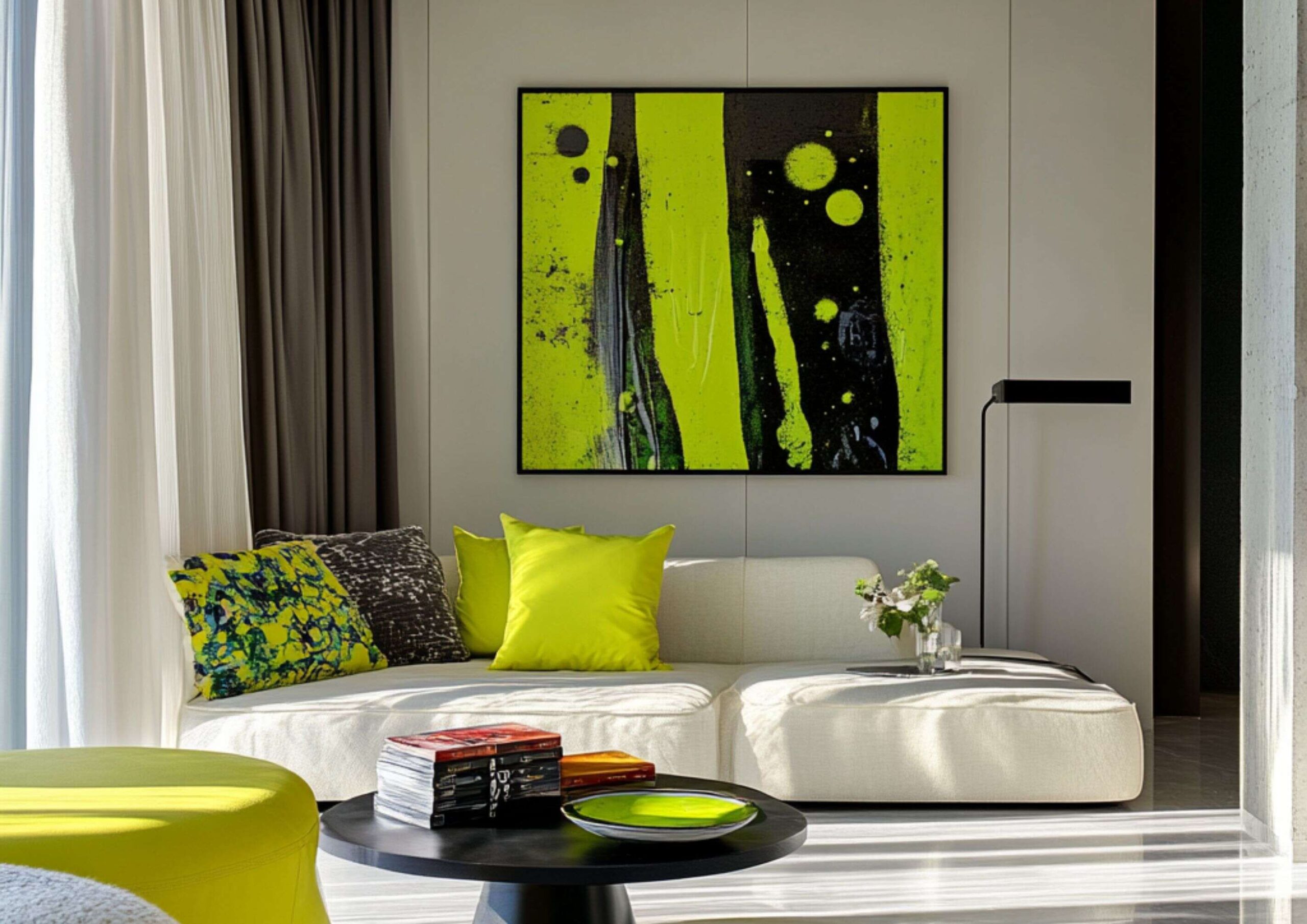
As Ring suggests, it’s better to start with smaller pieces like table runners, picture frames, or other decorative ornaments. Backdrop creative director Natalie Ebel additionally advises using brat green as an accent for highlighting a specific area or object. She suggests using it for floor tiles in smaller areas, overlooked architectural elements, understated furniture, or fabric trims. You can even collect and display various knick-knacks in this color.
Going Full Brat
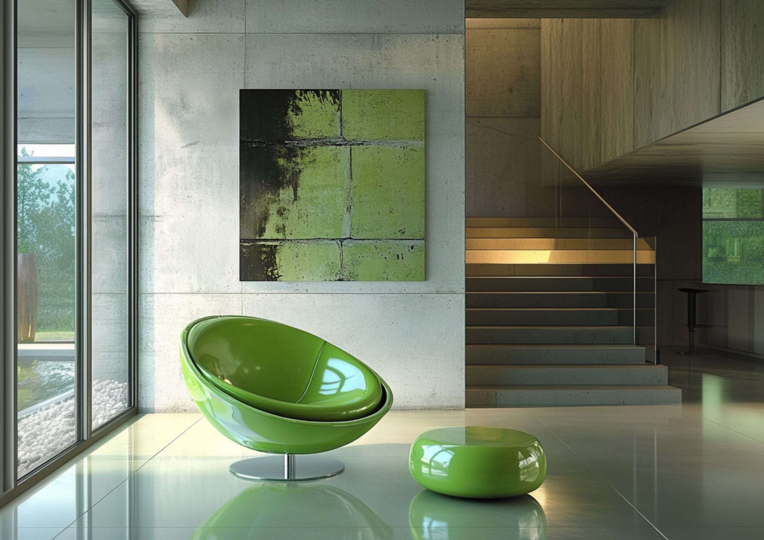
But if you’re ready to take the risk, you can go all out by enveloping the entire room with it. However, make sure that you integrate neutrals or wood elements to balance out the color’s audacious vibe. You can also integrate minimal amounts of blue, red, purple, and yellow to complement the dominant brat green. For instance, utilize these additional colors in curtains, light fixtures, and other decor.
Brat green is so much more than a color trend—it’s a powerful statement that leaves an impact all on its own. And what could be a better way to fully embody its aggressive and lively characteristics than by injecting it into your home? Whether you’re doing it to appreciate Charli’s artistry or simply infusing your space with a shock of unexpected energy, brat green is clearly a bold choice for your interiors.
Read more: Best Study Area Ideas for the Perfect Learning Corner
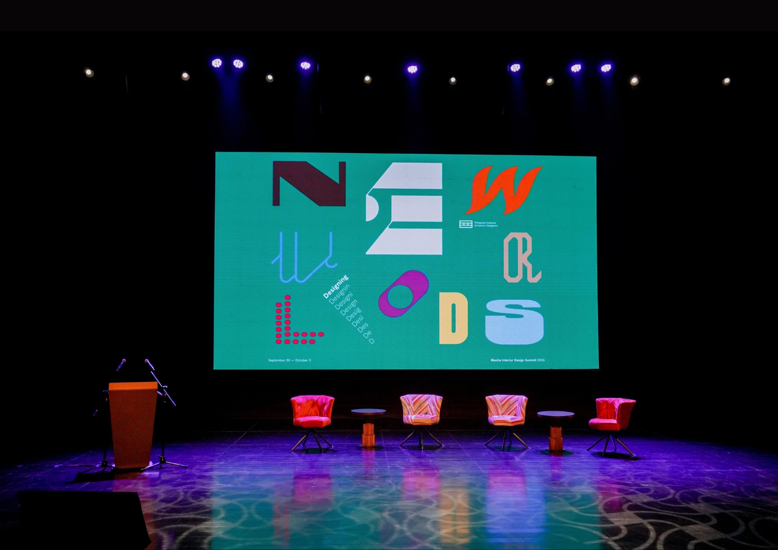
The fourth Manila Interior DesignInterior DesignThe discipline of planning and shaping interior spaces for function, comfort, safety, and beauty. It covers layout, lighting, materials, finishes, furniture, and color, and in the Philippines is a licensedGo to Interior Design Glossary Summit (MIDS) brought together more than 300 delegates for four days of conversations, exhibitions, and design […]
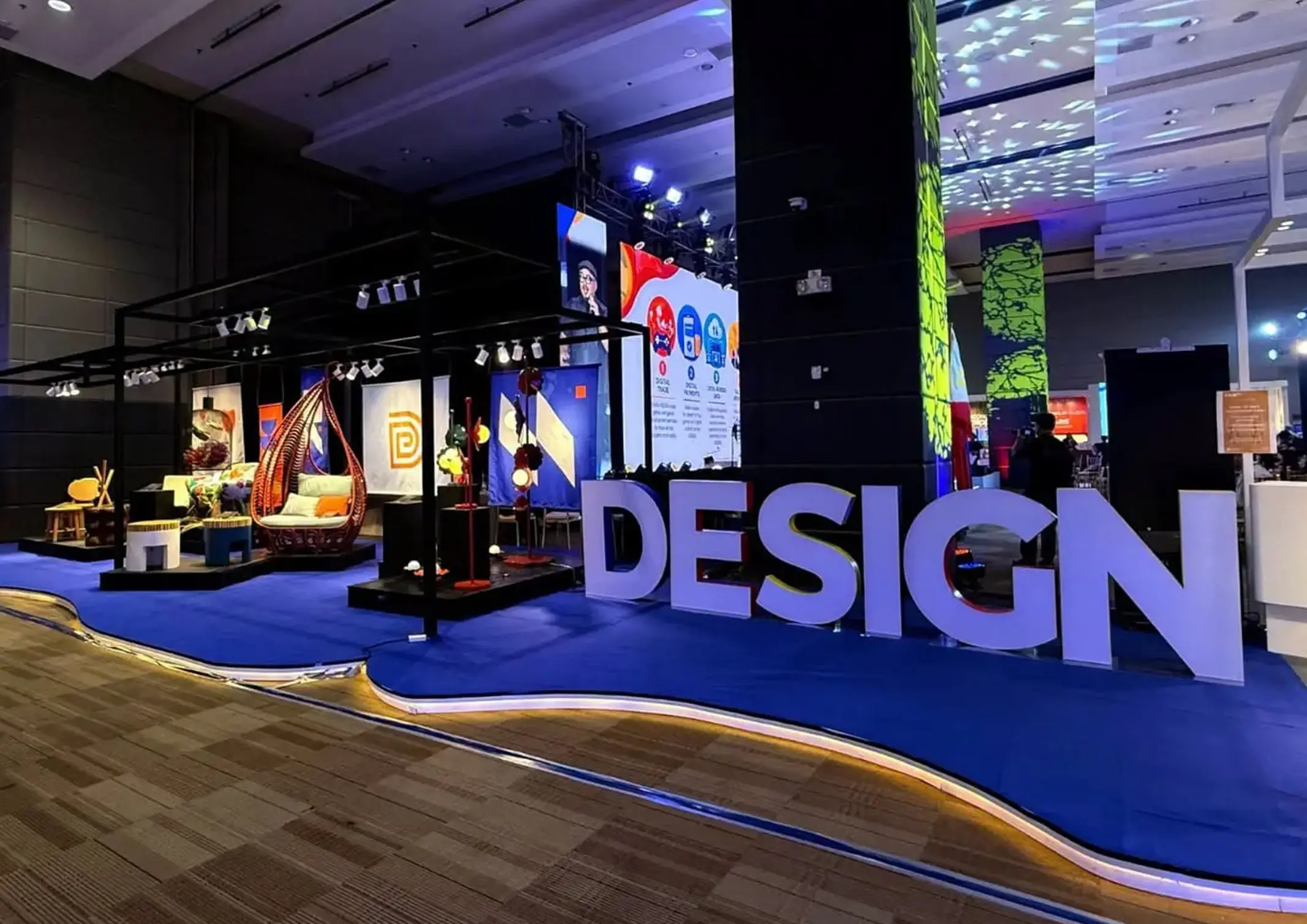
Held at the SMX Convention Center Aura in Taguig City, the first ASEAN Creative Industries Expo by Malikhaing Pinoy (ASEAN MPEx) features nine creative domains, including design, visual arts, digital interactive media, and performing arts. Organized by the Department of Trade and Industry (DTI), the event includes exhibitions, cultural performances, industry talks, and pitching sessions […]
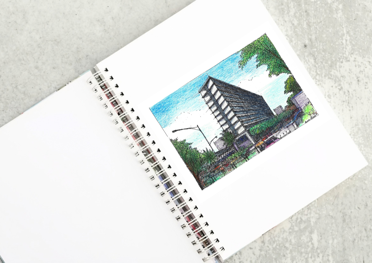
The SSS Building as an Expression of Civic Modernism My favorite modernist landmark in Quezon City is the SSS building on East Avenue. Designed by National Artist for ArchitectureArchitectureThe art and science of designing and constructing buildings, structures, and spaces that are functional, safe, and aesthetically pleasing. It encompasses the planning, design, materials, and techniques […]
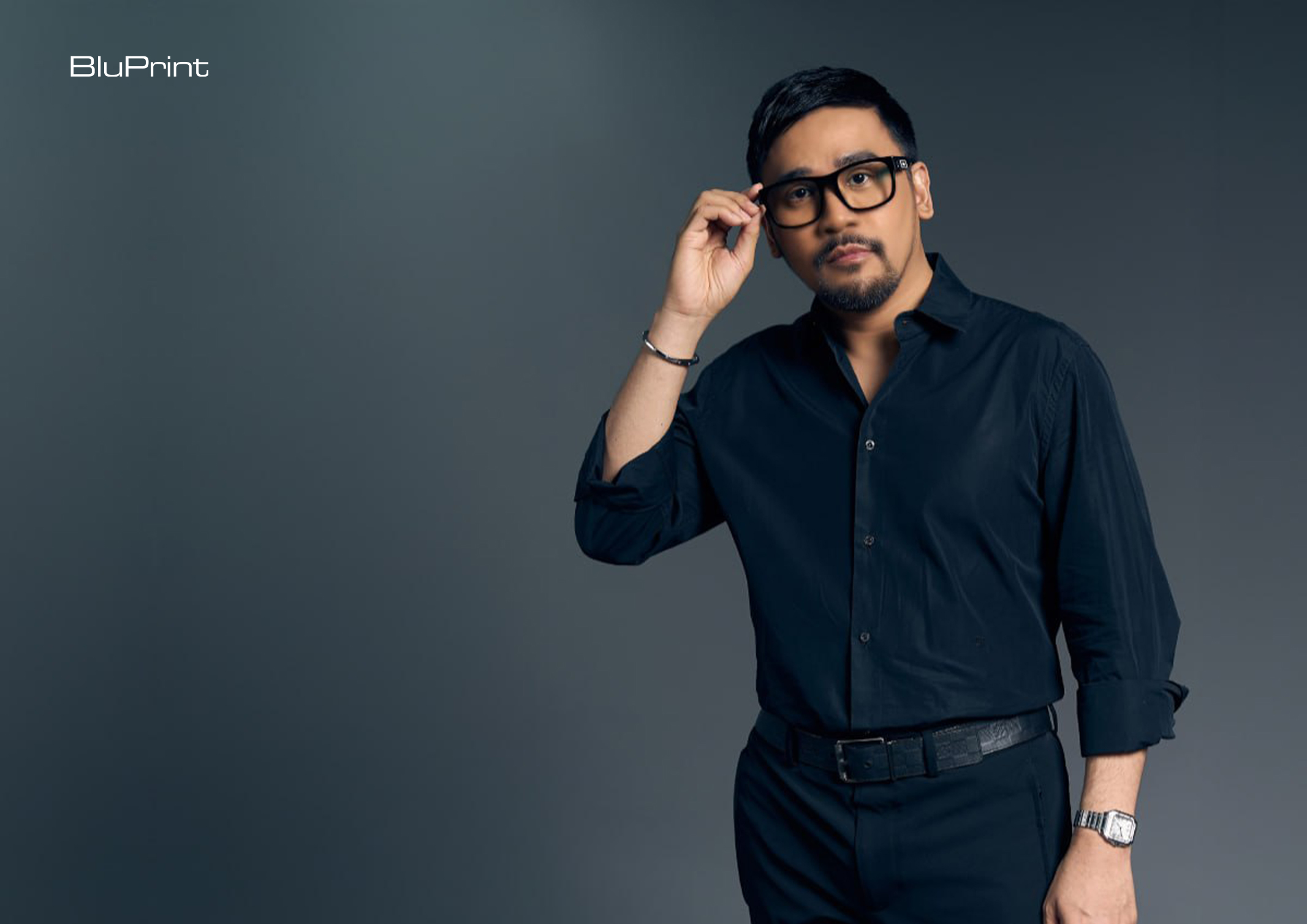
Archie G. Carrasco, Chairman and CEO of AGC Power Holdings Corp. (AGC PHC), has been named to The BoF 500 Class of 2026 under the Media category, joining The Business of Fashion’s global community of individuals shaping the fashion industry. Carrasco is among 100 new members from 33 countries and 48 nationalities selected for the […]
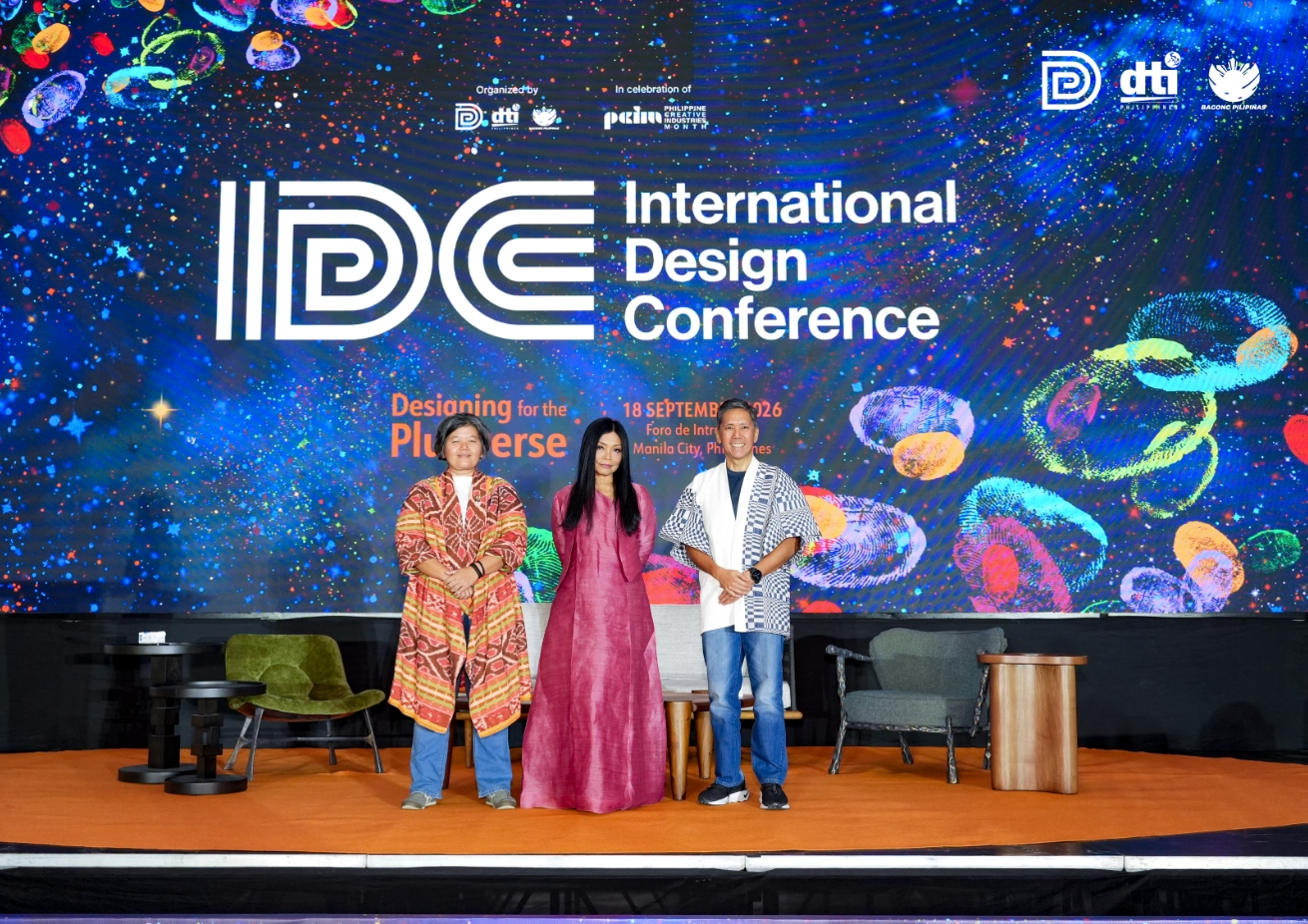
Culture in design does not always announce itself through a recognizable motif, material, or symbol. It can also be embedded in the relationships designers build, the knowledge they listen to, the materials they choose, and the decisions they make in response to communities and their environments. This distinction emerged throughout the 2026 International Design Conference […]
Read the issues.

Collect the volumes.

Recommended Video
Tap to Unmute
Unmute
0:00
0:00