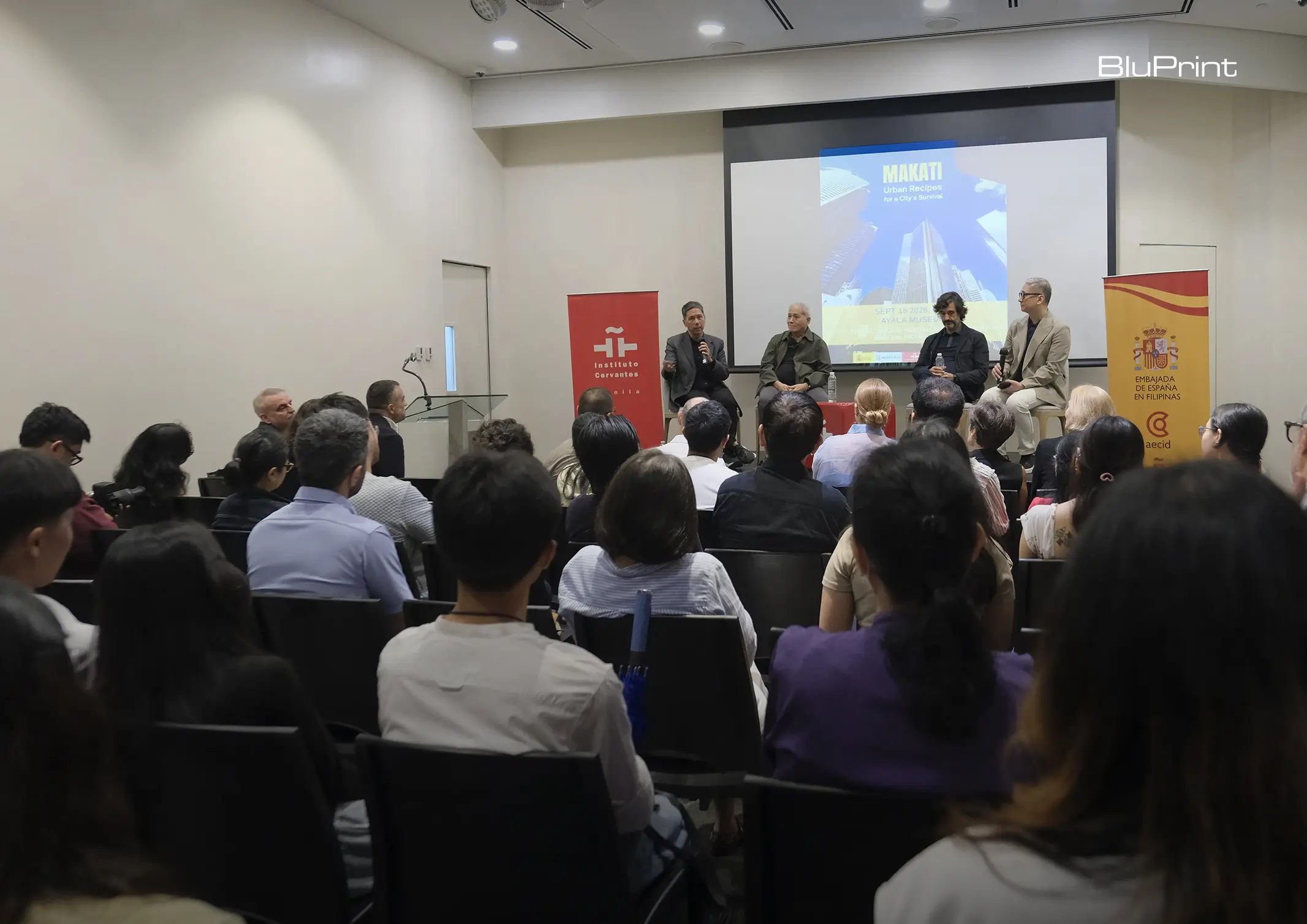
How can better-planned cities create the conditions for more creative, livable, and resilient urban environments? “Makati Urban Recipes for a City’s Survival,” a colloquium held at the Ayala Museum on September 15, brought together architects and practitioners from the fields of urbanism and the creative economy to discuss how design, planning, and collaboration can address […]
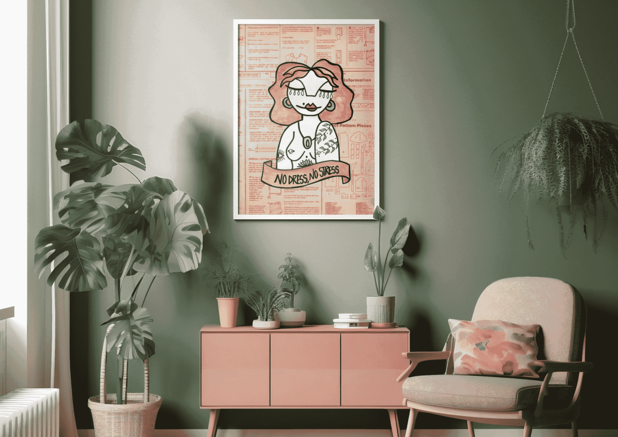
Color Drenching: The Monochromatic Magic You Need for Your Home



When designing a space, building a color palette is a crucial step you cannot skip. You often combine varieties of neutral and solid colors to create a balanced and harmonious look. Sometimes, you even consult the color wheel and rely on color theory to ensure your color selection is on point. But, what if you disregard all these rules and paint your home with only a single hue?
Color drenching is the paint idea trend that lets you achieve a full, dramatic interior without the meticulous and endless color swatch comparisons.
What Is Color Drenching?
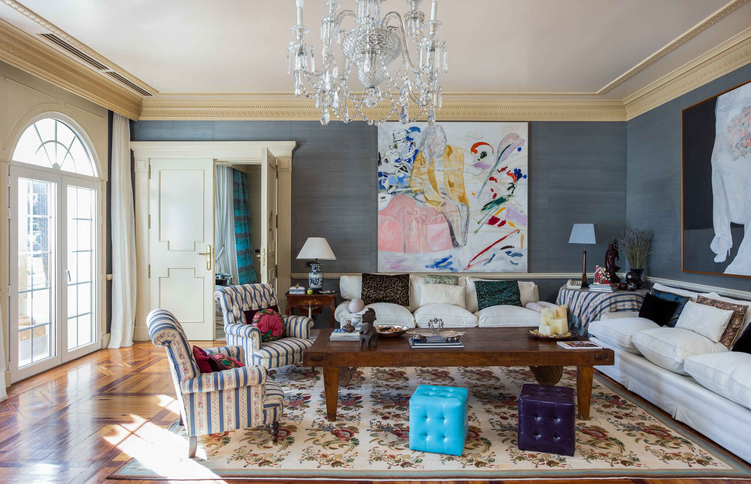
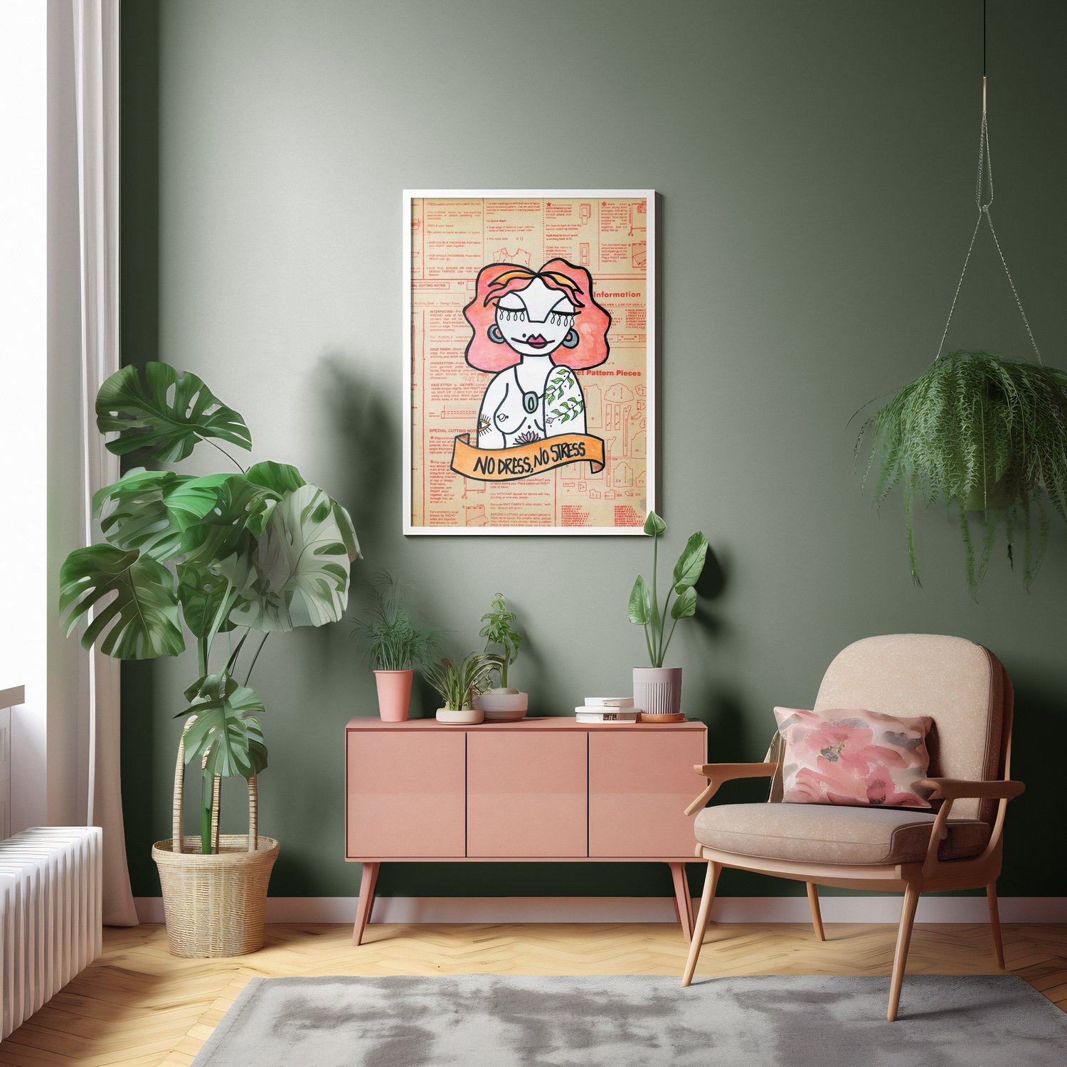
Color drenching is picking one color and draping the entire room, including decors and other furnishings, with it. However, it’s not the full-on monotonous color treatment you can erratically apply on every corner of your interior. This paint technique adds visual dynamics by incorporating patterns and textures so the space doesn’t come out plain and dull. Typically on wood or plaster, designers apply gloss or matte finish to create depth and visual interest.
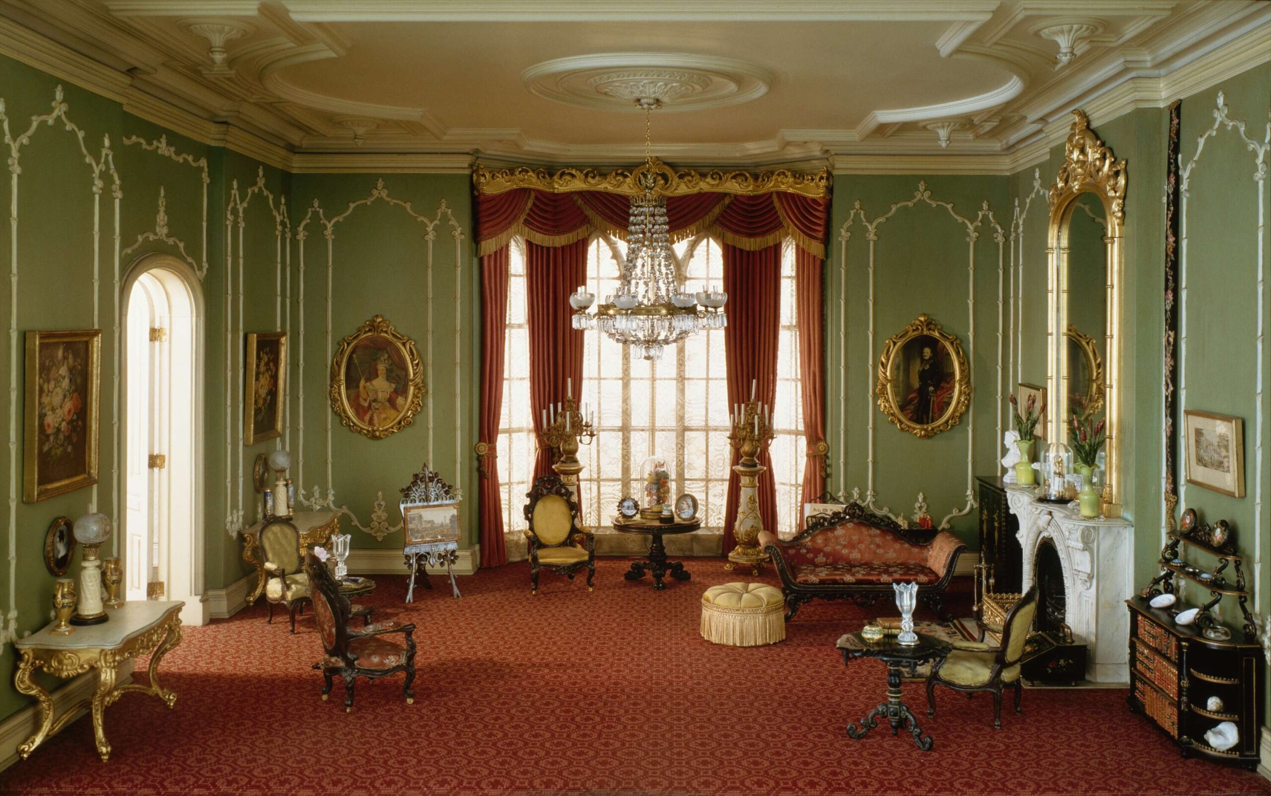
Color drenching has long been practiced by British designers even before it boomed on social media. The famous promotion campaign of Farrow & Ball’s dead flat paint finish made this paint technique even more popular. But this trend can be traced back to the Victorian era, when interiors were also saturated with a single bold color.
One Color; Multiple Perks
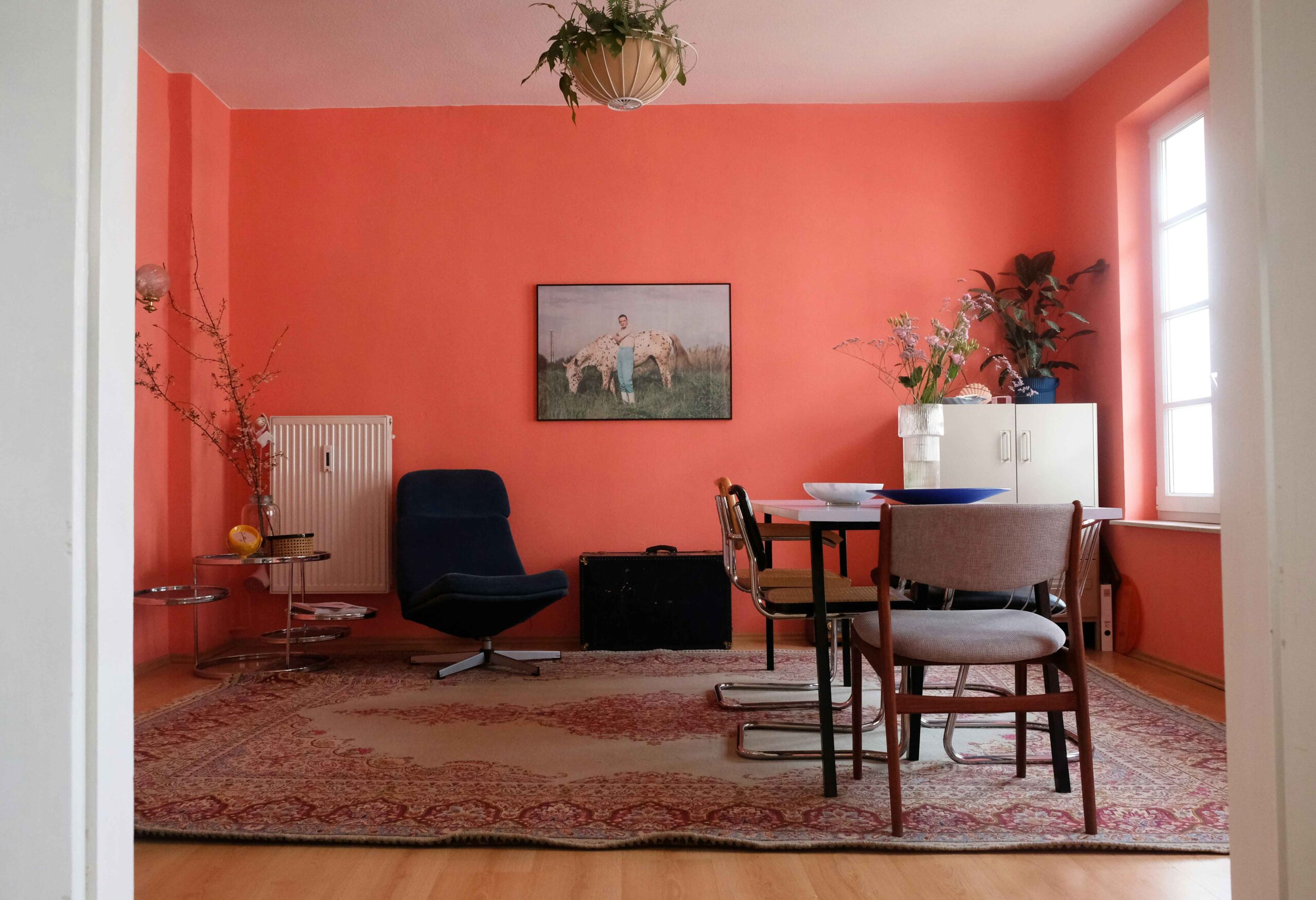
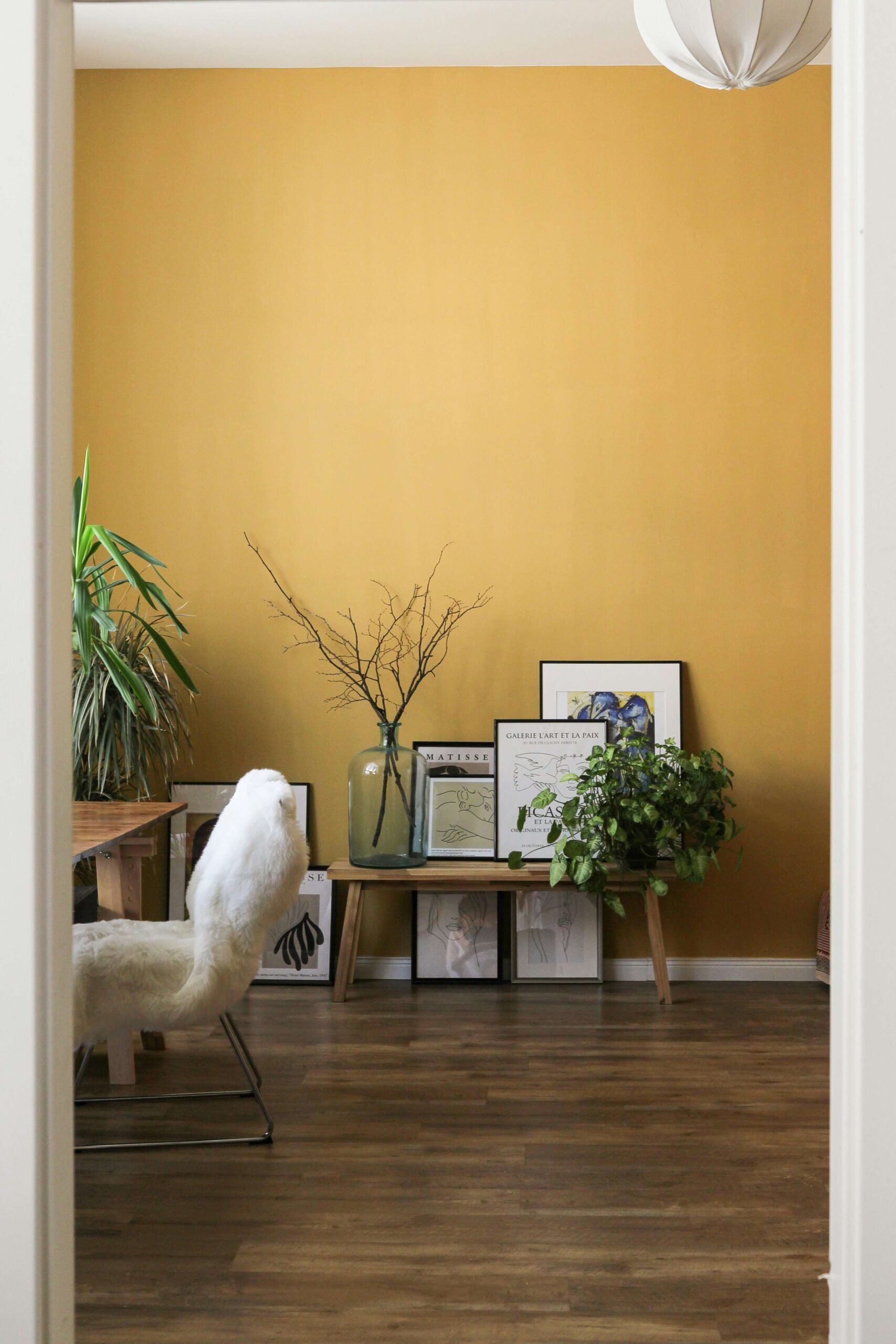
In the words of Farrow & Ball’s brand ambassador Patrick O’Donnell, color drenching makes a seamless look allowing unnecessary striking elements to disappear. It can also camouflage imperfections and prominent architectural details. But more than creating a cohesive and cocooning appearance, this technique creates an illusion of height.
Using the paint effect principle, you can immediately make the room cleaner and calmer by coloring only the moldings and walls. It can also create a stretched look when you apply it solely on the entire walls. And you can fully achieve an enlarged room when you paint a wall and the ceilings to make them look connected. But if you want a more compact-looking interior, you can paint the entire surfaces except the floors.
Color drenching is a versatile technique applicable to spacious and limited spaces alike. It additionally fits with a lot of interior styles since it brings a contemporary vibe. This technique is also one of the easiest and most cost-effective ways to exude a mood and character in a space. Citing the color psychology, you can dictate a room’s ambiance with just one saturated color.
How to Color Drench
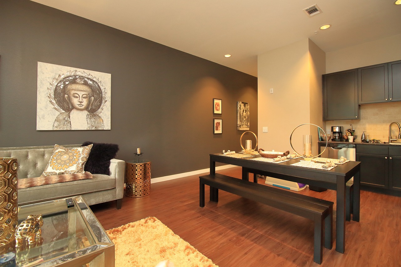
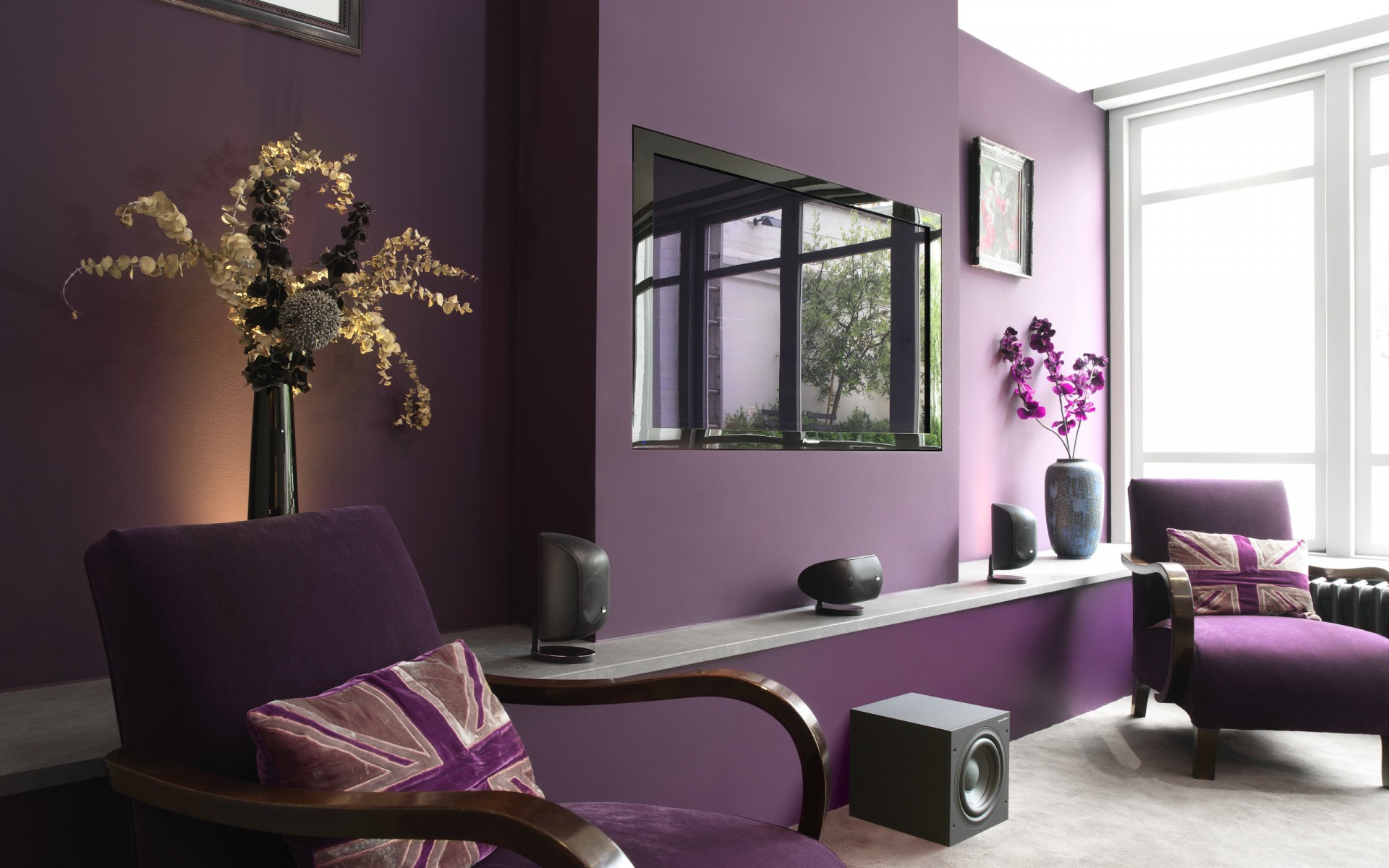
Although integrating color drenching may sound simple and straightforward, this technique still follows strict guidelines to ensure a not too overpowering space.
Decide on the Mood You Want to Create
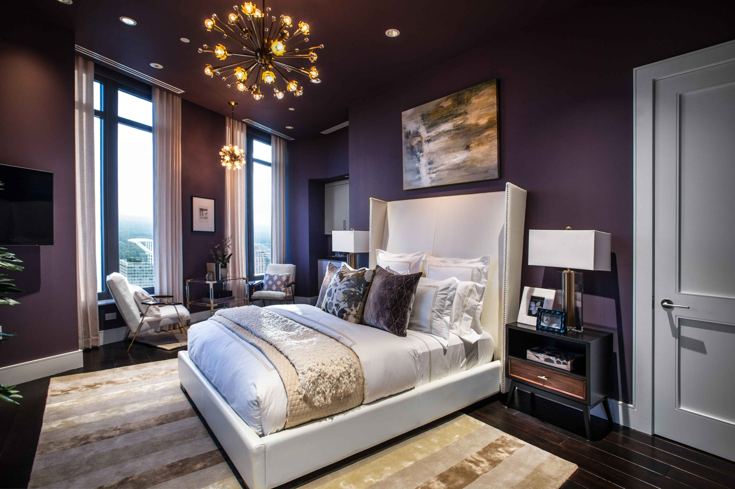
You’re free to choose whatever color you want to include. But take note of how it will impact the functionality of the space and your mood as well. If you want the interior to feel cozier, pick a cooler hue such as green, blue, and purple. To add vibrance and create an uplifting mood, warmer colors like red, orange, and yellow can give you that result. Color drenching can come out intensely. So, it’s best to ask yourself what mood you want to create and if you want to establish that ambiance for a longer time.
Apply on Readily Closed off Spaces
It’s true that color drenching works well in different spaces. But it works best if you refrain from applying them on open space layouts. Readily closed off spaces like bedrooms, bathrooms, separate kitchen, and pantry can be dramatically drenched in color. Since they are intentionally separated and enclosed, the chosen color won’t bleed and influence the mood and look of other spaces.
Opt for a Darker Color
Granted, you can pick whatever color you like for this technique. But if you want your interior to appear larger, elegant, and intimate all at the same time, opt for a darker color. These colors can be a good alternative for black or gray and cast a good contrast of shadow and light to the space. Navy blue, forest green, and merlot red are some of the best examples you can choose from.
Add Variations in Tones and Textures
To avoid a basic and boring splash of color, add a little twist by applying variations in tones and textures. You can drench a room with different shades of the color of your choice. For example, you pick red as the main color and use its darker shades for foreground elements and lighter shades as the background. You can experiment more by applying closer tones to decor and intricate details to give subtle but harmonious contrasts.
You can bring another visual interest by playing around with textures through pattern drenching. It is still drenching the space with the same color but instead of paint, you use wallpapers. You can either use it for the entire room or mix it with color drenching. Use pattern drenching on larger negative spaces like walls and ceilings then apply pattern drenching on furniture and decor and vice versa.
Designing a space shouldn’t be as complicated as building a color palette. Rather than spending a lot of time combining hues, color drenching offers a simpler and straightforward option. This technique is about embracing and maximizing the possibilities of one color while letting you attain the same dramatic effect.
Read more: Cecil Ravelas: Creating a New Living Experience in an Old Development
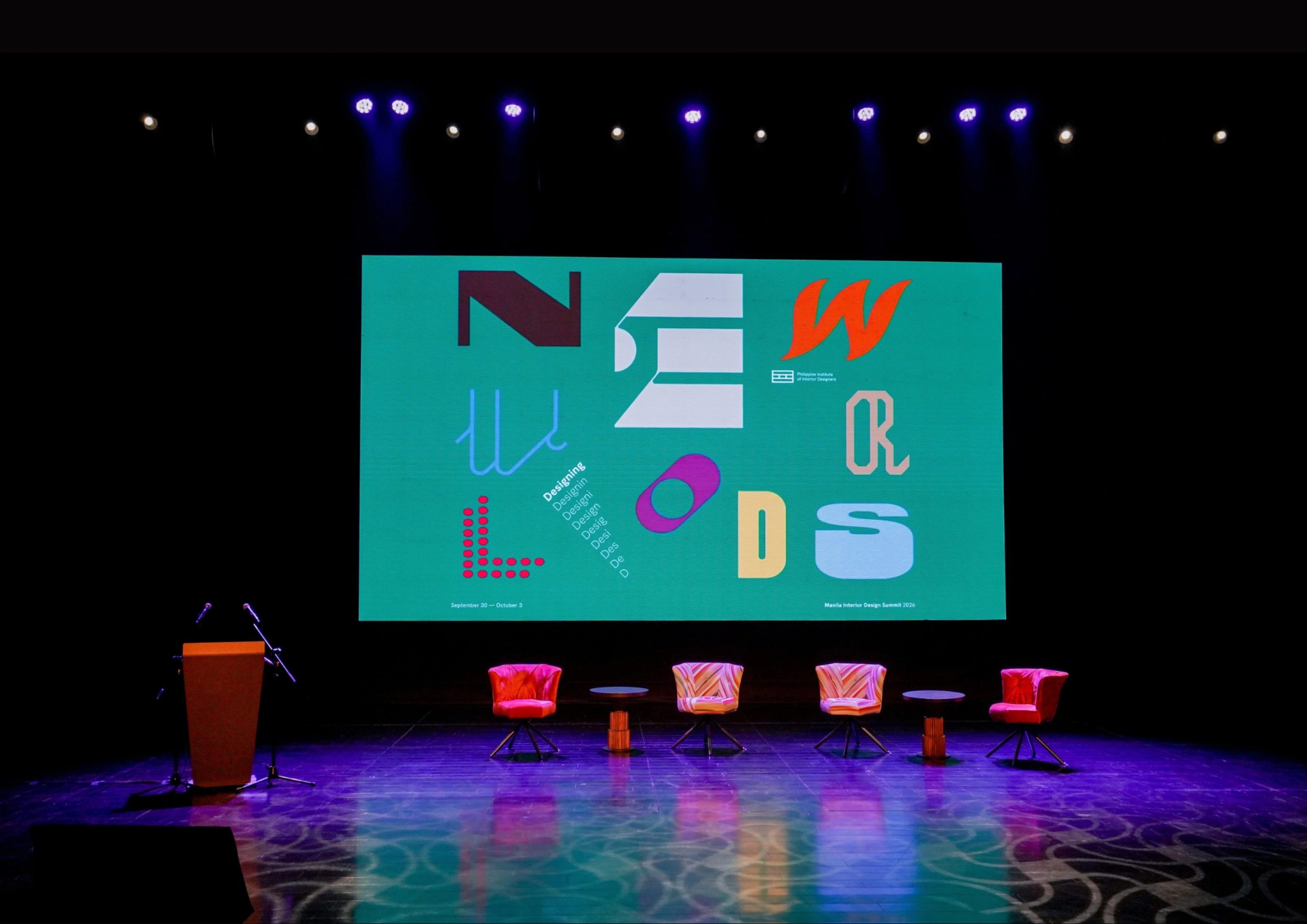
The fourth Manila Interior DesignInterior DesignThe discipline of planning and shaping interior spaces for function, comfort, safety, and beauty. It covers layout, lighting, materials, finishes, furniture, and color, and in the Philippines is a licensedGo to Interior Design Glossary Summit (MIDS) brought together more than 300 delegates for four days of conversations, exhibitions, and design […]
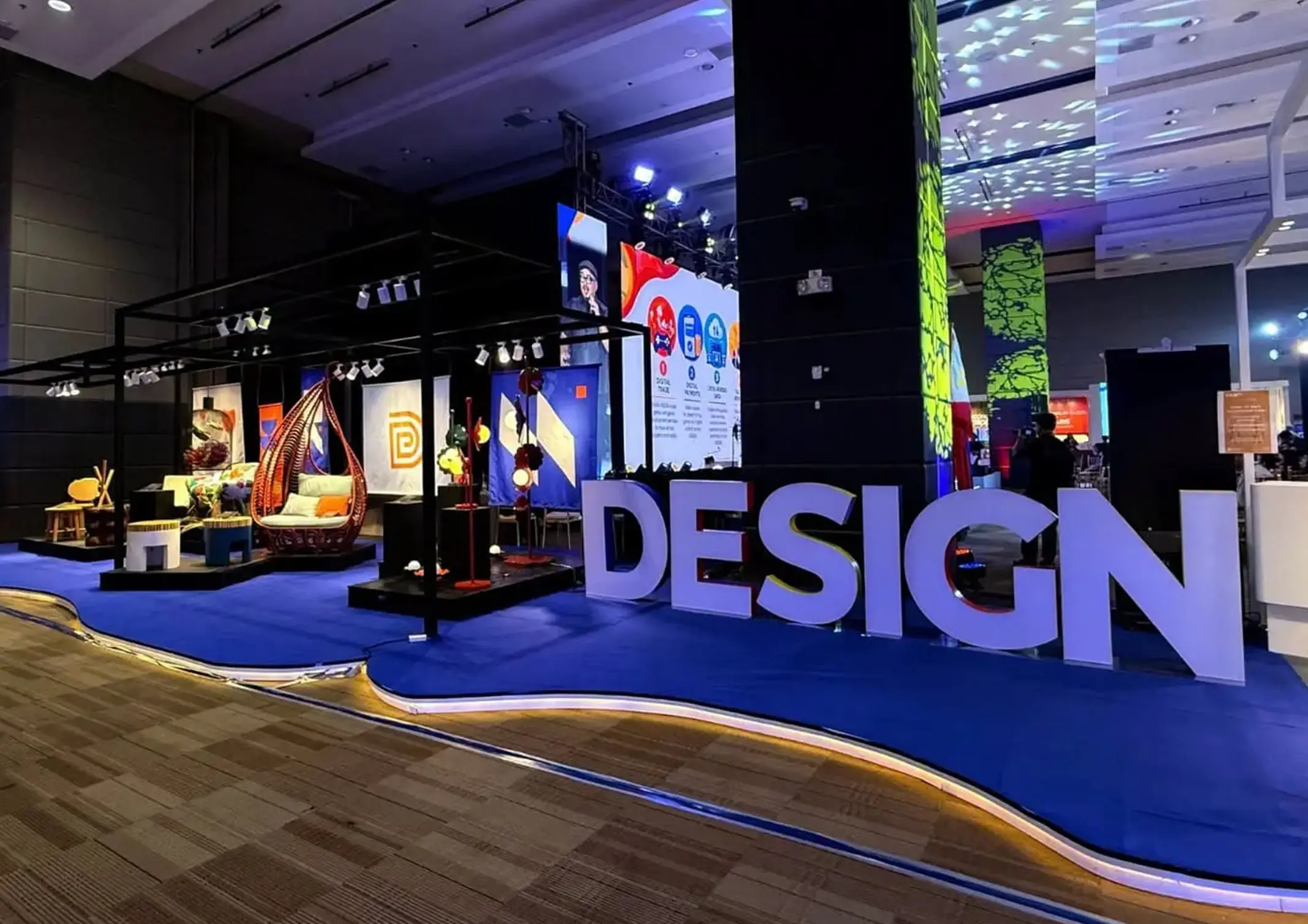
Held at the SMX Convention Center Aura in Taguig City, the first ASEAN Creative Industries Expo by Malikhaing Pinoy (ASEAN MPEx) features nine creative domains, including design, visual arts, digital interactive media, and performing arts. Organized by the Department of Trade and Industry (DTI), the event includes exhibitions, cultural performances, industry talks, and pitching sessions […]
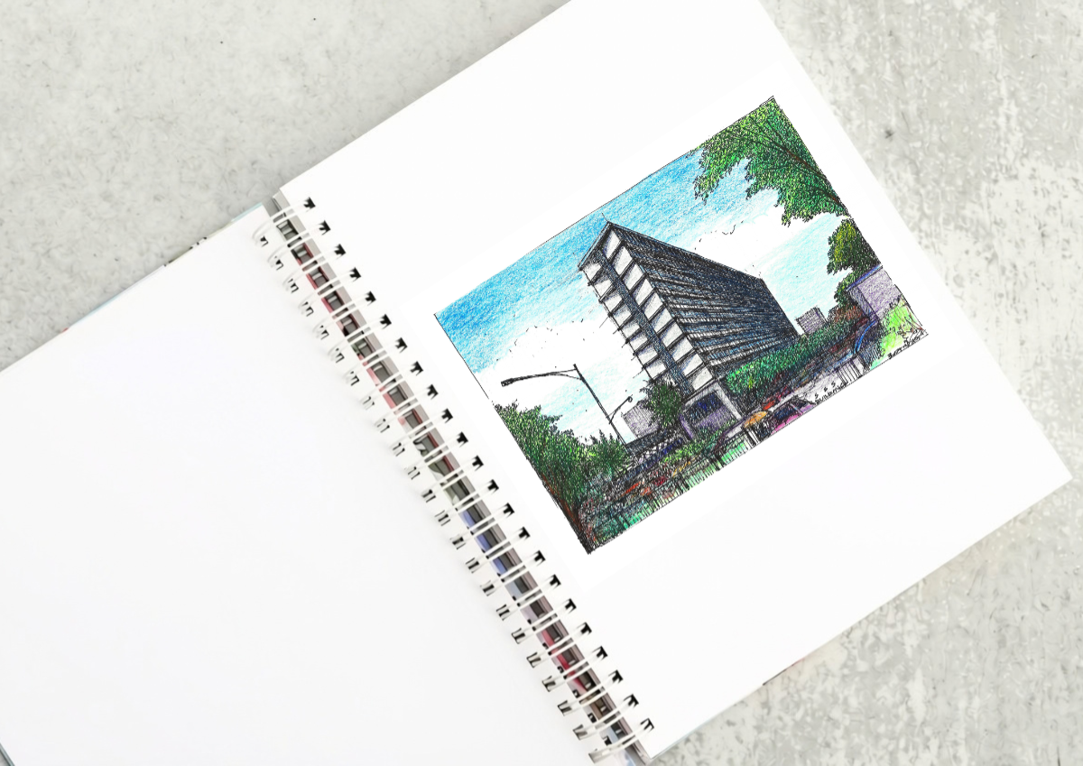
The SSS Building as an Expression of Civic Modernism My favorite modernist landmark in Quezon City is the SSS building on East Avenue. Designed by National Artist for ArchitectureArchitectureThe art and science of designing and constructing buildings, structures, and spaces that are functional, safe, and aesthetically pleasing. It encompasses the planning, design, materials, and techniques […]

Archie G. Carrasco, Chairman and CEO of AGC Power Holdings Corp. (AGC PHC), has been named to The BoF 500 Class of 2026 under the Media category, joining The Business of Fashion’s global community of individuals shaping the fashion industry. Carrasco is among 100 new members from 33 countries and 48 nationalities selected for the […]
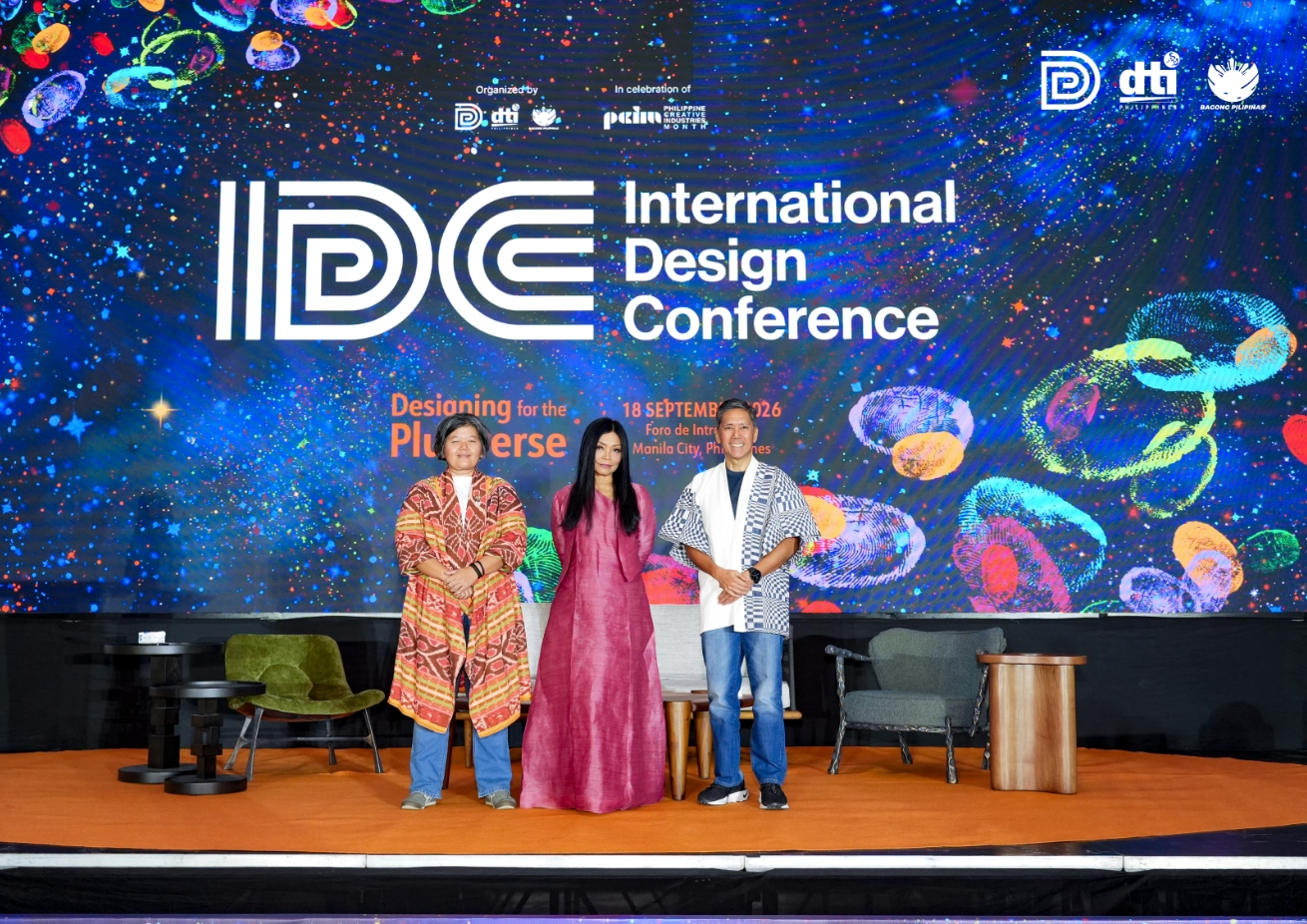
Culture in design does not always announce itself through a recognizable motif, material, or symbol. It can also be embedded in the relationships designers build, the knowledge they listen to, the materials they choose, and the decisions they make in response to communities and their environments. This distinction emerged throughout the 2026 International Design Conference […]
Read the issues.

Collect the volumes.

Recommended Video
Tap to Unmute
Unmute
0:00
0:00