In a curated setting at the The Tile Gallery showroom, architects, designers, and media guests were transported into the immersive world of Italian contemporary lighting brand Lodes, where light illuminated the space through sculptural forms and innovative materiality. The Language of Light event presented a selection of Lodes’ established collections alongside new releases, revealing the […]
4 Front Door Colors That Hurt Your Home’s First Impression
Recommended Video
Tap to Unmute
Unmute
0:00
0:00
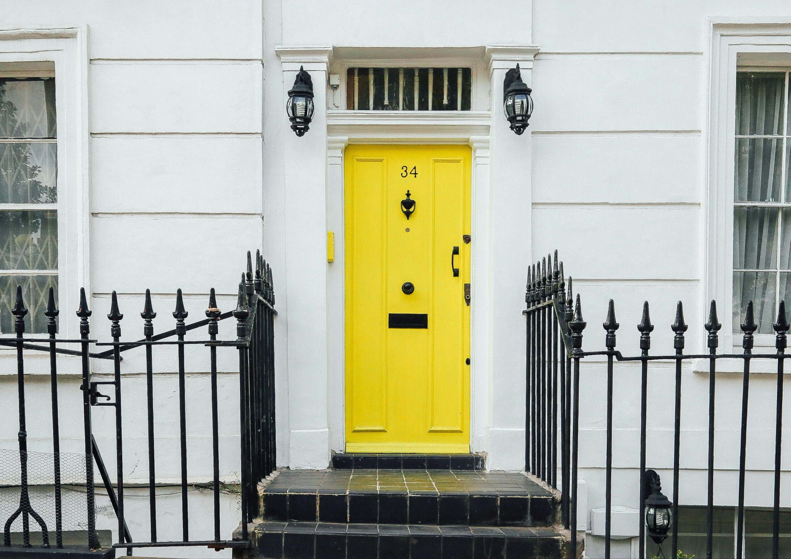
Your front door is more than just an entrance—it’s a powerful statement. As the first thing visitors see, it sets the tone for your home’s overall atmosphere. Some colors exude warmth and feel inviting, but others can be downright appalling. Discover the four front door colors to avoid for a home with lasting appeal.
Flashy Saturated Colors

Personal preference is essential to make your home feel truly like yours. However, following emerging trends like flashy saturated colors can make your front doors look dated over time.
Moreover, they also affect your home’s curb appeal. A Zillow study found that bright red and saturated blue front doors were linked to lower home prices and fewer house tours.
Neon and electric colors are particularly intense and pure because they don’t have any black, white, or gray mixed in. Having such a high chroma easily dominates the visual field and makes objects appear larger and more prominent.
When applied to front doors, this creates a harsh contrast between the surrounding environment, especially when the backdrop is light. These bright front door colors then cause increased light reflection, leading to glare and reduced visibility. As a result, the door can become a distracting focal point, overshadowing the home’s other architectural and decorative features.
In terms of their psychological effect, flashy saturated colors typically evoke high energy, excitement, and stimulation. While they can easily draw attention, they can also be jarring and intimidating.
Cement Gray

As a neutral color, gray generally looks good in interiors. But cement gray, a muted, desaturated shade similar to the color of concrete and weathered stones, is something you should avoid for your front door.
Its blue or green undertones lack warmth and brightness, making it recede into the background and a poor choice for a welcoming entryway. It also has a low contrast when paired with neutral or muted colors, which further contributes to its dull and uninteresting appearance. This monotonous look comes off as impersonal and prevents you from adding a complementing pop of color.
Additionally, Zillow’s survey shows that cement gray received the lowest score when it comes to home buyer perspective.
Pale Pastels
 - 2 - BluPrint")
Pastels are the softer and more refreshing alternatives to bolder colors. But very light shades lose depth and vibrancy necessary for front doors to be inviting. Too pale pastels such as millennial pink, creamy yellow, cloud blue, and light mint green are so diluted with white that they almost appear washed out.
Rather than making a statement, they blend with the surrounding spaces, making the door less distinct. Similar to bright, bold colors, these light colors can cause glare that makes front doors hard to spot. Because they are less noticeable, pale front doors might be perceived as bland, giving a negative impression of the homeowner.
Colors that are too pale also show dirt, scuffs, fingerprints, and wear more readily because they’re very reflective. They’re also more susceptible to fading from sun exposure, making new doors appear aged.
White

White is a classic front door color, and there’s no question about its visual appeal in any home design. In fact, it’s always been among the popular choices alongside black, navy blue, and brown. It even remains one of the top choices in Zillow’s list of high-priced and most sought-after front door colors for prospective homebuyers.
However, white presents its own set of challenges. Front doors are high-traffic areas, making them prone to dirt and stains. White front doors easily show wear and tear from constant use, and the last thing you want is a dirty, worn-out door greeting everyone entering your home.
Additionally, white’s similarity to pale pastels results in high reflectivity, low contrast, and a subdued appearance. Although it offers versatility, it doesn’t make the door stand out from the negative spaces surrounding it. So, unless you’re committed to high maintenance, you should avoid white for your front door.
Remember, while certain colors might be less than ideal, this isn’t a strict rule. With the right approach, you can make (almost) any color work beautifully. Your front door is your home’s first impression. The color you choose goes beyond aesthetics as it also influences perceptions, property value, and even the overall atmosphere. And by avoiding these impractical colors, you can create a more welcoming and memorable entrance to your home.
Read more: How to Hang Art in Bathrooms: Pros, Cons, and Tips


Once defined primarily by function, the bathroom is now becoming a space that reflects personal lifestyles. As broader design aspirations change in response, so do expectations of the products that shape these spaces. From customizable fixtures to touchless technologies, today’s bathroom solutions are increasingly designed around the way people live. COTTO’s KLIRR Collection highlights several […]

Many people only notice good design when it is absent. A faucet that splashes too far, feels awkward in the hand, or sits slightly out of alignment can disrupt a routine in ways that are subtle yet persistent. These are small irritations, but they reveal a larger truth: the objects used every day often have […]

Running from November 27, 2025, to May 31, 2026, the exhibition traces how Art Deco moved from global design movement to localized expression through Philippine architecture, furnishings, fashion, and everyday life. The National Museum of Fine Arts’ Art Deco: Modernity and Design in the Philippines 1925-1950 explored the history of the Art Deco style in […]

Flooring can profoundly influence how a space is experienced. Long before furniture and finishes are introduced, the floor establishes a visual field that shapes movement, light, and proportion. This is where large-format tiles are particularly effective. By reducing the number of grout lines across a floor or wall, they create a more continuous surface. The […]

Since setting up her design firm, MB Architecture Studio, in 2007, Ar. Micaela Benedicto has built a diverse portfolio of architectural projects. Her works, whether residential or commercial, showcase a distinct spatial quality, “I like to create things that can go from something static to something that is alive and reactive,” Benedicto states. “In creating […]
Download this month's BLUPRINT magazine digital copy from:

Subscribe via [email protected]