The seventh edition of the Anthology ASEAN ArchitectureArchitectureThe art and science of designing and constructing buildings, structures, and spaces that are functional, safe, and aesthetically pleasing. It encompasses the planning, design, materials, and techniques used to createGo to Architecture Glossary Festival brought together over 4,000 delegates from across the Philippines and Southeast Asia for three […]
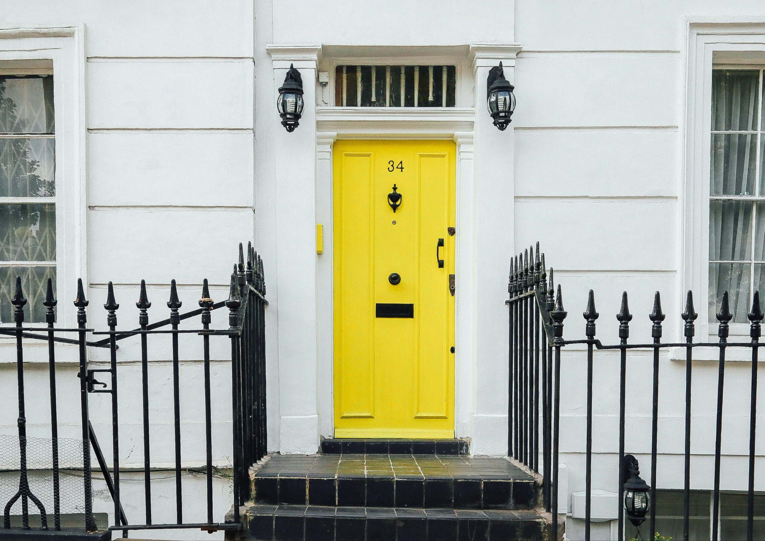
4 Front Door Colors That Hurt Your Home’s First Impression



Your front door is more than just an entrance—it’s a powerful statement. As the first thing visitors see, it sets the tone for your home’s overall atmosphere. Some colors exude warmth and feel inviting, but others can be downright appalling. Discover the four front door colors to avoid for a home with lasting appeal.
Flashy Saturated Colors
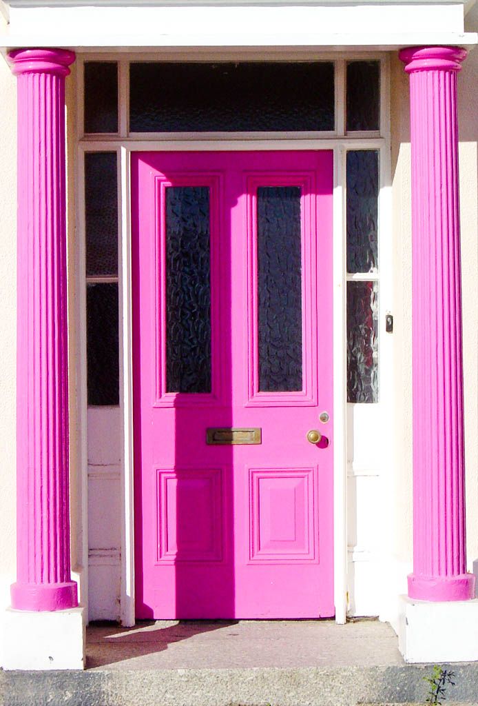
Personal preference is essential to make your home feel truly like yours. However, following emerging trends like flashy saturated colors can make your front doors look dated over time.
Moreover, they also affect your home’s curb appeal. A Zillow study found that bright red and saturated blue front doors were linked to lower home prices and fewer house tours.
Neon and electric colors are particularly intense and pure because they don’t have any black, white, or gray mixed in. Having such a high chroma easily dominates the visual field and makes objects appear larger and more prominent.
When applied to front doors, this creates a harsh contrast between the surrounding environment, especially when the backdrop is light. These bright front door colors then cause increased light reflection, leading to glare and reduced visibility. As a result, the door can become a distracting focal point, overshadowing the home’s other architectural and decorative features.
In terms of their psychological effect, flashy saturated colors typically evoke high energy, excitement, and stimulation. While they can easily draw attention, they can also be jarring and intimidating.
Cement Gray
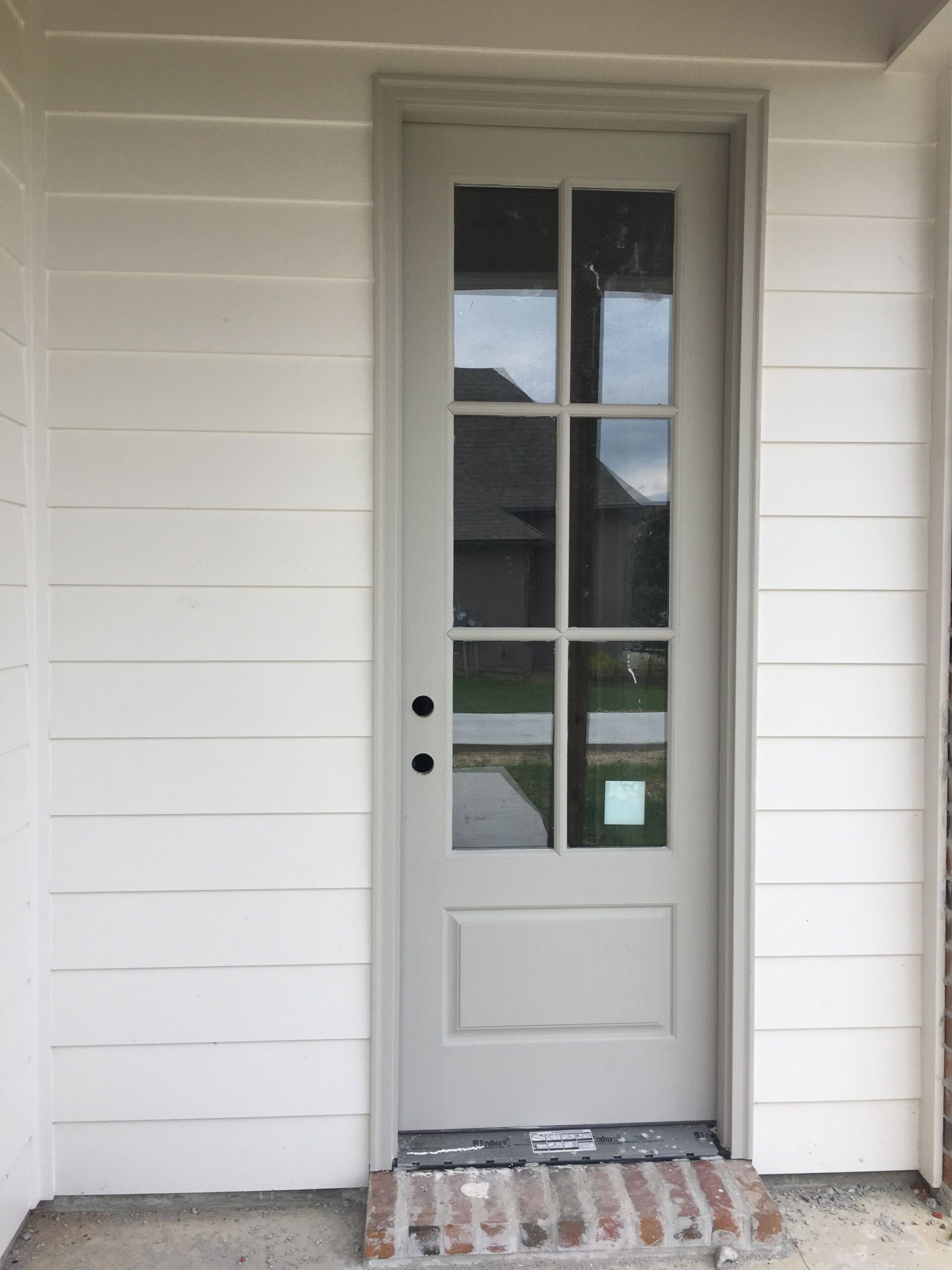
As a neutral color, gray generally looks good in interiors. But cement gray, a muted, desaturated shade similar to the color of concrete and weathered stones, is something you should avoid for your front door.
Its blue or green undertones lack warmth and brightness, making it recede into the background and a poor choice for a welcoming entryway. It also has a low contrast when paired with neutral or muted colors, which further contributes to its dull and uninteresting appearance. This monotonous look comes off as impersonal and prevents you from adding a complementing pop of color.
Additionally, Zillow’s survey shows that cement gray received the lowest score when it comes to home buyer perspective.
Pale Pastels
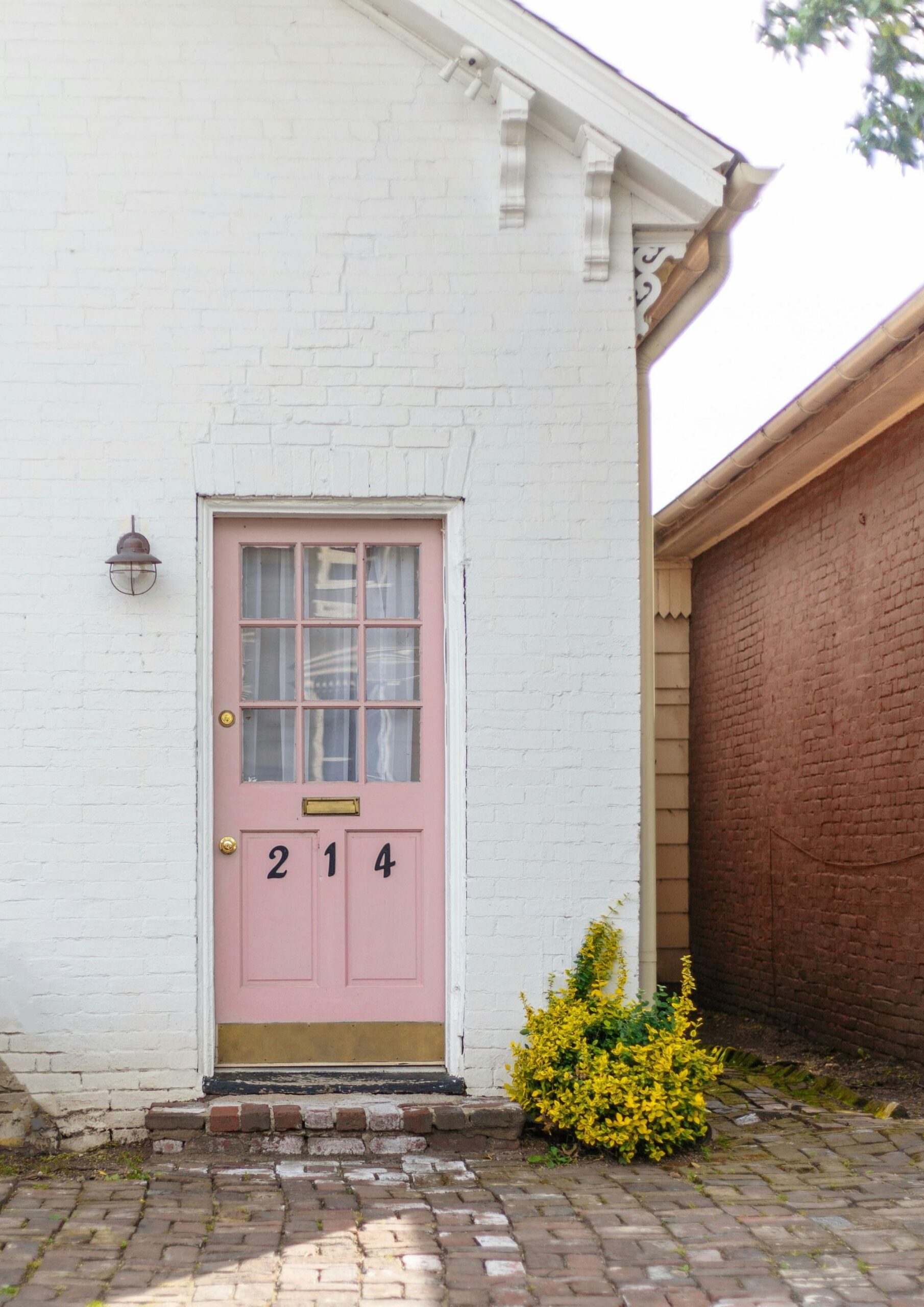
Pastels are the softer and more refreshing alternatives to bolder colors. But very light shades lose depth and vibrancy necessary for front doors to be inviting. Too pale pastels such as millennial pink, creamy yellow, cloud blue, and light mint green are so diluted with white that they almost appear washed out.
Rather than making a statement, they blend with the surrounding spaces, making the door less distinct. Similar to bright, bold colors, these light colors can cause glare that makes front doors hard to spot. Because they are less noticeable, pale front doors might be perceived as bland, giving a negative impression of the homeowner.
Colors that are too pale also show dirt, scuffs, fingerprints, and wear more readily because they’re very reflective. They’re also more susceptible to fading from sun exposure, making new doors appear aged.
White
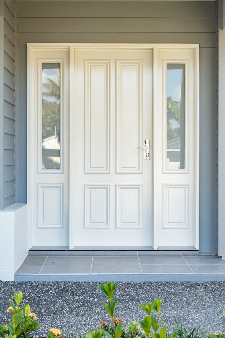
White is a classic front door color, and there’s no question about its visual appeal in any home design. In fact, it’s always been among the popular choices alongside black, navy blue, and brown. It even remains one of the top choices in Zillow’s list of high-priced and most sought-after front door colors for prospective homebuyers.
However, white presents its own set of challenges. Front doors are high-traffic areas, making them prone to dirt and stains. White front doors easily show wear and tear from constant use, and the last thing you want is a dirty, worn-out door greeting everyone entering your home.
Additionally, white’s similarity to pale pastels results in high reflectivity, low contrast, and a subdued appearance. Although it offers versatility, it doesn’t make the door stand out from the negative spaces surrounding it. So, unless you’re committed to high maintenance, you should avoid white for your front door.
Remember, while certain colors might be less than ideal, this isn’t a strict rule. With the right approach, you can make (almost) any color work beautifully. Your front door is your home’s first impression. The color you choose goes beyond aesthetics as it also influences perceptions, property value, and even the overall atmosphere. And by avoiding these impractical colors, you can create a more welcoming and memorable entrance to your home.
Read more: How to Hang Art in Bathrooms: Pros, Cons, and Tips

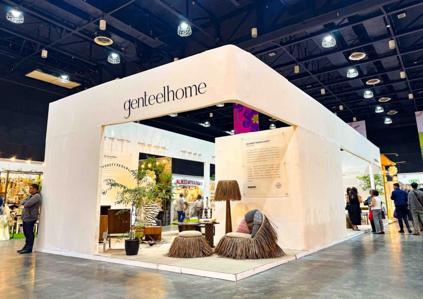
Bigkis is the act of binding. In Tagalog, the word can refer to something used to bind or encircle, as well as a bundle formed by tying several separate elements together. Figuratively, it can also mean a bond, union, or unity. The meanings move from the physical act of joining things together to the connection […]
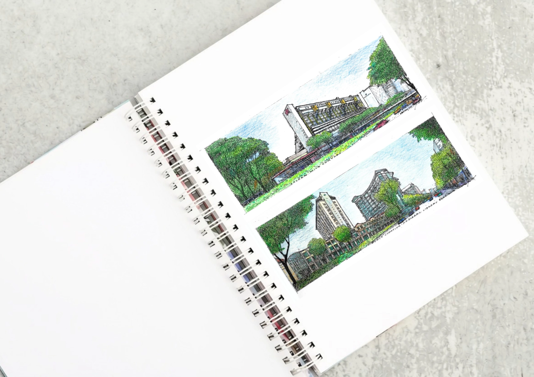
Two sketches of Singapore connect BluPrint Editor in Chief Paulo G. Alcazaren’s personal and professional history with Shared Ground: ArchitectureArchitectureThe art and science of designing and constructing buildings, structures, and spaces that are functional, safe, and aesthetically pleasing. It encompasses the planning, design, materials, and techniques used to createGo to Architecture Glossary of Care, Culture, […]
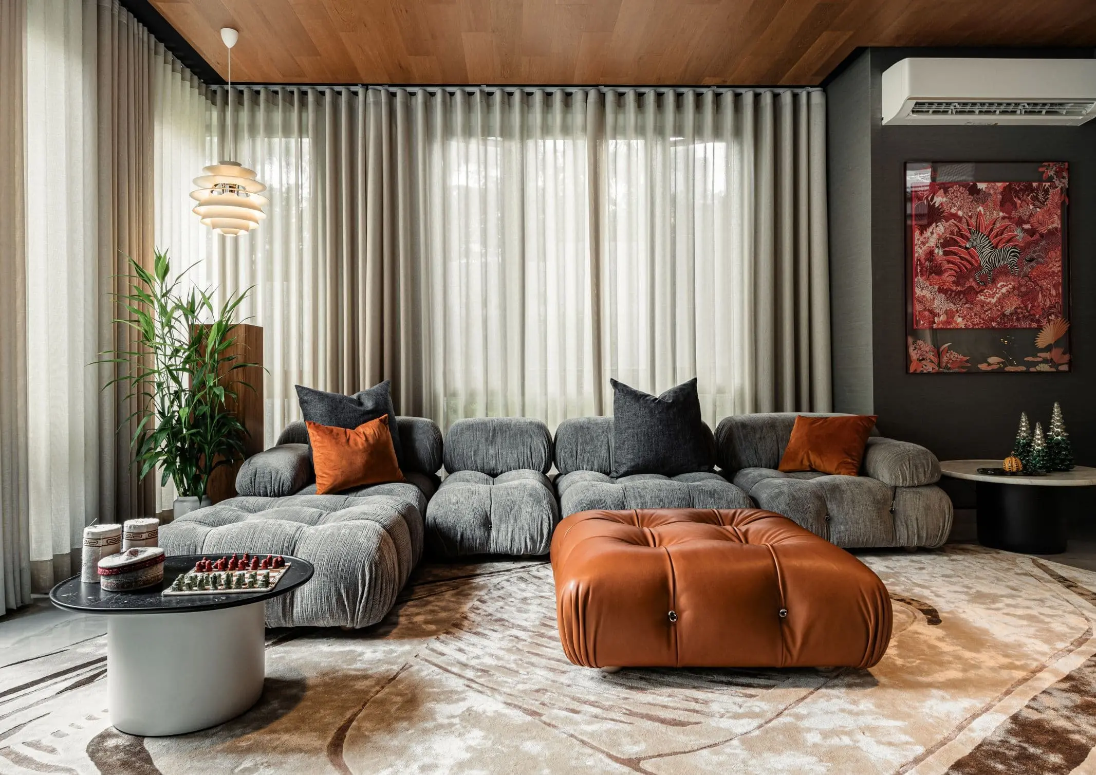
Some have become household names – Coleman, Oster, and KitchenAid – products that have found their way into Filipino kitchens, homes and family routines. In home furnishings, brands such as B&B Italia, Ethan Allen, Sub-Zero, Miele, SieMatic, Louis Poulsen, Hunter Douglas, Tempur, and Technogym, have helped shape the way Filipinos live. From everyday essentials to […]

In a way, designers are the modern-day soothsayers and prophets. They design for the future, predicting how a room, a house, a building or a whole city will be used by people. They foresee how users will interact with a space, conjure exact shades of colors to elicit specific behavior and arrange furniture to build […]
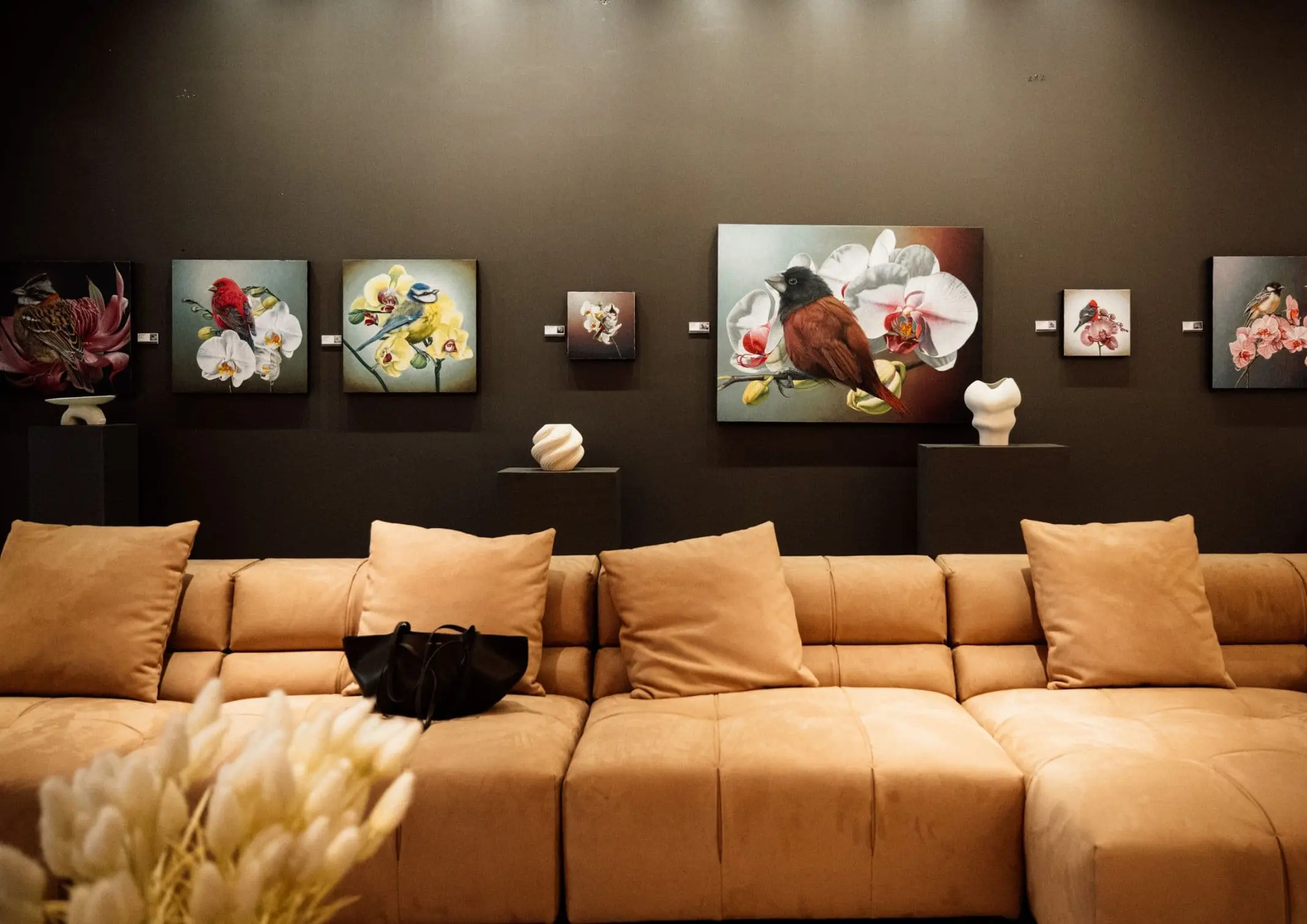
Art and furniture are often selected separately, yet their relationship can shape how a room looks and feels. The collaboration between Hooga and Galerie Joaquin explores how these elements can work together, bringing contemporary artworks into furnished residential settings at Hooga’s showroom in Uptown Mall, Bonifacio Global City. For Hooga, which curates furniture, lighting, and […]
Read the issues.

Collect the volumes.

Recommended Video
Tap to Unmute
Unmute
0:00
0:00