Contemporary design refers to the constantly evolving design trends of today. With the power to design our built environments, architects have been experimenting with various architectural approaches. Whether that is through unconventional forms or the integration of smart technologies, BluPrint lists down Filipino architects who are defining contemporary architecture. Deo Alam Architect Deo Alrashid Alam […]
‘The Soup Can Factory’ Parodies Popular Culture and Consumerism
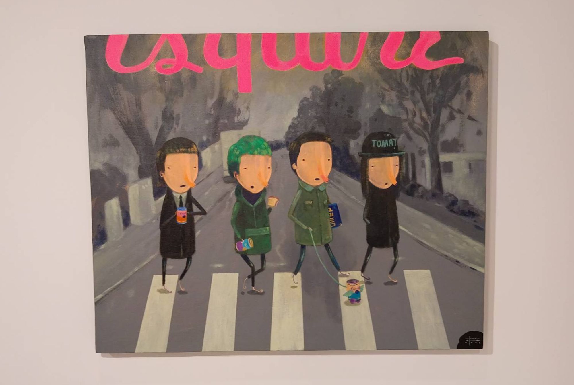
The Soup Can Factory, the new exhibit by Farley del Rosario at Galerie Stephanie, shows a series of pop culture parodies that poke fun at the behemoths of the past. del Rosario’s work criss-crosses between different periods and mediums, creating an all-encompassing caricature of our art history.
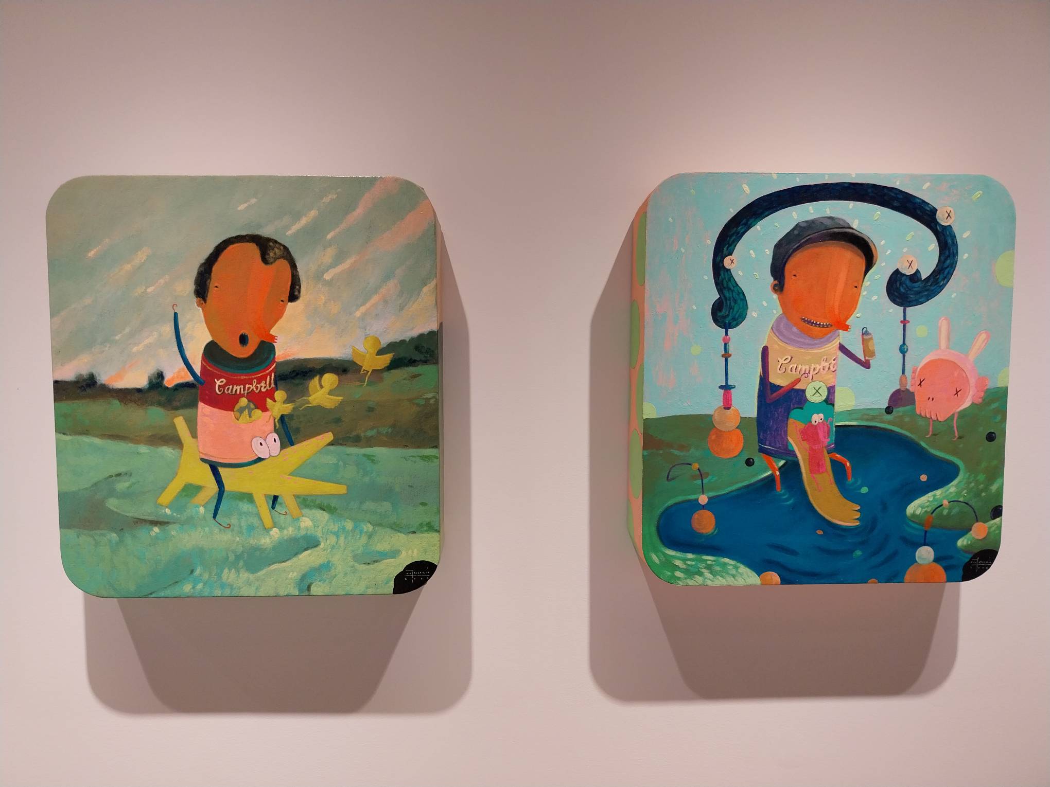
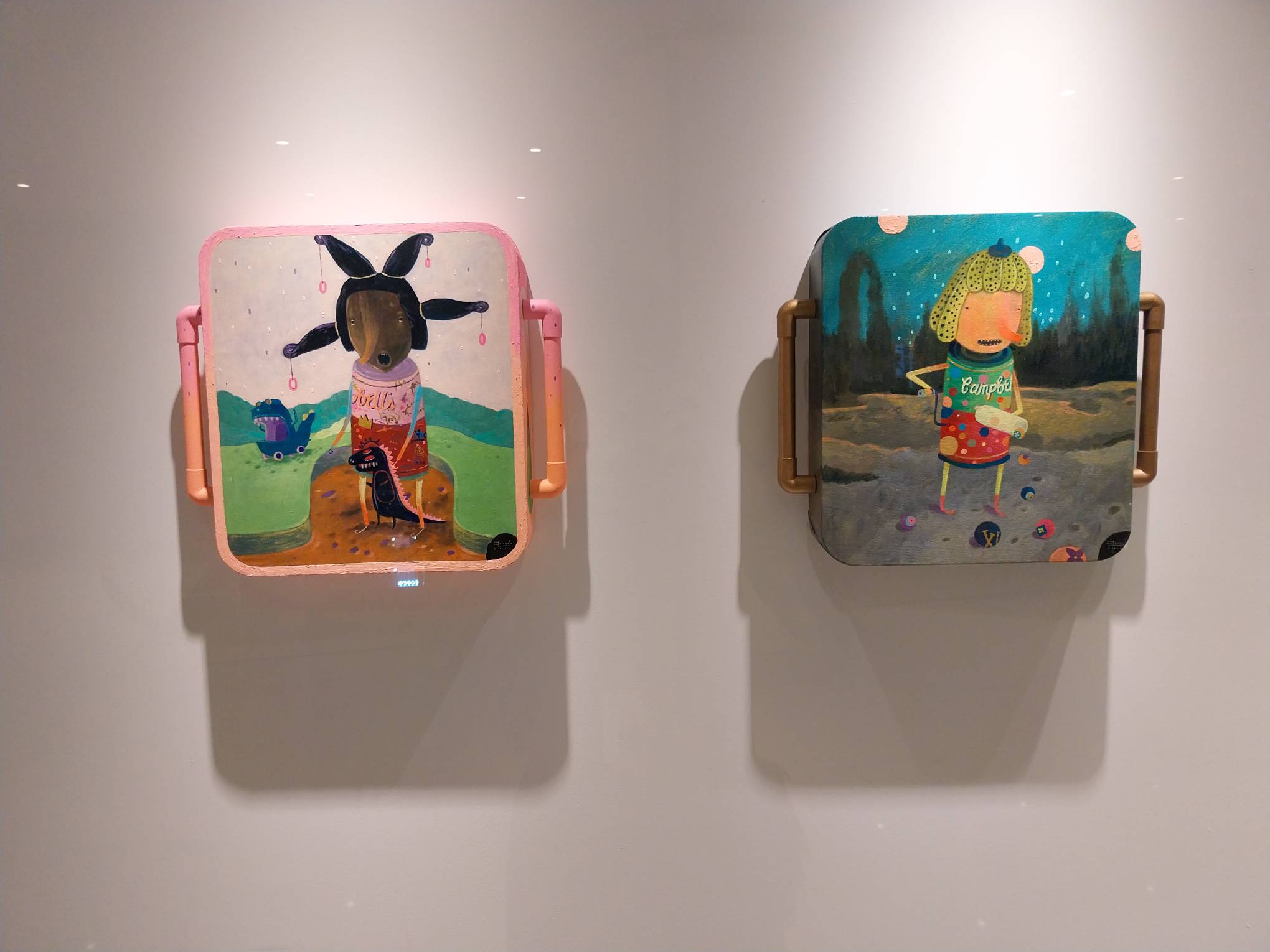
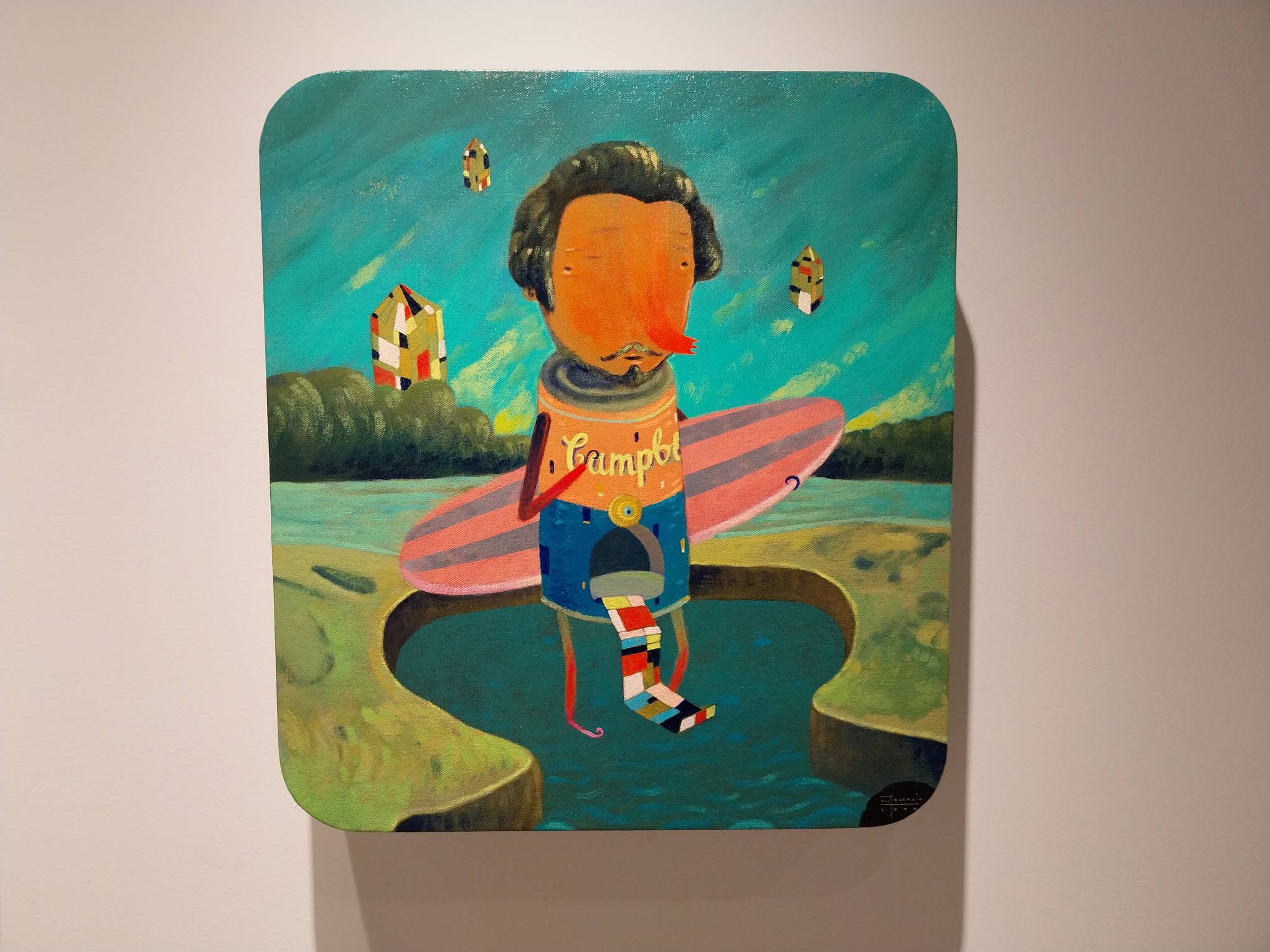
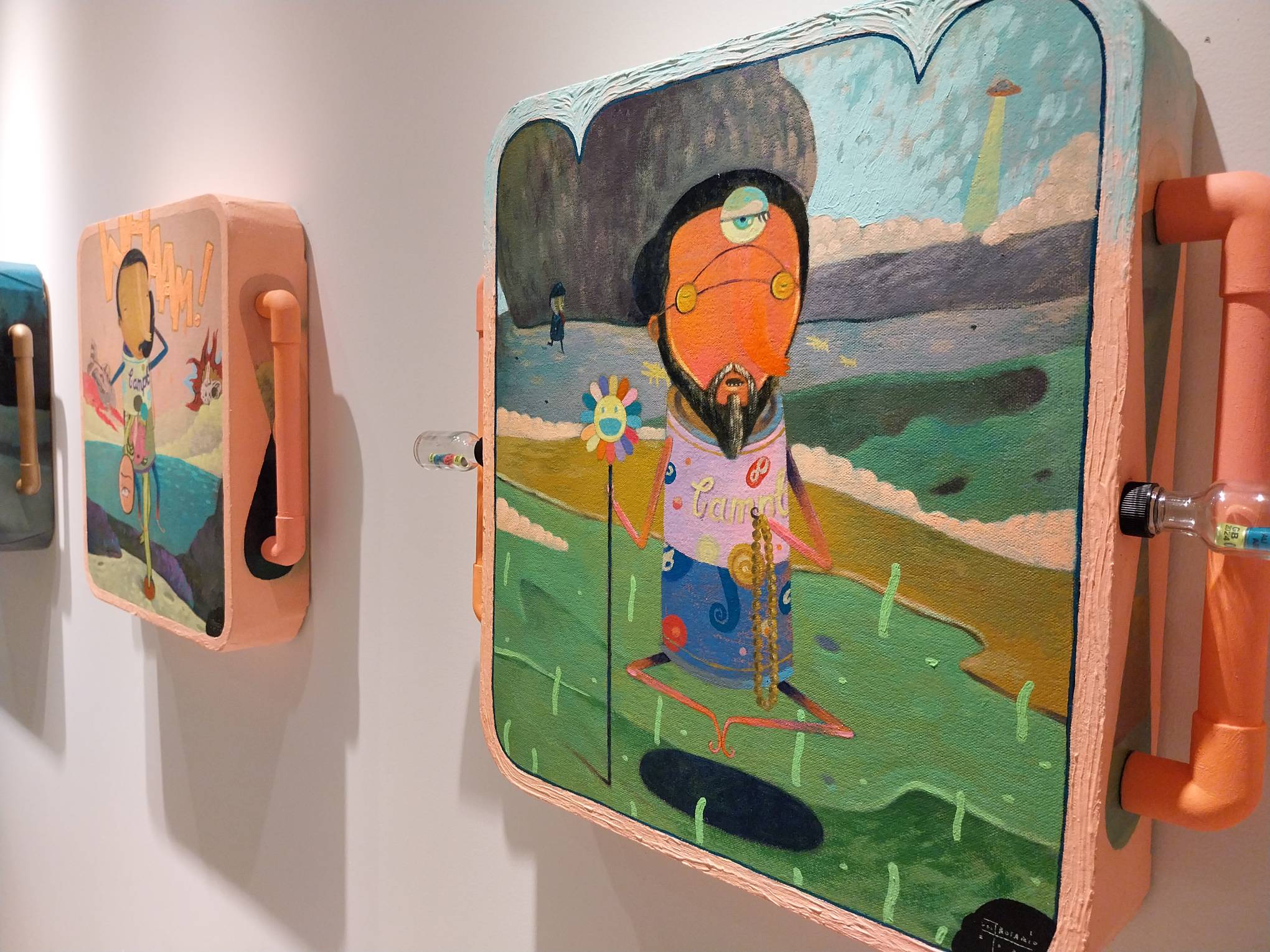
For this exhibit, the main point of parody is Andy Warhol, specifically his famous “Campbell’s Soup Cans.” The concept appears to reference Warhol’s work in different ways: beyond the soup cans, the decision to name the exhibit Soup Can Factory references Warhol’s own studio in New York called The Factory. The concept also utilizes Warhol’s hyperfixation on popular culture in the works.
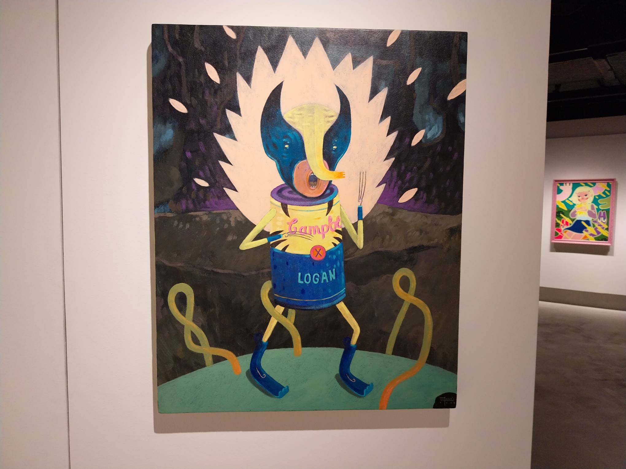
But while Warhol’s work took popular culture and celebrity seriously, Farley del Rosario’s approach finds a humorous, whimsical tone to the past works. He riffs on famous paintings and cultural icons with his exaggerated, expressive art style.
Advertisement
The art style is something at home in children’s books as much as it is in the canvas, as he creates giant heads, stringy noses, and small limbs that translate well from a distance. It creates unique outputs, as one can see for this exhibit.
Art and Comic Parodies
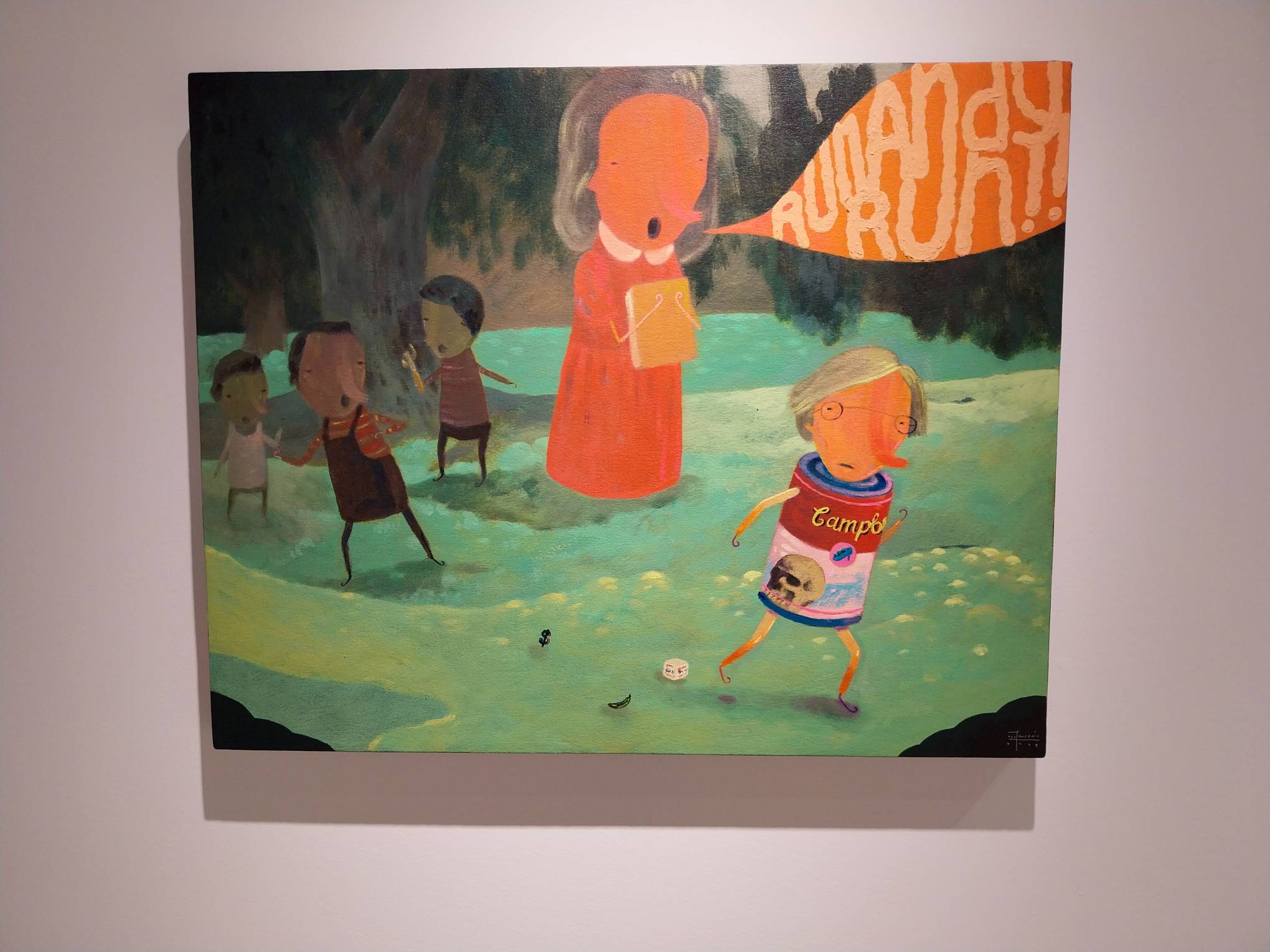
del Rosario’s main creative decision for the exhibit is turning the figures’ bodies into soup cans. The artist seeks to show how mass culture sees these artworks: as commodities, mass produced to ubiquity and to the point where their original intent is lost.
As a message, the idea traces itself to the roots of pop art and its appropriation of kitschy low art—how even the banal logos contribute to our artistic culture as a whole. But del Rosario takes it further, and shows that, like anything can be art, anything can be commodified into a product as well.
Advertisement
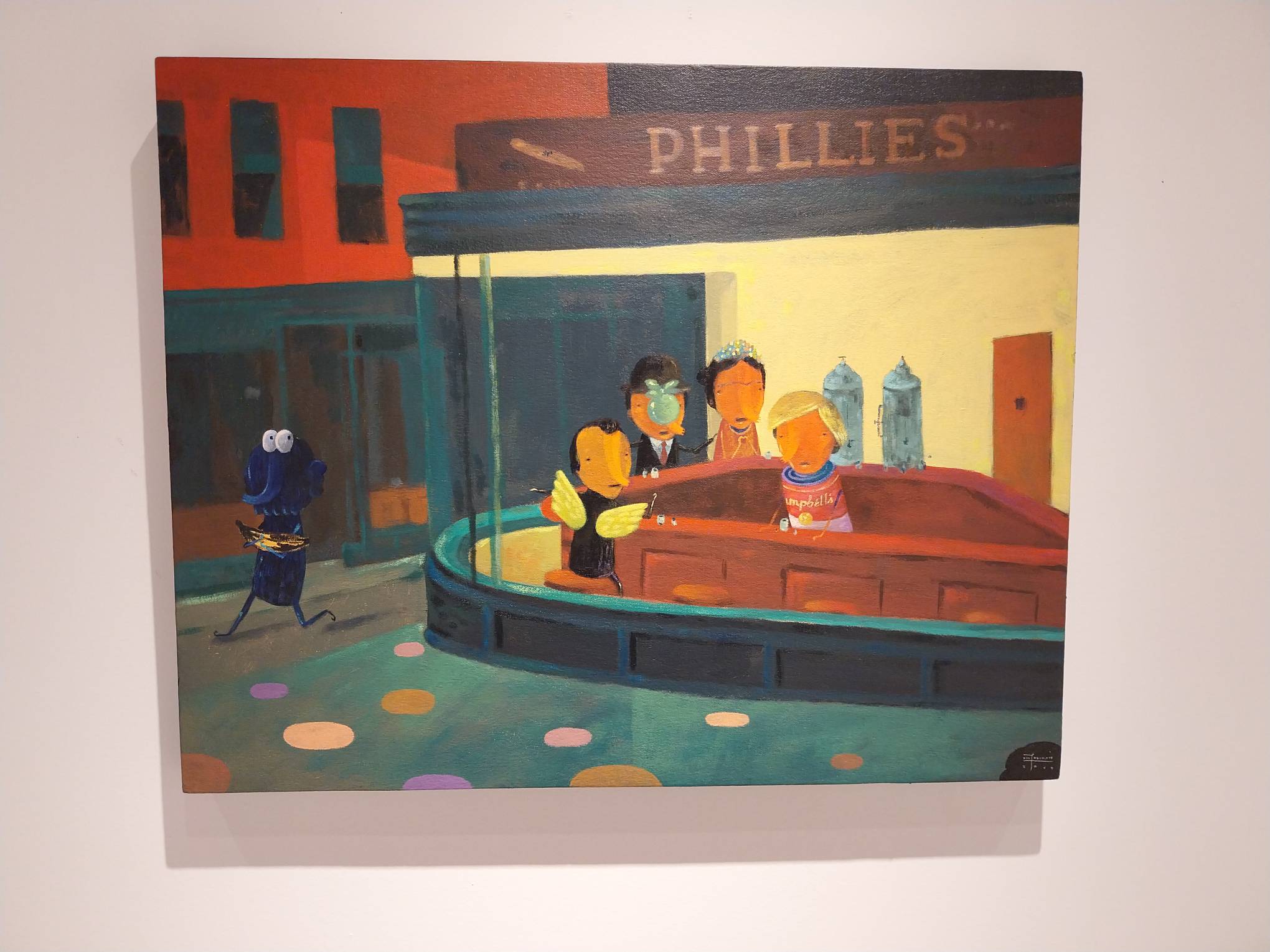
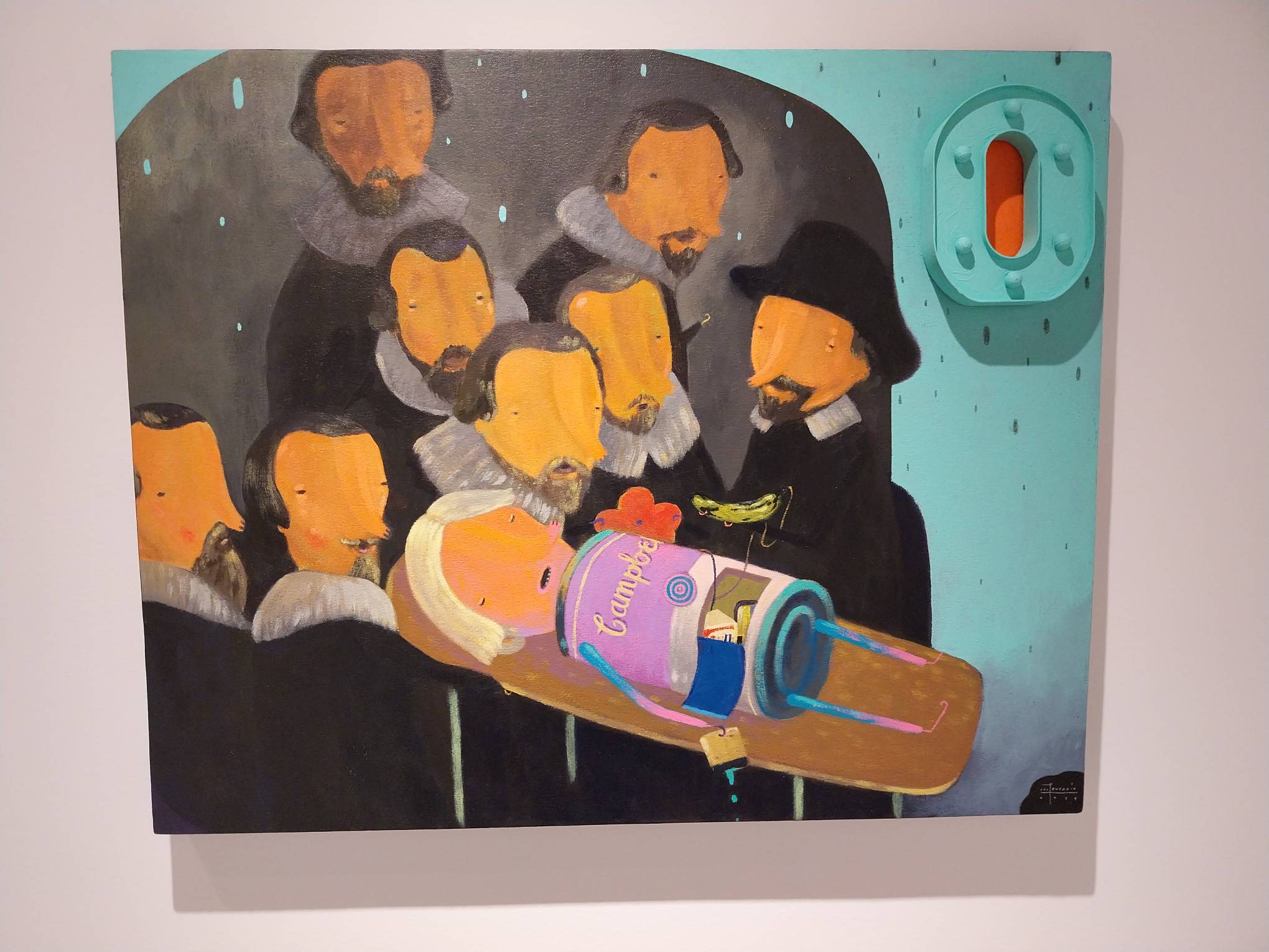
The Soup Can Factory targets a really broad swatch of cultural iconography for parody. Many of them remain deeply ingrained in our cultural language. While most people would probably not be able to name Nighthawks or The Anatomy Lesson of Dr. Nicolaes Tulp, most would recognize the visual easily. Del Rosario packs in a lot of references per painting, and there’s a sense of excitement in recognition that one would also feel while watching a Marvel film.
Commerce and Commercialism
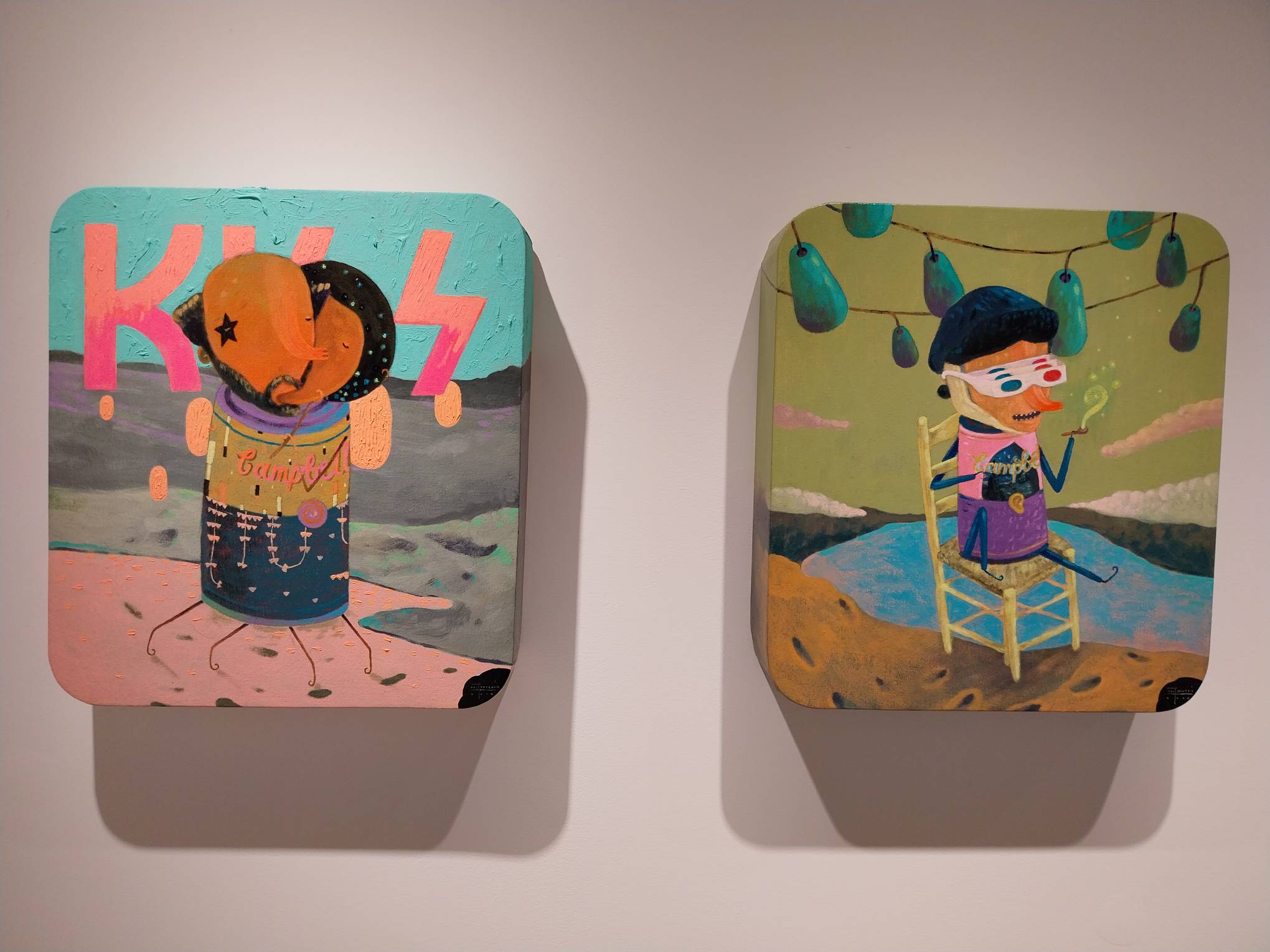
The fact that del Rosario’s parodies of Nighthawks exists next to a painting parodying the rock band Kiss makes its point ever-clearer. Kiss is a band well-known for their theatrical presentation and for their mercenary existence as generators of merchandise and money. The personas exist within the Scooby-Doo universe, among other profit-oriented artistic decisions. Once band leader Gene Simmons got too old to tour, he lent the copyrighted images to a hologram-centric tour to keep the money going.
Both are iconic symbols of culture. And both are commodified and referenced for mass production in some way, as Warhol once mimicked mass-production in his celebrity portraits. The works make a point that even iconic artworks like this, which have survived for decades, can and will be turned into profit-making references in today’s society.
Advertisement
Why So Serious?
Of course, just because it exists as commentary does not mean that the exhibit doesn’t have fun with its references and touchpoints. Referenced in the exhibit write-up is a parody of Piet Mondrian, and it’s funny in how it integrates the abstract images within the final product. His Van Gogh parody also gives a sense of comedic whimsy and affection. It also hints at his cultural place as a shorthand for good art, to the point where a Top 20 song, a Doctor Who episode, and a 2017 movie circles around it.
In another sort of way, commentary also merges with commerce through the creation of merchandise for the exhibit. Some of the merchandise appears to be actual parodies poking fun of the concept, like the soup cans with del Rosario’s name in them. Others are purchasable on Galerie Stephanie’s website.
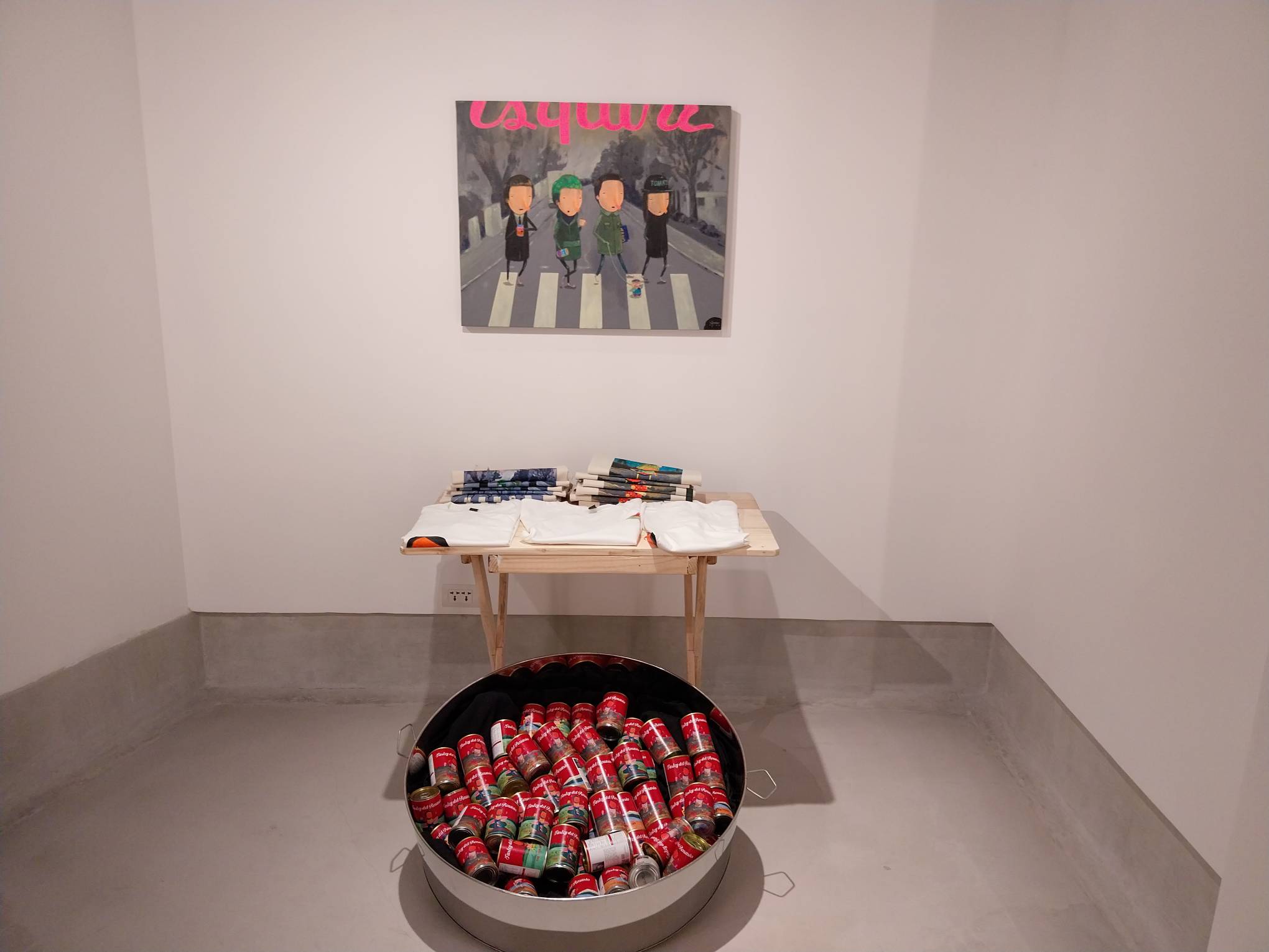
In a Paul Verhoeven way, it makes the point of satirizing and participating in the commodification presented in the exhibit. Differently, of course, because it’s not mass-produced, but participating all the same.

The Soup Can Factory takes the principles of Andy Warhol’s movement and takes them to its endpoint, at least for this decade. No art is sacred, and everything will be mass produced if it’s popular enough. Is that a good thing or a bad thing? Perhaps it just is.
Advertisement
Related reading: Refreshing the Classic: The Art of Farley del Rosario

In the Philippines, adaptive reuse gained traction during the 1970s with the rise of conservation and environmental preservation movements. It offered an architectural solution that reuses existing spaces to fit modern needs. Across the country, several projects demonstrate how this approach is being applied—transforming heritage structures into active spaces for culture, hospitality, and community life. […]
Advertisement
From residential spaces to civic structures, lighting dictates the mood of a space. It controls the visual dynamics of an interior, serving as a guiding tool that highlights key design elements, including materials and textures. Related Reading: Lampscaping: How to Light up Your Home like a Pro Regulating the Mood: Natural and Artificial Light in […]
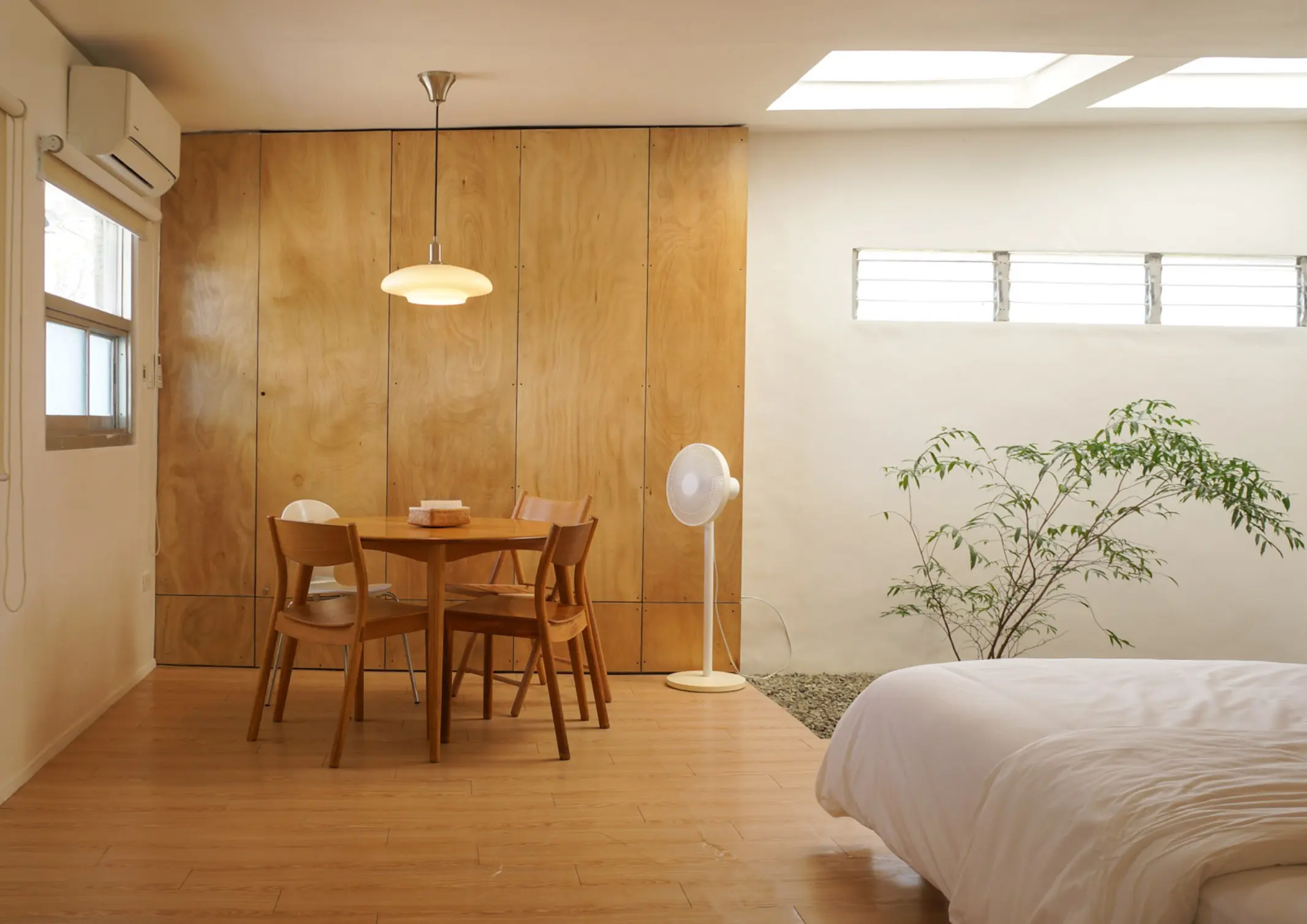
More and more Filipinos are flocking to condominium communities. Often tucked within busy city centers, condo living acts as a small respite from urban chaos. Faced with the challenge of transforming a cramped condominium into a warm living space, BluPrint lists condo interior design ideas that can maximize each square foot of small spaces. Purposeful […]
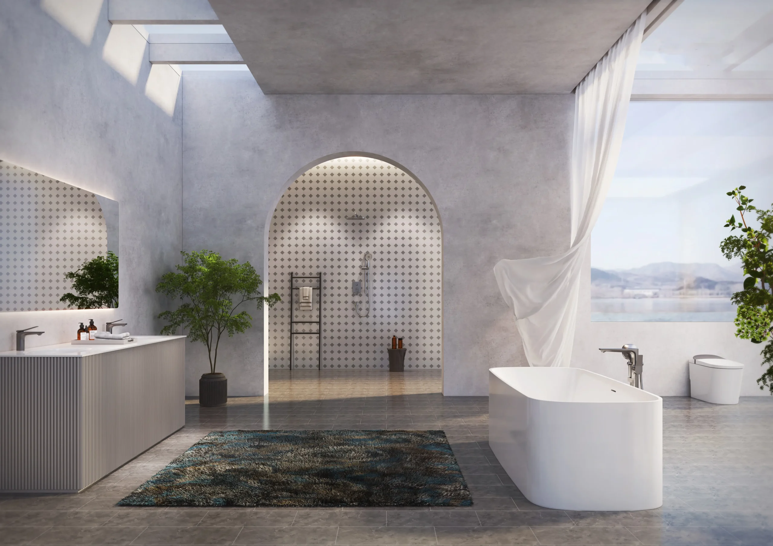
Modern bathrooms are no longer purely functional spaces. Increasingly, they are being designed as environments that support cleanliness, ease, and quiet restoration within the home. As daily life becomes more demanding and health awareness continues to rise, homeowners are beginning to expect more from the spaces where daily rituals begin and end. For architects and […]
Advertisement
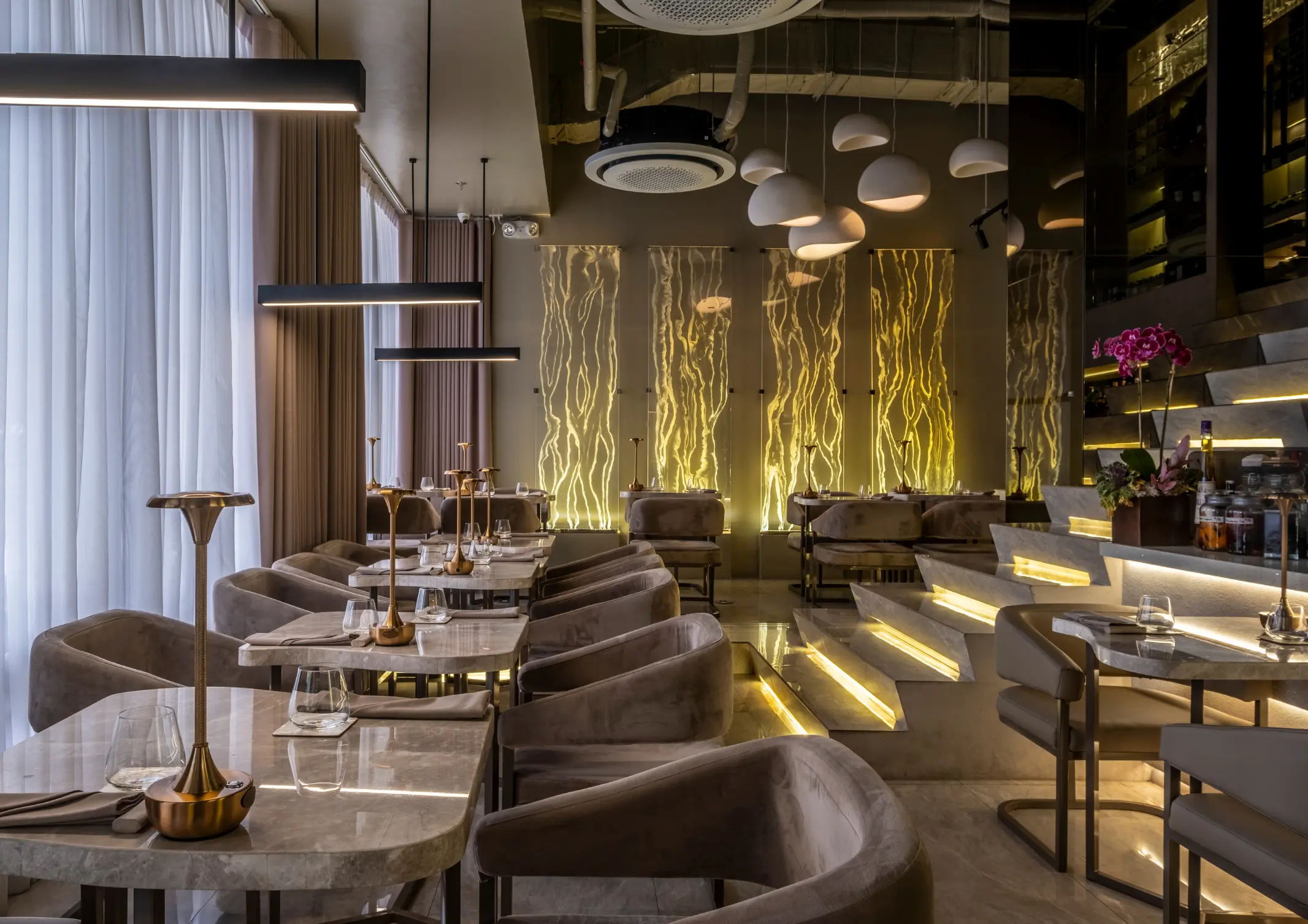
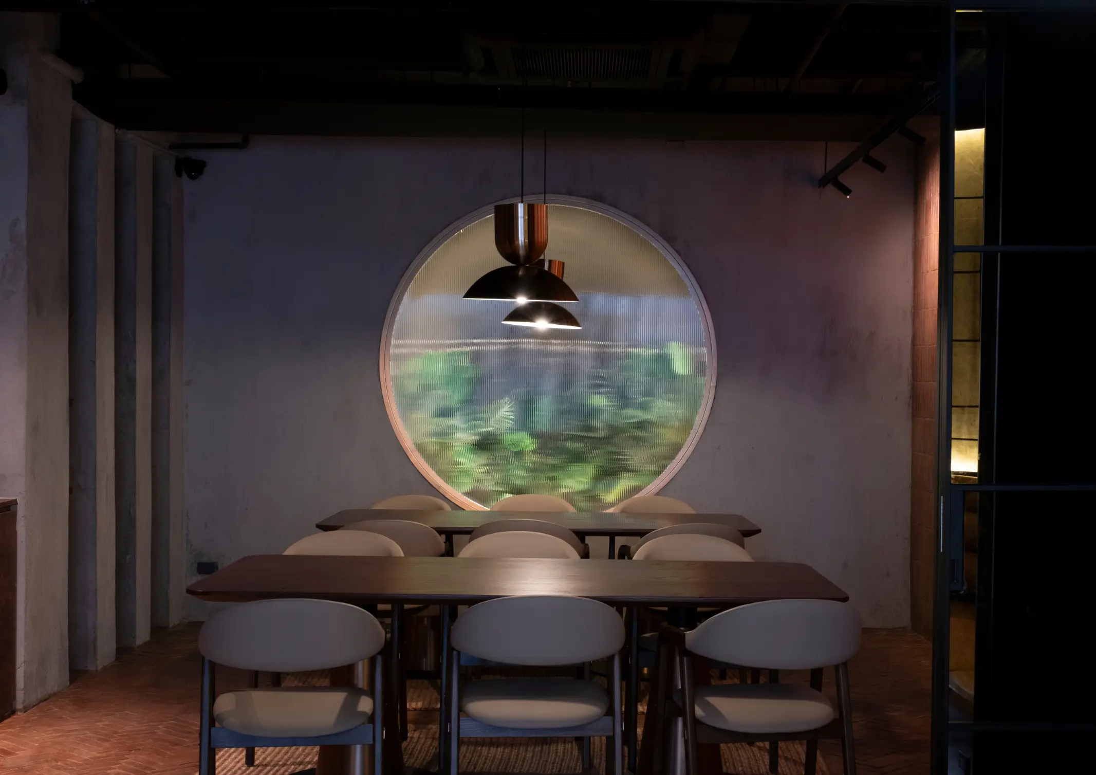
From the moment a diner steps through the door, each detail shapes how a meal is experienced. Restaurant design has evolved, with architects and culinary professionals collaborating to create built spaces that are as intentional as the menu itself. The spatial atmosphere acts as an additional ingredient that can define the culinary experience. Taupe and […]

Download this month's BLUPRINT magazine digital copy from:

Subscribe via [email protected]