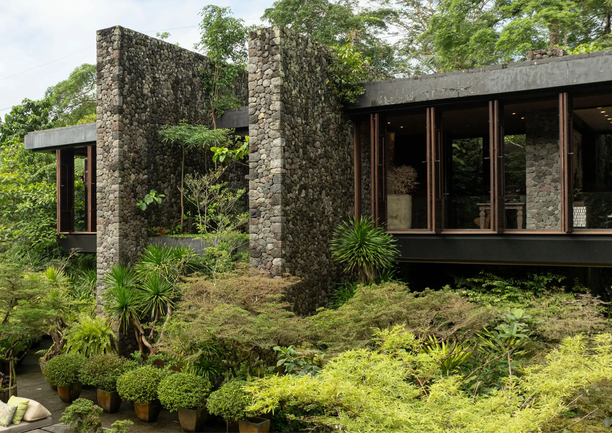
Located near the equator, factors such as heat and humidity are the norm in the Philippines. This tropical climate has shaped the development of architecture in the country. As Leandro V. Locsin stated: “The first consideration of the Filipino builder and certainly the most evident in his architecture, which is after all an outgrowth of […]
Maximalist Design for Small Spaces: How to Go Bold Without Overwhelming
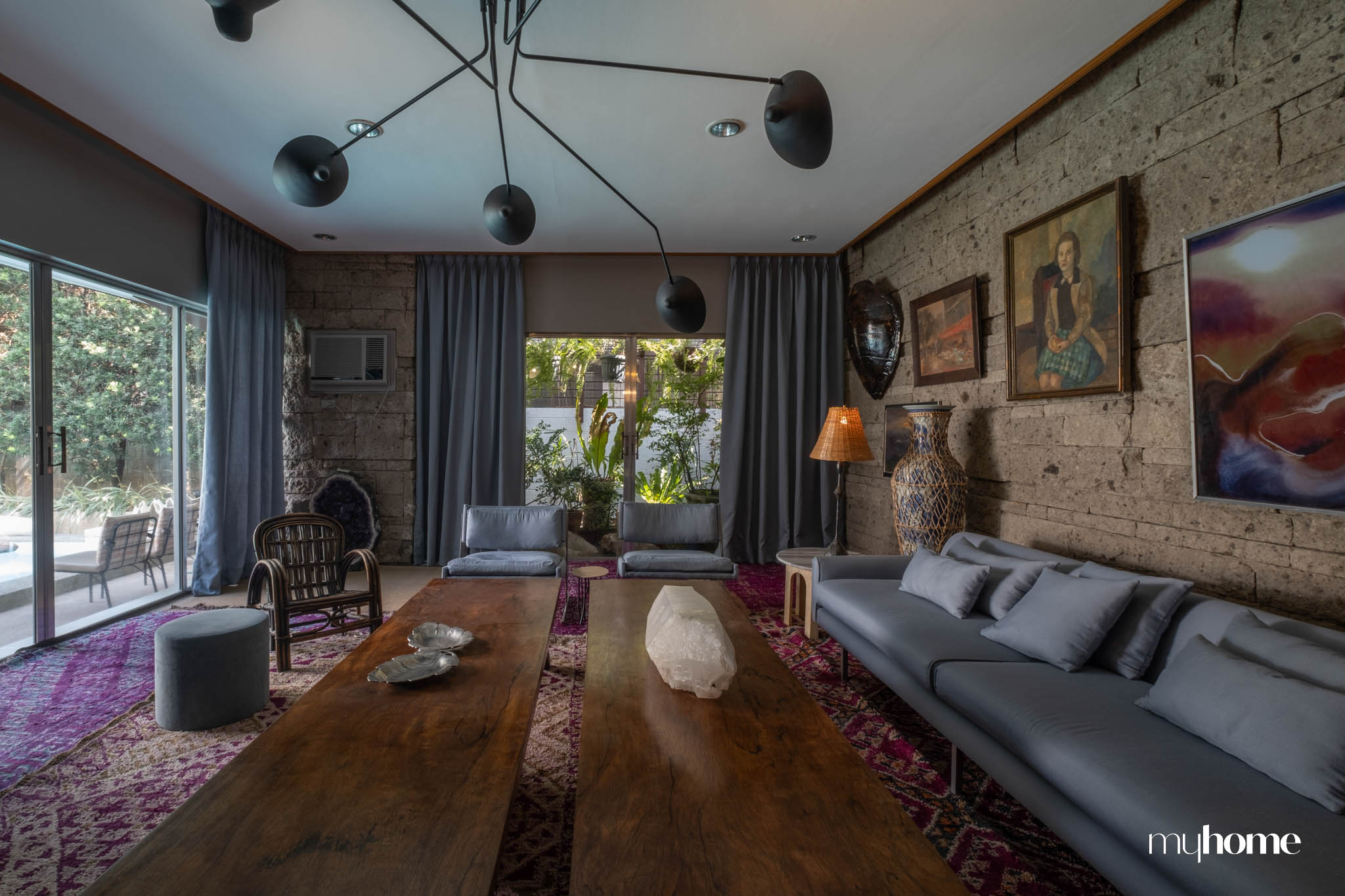
Designing small spaces can feel limiting. But for those with maximalist tendencies, the challenge becomes an opportunity to make a big statement. With the right approach, even the tiniest of rooms can be transformed into a rich, layered environment that exudes personality. We tapped into the expertise of Interior Designer Ivy Almario of Atelier Almario and Interior Decorator Ram Bucoy of Casa Buddha. They show us how to successfully design a maximalist small space without sacrificing functionality or overwhelming the area.
Maximalism vs. Maximizing Space
When thinking about maximalism, it’s easy to equate it with simply filling a space with more things. But that’s not the whole picture. Almario highlights that “maximalism is about layering—textures, fabrics, patterns, and ornamentation—but it’s also about maximizing the function of the space.” For small rooms, the trick lies in balancing opulence with functionality.
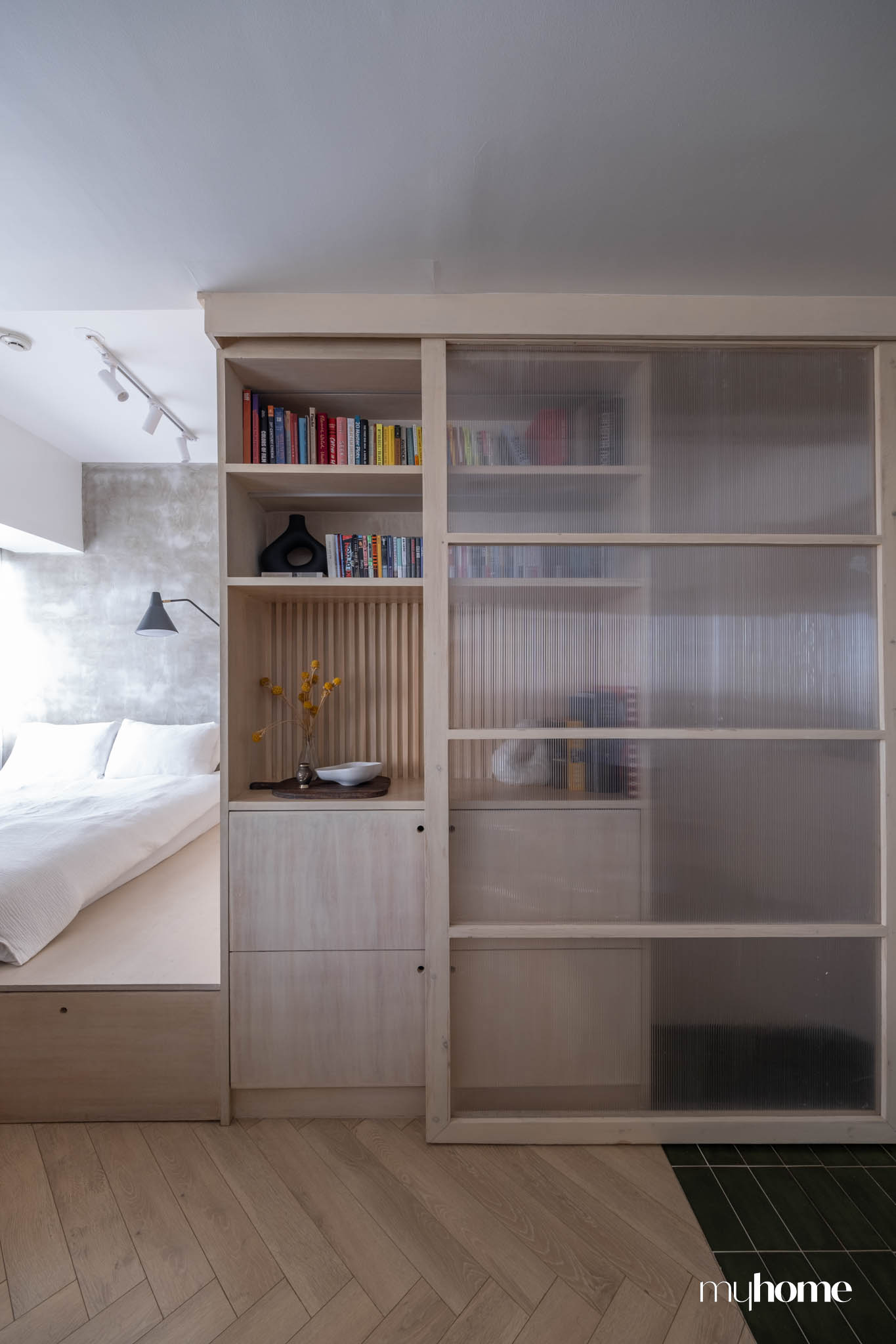
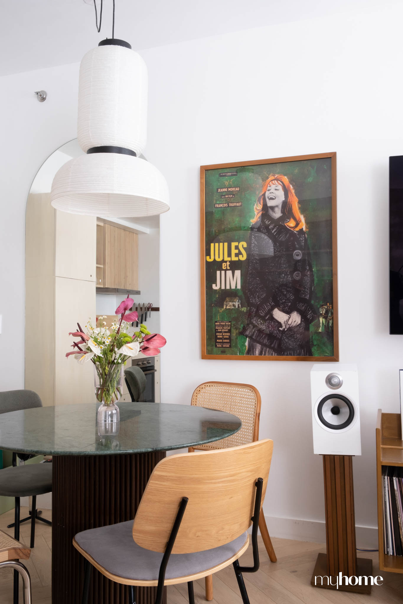
One key tactic is incorporating flexible design elements. Almario recommends sliding partitions that can reveal or conceal space, maximizing the room’s usability without adding visual clutter. She also suggests using mirrors, which “automatically double your space,” not only by reflecting the room but by adding depth and a touch of luxury.
Layers of Texture and Pattern
Maximalism is about richness and depth. And in small spaces, this often manifests through layers of texture and pattern. Bucoy advises homeowners to play with color and pattern fearlessly, noting that “nothing is truly maximalist if the palette is neutral; bright, show-stopping color is an absolute must.” Whether it’s bold wallpaper, layered rugs, or dramatic curtains, Bucoy insists that every element in the space should tell a story, creating a jewel box effect.
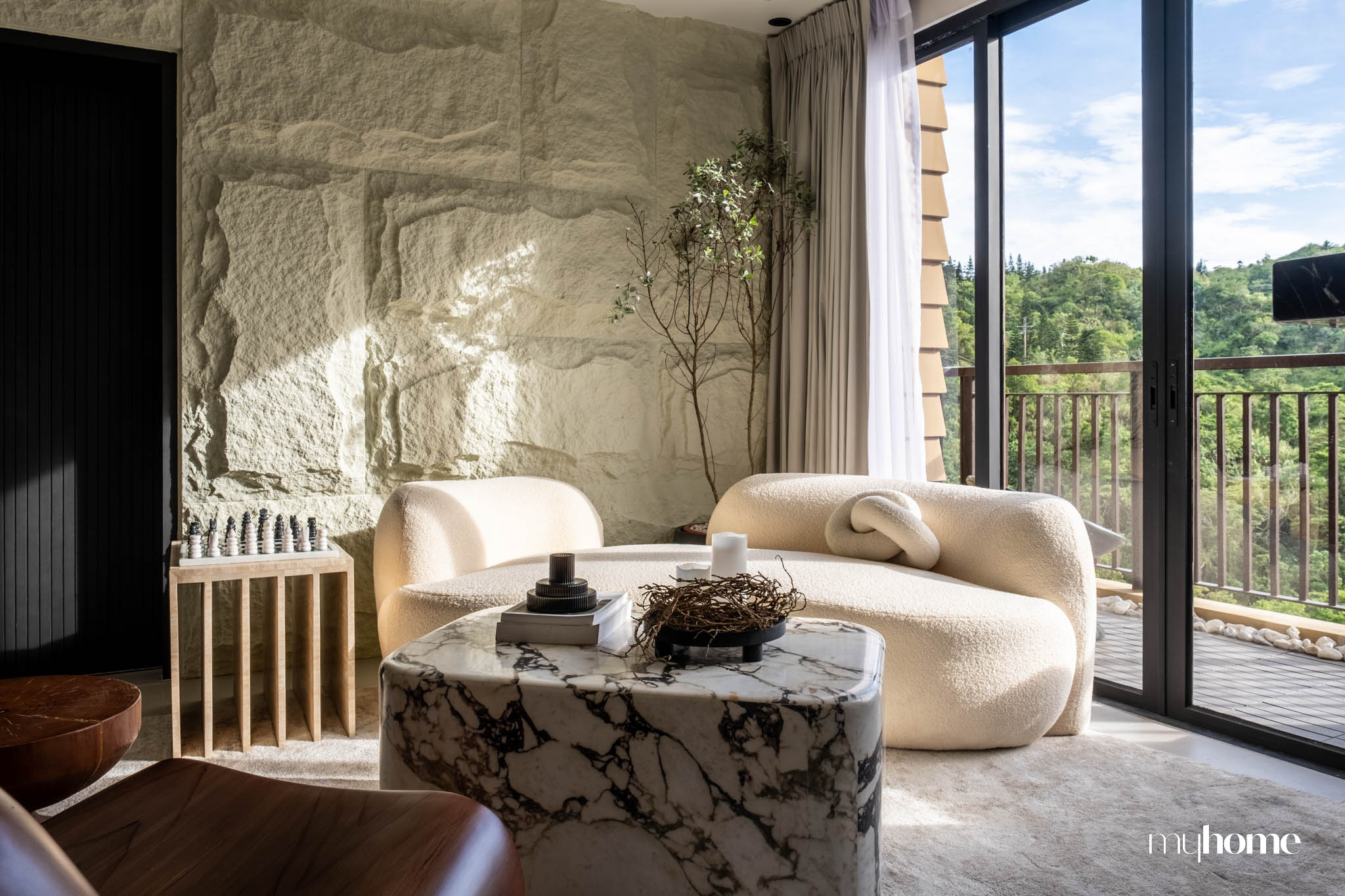
Almario echoes this sentiment, adding that maximalism requires a good understanding of how to layer without making the space feel chaotic. “There are no hard and fast rules,” she explains. “Some people are intuitively good at mixing patterns, but if not, research can be your best friend. Study what first attracted you to maximalism and who your heroes are, then use that as a starting point.”
Scale and Proportion in a Maximalist Small Space
For Bucoy, scale is key. Many people assume that smaller spaces require smaller furniture and decor, but he advises against this approach. “Proportion controls every choice you make when decorating a small space,” he says. Rather than opting for many small pieces, Bucoy suggests focusing on fewer, larger statement items. This creates a sense of grandeur without cluttering the room. “Objects should look collected but never unnecessary,” he adds, advising clients to avoid overcrowding by scaling back to a few well-placed items.
Making a Statement with Color
Maximalism thrives on bold choices, and color plays a starring role in any maximalist design. Neutral tones can create a sense of calm in small spaces. But Bucoy encourages maximalists to go in the opposite direction. “People know deep fuchsia or raspberry is my neutral color,” he says, adding that saturated hues create a dramatic backdrop for layered decor. He also favors finishes that bounce light, such as satin or gloss paints, which prevent small spaces from feeling flat.
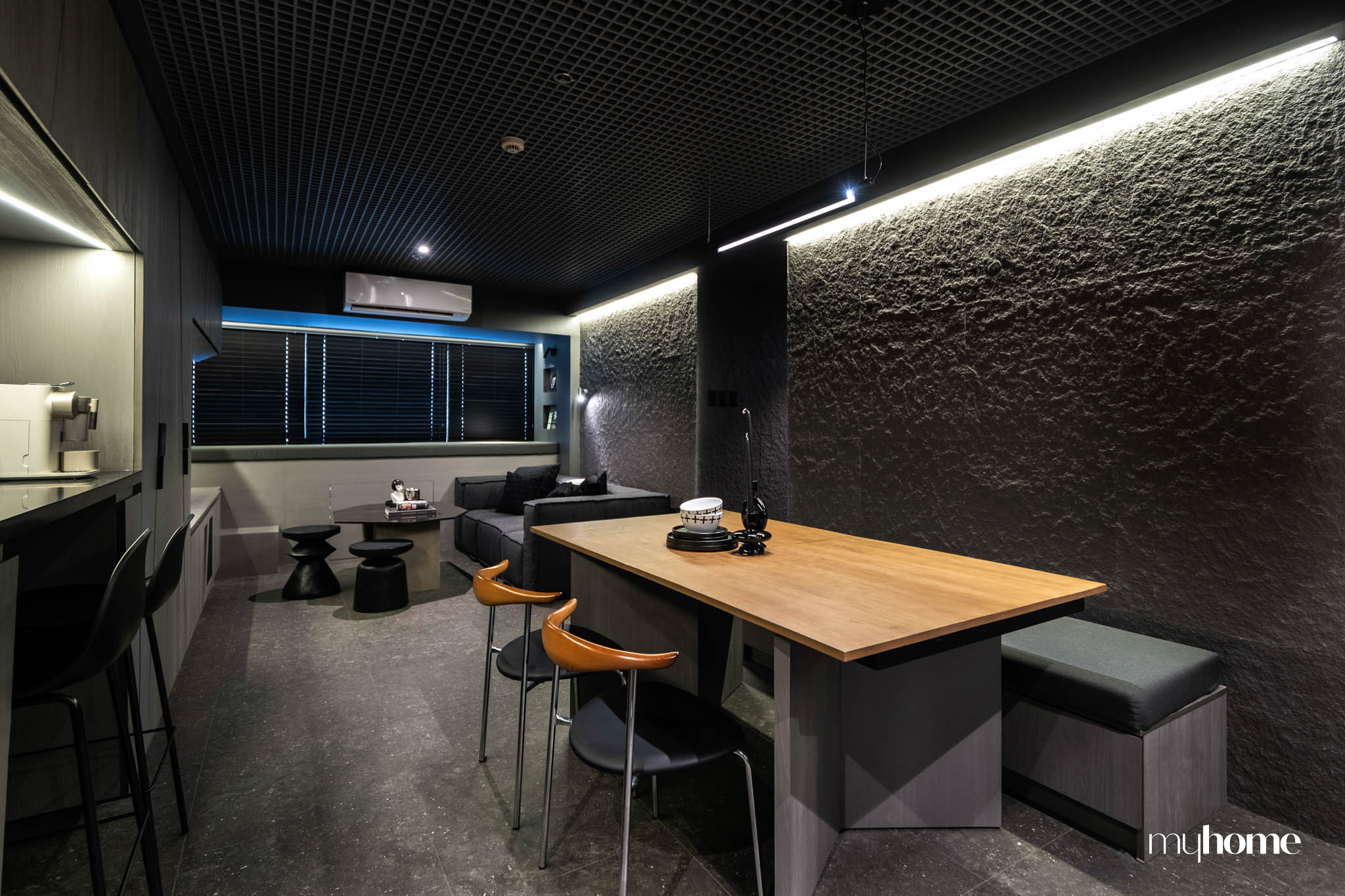
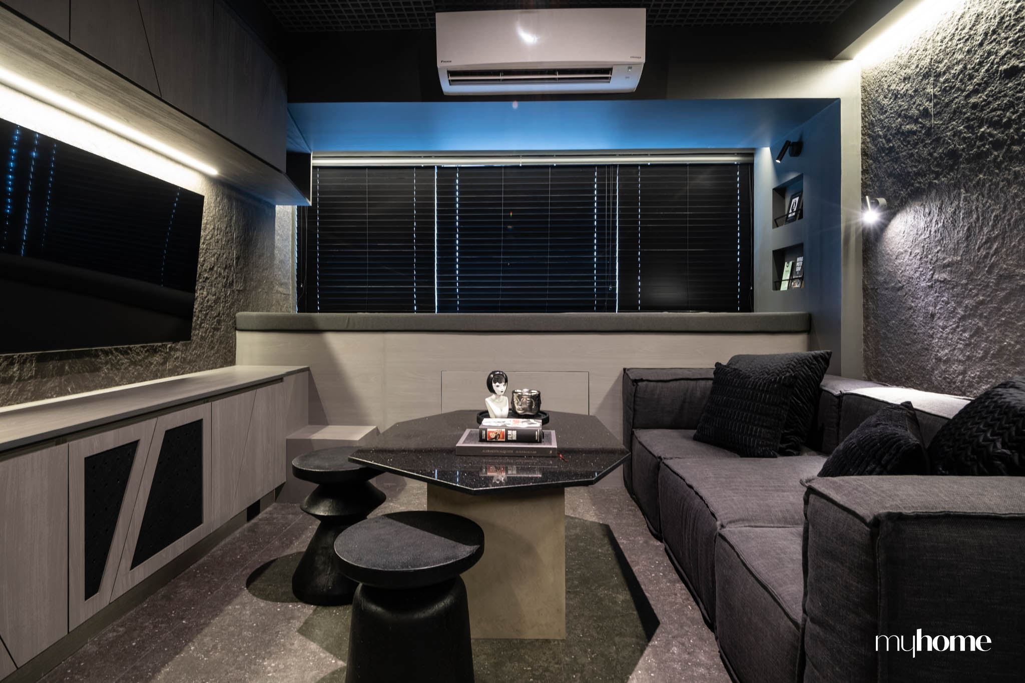
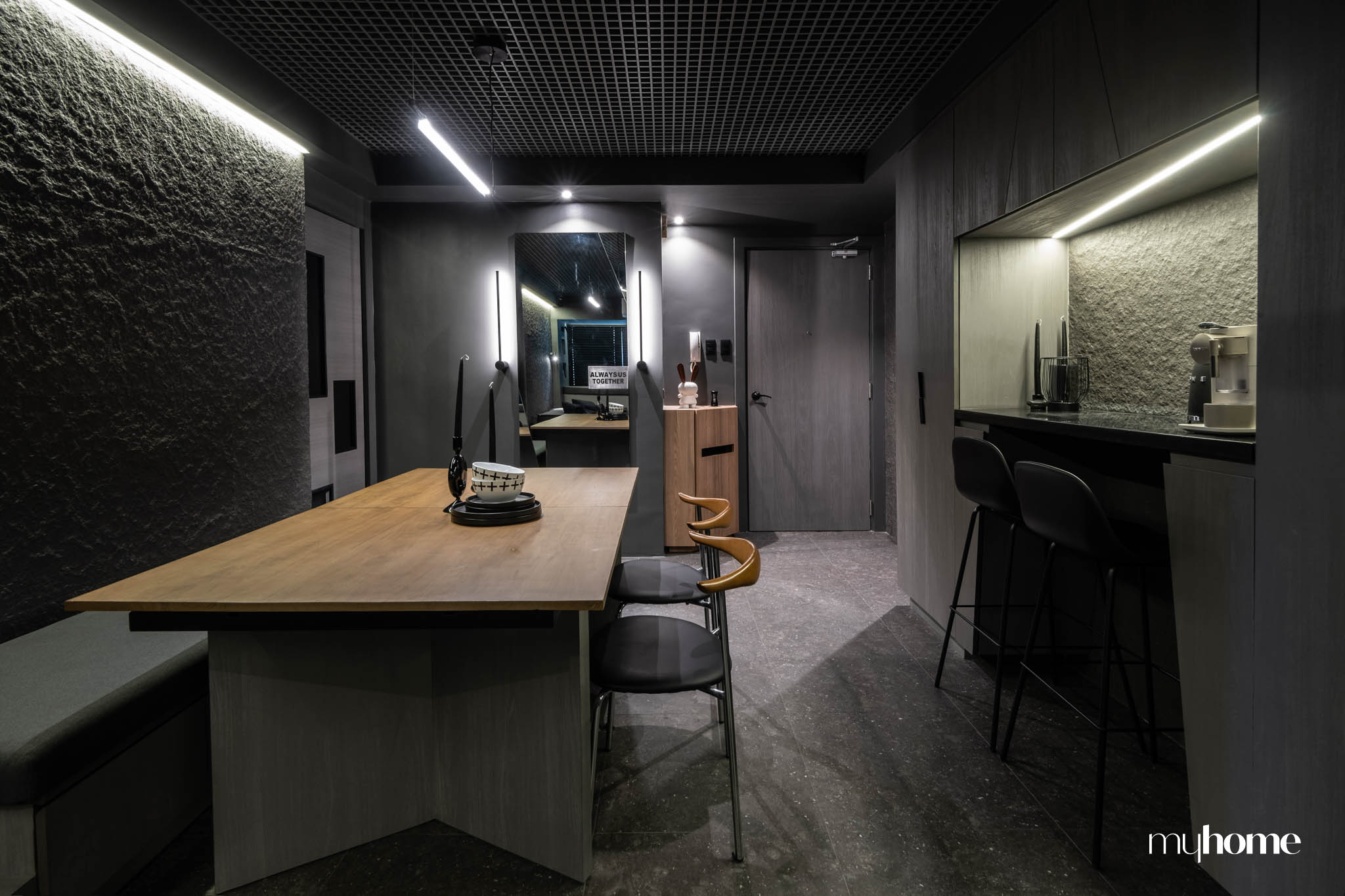
Almario advises embracing the character of a small space, even if it’s dark or has architectural quirks. “If a place is small and dark, make it even darker,” she suggests, challenging the conventional wisdom of trying to make small spaces feel bigger. “Own what’s wrong with it, and make it right by design.”
Curating a Collection
Maximalism is inherently personal, and both Almario and Bucoy stress the importance of curating a collection that reflects the owner’s life and travels. Bucoy describes the process as “creating a narrative from the start,” where every piece is carefully chosen and layered to build a cohesive, multi-sensory experience. This doesn’t mean the space should feel cluttered; rather, it should feel intentional. “It’s not about piling everything in and calling it a day,” Bucoy says. “It’s about curating the right pieces without overshadowing them.”
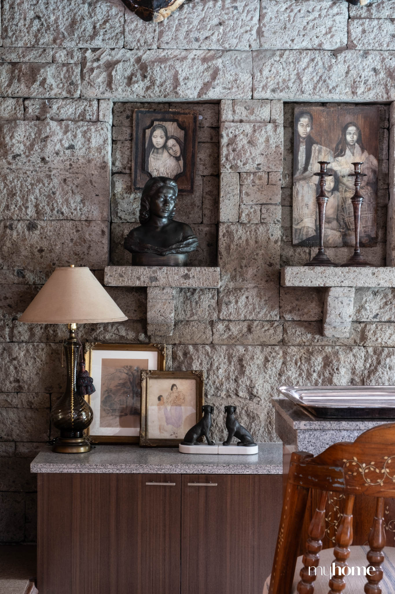
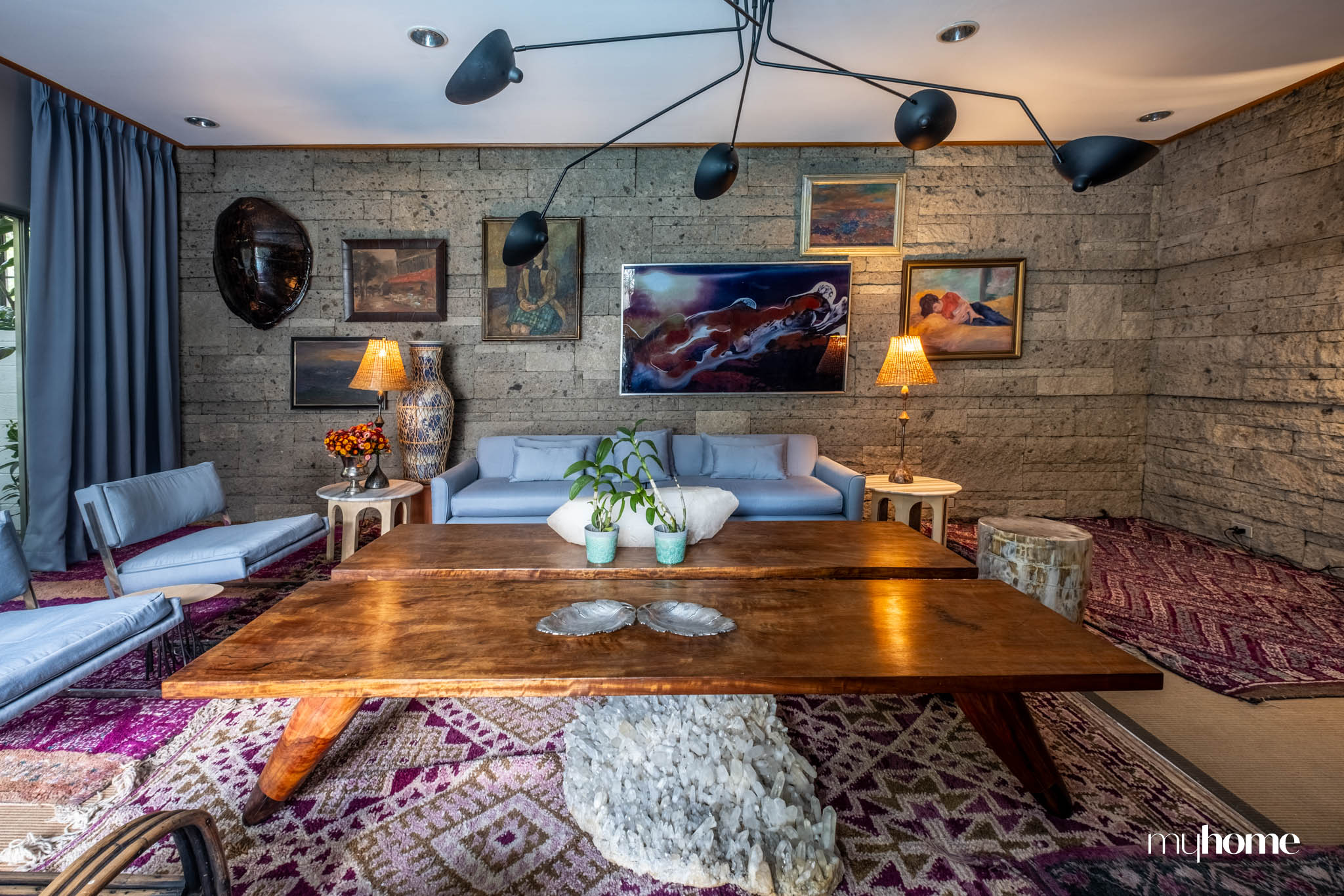
Almario adds that maximalism doesn’t have to be expensive. “You can source affordable items and still create something dramatic,” she advises. It’s about finding beauty in the layering of textures and patterns, whether it’s mixing vintage finds with modern pieces or pairing high-end decor with budget-friendly accents.
Lighting and Storage Solutions
In small spaces, lighting can make or break the design. Bucoy believes that “good lighting is everything” in maximalism. Proper lighting enhances the richness of textures and colors while creating focal points that guide the eye through the space.
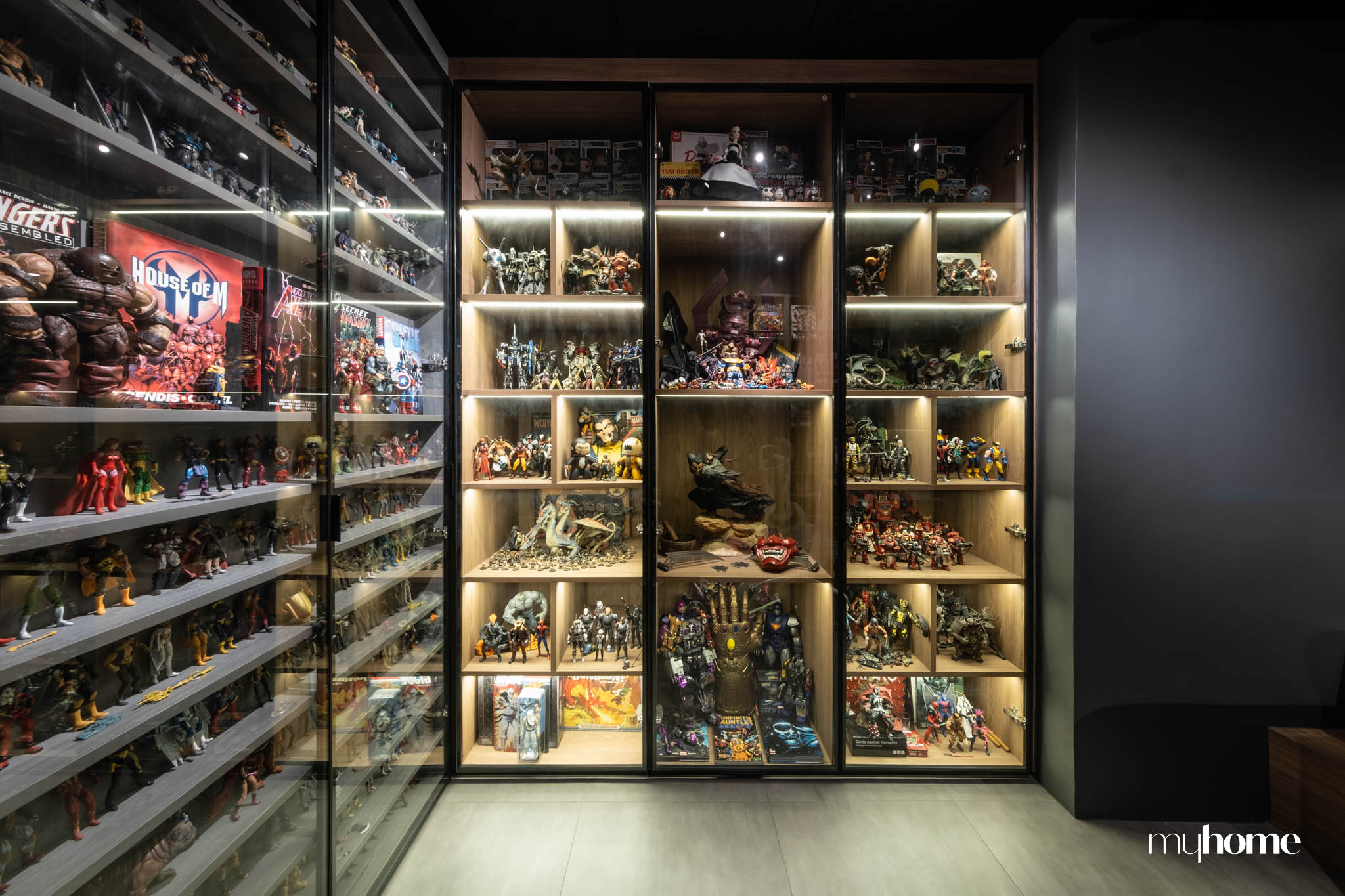
Storage can be a challenge in any small room, but Bucoy has creative solutions that blend seamlessly into the maximalist aesthetic. “Incorporate storage in a way that doesn’t detract from the design,” he says. For example, using antique trunks as coffee tables or integrating cabinetry that matches the wall’s texture and pattern can provide necessary storage without disrupting the room’s flow.
Embrace the Bold
For those hesitant about maximalism in small spaces, Bucoy’s advice is simple: “Be brave and don’t look back.” Almario agrees, encouraging homeowners to lean into the dramatic potential of their spaces. “Research, take risks, and make what’s wrong with the space the thing that’s right about it,” she concludes.
Designing small spaces as a maximalist is not about restraint; it’s about finding the balance between boldness and functionality, creating a space that feels rich, layered, and full of life. Whether you’re drawn to bold colors, intricate patterns, or eclectic collections, maximalism can transform even the smallest of rooms into a beautifully curated, personal haven.
Photos by Ed Simon
Read more: Empty Spaces to Fill: Why Filipinos Love Maximalist Houses
