A kitchen is one of the hardest-working spaces in a home. It must withstand daily wear, changing routines, evolving technologies, and shifting lifestyle needs while remaining visually coherent within the larger architectural narrative. While every project has its own requirements, experienced designers often return to a similar set of considerations when evaluating a kitchen. Here […]
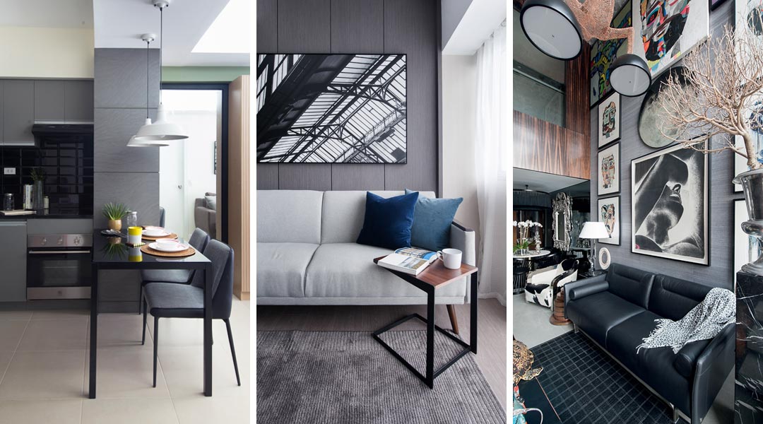
<!–[CDATA[White has always been the obvious color choice when painting walls in small spaces. Other choices include pastels and other neutral colors on the lighter side of the spectrum. Deep and dark hues take the back seat, especially when the minimalist movement was introduced to the rest of the world. Since then, “airy,” “bright,” and “spacious-looking” sensibilities have been the standard in small spaces. However, as much as we love a bright and dreamy condo, a dark-schemed space is really a show-stopper with its elegantly modern and sophisticated look. 
Working with bold and rich hues can be tricky at times, and are typically envisioned to have the exact opposite effects that bright colors have on small spaces. While these dramatic hues are seen to be gloomy, encasing, and heavy, the right use can bring about spaces that are daring, dramatic, and dynamic. Believe it or not, dark colors create an intimate and cozy vibe, and an illusion of an endless and expansive space as these colors blur the corners of the room. Still not convinced? Here are ways you can pull off dark colors in your condo, no matter how small it is.
1 | Start Small
In every new thing you try out, it’s always advisable to take baby steps. Instead of painting all your walls and ceiling in dark hues all at once, try it out in a small portion in your condo first. Take your compact kitchen for instance. Paint a neutral but deeper and darker matte shade on the area and tie it in with furniture or décor pieces in a contrasting shade or a backsplash with a glossy finish. Go for deep earth tones or a warmer shade of terra cotta for the walls, a high-gloss stainless backsplash, and complete it with black bar stools. Doing so creates a visual separation between living areas and depth for a spatial illusion.
2 | Add Reflective Surfaces
Given that dark colors absorb instead of reflect light, adding reflective surfaces into the space allows light to still spread throughout the room. Break the monotony of walls with floor-to-ceiling slats of mirror or go for ultra modern vibe with stainless steel accent furniture. Not only do these shiny surfaces reflect light; these also create depth and drama, and a touch of luxury.
3 | Put In Patterns
A solid block of dark color can be boring, so don’t be afraid to play with patterns. Instead of sticking to a plain matte paint color, mix in an interesting print courtesy of wallpaper for a dynamic twist. If you’re not up for wallpapers in your condo, you can throw in patterns through throw pillows or rugs. Make sure, however, that whatever pattern you incorporate into the design still ties in with the color scheme or at least with the look you’re going for. We are loving classic prints such as quatrefoil and fleur de lis against navy or dark gray.
4 | Blend Big And Bulky Pieces
So as not to make your small space look even tinier and cramped, incorporate big furniture pieces into the mix. This visual play creates more tension compared to the same composition arranged in a space done in a lighter palette.
5 | Contrast Colors
To avoid looking like a cave, contrast your chosen dark color with a lighter tone. White, pastels, and other neutral colors like beige, off-white, and light gray are great for contrast as they reflect more light and add a clean and fresh look. Natural colors from wood and plants are also good color contrasts as they bring out the richness of the color they are in contrast with.
Read More Condo Tips
Wallpaper with a Twist: Ram Bucoy on New Trends and Bold Choices
Maximalist Design for Small Spaces: How to Go Bold Without Being Overwhelming


The modern kitchen has evolved beyond its traditional role as a place for preparing meals. It is the heart of the home – a space where daily rituals unfold, conversations linger and the rhythm of everyday life takes shape. As open-plan living continues to redefine residential design, the kitchen is no longer a separate room, […]

Likhang Filipino stands on the former site of the PhilTrade Center along Roxas Boulevard in Pasay City, a landmark that once symbolized the Philippines’ export ambitions and introduced Filipino craftsmanship to international audiences. Originally inaugurated in 1979, the PhilTrade Center was conceived as a national showcase for Philippine exports, with its longitudinal form and sloping […]

Presented during Milano Design Week 2026 at Palazzo Gallarati Scotti, Poltrona Frau’s flagship store in Milan, the “True Over Time” Collection celebrates one of the brand’s most enduring values: authenticity. More than a matter of craftsmanship or material quality, durability is understood as a design’s ability to preserve its meaning over time, remaining relevant across […]

Within a two-building commercial complex organized around a central courtyard, an unexpected layout unfolds. The shops are small and quaint, uniformly sized, and directly face one another like apartment units. This is Atúa. Related Reading: Creative Placemaking: Designing Public Spaces that Reflect Shared Memory What used to be a functioning hotel in the early 1990s, […]

In a curated setting at the The Tile Gallery showroom, architects, designers, and media guests were transported into the immersive world of Italian contemporary lighting brand Lodes, where light illuminated the space through sculptural forms and innovative materiality. The Language of Light event presented a selection of Lodes’ established collections alongside new releases, revealing the […]
Download this month's BLUPRINT magazine digital copy from:

Subscribe via [email protected]
Recommended Video
Tap to Unmute
Unmute
0:00
0:00