When injecting two colors into a space, you would rarely think of combining generous amounts of lively and saturated hues. At the very least, a neutral or understated shade should be present to tone down the intensity and create a sense of balance. But, an emerging audacious paint idea called “double drenching” encourages you to confidently envelop your home with two or more vivid colors without losing visual harmony.
Doubling Down on Color
Photo courtesy of Little Greene
Double drenching isn’t the typical pairing of striking tones that you usually find in eclectic interior styles. It’s a paint method involving intense application of two or more related vibrant colors on all available surfaces of a room. This includes walls, floors, ceilings, trims, and even furniture or other decorative elements. To put it simply, this technique washes down the entire space with more than a single bright shade.
However, this approach doesn’t automatically work by simply blending random or complementary colors. Traditional color schemes might rely on tonal variations like combining light, mid, and dark pinks and blues, for example. But for double drenching, undertones matter the most.
Advertisement
Instead of selecting hues from a single color family, it builds a palette from analogous color groups. This means that you can use any pigments that sit beside or are near each other in the color wheel. It can be a pair of purplish and greenish blues, or a blend of yellow and red oranges.
While integrating multiple colors is already a familiar sight in interiors, double drenching offers a braver and more trendy decorating approach. The independent, eco-conscious British manufacturer, Little Greene, noticed the growing appetite for eye-catching colors in recent years. They’re additionally ecstatic to see the shift from traditional schemes to deep and mid-tone hues to create “really engaging, inviting spaces.”
So, to capitalize on this trend, they coined the term “double drenching” to truly maximize the “effect of color on the atmosphere of a space.”
Advertisement
“Double drenching is an expansion of this color confidence, taking the concept into a highly creative, sophisticated and nuanced approach to decoration,” Little Greene Creative Director Ruth Mottershead stated.
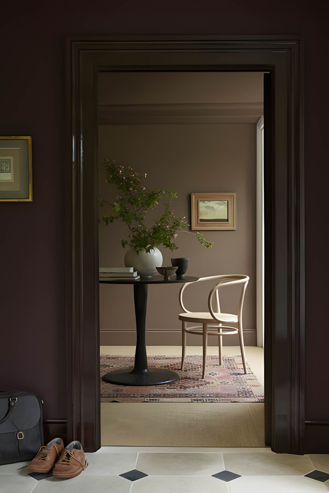
Distinguishing Double Drenching from Color Drenching
Photo courtesy of Little Greene
We can’t talk about double drenching without mentioning its predecessor, color drenching. After all, the latter’s one-paint approach sets the stage for bold and striking color combinations that define the former. Although they share similar qualities in terms of filling your space with an abundance of color, they differ in their overall effect and function.
The first obvious difference between these paint techniques is the amount of colors they use. Double drenching allows multiple analogous colors, while color drenching solely relies on a single hue with variations in texture, finish, or tone.
Advertisement
In this sense, double drenching utilizes unexpected yet subtle color contrasts to establish a dramatic statement. Mottershead emphasized that this is especially effective when an interior lacking in architectural details needs visual interest that doesn’t overwhelm.
As for color drenching, it focuses more on unifying the space with a single hue. Moreover, it lets you leave out certain surfaces, like floors or ceilings, as long as your chosen color remains dominant throughout the space.
Another aspect that sets these paint ideas apart is how they treat neutral colors. Double drenching leaves no room for whites. It requires a full commitment to vibrant hues to completely show “confidence in color.” Color drenching, on the other hand, can accommodate minimal subdued shades to help your main color pop.
Advertisement
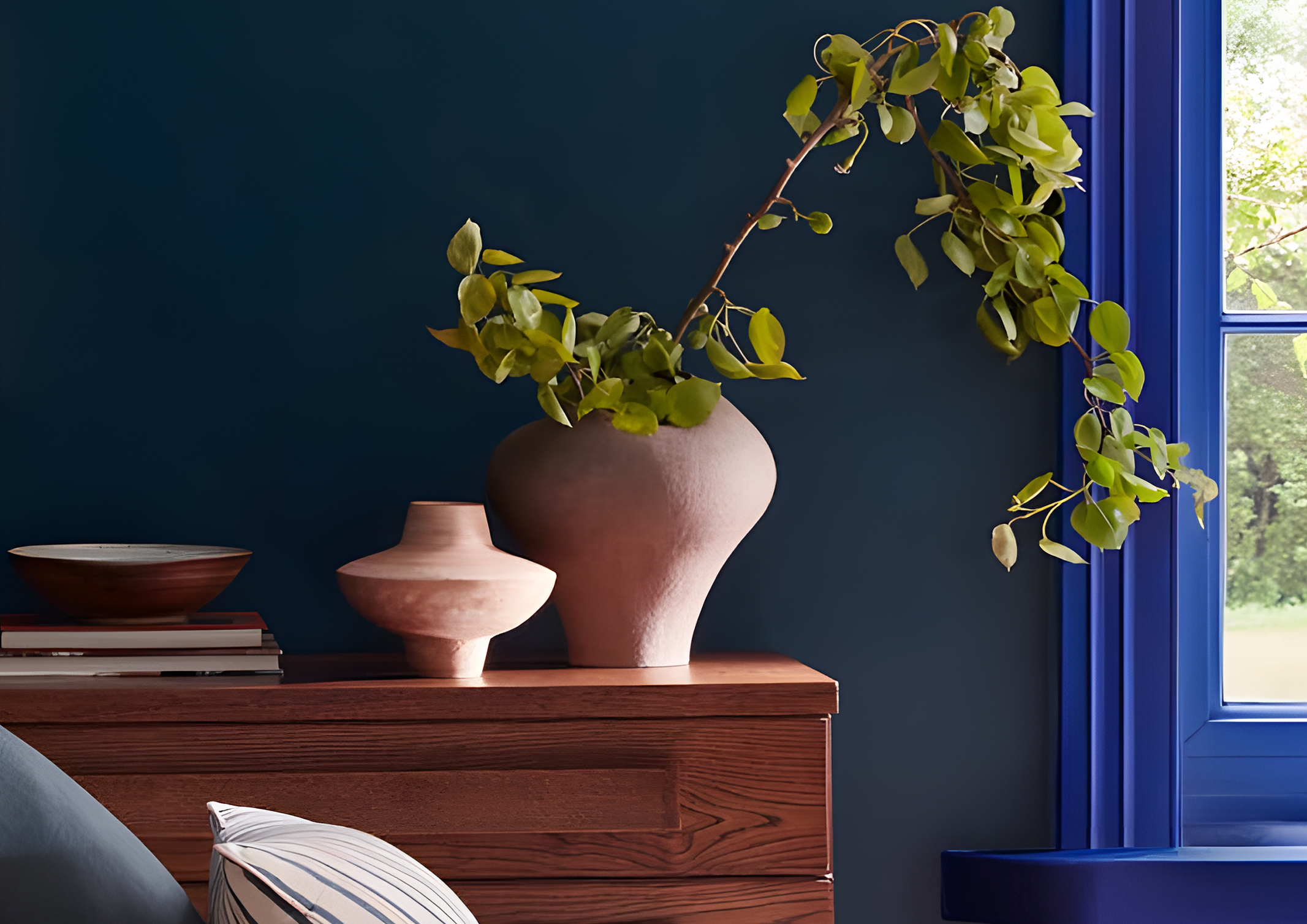
It Takes Two or More to Double Drench
Double drenching might appear as simply covering all surfaces with vibrant colors. However, there are multiple methods to effectively show its intention to leave a dramatic impression. Mottershead detailed that you can utilize this paint idea to highlight specific surfaces and elements or zone spaces.
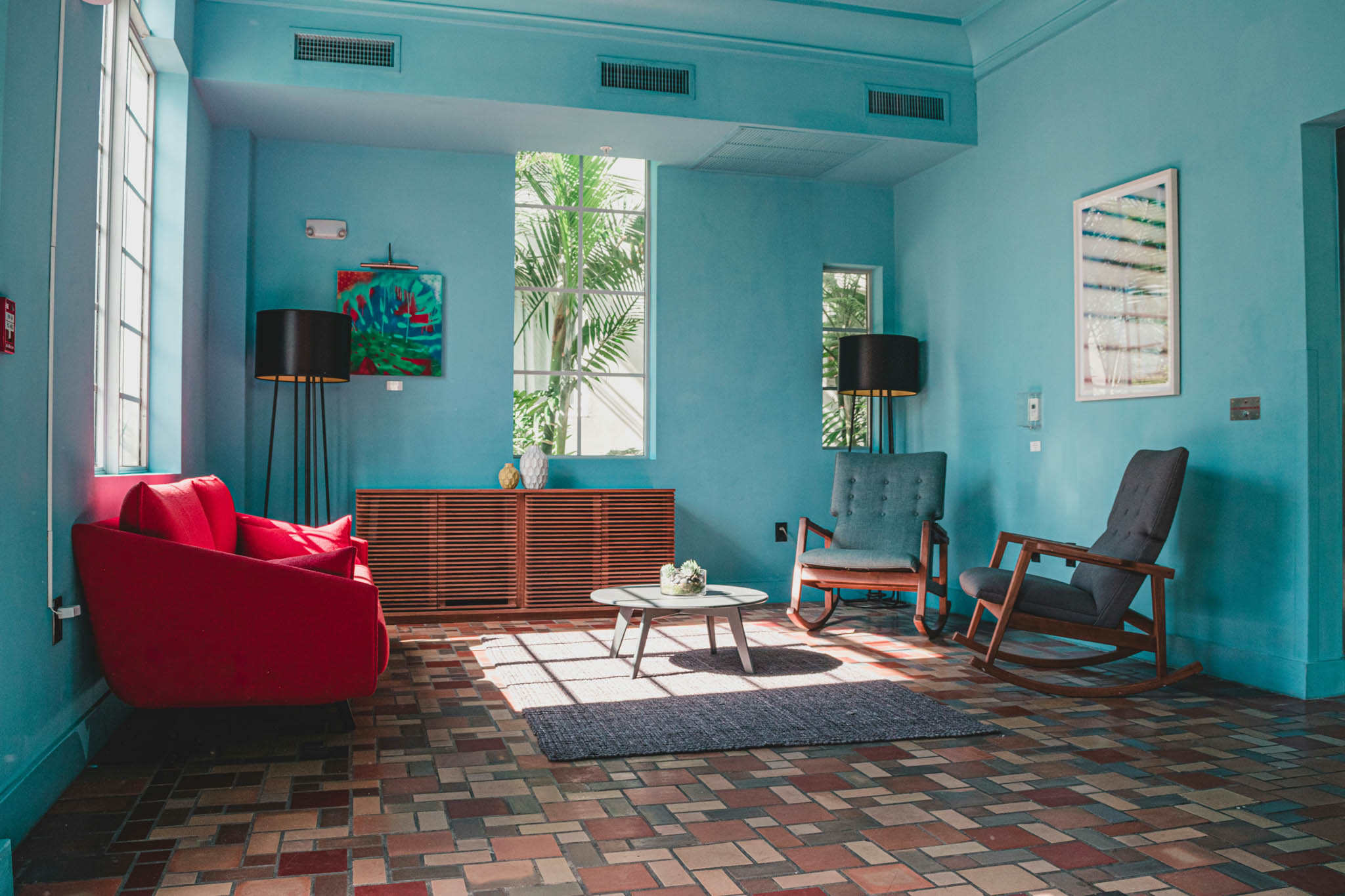
Photo by Juan Rojas \ Source: Unsplash
This living area, for example, painted the walls and ceilings with turquoise blue. But to break its monochromatic look, two armchairs and a floor rug in a darker blue shade are included. While double drenching isn’t achieved in surfaces, these pieces make the undertone difference evident. The yellow undertones of the walls and ceilings complement the green and purple undertones of the furnishings.
Photo from Little Greene
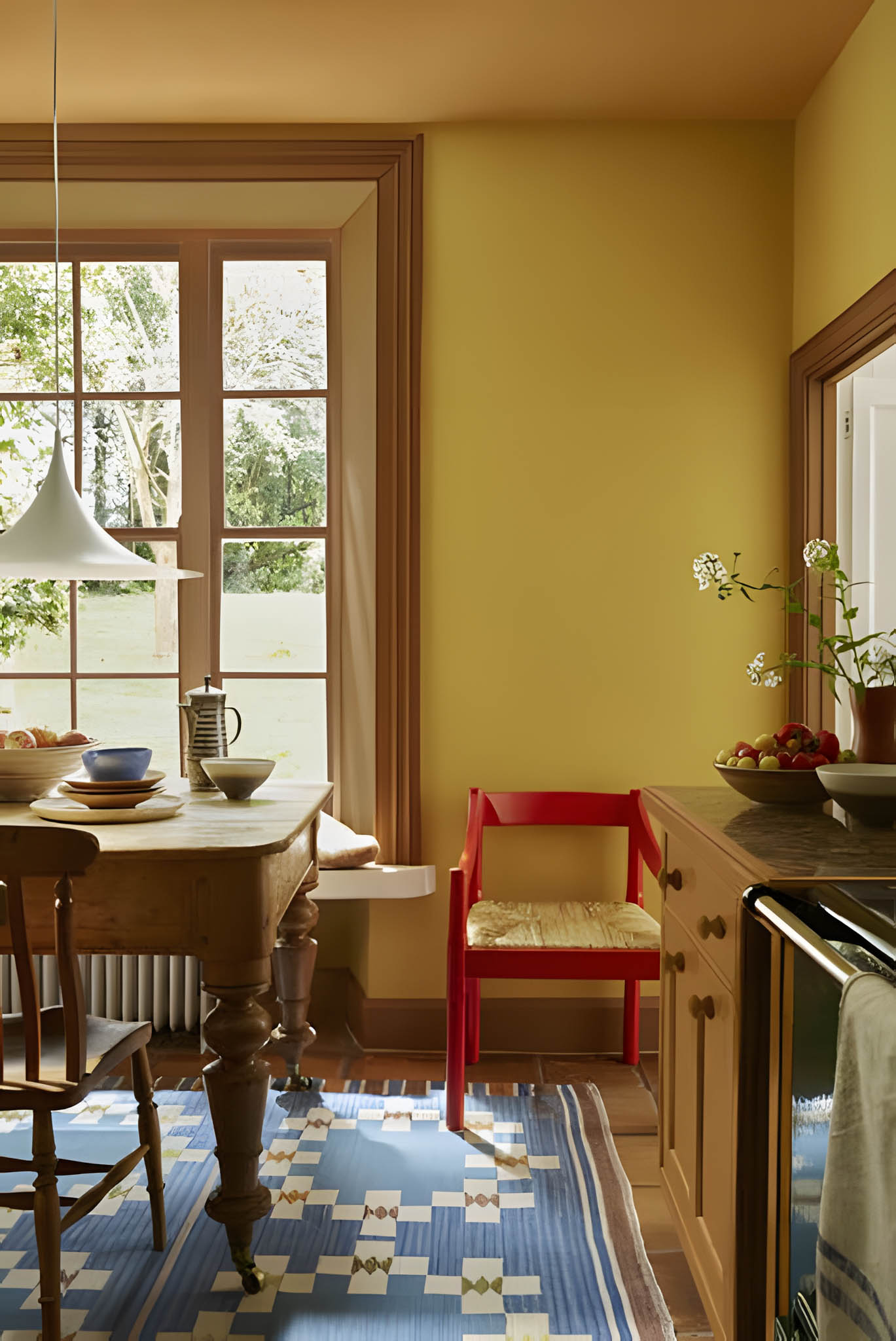
For this dining area, the colors define every inch of the surface. To establish a sense of groundedness, floors are in a warm brown color. The wooden furniture in the same tone additionally separates the lower part of the room, making it appear more cohesive. For the trims, a lighter brown shade emphasizes the architectural details and creates contrast against the earthy yellow color of the wall. And to give depth and sense of spaciousness and height, the ceilings are in a slightly darker yellow orange hue.
Photo by Max Vakhtbovycn | Source: Pexels
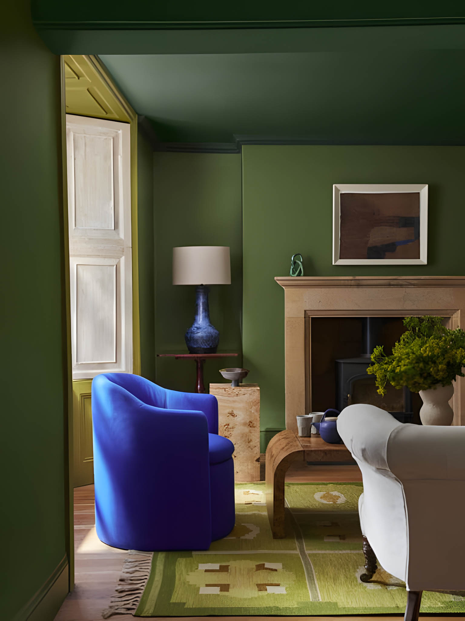
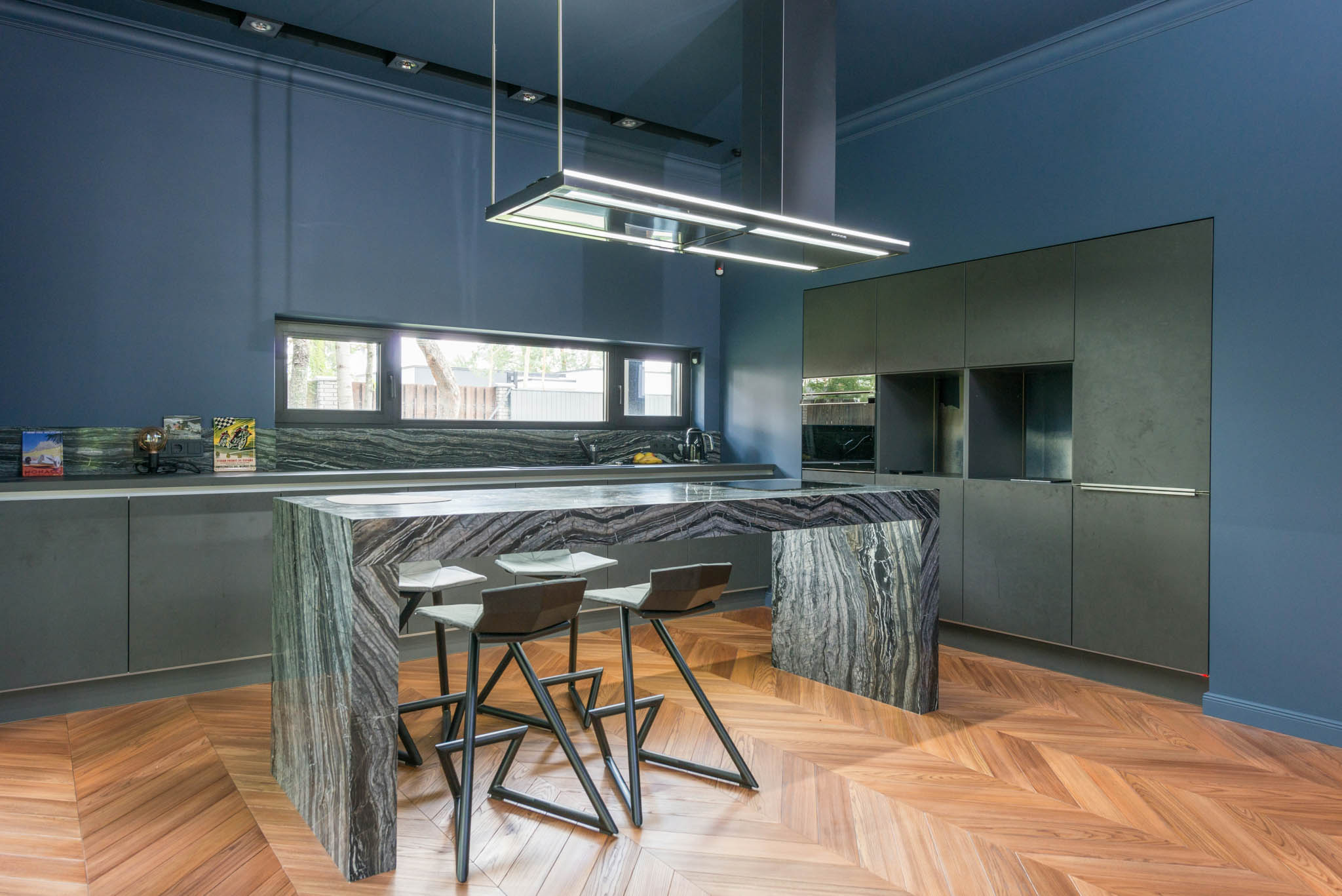
Meanwhile, this kitchen applied double drenching to distinguish the negative spaces from the other areas. The dark moss green cabinets cut through the dark blue color covering the walls and ceilings. This contrast helps the eye easily distinguish the different areas within the space.
Advertisement
Double drenching is a daring and innovative solution for those who are willing to take risks in elevating their home. This paint idea breaks away from the reliance on neutral tones to demonstrate how vibrant colors can transform a room into a captivating and unforgettable space.
Modern bathrooms are no longer purely functional spaces. Increasingly, they are being designed as environments that support cleanliness, ease, and quiet restoration within the home. As daily life becomes more demanding and health awareness continues to rise, homeowners are beginning to expect more from the spaces where daily rituals begin and end. For architects and […]
From the moment a diner steps through the door, each detail shapes how a meal is experienced. Restaurant design has evolved, with architects and culinary professionals collaborating to create built spaces that are as intentional as the menu itself. The spatial atmosphere acts as an additional ingredient that can define the culinary experience. Taupe and […]
With climate change and global warming, the Philippine climate is in constant evolution. Consequently, it is important for Filipinos to have living spaces that respond to the local environment. In this article, BluPrint lists down Filipino architects who are reimagining the tropical house, aligning the built and natural environment. BAAD Studio Principal architects Benjee Mendoza […]
Ventilation involves the introduction of outdoor air into a room, providing occupants with their needs. Proper ventilation allows for the moderation of internal temperatures, the creation of better airflow, the dilution of carbon dioxide to acceptable levels, and the removal of contaminants. This addresses health risks associated with indoor air pollution, such as respiratory problems […]
WORLDBEX 2026, running from March 12 to 15, 2026, proves itself as the Philippines’ leading construction and design expo as it wrapped its 29th edition. It drew together 1,000 local and international exhibitors under one theme, “Building Opportunities: Sustaining Lives.” Organized by Worldbex Services International (WSI), in support of the ABS-CBN Foundation Inc., the event […]
Located near the equator, factors such as heat and humidity are the norm in the Philippines. This tropical climate has shaped the development of architecture in the country. As Leandro V. Locsin stated: “The first consideration of the Filipino builder and certainly the most evident in his architecture, which is after all an outgrowth of […]