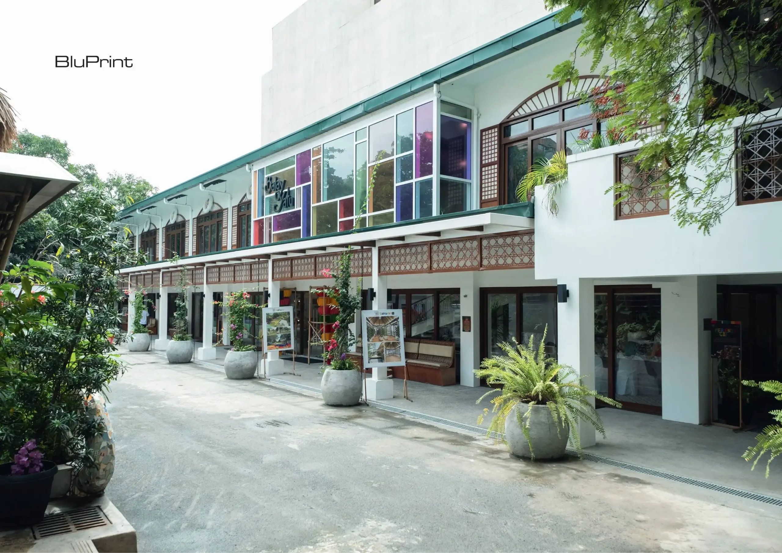
In the Philippines, adaptive reuse gained traction during the 1970s with the rise of conservation and environmental preservation movements. It offered an architectural solution that reuses existing spaces to fit modern needs. Across the country, several projects demonstrate how this approach is being applied—transforming heritage structures into active spaces for culture, hospitality, and community life. […]
How to Stylishly Add Green Colors to Filipino Homes: A Guide by Nix Alañon
Lately, there has been an active online discussion surrounding the extensive use of green colors in Filipino homes. Why this particular hue has captured the hearts of homeowners across the archipelago is a question that has sparked countless threads, theories, and even memes. So, we’re diving deep into this popular trend with designer Nix Alañon to explore its potential motivations and creative applications.
What’s Behind the Green Code?
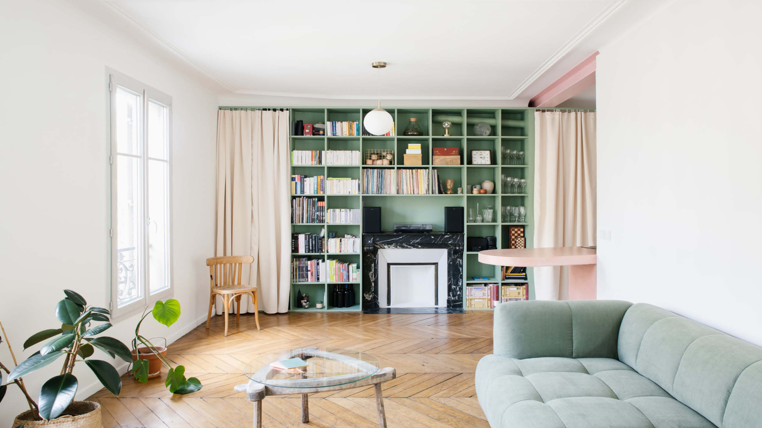
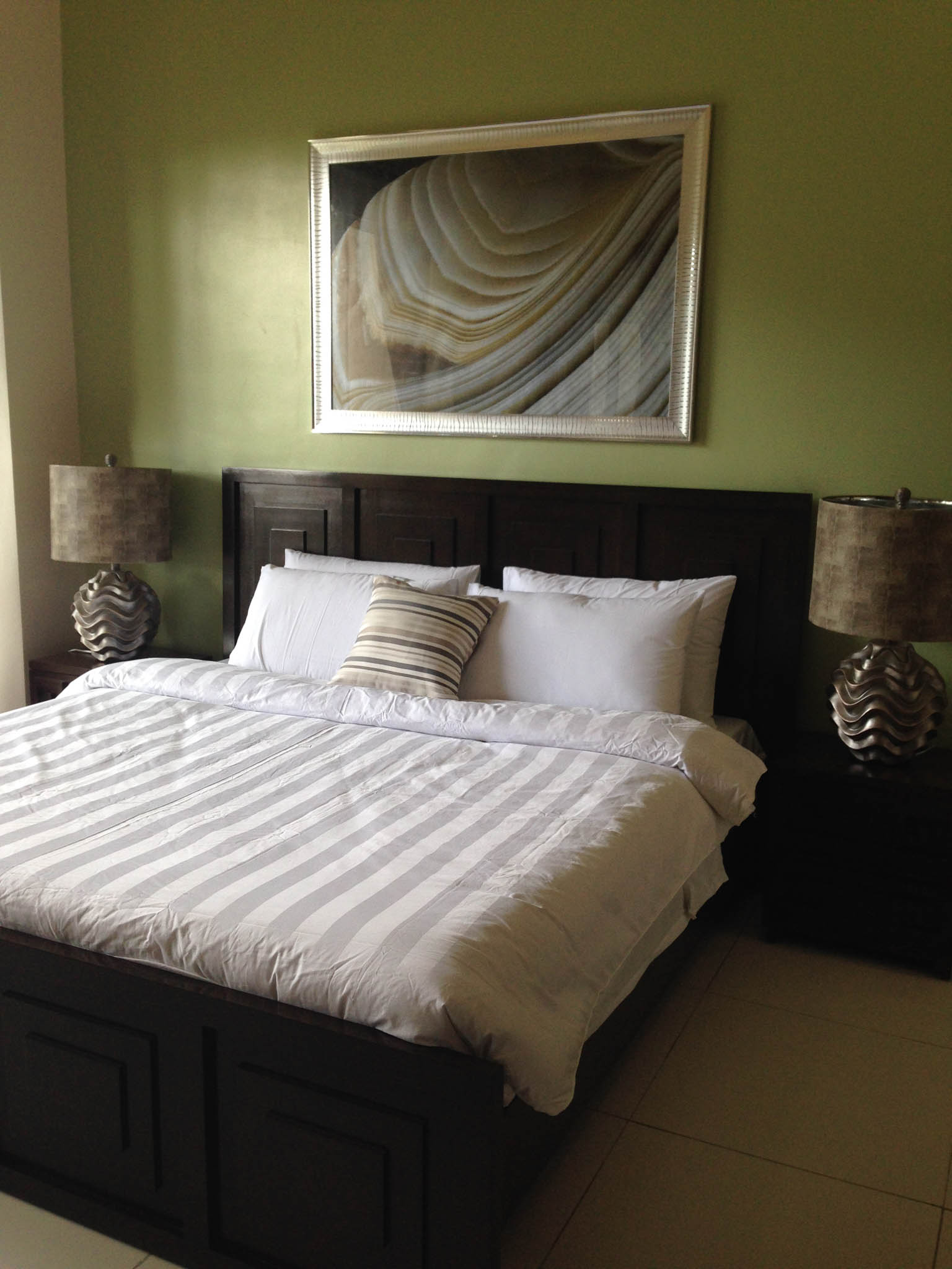
From urban centers to rural areas, home designs with a single dominant shade of green are a common sight. This is typically seen in wall treatments, roofs, furnishings, and decorative accents. And for many Filipinos, brighter tones hold more significant appeal.
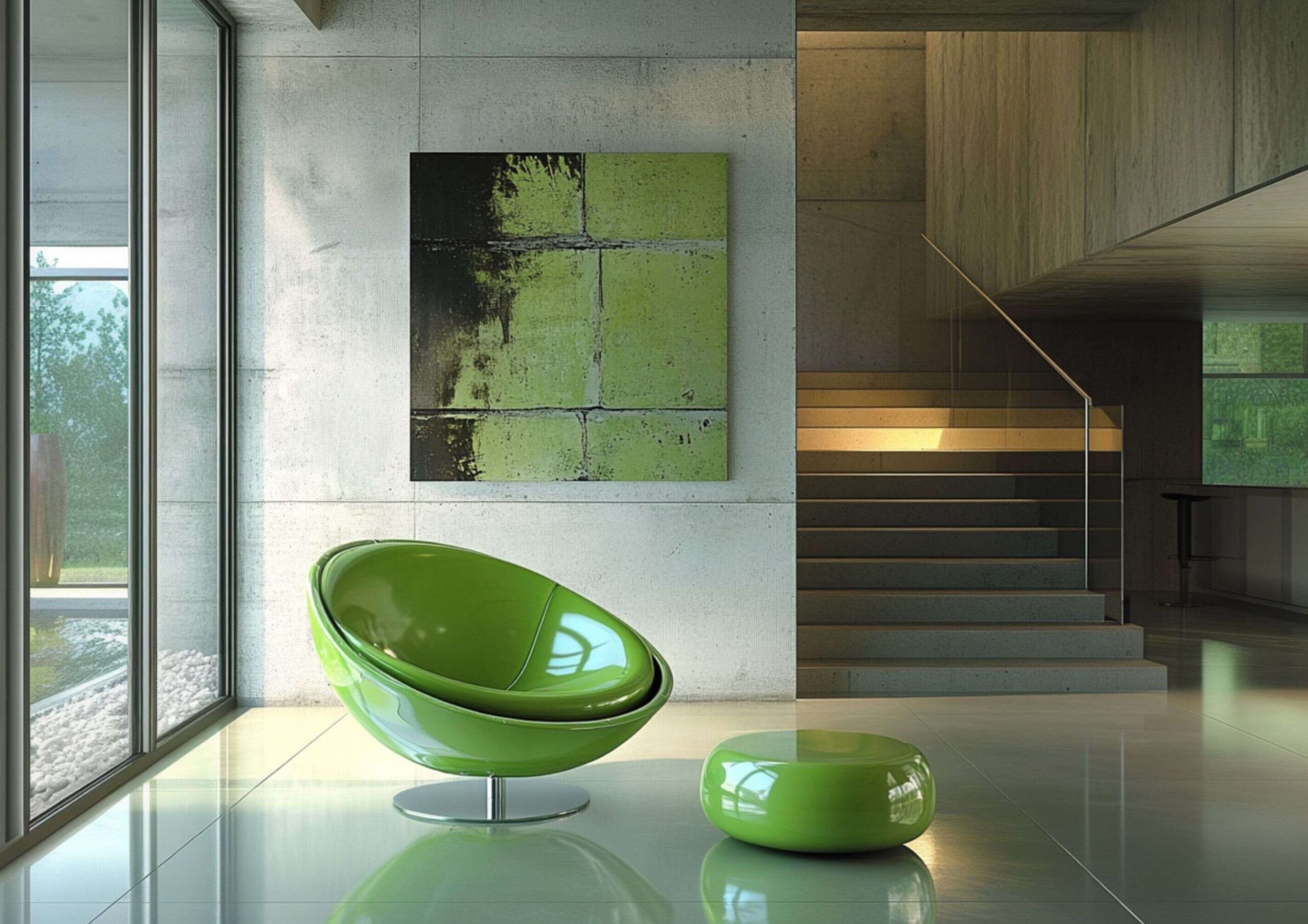
Among the most common choices are neon and mint green due to practical, psychological, and culturally imbued factors. One of the reasons for their popularity is their affordability since green pigments are generally easier and less expensive to produce than other colors.
Advertisement
Homeowners also believe that green colors bring prosperity because they’re closely affiliated with money. But one can additionally link this phenomenon to Filipinos’ maximalist tendencies.
Green, particularly its vibrant forms, is naturally eye-catching. And a generous application throughout a home contributes in establishing a sense of abundance and aesthetic impact. This perfectly aligns with our penchant for creating memorable and visibly rich spaces.
For Alañon, alternatively, the easiest explanation for this trend is green’s inherent connection to nature. He explained that Filipinos have an innate inclination to it because it mirrors the Philippines’ tropical environment. This deep-seated association results in green being perceived as fresh and calming.
Advertisement
However, rather than overwhelming a space with solid greens, the designer suggests that there are more balanced and strategic ways to achieve its visual and emotional effects.
Expert Techniques to Use Green Colors
Alañon clarified that incorporating green in homes is not exclusive to paints. There are multiple methods to apply this hue that go beyond merely covering surfaces with artificial pigments.
1) Explore Smaller Green Elements
Before you consider going all-out on your walls and larger negative spaces, the designer advises to start with smaller accents. In this way, you can gauge your comfort level with the color and gradually build a relaxing atmosphere without committing to a full-scale transformation.
Advertisement
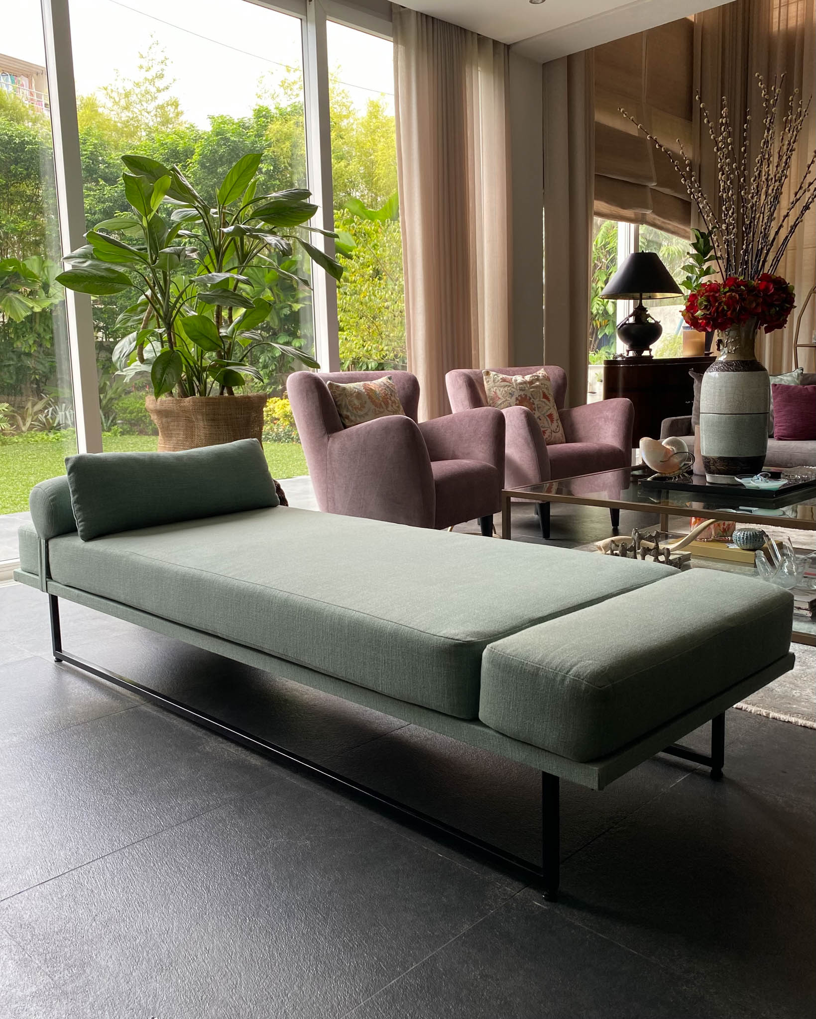
“A green accent wall, upholstery, statement chair, or even accessories would be enough. Sometimes even having actual plants to accent on the table or a simple [indoor] tree can do wonders for your space. It doesn’t always have to mean a full green color transformation,” Alañon suggests.
2) Introduce Different Shades and Tones
Contrary to the trend’s general interpretation, Alañon does not recommend using green colors in liberal amounts. However, if you take this direction, he encourages varying shades and tones to create a better monochromatic design.
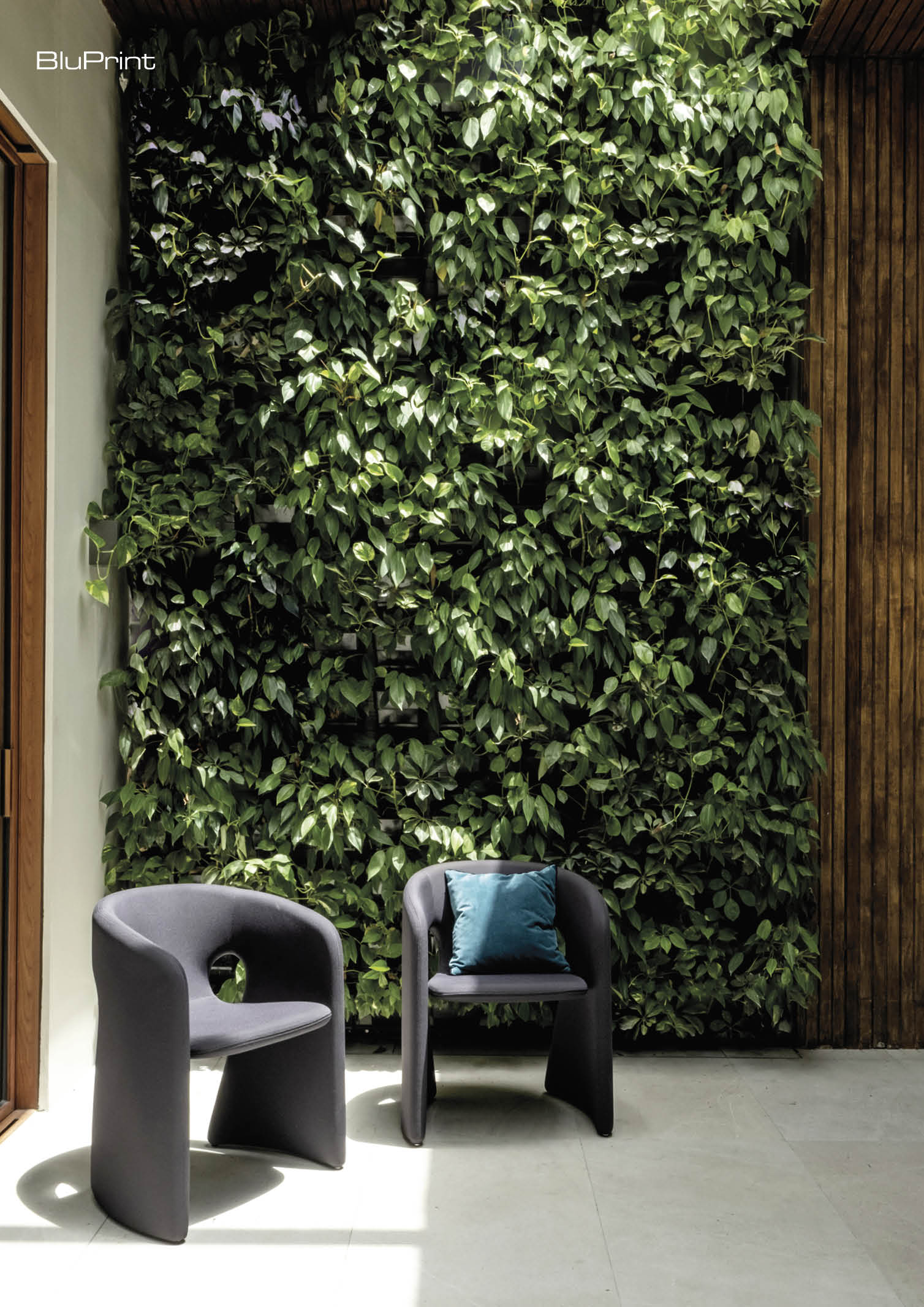
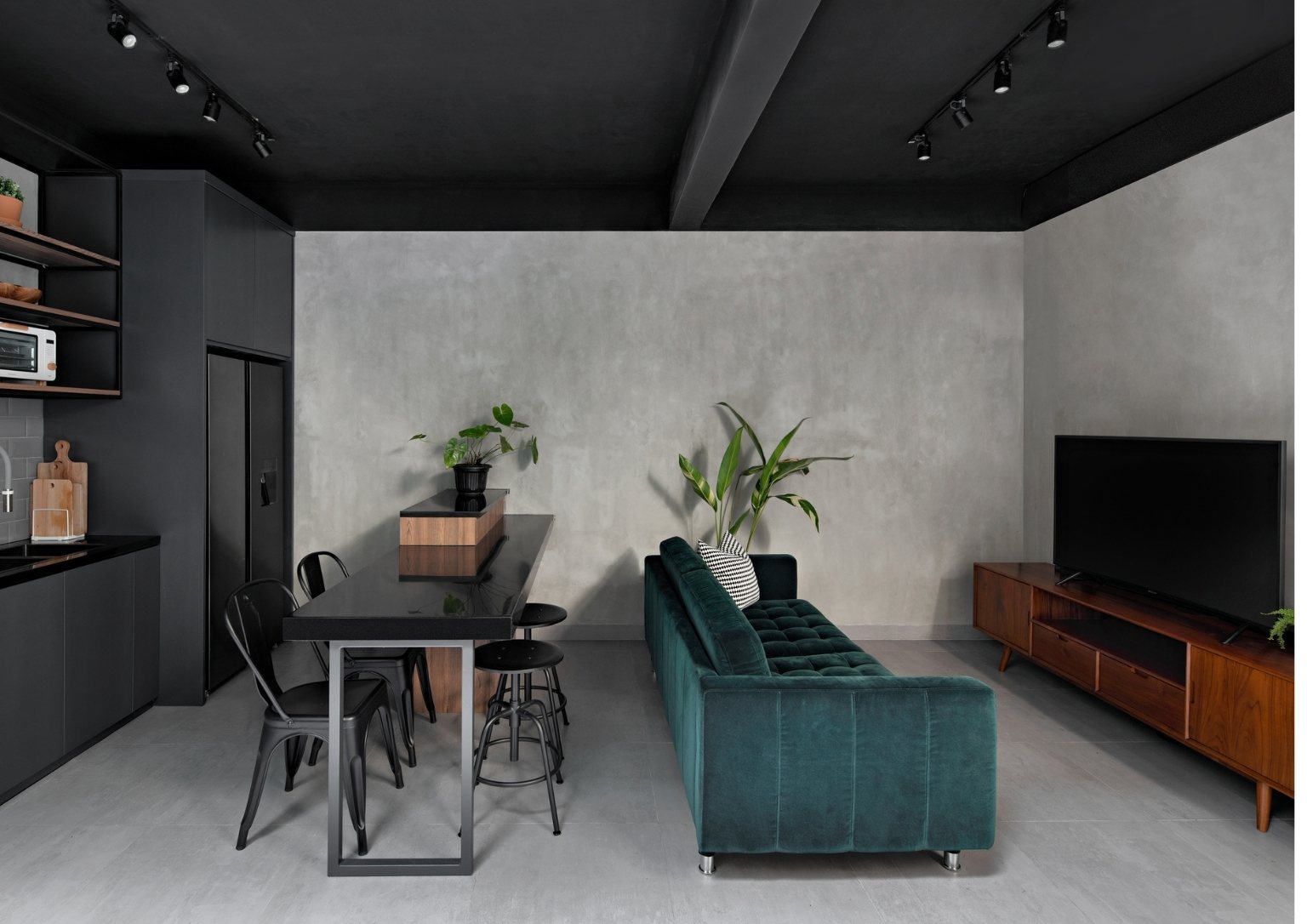
A good place to start is with versatile neutral shades like sage, moss, and celadon green. He also recommends using hunter and emerald green if you want a more saturated yet elegant feel. Blue green, on the other hand, can also be an interesting option to subtly incorporate an analogous color.
Advertisement
But the designer emphasizes that the ideal green palette is a matter of personal taste. And by carefully layering your chosen color palette, you can create a far more interesting space than a room with a flat, monotonous green.
3) Distribute Green Throughout the Space
The Phoenix Home Interiors founder specifically noted that when designing a home, “your eye has to travel.” This means green colors should be carefully scattered and balanced throughout the space. In any case, refrain from putting them all in one side or corner to avoid a concentrated, unbalanced look.
“It has to be unified from one corner to the other, from lower to higher portions. So, your eye moves around and it’s not condensed in one space,” Alañon states.
Advertisement
Green Colors Through Fleeting Trends
Alañon contends that this design trend in Filipino homes validates the timelessness of green colors. He believes that even if the current surge of green-dominated spaces subsides, these versatile hues’ appeal and relevance will continue.
Moreover, he notes that green seamlessly integrates into a wide range of design styles, particularly those rooted in tropical aesthetics prevalent in the Philippines. In his view, unless a space has an ultra-modern, minimalist design that eschews color altogether, green will consistently remain a viable and adaptable choice for any home.
“Green is one of the most accessible colors to use. Because you can just go outside, get a plant and that for one is already a green color that would automatically enhance your space. Green will always be on trend and feel good in any space. So, it’s one color that I would highly recommend to stick with,” Alañon closes.
Advertisement
Read more: Mocha Mousse: JJ Acuña’s Hot Take on Pantone’s 2025 Color of the Year
From residential spaces to civic structures, lighting dictates the mood of a space. It controls the visual dynamics of an interior, serving as a guiding tool that highlights key design elements, including materials and textures. Related Reading: Lampscaping: How to Light up Your Home like a Pro Regulating the Mood: Natural and Artificial Light in […]
Advertisement
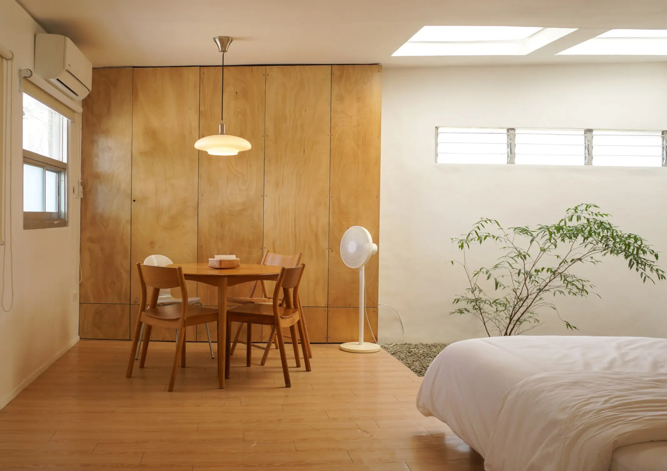
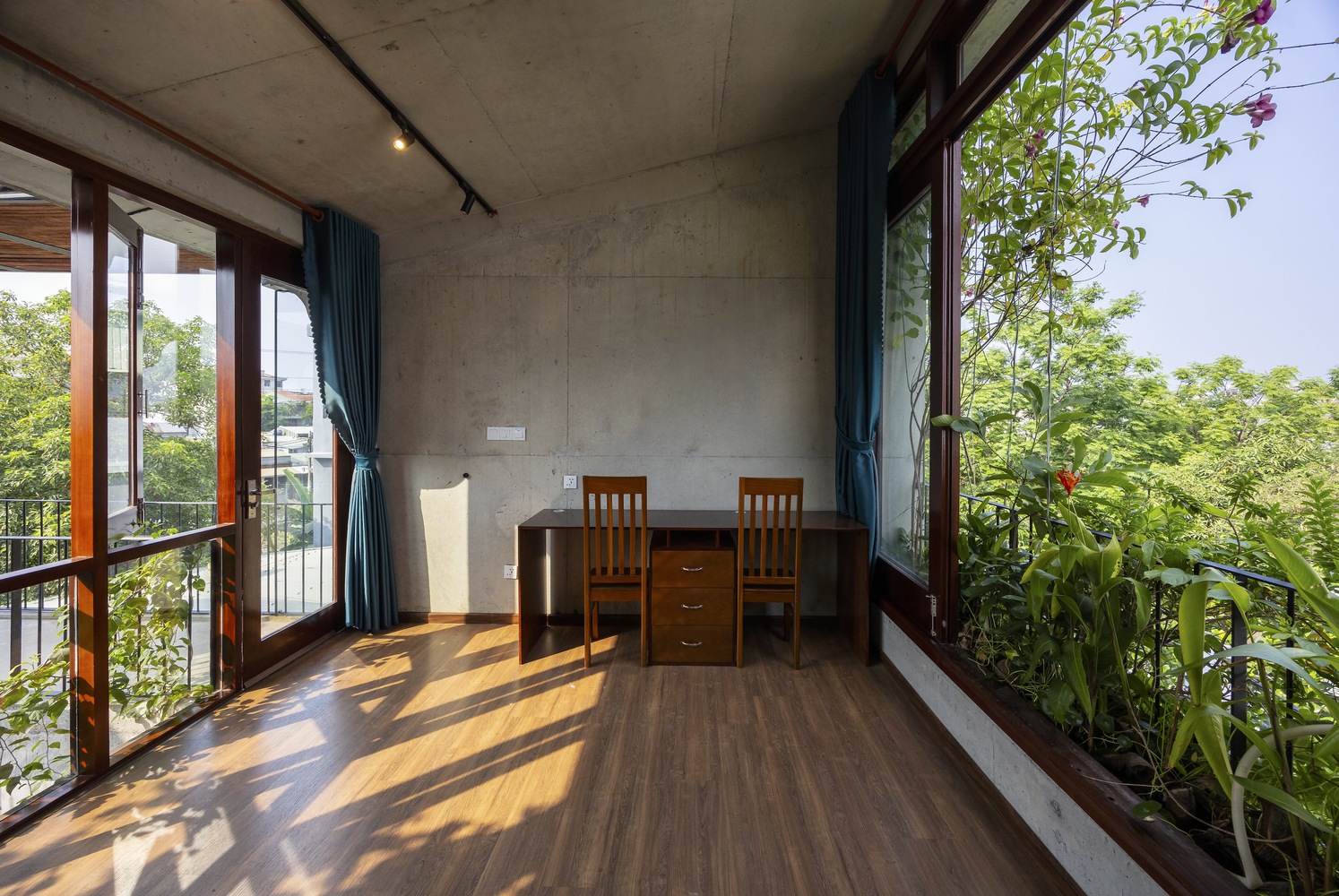
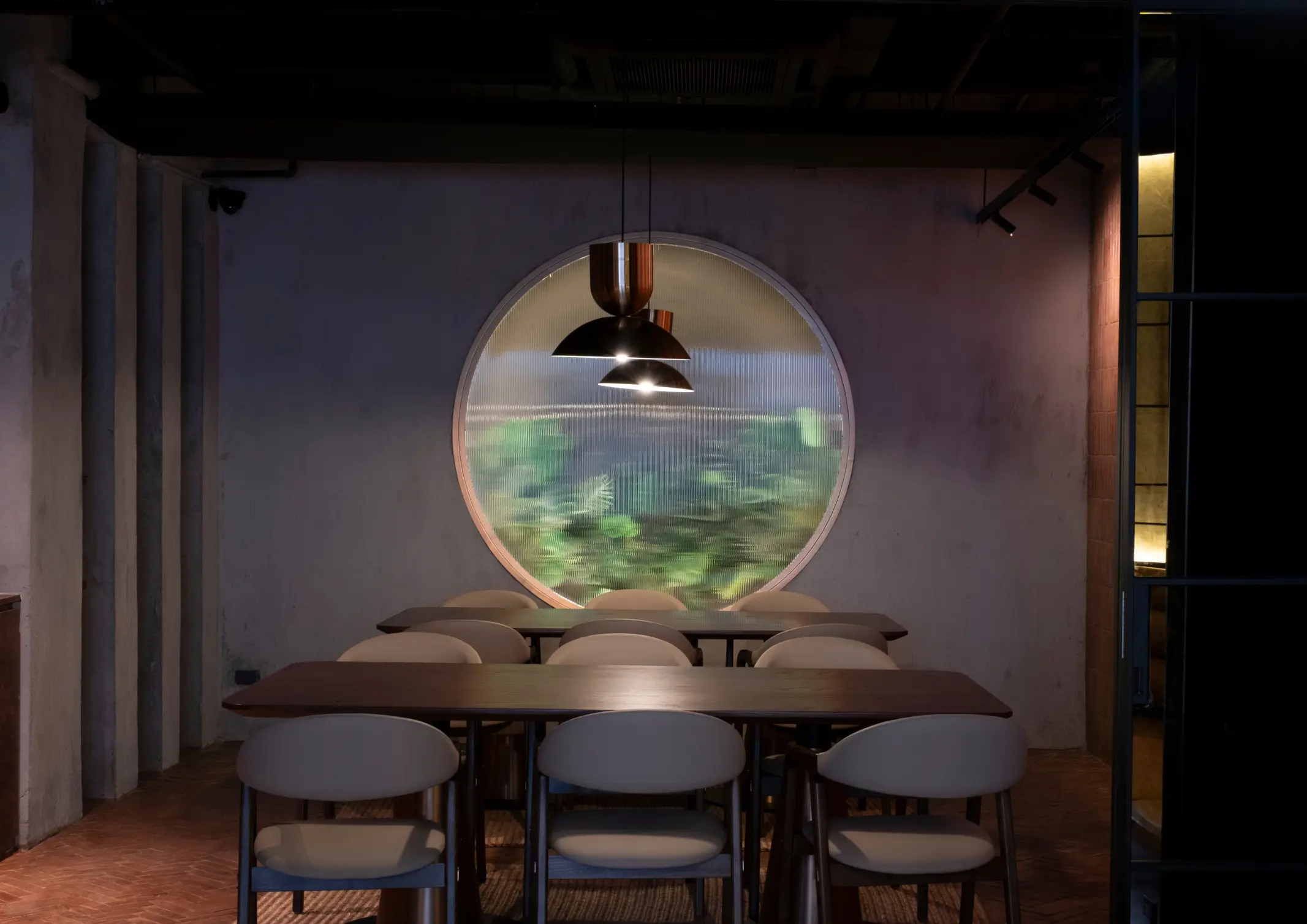
More and more Filipinos are flocking to condominium communities. Often tucked within busy city centers, condo living acts as a small respite from urban chaos. Faced with the challenge of transforming a cramped condominium into a warm living space, BluPrint lists condo interior design ideas that can maximize each square foot of small spaces. Purposeful […]
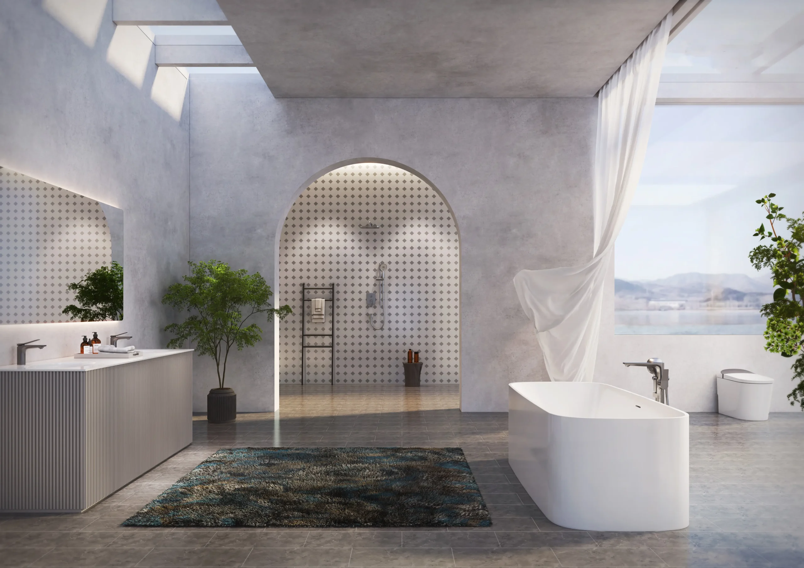
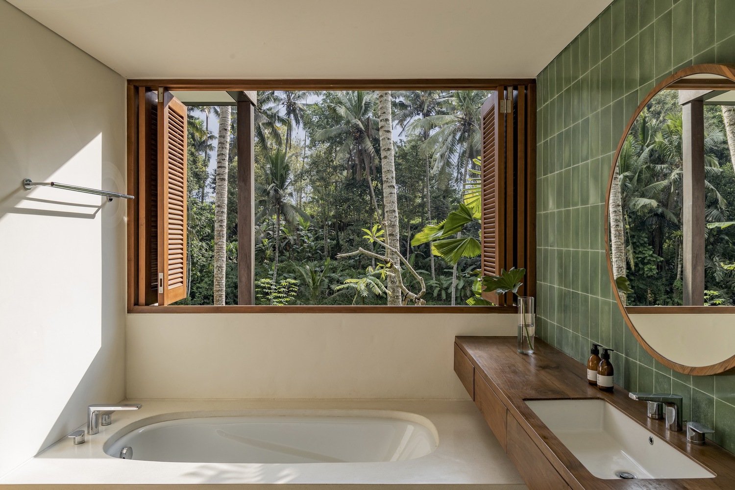
Modern bathrooms are no longer purely functional spaces. Increasingly, they are being designed as environments that support cleanliness, ease, and quiet restoration within the home. As daily life becomes more demanding and health awareness continues to rise, homeowners are beginning to expect more from the spaces where daily rituals begin and end. For architects and […]
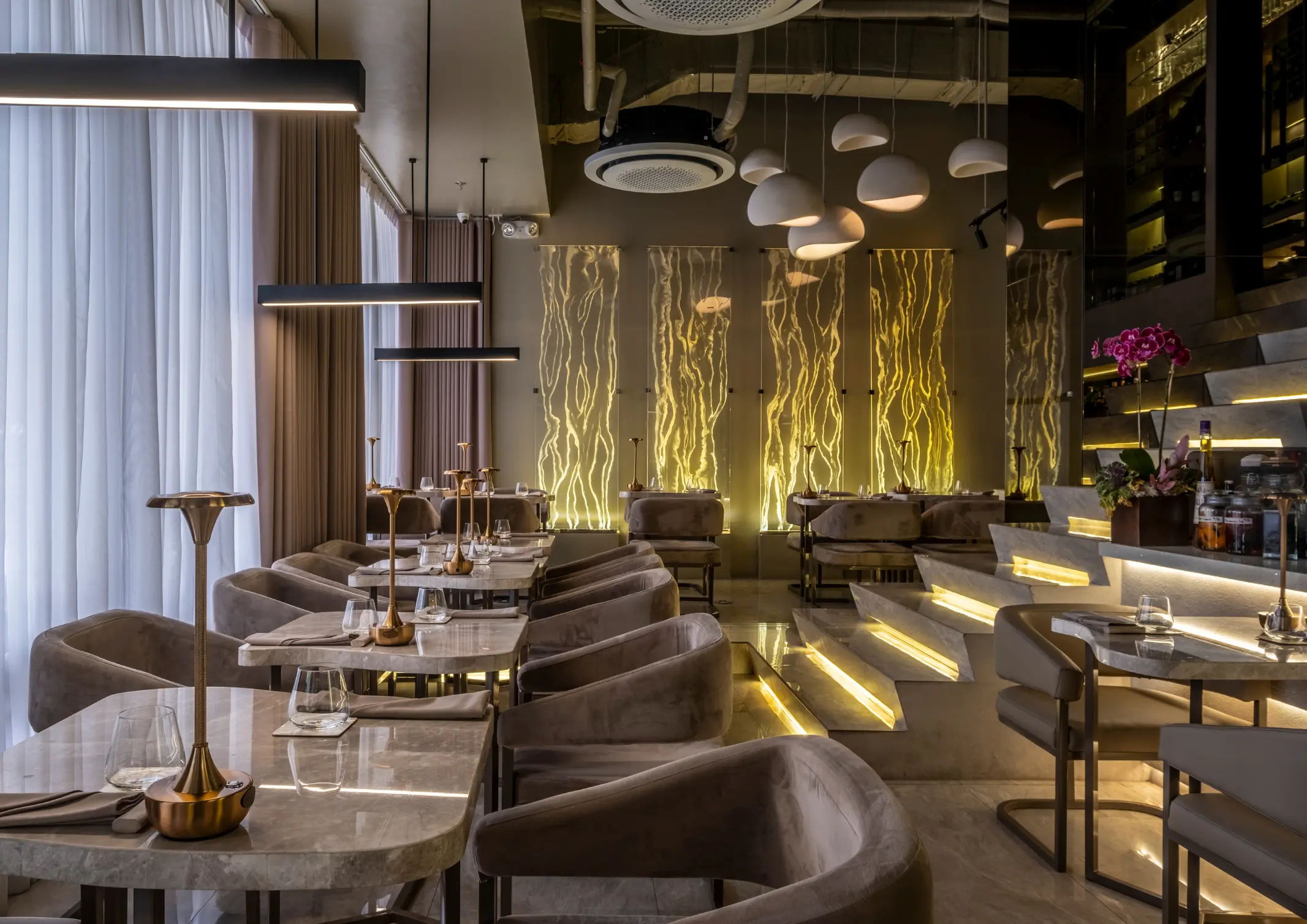
From the moment a diner steps through the door, each detail shapes how a meal is experienced. Restaurant design has evolved, with architects and culinary professionals collaborating to create built spaces that are as intentional as the menu itself. The spatial atmosphere acts as an additional ingredient that can define the culinary experience. Taupe and […]
Advertisement
With climate change and global warming, the Philippine climate is in constant evolution. Consequently, it is important for Filipinos to have living spaces that respond to the local environment. In this article, BluPrint lists down Filipino architects who are reimagining the tropical house, aligning the built and natural environment. BAAD Studio Principal architects Benjee Mendoza […]

Download this month's BLUPRINT magazine digital copy from:

Subscribe via [email protected]