A kitchen is one of the hardest-working spaces in a home. It must withstand daily wear, changing routines, evolving technologies, and shifting lifestyle needs while remaining visually coherent within the larger architectural narrative. While every project has its own requirements, experienced designers often return to a similar set of considerations when evaluating a kitchen. Here […]
‘Storm in a Teacup’ Explores Abstraction in Printed Images
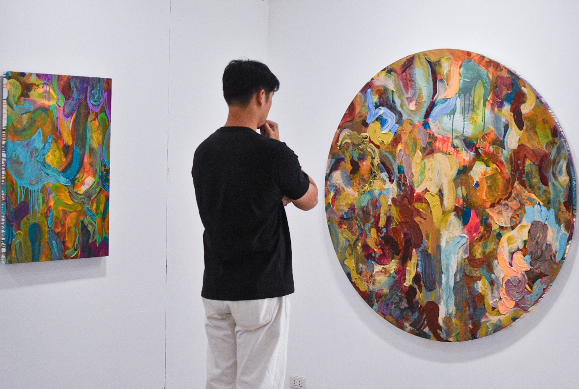
Artist Patrick de Veyra has always been obsessed with the idea of images and appropriation. As recently as last year, he curated two exhibits for Faculty Projects which tackle the idea of how we deal and define the images we use today. Storm in a Teacup, his most recent exhibition at West Gallery, circles around the same ideas of image appropriation.
“Part of my exploration is to break down the printed image and use it as visual stimuli for a work that tackles gestural abstraction and appropriation,” he said. “There is a relationship between the painted and the printed; it almost is like a commentary on technology and humanity.”
 - BluPrint")
But there are headier ideas here, and Storm in a Teacup showcases Patrick de Veyra at his most conceptual. He creates new meaning through his methodology, utilizing touchpoints of abstract art to obscure the essence of an artwork and really ask what purpose is in the images we see every day.
Seeing Images in a New Light
For Storm in a Teacup, Patrick de Veyra utilizes images from open-access databases of museums around the world, and then layers them on top of each other.


It’s not just one layer of images and another layer of paint. In some, he uses a specific type of paper as a way of imprinting the image onto the paint itself, before adding more layers on top of it.
“Actually, the works here, they do not exist on a singular plane,” he said. “They are not transferred on a singular plane. If you look closer, there are some images transferred onto the canvas, which is the base of the work. But a lot of the images are also transferred onto the actual paint. So when the paint cured, I transferred on top of it.”
Distortion of Images
These paintings end up distorting, in a way, whatever images are printed on top of it. The brushstrokes come in short bursts, trying to wiggle on top of the image and each other. At times, the colors drip downward, coating over other layers of paint and images in the process.
“I didn’t want to just have one layer of appropriated images, because I want to keep on reacting,” de Veyra explained. “Being able to keep on reacting to the process; visual stimuli. Because if I have one layer of printed imagery, then the only way I could react to it is through paint.”


An intentionality exists with the abstraction, in the way that the images are obscured by the paint. It mimics the hyperactive visual environments of today, with all its distracting variability, so that even the images meant to be appreciated become nothing more but detritus in an overbursting visual world.
“I want to be able to react also with the appropriated images,” he added. “That’s why the appropriated images are also situated in areas: on top of the paint, [and] the surface itself. And then, I would overlay paint again, so they become suspended in layers of gestural abstraction.”
Commenting on Mass Perception and Production
For additional context, Patrick de Veyra shared that growing up, his family home had a printing press. His family did mass production printing like offset lithography for corporations. This became de Veyra’s first exposure to art and it influenced his perspective of the practice.
From there, he ruminated on the idea of “visual tolerance,” or how images tend to lose their power and meaning the more times we see them; they become part of the background of the world instead.
“This [exhibit] is my way to comment on visual tolerance,” he said. “Because when you have a printed image, a mass-produced image, that is basically the epitome of visual tolerance. You see it again and again to the point that you don’t see it anymore; you lose the grasp of the details of the image. It becomes like a peripheral image.
 - BluPrint")
“So, this is my way of lifting it from that space, and bringing them into a more immediate space, which is the immediacy of painting. [Those ideas are] a key component of a gestural work, a gestural abstraction painting, but with key components that are appropriated [instead].”
Storm in a Teacup is showing at West Gallery until March 29.
Photos provided by the artist unless otherwise stated.
Related reading: Finding Order Within Chaos: Patrick de Veyra’s Fifth Solo Show
Frequently Asked Questions
The exhibition explores the complex relationship between technology and humanity by breaking down mass-produced printed images through gestural abstraction. Artist Patrick de Veyra utilizes appropriation to question the purpose of the digital and physical images we consume daily, layering museum database imagery with physical paint. This methodology creates a headier, conceptual dialogue that elevates printmaking into a space of immediate, fine art painting.
Patrick de Veyra sources his visual stimuli from open-access museum databases, layering these appropriated images onto both the canvas base and the curing paint. By imprinting imagery directly into the layers of the work rather than on a singular plane, he creates a multi-dimensional surface where paint and print interact. This process allows the artist to react continuously to the visual stimuli, suspending the appropriated details within thick layers of gestural brushstrokes.
Visual tolerance refers to the phenomenon where mass-produced images lose their power and detail because they are seen so frequently that they become part of the background. De Veyra uses his family’s background in commercial printing to comment on how images become peripheral detritus in a hyperactive visual world. By distorting these images through abstraction, he pulls them from the space of mass production and reintroduces them into the immediate, focused space of high art.
The paintings feature short, wiggling brushstrokes and downward-dripping colors that intentionally obscure and distort the printed images underneath. De Veyra layers the images at different stages of the paint’s curing process to ensure they do not exist on a single plane, creating a sense of suspended animation. This tactile distortion mimics today’s distracting visual environments, forcing the viewer to work harder to grasp the details hidden within the layers of abstraction.
Growing up with a family-owned printing press specializing in offset lithography for corporations gave Patrick de Veyra a unique perspective on mass production. This early exposure to the “epitome of visual tolerance” led him to ruminate on how repetition strips an image of its meaning. His current work serves as a bridge between that commercial past and his artistic present, using the immediacy of painting to reclaim the significance of the printed form.


The modern kitchen has evolved beyond its traditional role as a place for preparing meals. It is the heart of the home – a space where daily rituals unfold, conversations linger and the rhythm of everyday life takes shape. As open-plan living continues to redefine residential design, the kitchen is no longer a separate room, […]

Likhang Filipino stands on the former site of the PhilTrade Center along Roxas Boulevard in Pasay City, a landmark that once symbolized the Philippines’ export ambitions and introduced Filipino craftsmanship to international audiences. Originally inaugurated in 1979, the PhilTrade Center was conceived as a national showcase for Philippine exports, with its longitudinal form and sloping […]

Presented during Milano Design Week 2026 at Palazzo Gallarati Scotti, Poltrona Frau’s flagship store in Milan, the “True Over Time” Collection celebrates one of the brand’s most enduring values: authenticity. More than a matter of craftsmanship or material quality, durability is understood as a design’s ability to preserve its meaning over time, remaining relevant across […]

Within a two-building commercial complex organized around a central courtyard, an unexpected layout unfolds. The shops are small and quaint, uniformly sized, and directly face one another like apartment units. This is Atúa. Related Reading: Creative Placemaking: Designing Public Spaces that Reflect Shared Memory What used to be a functioning hotel in the early 1990s, […]

In a curated setting at the The Tile Gallery showroom, architects, designers, and media guests were transported into the immersive world of Italian contemporary lighting brand Lodes, where light illuminated the space through sculptural forms and innovative materiality. The Language of Light event presented a selection of Lodes’ established collections alongside new releases, revealing the […]
Download this month's BLUPRINT magazine digital copy from:

Subscribe via [email protected]
Recommended Video
Tap to Unmute
Unmute
0:00
0:00