Driven by the popularity of soothing living spaces, neutral colors have become a fundamental choice to counterbalance vibrant hues. Since they innately exude a relaxed and understated ambiance, they typically pair well with most interior styles. But there’s a new, deeper shade that’s trending—espresso. Different from other neutrals, it works as a base color or as a striking statement. Discover more about espresso and how it can be strategically incorporated to add warmth and drama in your home.
That’s That Shade, Espresso
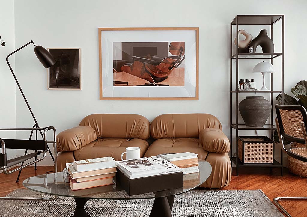
Photo from FRANÇOIS HALARD for Zara Home
Espresso, as its name suggests, is a dark and rich shade of coffee brown due to its black undertones. Basically, it’s darker than most browns and lighter than most black colors.
Due to its variations, ranging from ashy to chocolatey, many interior designers choose it as an alternative to black. However, espresso doesn’t come out as harsh and edgy because of its inherent warmth. In spaces with little to no natural light, this color might look like a true black. But its reddish brown tones appear once exposed to direct sunlight.
Advertisement
Although it can be categorized as a bold color, its sophisticated and grounding presence sets it apart. After all, espresso is still neutral and it’s only natural for it to blend seamlessly with other color palettes and interior styles. This is why it’s ideal as a focal and backdrop color and even in accent pieces and accessories.
While it’s difficult to pinpoint the exact origins of this trending color, it started to gain traction alongside the rise of modernism. In particular, the surge of mid century modern interiors often features neutral colors, including deep brown and black. This further grew in popularity when people began hyping the coffee culture, the same way the cafecore trend was born.
Regardless of its roots, espresso stands out as one of the most unique and versatile interior color designs today.
Advertisement
What Pairs with Espresso?
As a dark color, it’s common to combine espresso with lighter neutrals and pastels for a balanced look. But since this trending color is also neutral, it goes perfectly even with other bold hues and finishes.
Earth Tones. Since espresso and earth tones are both inspired by nature, this combination creates a harmonious and inviting atmosphere. Soft neutral colors or those with red, green, and yellow undertones balance the intensity of espresso, preventing the space from feeling too dark. This subtle contrast further establishes a sophisticated and dramatic ambiance in the space.
Vibrant Hues. Thanks to espresso’s dark tones, vibrant hues can pop and shine to make visually stimulating and energetic interiors. Pairing this trending color with teal, mustard yellow, burnt orange, or fuschia adds dynamism and a contemporary feel to a room. Plus, espresso stabilizes the high contrast of the brighter colors, preventing the space from feeling chaotic and overwhelming.
Advertisement
Metallic Finishes. When used with tiny details like fixtures, hardware, and decorative accents, they can make espresso appear more complex and interesting. The reflective property of brass, copper, and gold further highlights espresso’s richer and deeper tone, particularly if it’s used for larger spaces and pieces. Moreover, metallic finishes allow espresso to exude a luxurious feel, elevating the overall aesthetic of the room.
Other Dark Neutrals. Besides creating contrast, espresso needs supporting colors to help it shine. Dark neutral colors like browns and grays serve as a cohesive foundation that complements the depth and richness of espresso. Additionally, it creates a unified and moody look, perfect for sophisticated and contemporary spaces.
Warm and Dramatic Interior Color Design Ideas
Since it’s both a statement and base color, you can integrate espresso in almost every part and item of your house. Here are some of its best applications to get you started.
Advertisement
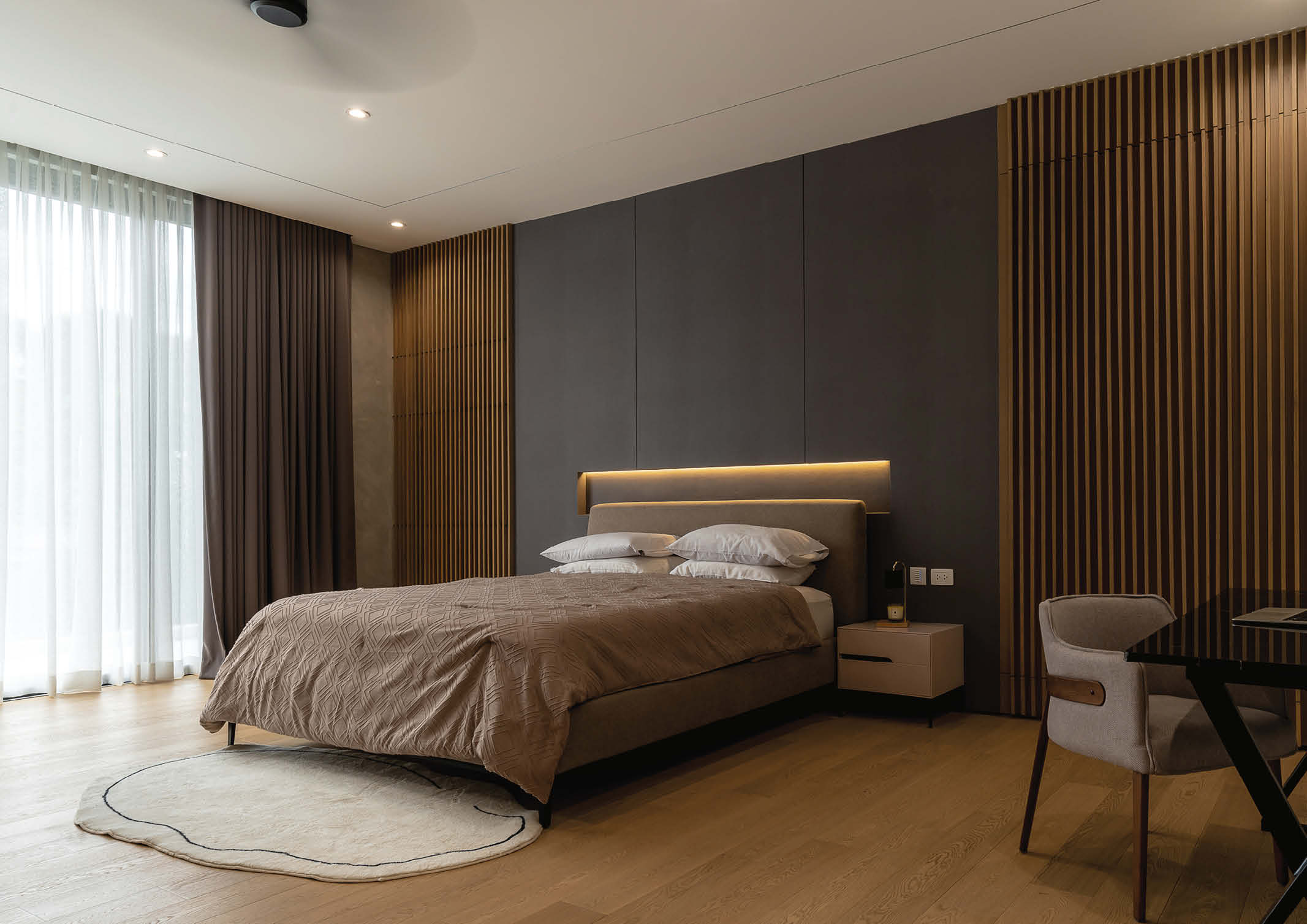
Espresso Accent Wall
Surrounded by warm neutrals and wood finishes, the espresso accent wall behind the headboard immediately highlights the placement of the bed. | Photo courtesy of Sim Ateliers and Benson Go
Using espresso for accent walls is more effective when you surround it with lighter and warmer shades of brown. Since it’s the darkest shade in the room, it anchors the space and prevents it from feeling too bland or overwhelming. Better if you place it near a window to help accentuate the espresso’s unique color.
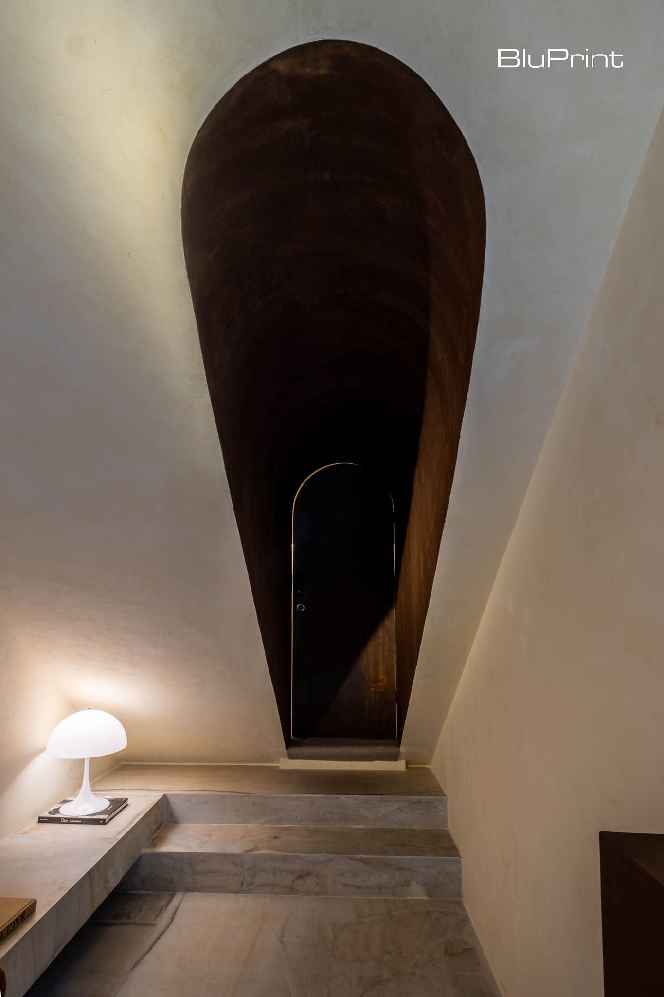
Emphasized Architectural Element
Espresso emphasizes this slanted alcove, giving the illusion of a longer and more open hallway and directing the eye towards the arched doorway at the end. | Photographed by Ed Simon
With its eye-catching shade, espresso can instantly highlight architectural elements to add depth and dimension to the space. Due to its shade close to black, it can seemingly cast shadows, especially if the space is draped with light colors. On top of it, it makes even the awkward areas noticeable and turns them into another focal point of interiors.
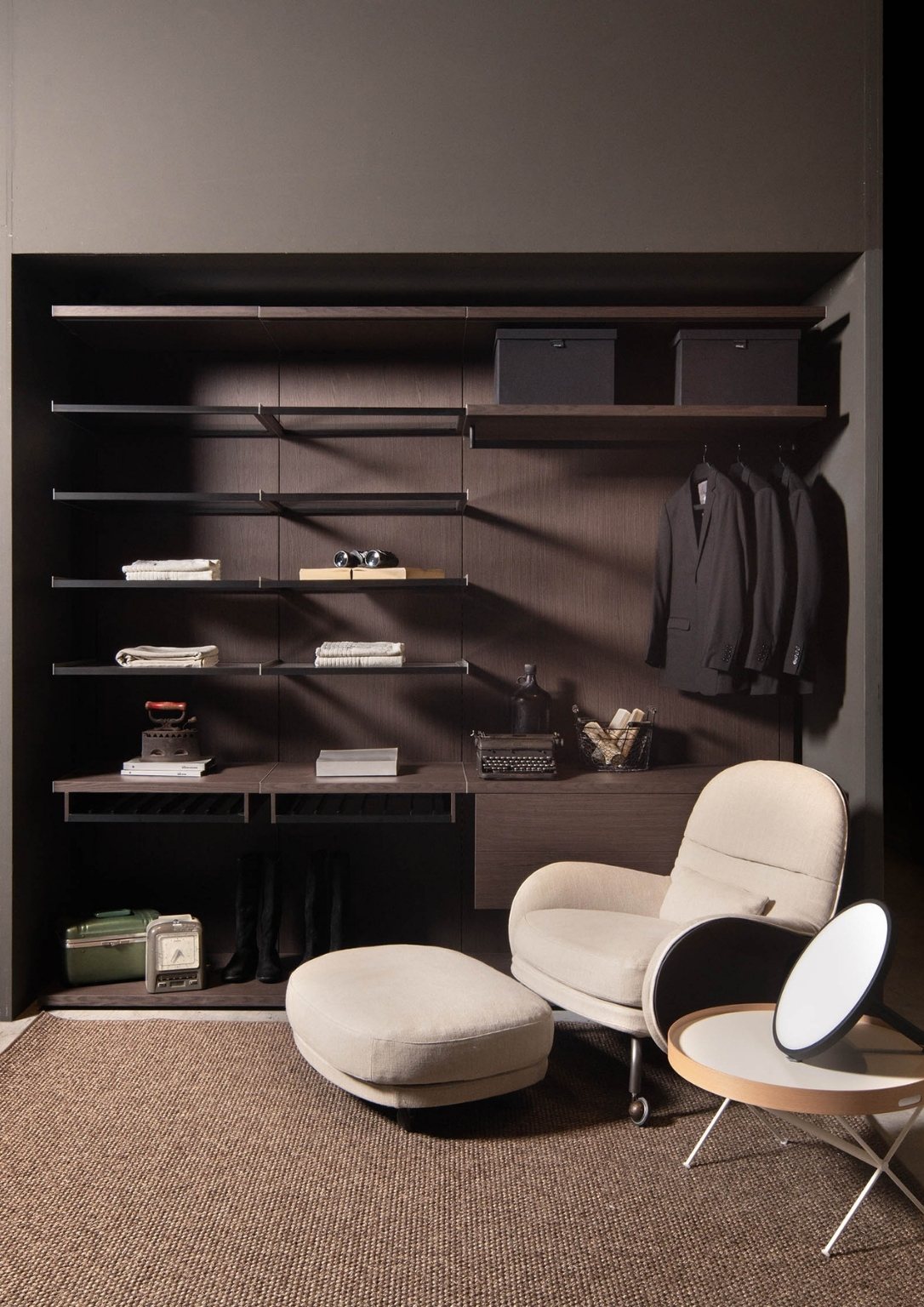
Built-in Closet
The espresso built-in closet blends well with the niche, maximizing the shadows to conceal the depth of the closet, creating a streamlined and sophisticated look. | Photo from Tana Verzo
Using espresso for built-in closets is probably one of the smartest choices if you’re into modern and minimalist styles. Its dark hue helps camouflage the storage elements within the closet, such as shelves and hanging rods. This allows the focus to remain on the clothing and accessories displayed, enhancing the overall presentation.
Advertisement
Espresso isn’t just a striking new alternative to traditional neutral palettes. It’s a dynamic color redefining the function and effect of neutrals in modern interior spaces. And with this versatility, it allows homeowners to reimagine their spaces with newfound depth, sophistication, and warmth.
Espresso is a deep, rich coffee-brown with black undertones. It is considered a unique neutral because it is darker than most browns but lighter than true black, providing warmth without being harsh.
Advertisement
Espresso’s inherent warmth makes it an excellent choice for a cozy atmosphere. It can be paired with lighter neutrals and pastels for a balanced look, or with earthy tones for a harmonious and inviting feel.
Espresso can be paired with both light and vibrant colors. It looks great with lighter neutrals and pastels, but also creates a dramatic effect when combined with colors like teal, mustard yellow, burnt orange, or fuschia.
Metallic finishes such as brass, copper, and gold are recommended. These metals highlight the richness of the espresso tone and add a luxurious, elegant feel to the interior.
Advertisement
Espresso can be used to create drama by serving as a striking statement color. It can be applied to an accent wall, used to emphasize architectural features, or on built-in closets for a sophisticated and unified look.
Contemporary design refers to the constantly evolving design trends of today. With the power to design our built environments, architects have been experimenting with various architectural approaches. Whether that is through unconventional forms or the integration of smart technologies, BluPrint lists down Filipino architects who are defining contemporary architecture. Deo Alam Architect Deo Alrashid Alam […]
In the Philippines, adaptive reuse gained traction during the 1970s with the rise of conservation and environmental preservation movements. It offered an architectural solution that reuses existing spaces to fit modern needs. Across the country, several projects demonstrate how this approach is being applied—transforming heritage structures into active spaces for culture, hospitality, and community life. […]
From residential spaces to civic structures, lighting dictates the mood of a space. It controls the visual dynamics of an interior, serving as a guiding tool that highlights key design elements, including materials and textures. Related Reading: Lampscaping: How to Light up Your Home like a Pro Regulating the Mood: Natural and Artificial Light in […]
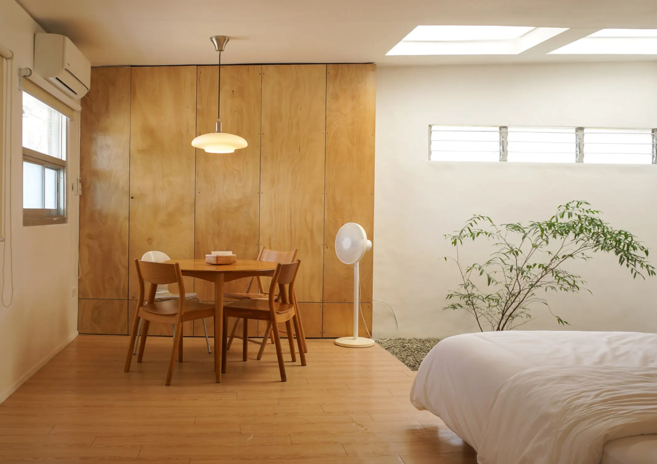
More and more Filipinos are flocking to condominium communities. Often tucked within busy city centers, condo living acts as a small respite from urban chaos. Faced with the challenge of transforming a cramped condominium into a warm living space, BluPrint lists condo interior design ideas that can maximize each square foot of small spaces. Purposeful […]
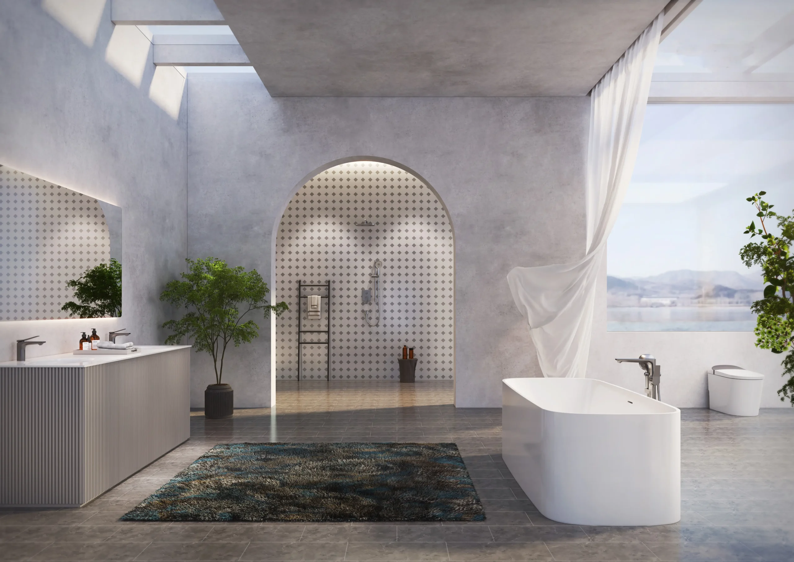
Modern bathrooms are no longer purely functional spaces. Increasingly, they are being designed as environments that support cleanliness, ease, and quiet restoration within the home. As daily life becomes more demanding and health awareness continues to rise, homeowners are beginning to expect more from the spaces where daily rituals begin and end. For architects and […]
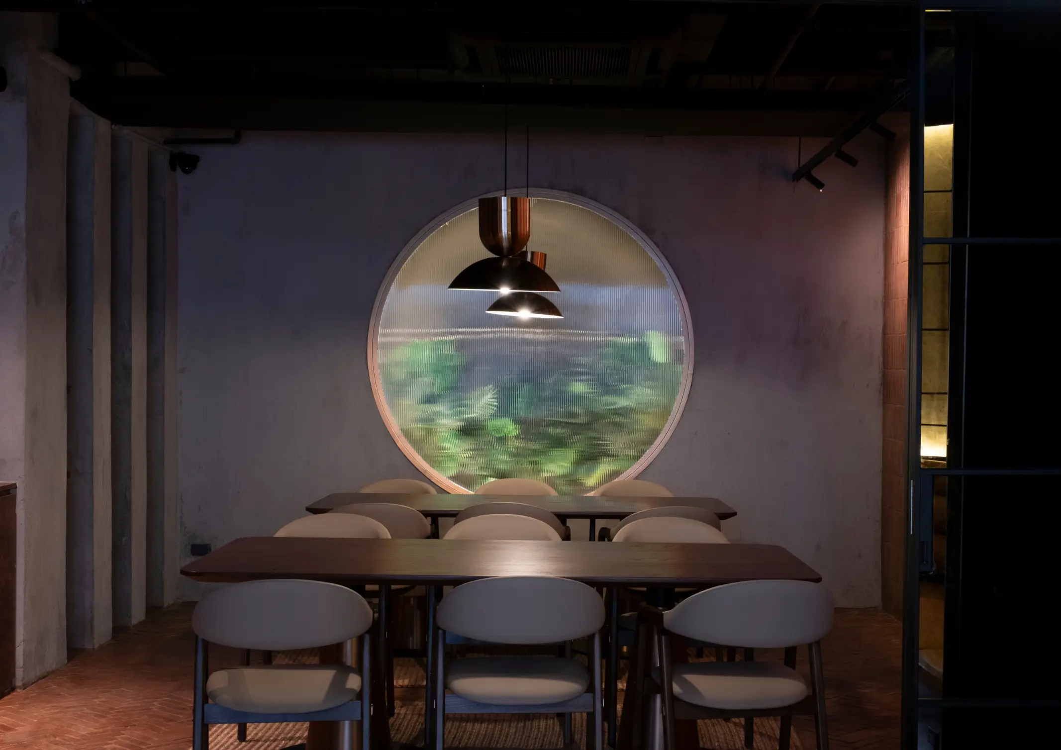
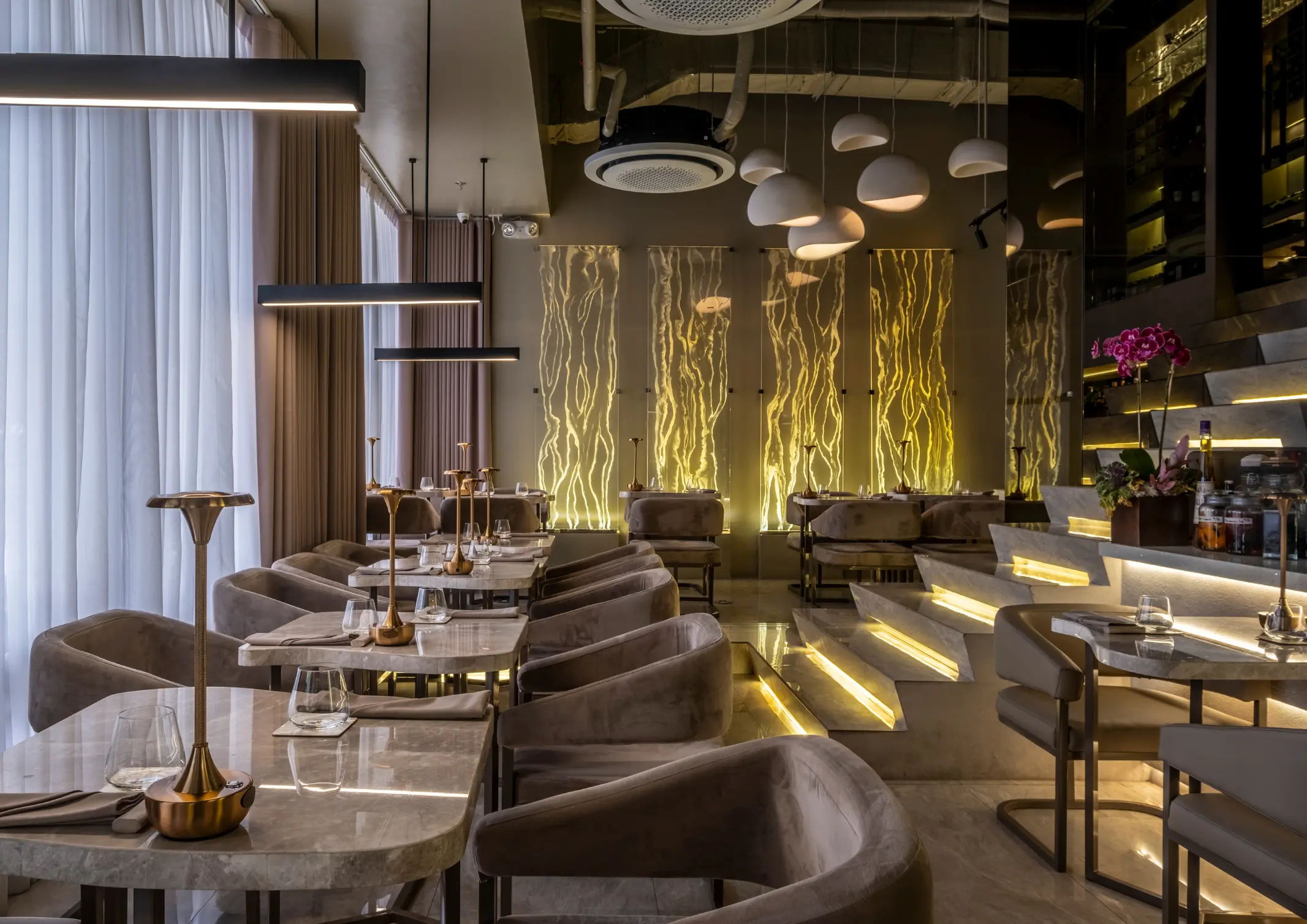
From the moment a diner steps through the door, each detail shapes how a meal is experienced. Restaurant design has evolved, with architects and culinary professionals collaborating to create built spaces that are as intentional as the menu itself. The spatial atmosphere acts as an additional ingredient that can define the culinary experience. Taupe and […]