Organized biennially by the Design Center of the Philippines, the Good Design Award Philippines (GDA) champions a distinctly Filipino approach to design rooted in malasakit (caring). It posits that good design goes beyond balancing form, function, and innovation—it creates meaningful solutions that respond to society’s most pressing challenges. The awards also advances the United Nations […]
Beet: The Fall Color Trend You Need to Know About
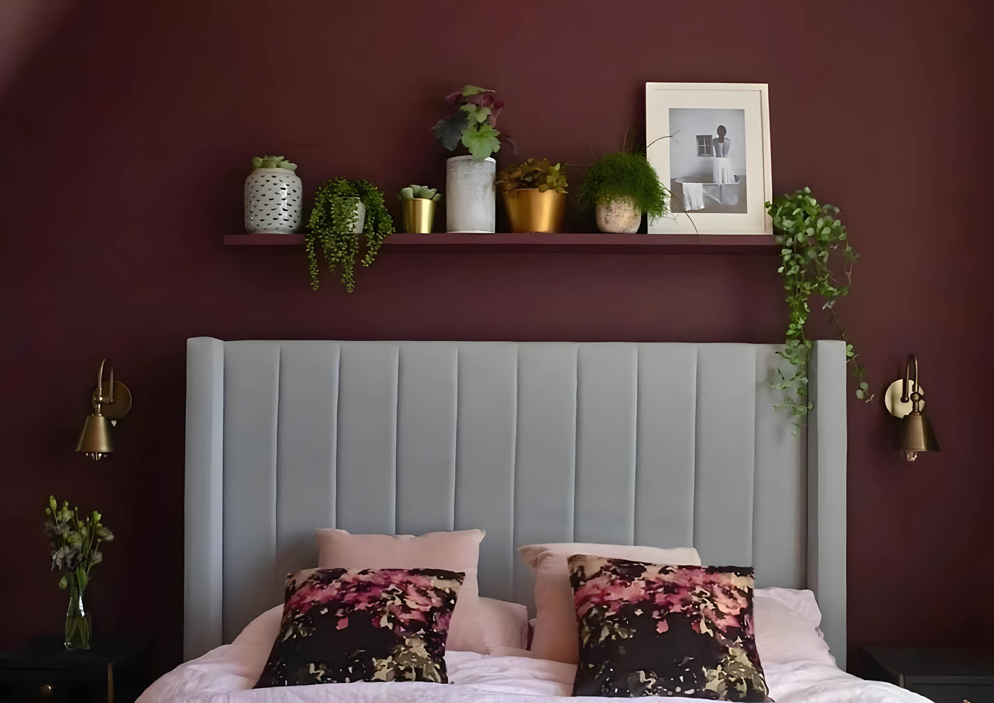
There’s no denying that fall is synonymous with warm colors. Reds, oranges, yellows, browns, and purples reflect the vibrant tones of fallen leaves that typically make up this season’s palette. At home, these classic shades bring a cozy and inviting atmosphere whether used in small or large accents. However, a surprising and less traditional hue has joined the usual mix this year. Beet offers a bold and unexpected twist to your home’s fall decor.
Emerging from the Depths of Earthy Colors

Beet isn’t a common sight in interiors. Its highly saturated tone, sitting between purple and red, is the very reason why it appears “elusive.”
At first glance, it may look like burgundy, wine red, or dark plum. Reath Design principal Frances Merrill added that it can be difficult to know its exact tone and it’s often “mistaken as brown.” To some extent, this trending fall color has a riddling characteristic that will leave you wanting to explore its nuances further. This gives beet the power to create a dynamic design to most interior spaces.
But due to its brown undertones, it can appear muted in certain light conditions. Imagine purple but more grounded, or a dark maroon with a hint of purple. Such a unique quality categorizes beet as an earthy color, which separates it from the usual vibrant hues.
It exudes depth, richness, and sophistication that effectively establishes a dramatic interior. But despite having an initial moody and imposing impression, beet is still capable of creating a soothing and energetic atmosphere. The key lies in how you use it in your home.
Why Beet Dominates the Fall Season

Of all the warm colors available, you might wonder why people seek out beet to welcome this year’s fall decor. Its rarity and ability to shift hues with light makes it an even more intriguing choice. But this trending saturated fall color is so much more than the hype of being a trending hue.
With its striking shade, beet serves as a fresh departure from the long fascination towards neutral tones. It can instantly elevate the mood of any interior space whether used sparingly or generously.
It’s even regarded as the unexpected new neutral because it pairs beautifully with a variety of colors and textures in different approaches. Warm-toned woods like maple and oak complement beet’s subtle warm base tones, which effectively fits a traditional interior style.
Like other vibrant hues, it additionally provides a nice contrast with lighter colors, especially in shades of white and beige. It further works well with similar eye-catching colors such as blue and yellow, or with similar shades of purple and red to create a monochromatic look.
In addition to defying neutrals, its undertones and tertiary color group are also the reason behind its popularity this year. Although it’s the uncommon shade in the group, beet still maintains a strong connection to the core colors of fall. Since it lies somewhere between purple and red with a drop of brown and earthiness, beet comes out as a combination of fall’s essential elements. And this unique feature positions beet as a special choice for interiors, especially in this season.
The Best Beet Alternatives

As described earlier, beet is a hard-to-find color. However, there’s no need to browse the entire hardware store or home goods market just to find its exact shade.
As interior designer Noz Nozawa says, beet is one of the vivid “earthbound hues” you’ll find a sense of timelessness and comfort. This implies that this color’s flavor-forward yet grounding aesthetic, rather than its specific hue, is what truly resonates with people. So, here are some of beet’s similar shades you can use as alternatives.
Aubergine Purple
It’s a deep, rich shade of purple that leans towards a slightly brownish or grayish hue. Think of the color of ripe eggplants or a deep wine. Thanks to its dark, velvety color, it can evoke feelings of luxury, maturity, and mystery in a space. This pairs well with neutrals like white, black, and gray, as well as with other deep colors like navy blue and burgundy.
Dark Burgundy
If beet is a purple-red hue, this color is a deep, rich shade of red that leans towards purple. It’s a classic color that exudes elegance and sophistication similar to the color of fine wine or a luxurious velvet fabric. Additionally, dark burgundy exudes confidence, coziness, and intrigue, which makes it one of the most common fall colors to use. Aside from neutral tones, it can be combined with its complementary colors like teal and green, and analogous colors like purple, brown, and oranges.
Claret
It’s a deep, rich red wine color that is slightly darker and more muted than pure red. It often has a hint of brown or purple as a nod to Bordeaux wine. Its intensely vivid shade complements similar colors like mauve and plum and metallic accents. It even blends well with greens and oranges to create a more vibrant and eye-catching look.
Along with the signature palette, beet offers a fresher approach to your home’s fall decor. It’s the color addition that envelopes a space with a sense of newness and rarity yet still familiar and easy to connect with.
Read more: Espresso: A Unique Neutral Color Adding Warmth and Drama to Interiors


In the business district of Bonifacio Global City rises a residential development designed around low-density living. Aurelia Residences brings together architecture, interiors, landscape, and art to create an elegant and culturally-resonant living environment. Related Reading: Shang Summit: Shang Properties Unveils New 250-Meter High Rise Architecture, Interiors, and Landscape Design Arrival plays a central role in […]

Architecture awards often document more than just individual achievements. They also recognize the work, effort, and vision behind any architecture project, revealing the priorities, values, and trajectories of a profession at a given moment. The United Architects of the Philippines’ (UAP) Outstanding and Beyond Recognition Awards (OBRA) continues to serve as one such marker, recognizing […]

For 66 years, the Ateneo Art Gallery (AAG) has been at the forefront of preserving modern and contemporary Philippine art. Today, its home at Areté reflects an expanded mission: to extend beyond exhibitions to cultivating education and creative exchange. Building a Home for Contemporary Art The AAG was founded in 1960 after artist, collector, and […]

A kitchen is one of the hardest-working spaces in a home. It must withstand daily wear, changing routines, evolving technologies, and shifting lifestyle needs while remaining visually coherent within the larger architectural narrative. While every project has its own requirements, experienced designers often return to a similar set of considerations when evaluating a kitchen. Here […]

The modern kitchen has evolved beyond its traditional role as a place for preparing meals. It is the heart of the home – a space where daily rituals unfold, conversations linger and the rhythm of everyday life takes shape. As open-plan living continues to redefine residential design, the kitchen is no longer a separate room, […]
Download this month's BLUPRINT magazine digital copy from:

Subscribe via [email protected]
Recommended Video
Tap to Unmute
Unmute
0:00
0:00