Organized biennially by the Design Center of the Philippines, the Good Design Award Philippines (GDA) champions a distinctly Filipino approach to design rooted in malasakit (caring). It posits that good design goes beyond balancing form, function, and innovation—it creates meaningful solutions that respond to society’s most pressing challenges. The awards also advances the United Nations […]
Best Fall Colors of 2024 to Decorate Your Home
September is a special time in the Philippines. This month marks the start of a festive season and the spirit of fall distinguished by bold and warm hues. It’s also the period of nostalgia, gratitude, and contemplation as people anticipate the upcoming celebrations, gatherings, and colder weather. And there’s no better way to capture the essence of this magical time than styling your home. So, here are the best fall colors to decorate your home with to truly welcome the cozy air of Ber months.
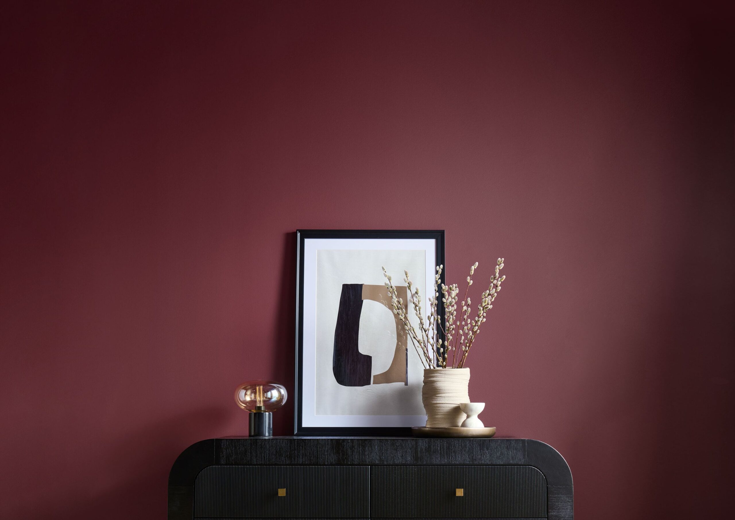
Brick Red: The Subtly Daring Shade
 - 1 - BluPrint")
One of fall season’s trademark colors are fiery reds. These hues are known for their deep, intense, and saturated tones, commonly associated with heat, passion, and energy. While generally commands immediate attention, among them stands out a distinct shade with a more nuanced appeal—brick red.
It’s almost similar to bamboozle red, terracotta, and rust, where three hues are in perfect harmony. Because of its balanced red, brown and orange undertones, it remains consistent even in various lighting conditions. Additionally, it doesn’t come out as too imposing and intimidating, making your home appear more congenial, especially during this festive season.
Despite its subtlety, it also exudes daring and joyful spirit since it leans towards the orange side of the red spectrum. Even when applied in small amounts and overlooked areas, this hue can instantly brighten up the space. This is why it’s a perfect choice for both traditional and modern interior styles.
Brick red ideally pairs with lighter and grayish neutrals like slipper satin and bold hues like beverly and wine dark. Moreover, it works best in accent walls, statement furniture, and highlighting architectural features.
Apricot: Your Unusual Muted Hue Among Fall Colors
 - 2 - BluPrint")
In contrast to brick red’s eye-catching characteristic, try something softer and muted like apricot. Unlike the classic vibrant reddish-brown hue, this kind of terracotta color displays hints of grays, beige, and subtle orange. Resembling a washed out California sun and clay pottery, its weathered and dusty appearance brings a sense of rustic and vintage elegance in a space. Such connection to nature makes it feel more grounded, particularly fitting during the weather transition happening in fall season.
Due to its earthy tone, it can look slightly vibrant in rooms bathed in natural light and more subdued in darker areas. This gives the interior a dynamic character using a singular color.
It further showcases its versatility when combined with soft whites like salt and similar earthy colors like olive green, taupe, and burnt sienna. And because it’s a soft color, it won’t appear too overpowering even when applied in prominent interior details such as lighting fixtures, artwork, and surfaces.
Chocolate Brown: History and Elegance in One
 - 2 - BluPrint")
To complete the basic fall colors, include a timeless and historically significant shade of brown like chocolate. Taking inspiration from John Blair Jr.’s 1770s house, this color has the classic appeal of rich, deep brown commonly found in antique and vintage materials and items.
As its name suggests, it’s as sophisticated and soothing as the indulgent flavor of a cup of hot chocolate. It also evokes the warmth and comfort of traditional coffee houses, which is particularly appealing during the cooler Ber months.
Unlike other brown shades, chocolate brown has red and black undertones. This unique combination sets it apart from other browns mainly used as neutral colors. Such quality allows this color to complement with vibrant reds and muted tones, ideal for building a solid fall color palette. So whether in accent walls, furniture, accessories, or textiles, it stands out as striking elegant color regardless of interior style.
Beet: The Newfound Fall Color This Year
 - 1 - BluPrint")
Beyond the hues of fallen leaves, a rather elusive color enters the list of best fall colors this year. Beet is a deep purple-red shade reflecting the color of the root vegetable it’s named after.
Although it looks similar to oxblood and wine, the mix of red and brown undertones give it its distinct earthy quality. Despite looking saturated at first glance, it gives off a moody yet elegant ambiance, aligned with the fall season’s cozy atmosphere.
Since it’s an unusual and unfamiliar interior color, it’s hard to figure out the exact hue it portrays. And that sense of confusion is exactly its unique appeal. Not to mention its changing tone under different lighting conditions, this color leaves an unforgettable impression by keeping you guessing. This illusive quality makes beet a challenging color to find, match, or replicate accurately.
Having that depth and dynamism allows this trending fall color to harmonize with various hues outside the autumnal palette. Pops of green, blue, and warm neutrals further emphasize its distinctive allure while metallic accents highlight its innate grandeur.
Sapphire Blue: The Classic September Color
 - 1 - BluPrint")
Of course, you cannot leave out the birthstone color of September, sapphire blue. Among the listed fall colors this year, this particular shade serves as the contrasting element to their warm and inviting feel. It breaks the expected analogous colors of red, orange, and yellow to give a nice surprise in interiors.
Aside from its long history rooted in Persian pagan beliefs, its serene and calm qualities make it a timeless color. For homeowners who wish to insert a hint of sentimentality in their home, this is a prime choice.
Due to its broad spectrum ranging from purplish to greenish tones, it can seamlessly blend with various interior styles. Although typically integrated in decorative items, sapphire blue is also perfect for accent, furniture, and mosaic tile designs.
As we enter a period of transition and transformation, these fall colors offer a vibrant and inviting approach to embrace the nostalgic spirit of Ber months. Decorating your home with these distinct hues is one of the most significant gestures to truly capture the essence of this season.
Read more: Wrong Shoe Theory: How to Break Interior Rules Through Mismatches


In the business district of Bonifacio Global City rises a residential development designed around low-density living. Aurelia Residences brings together architecture, interiors, landscape, and art to create an elegant and culturally-resonant living environment. Related Reading: Shang Summit: Shang Properties Unveils New 250-Meter High Rise Architecture, Interiors, and Landscape Design Arrival plays a central role in […]

Architecture awards often document more than just individual achievements. They also recognize the work, effort, and vision behind any architecture project, revealing the priorities, values, and trajectories of a profession at a given moment. The United Architects of the Philippines’ (UAP) Outstanding and Beyond Recognition Awards (OBRA) continues to serve as one such marker, recognizing […]

For 66 years, the Ateneo Art Gallery (AAG) has been at the forefront of preserving modern and contemporary Philippine art. Today, its home at Areté reflects an expanded mission: to extend beyond exhibitions to cultivating education and creative exchange. Building a Home for Contemporary Art The AAG was founded in 1960 after artist, collector, and […]

A kitchen is one of the hardest-working spaces in a home. It must withstand daily wear, changing routines, evolving technologies, and shifting lifestyle needs while remaining visually coherent within the larger architectural narrative. While every project has its own requirements, experienced designers often return to a similar set of considerations when evaluating a kitchen. Here […]

The modern kitchen has evolved beyond its traditional role as a place for preparing meals. It is the heart of the home – a space where daily rituals unfold, conversations linger and the rhythm of everyday life takes shape. As open-plan living continues to redefine residential design, the kitchen is no longer a separate room, […]
Download this month's BLUPRINT magazine digital copy from:

Subscribe via [email protected]
Recommended Video
Tap to Unmute
Unmute
0:00
0:00